Prologue
For a long time, I wanted to make a bivariate map. Not "someday, maybe." I actively wanted to, had the data sitting right there, had the story it would tell already worked out in my head. And every single time, I stalled at the same spot: the color palette. Not the data classification, not the projection, not even the legend design; the colors.
Bivariate maps ask something of a palette that a normal choropleth never has to worry about. You are no longer picking one gradient from light to dark, or from say calm to alarming. You are building a grid (nine colors, sixteen, twenty-five) where every single cell has to simultaneously say two things at once: how much of variable one, and how much of variable two. Get it right and the map reads intuitively, but if you get it wrong you have a mess of unrelated colors that nobody can decode, however carefully you write the legend.
The frustrating part is how little help there is when you actually go looking. Search for "bivariate color palette" and you mostly find the same handful of already-finished palettes, usually as static images, screenshots of somebody else's project, not tools. Fine if one of them happens to match your map's mood; useless if it doesn't. A few programming libraries can generate bivariate scales for you, but they live inside a specific language's plotting ecosystem and hand you nothing you can actually carry into a GIS or a design application. And if you try to build one by hand, opening your favourite drawing app, dropping in your two "high" colors and a neutral base, and eyeballing nine or sixteen intermediate cells one at a time, you will spend an afternoon nudging RGB sliders and still end up with a grid that doesn't blend evenly, where one diagonal looks muddy and another looks like a completely different palette bolted onto the corner.
That first, unresolved step is what kept blocking me. I never got to practise the actual cartography, the classification choices, the legend layout, the parts of bivariate mapping I was genuinely curious about, because I never got past my FOCC (Fear of Choosing Colors) to actually find three colors and a way to turn them into a coherent grid.
So eventually I did what I usually do when a tool I need doesn't exist: I built it! The Bivariate Color Palette Builder is a small, free, entirely browser-based app that takes any three colors you give it and computes a perceptually smooth grid from them, live, with no install and no learning curve.
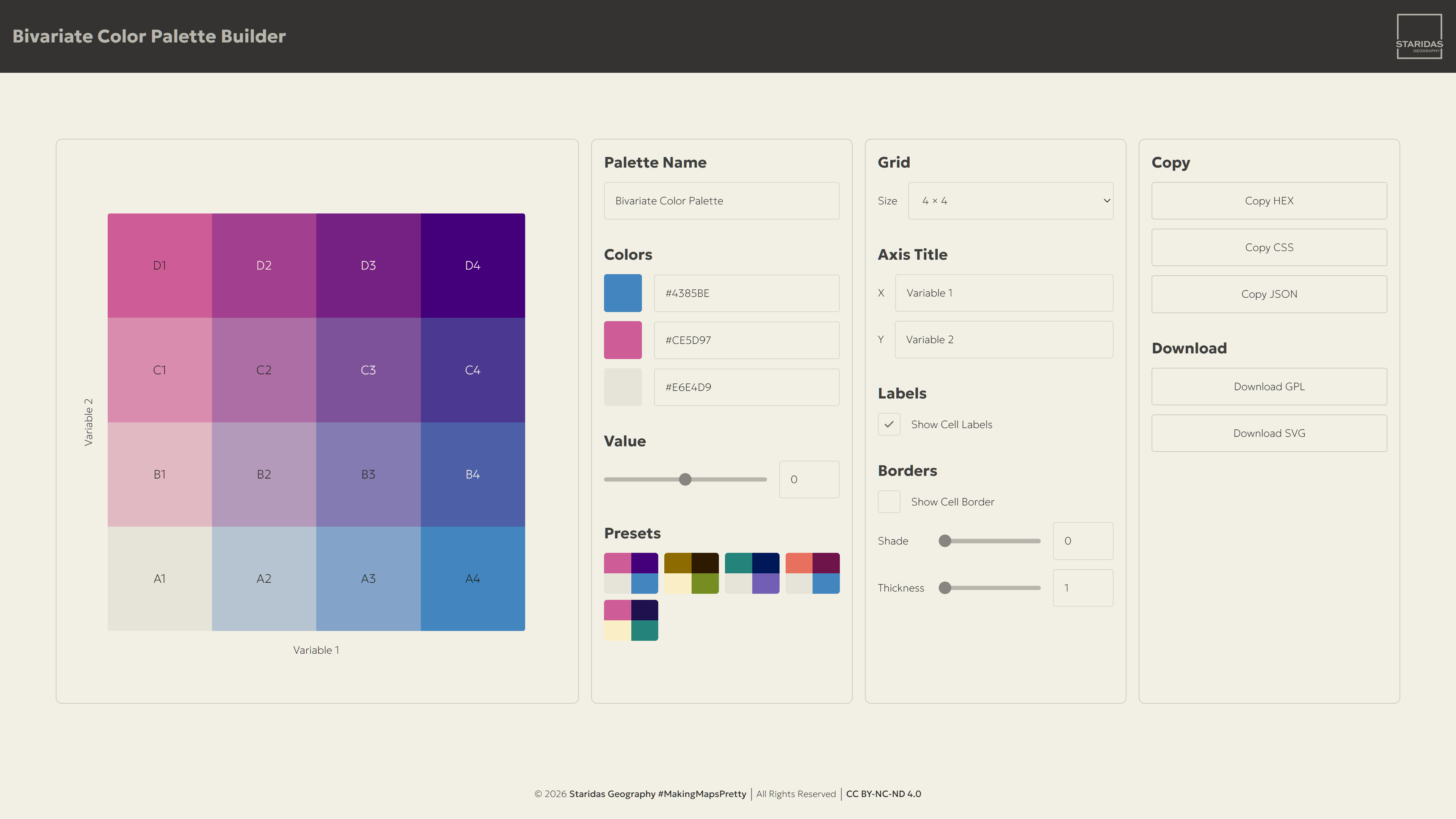
You can try it here! It runs directly in the page, no sign-up, nothing to download to get started. And crucially, once you have a palette you're happy with, it doesn't just sit there as a pretty preview: it exports directly into the formats the rest of your workflow actually speaks, a GPL palette for QGIS and a fully vector SVG for Illustrator, which are exactly what you'll need most if you've been stuck exactly where I was.
The Color Science Behind the Grid
Before walking through the interface, it's worth explaining briefly what the builder is actually doing, because it's the reason the results look coherent instead of like three random gradients stitched together.
You give the app three colors, one for each of three corners of the grid: a base color for the bottom-left (low on both variables), and one high color each for the bottom-right and top-left corners (high on variable one, and high on variable two, respectively). The fourth corner, top-right, where both variables are high at once, is not something you pick. The app computes it for you, as the natural combination of the two shifts you've already defined, so it stays consistent with the rest of the palette instead of being a fourth, unrelated color choice.
All of this blending happens in CIE LAB color space rather than plain RGB. LAB is built to match how human eyes actually perceive differences in color, so a step that looks "equally big" mathematically also looks equally big to a reader, which is exactly the property a bivariate grid needs, since its entire job is to let people compare cells at a glance. Once the four corners are set, the rest of the grid (nine cells, sixteen, twenty-five, however many you choose) is filled in by interpolating smoothly between them, corner to corner, row by row.
The Interface
The Grid Itself
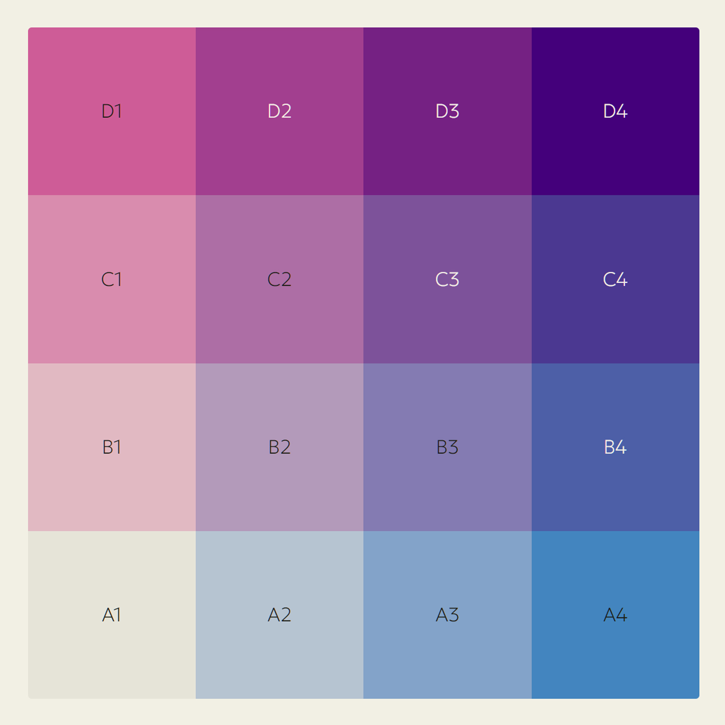
The grid preview is sitting at the top of the app, framed by the two axis titles along its bottom and left edges. This isn't a sample or a mock-up, it's the actual palette, live, and it redraws itself the instant you change anything in any panel below it, whether that's a corner color, the grid size, or a border setting.
Every cell also carries an index, a letter plus a number, so you can point to any exact swatch. Rows are lettered A, B, C and so on, starting at the bottom row and going up. Columns are numbered 1, 2, 3, left to right. So the bottom left cell is always A1, no matter the grid size, and the top right cell is C3 on a 3x3 grid, D4 on a 4x4, E5 on a 5x5. This is the same convention used for map grids, so it should feel familiar if you've ever given someone a grid reference on a map.
Click any swatch and its hex value gets copied straight to your clipboard. It's the fastest way to grab one color without digging into the Export panel. Everything in the next three chapters exists to shape what this one grid shows.
The Color Panel
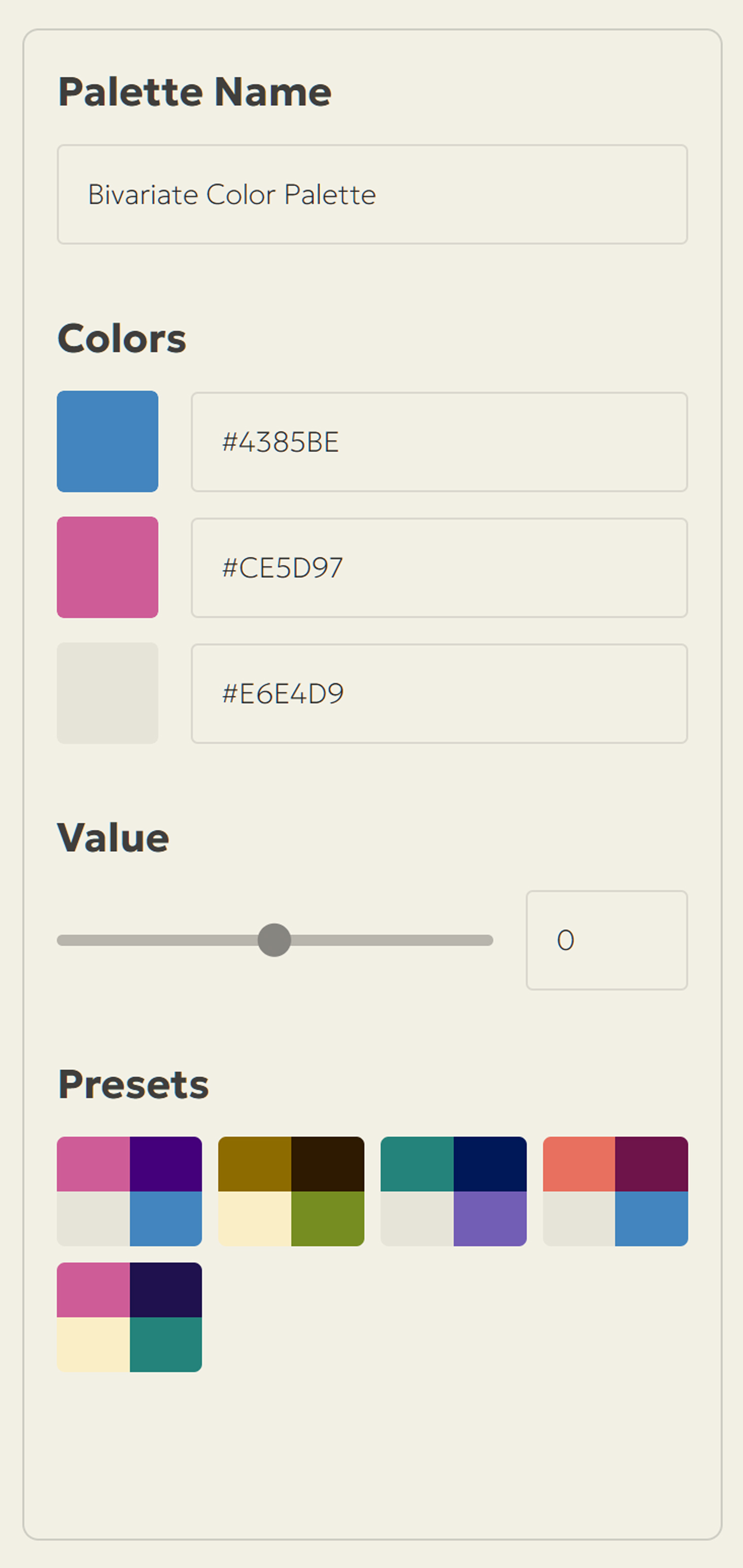
This is where the palette itself is defined, and it's the first panel you'll reach for, before anything else about the map even gets decided. Four controls live here: a name for the palette, the three corner colors that define the whole grid, a slider that fine-tunes the value/brightness of the corner the app computes for you, and a set of presets to jump-start the whole process. Everything else in the interface reacts to what you set here.
Palette Name is a simple text field, but it matters more than it looks: whatever you type here becomes the name embedded inside your exported .gpl file, and the filename used for both downloads. Naming it after the map or project it belongs to now saves you from digging through a folder of "bivariate-legend-final-v3" files later.
Colors is where you set the three corners described above: the bottom-right and top-left swatches for your two "high" colors, as well as the bottom-left swatch for the shared base. Each one gives you both a native color-picker, for editing the color visually and opens by clicking on the swatch, and an editable hex text field next to it, for typing an exact value from a brand guide or a color you've already sampled elsewhere. Change either one and the other updates to match, and the whole grid redraws instantly.
Value is a slider that looks like it belongs to the Colors group, and in a sense it does, but its job is narrower and more surgical than it first appears. It only touches that fourth, automatically-computed top-right corner, the "high-high" cell, and it only adjusts its brightness up or down, while deliberately holding its hue and saturation exactly where they were. This exists because the natural combination of two "high" colors can sometimes come out a little too dark or a little washed out for comfort, and without this control your only fix would be second-guessing your two base color choices. With it, you can rescue that one corner without disturbing the color logic that ties the rest of the grid together.
Presets gives you five ready-made three-color combinations, each shown as a small thumbnail of its own four-corner grid. Clicking one loads all three base colors in one go. They're there for two reasons: a genuinely fast starting point when you already know your grid size and just need a working palette, and a bit of inspiration on the days when you're staring at a blank set of color pickers with no idea where to start.
The Layout Panel
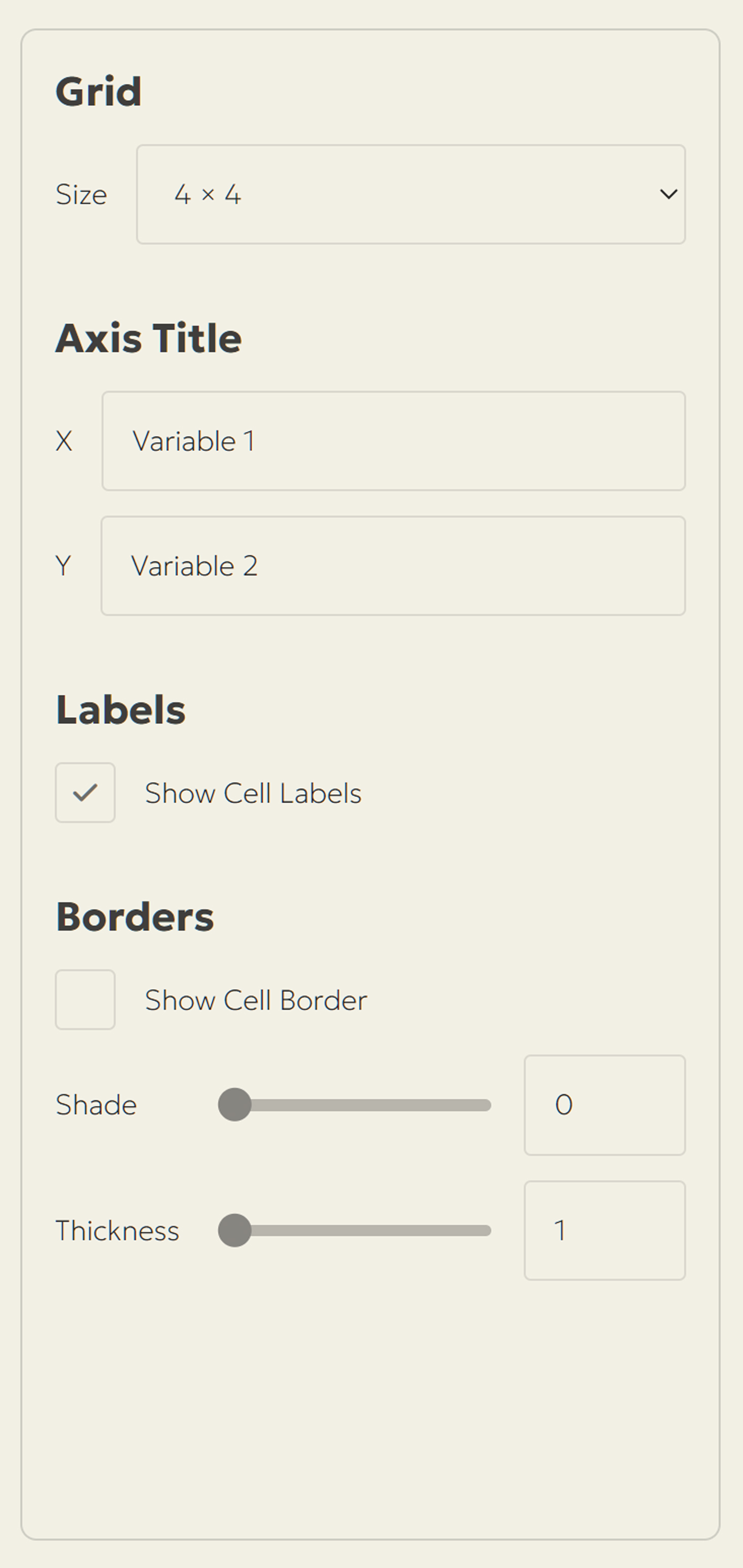
This panel doesn't touch color at all. It shapes the grid the colors are poured into, and the legend text that will sit around it once it's exported. Four controls live here too: the grid size itself, the axis titles that will end up baked into your final SVG, whether the cell index is visible, and how the borders (gridlines) separating each swatch look, if you want them at all.
Grid lets you choose the size of the palette: 3×3, 4×4, or 5×5. The classic 3×3 (nine classes) is the safest default and the one most map readers will parse without a second thought; it's what most published bivariate maps still use. Larger grids give you more nuance, more classes to distinguish "moderately high" from "very high," but they ask more of your reader's ability to decode a small colored square at a glance, so treat 4×4 and especially 5×5 as a deliberate choice for a more expert audience, not a free upgrade.
Axis Title is a pair of text fields, X and Y, that label the two variables shown on the live preview. Type your real variable names here, like for example "Median Income" and "Population Density," or whatever your two variables actually are, and the preview updates immediately. This isn't just a cosmetic aid: what you type here becomes the actual axis text baked into your exported SVG legend, so it's worth finalizing your wording before you download.
Labels is a single checkbox, "Show Cell Labels," that toggles the cell index inside each swatch, following ordinary map-grid convention: rows are lettered starting at the bottom (A, B, C...), columns are numbered left to right (1, 2, 3...), so the bottom-left cell of any grid size is always A1, and the top-right of a 3×3 is C3. Turn it on while you're designing, to talk precisely about "cell B2" instead of pointing at the screen, and decide only at the end whether you want those codes visible in the final published legend.
Borders gives you three related controls: a checkbox to show or hide the borders (gridlines) between swatches at all, a Shade slider running from pure black to pure white (always a neutral gray, regardless of your chosen palette, so it never fights with your colors), and a Thickness slider from 1 to 16 pixels. Borders earn their keep most at the larger grid sizes, where two neighbouring cells can end up close enough in color that a thin line is the only thing keeping them visually separate.
The Export Panel
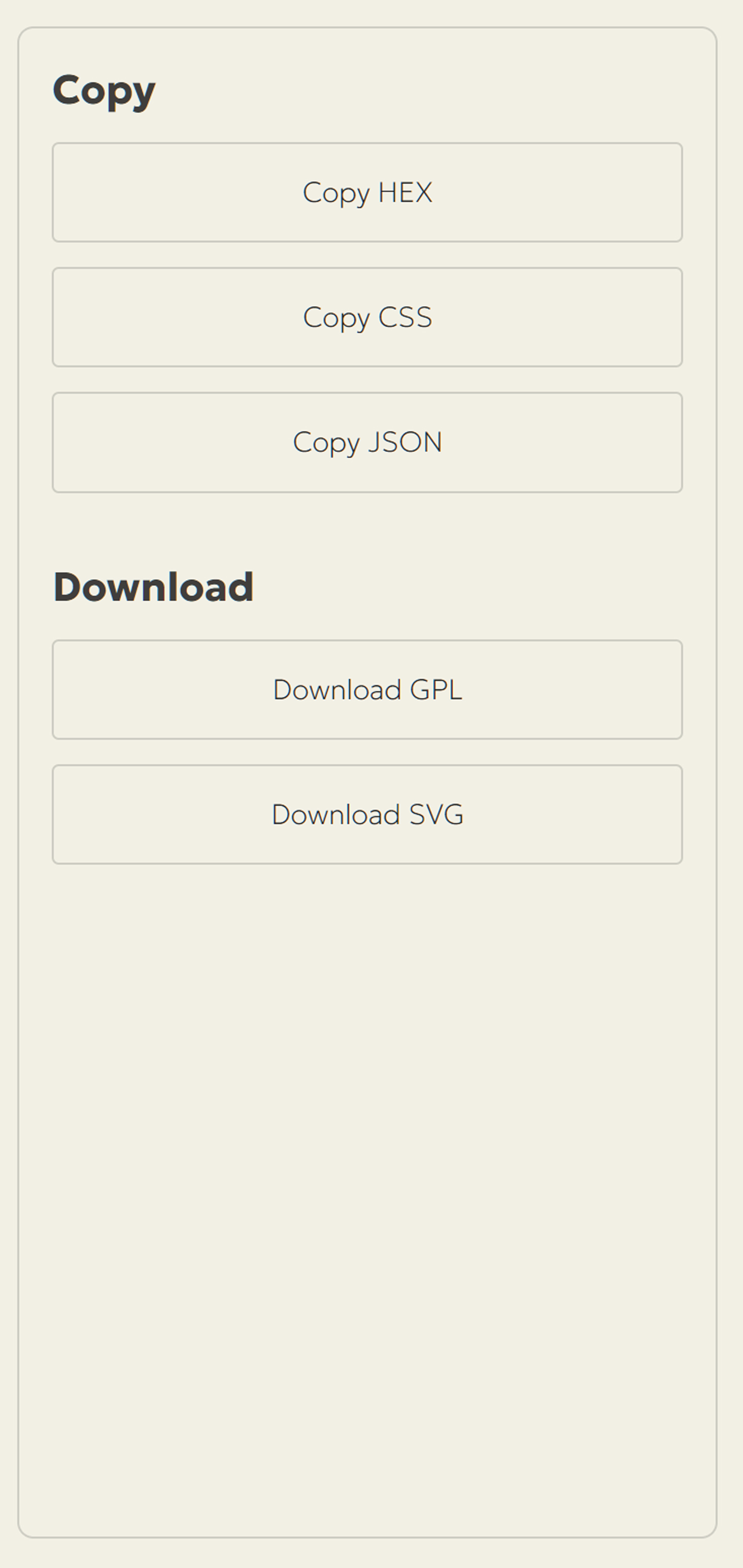
Once the palette and the grid options are where you want them, the Export Panel is where the work actually leaves the browser. It splits into two groups: quick copy-paste exports for anyone working in code or a web map, and two proper file downloads built for QGIS and Adobe Illustrator, but also for other graphic design software, including GIMP and Inkscape.
The Copy group handles the quick, text-based exports, three different shapes of the same data, each suited to a different destination. Copy HEX gives you the plainest version: every cell index paired with its hex value, one per line, readable as-is and easy to paste into a spreadsheet or a quick note. Copy CSS wraps the same values as ready-to-use CSS custom properties, so you can paste the whole block straight into a stylesheet and reference each cell by name anywhere in your project. Copy JSON turns the palette into a structured object, cell index as key, hex value as value, the format you actually want if you're feeding the palette into a web map, a charting library, or any script that expects to loop through the colors programmatically rather than read them.
The Download group is where the palette turns into an actual file on your computer. Download GPL saves it as a GIMP Palette file (.gpl), a plain-text format that names every swatch by its cell index and that QGIS, GIMP, Krita, and Inkscape all read as a ready-made, importable color set. Download SVG saves the entire grid as a vector file instead, complete with the borders, axis titles, and cell labels exactly as configured in the Layout panel, so what comes out is finished, editable artwork rather than a flat screenshot. One turns the palette into data your GIS can use, the other turns it into artwork your design software can use, and which one you reach for depends entirely on where the map is headed next.
Bringing Your Palette into QGIS with the .gpl File
The .gpl format, short for GIMP Palette, is an old, plain-text, and an extremely portable way of describing a named set of colors. It predates most modern design tools and is still recognised almost everywhere, QGIS included, which is exactly why it's the format the builder exports for QGIS use.
QGIS gives you two places to bring that .gpl file in, and the difference between them actually matters. The first is scoped to a single project: Project > Project Properties > Colors, find the Project Colors section, and use the Import Colors button next to the color list to load your downloaded .gpl file. Every swatch arrives already named with its cell index, A1, B2, C3, and so on, exactly as shown in the app, so nothing needs renaming. Those colors then live inside that project file only, available anywhere QGIS offers a color picker while you're working in it, and travelling with the project if you hand it to someone else. Full details on this panel are in the QGIS documentation, under Colors Properties.
The second option is scoped to your whole QGIS install instead of one project: Settings > Options > Colors, where the Import Palette button lets you load the .gpl file into a new palette, or the Import Colors button will allow you to import the .gpl colors into an existing palette. Do it here and the palette shows up in every project you open from now on, which is the better choice if this is a palette you'll reach for again on future maps rather than a one-off. This tab, along with the other palette types it manages, is covered in the QGIS documentation under Colors Settings.
Either way, once the palette is loaded the actual mapping work is the same: rank each of your two variables into classes matching your chosen grid size, combine the two rankings into a single class with an expression, concatenating row and column into something like "B2", and symbolize with that code, categorized or rule-based, pulling each category's fill straight from the imported palette by name instead of hunting for hex values one at a time. Picture 6 shows exactly that, a bivariate map in QGIS styled entirely from the .gpl exported out of the builder, with each region colored by its A1 through C3 class, matching each color's index.
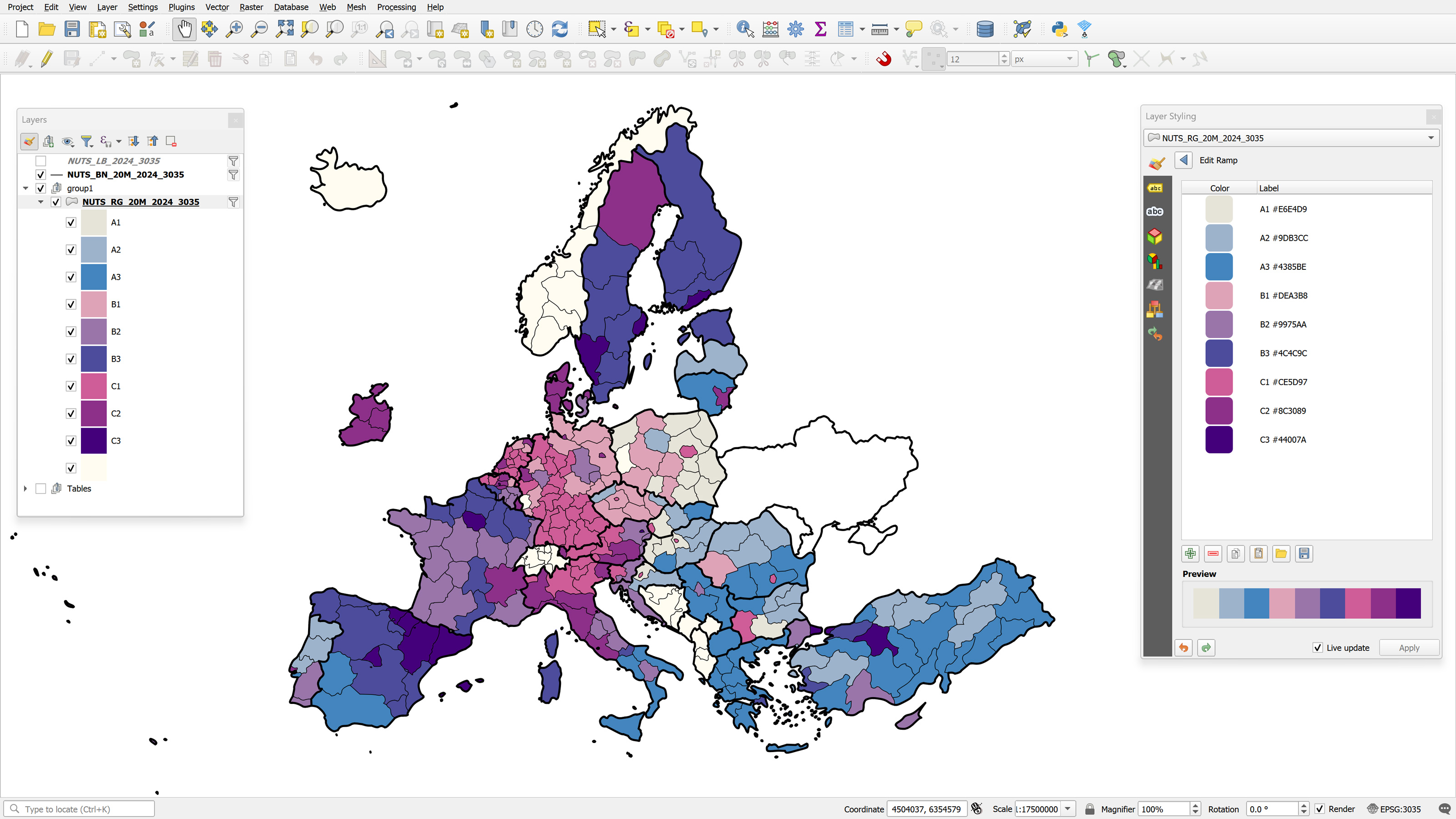
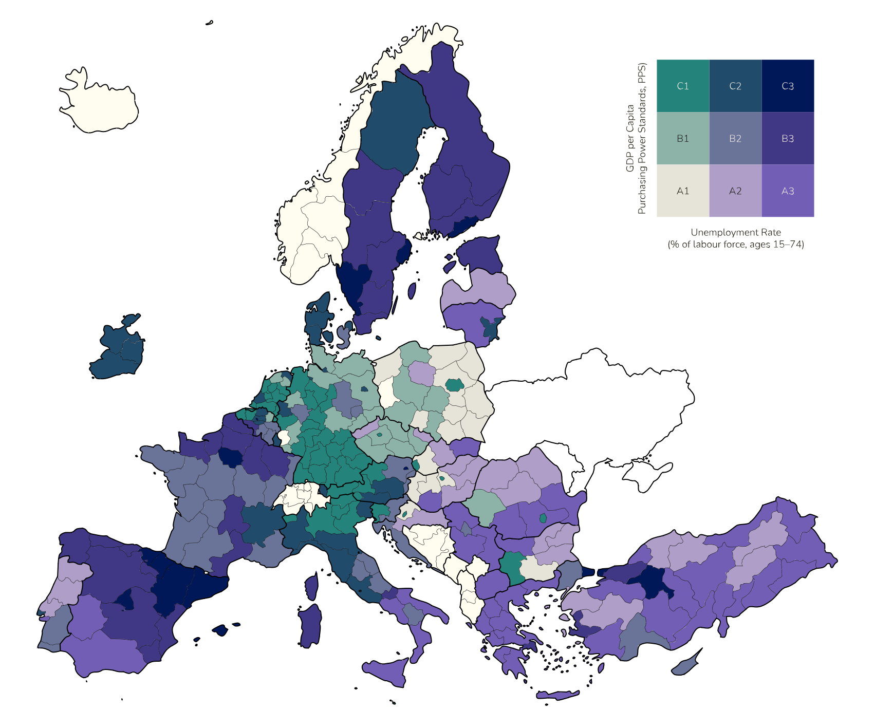
And here it is, the whole reason this post exists. Below is the actual map, built in QGIS for this very post, running on the exact 3x3 grid from the builder above, loaded in through one of the two import .gpl methods just covered. No more staring at empty color pickers wondering what goes where. Every region is styled by its corresponding cell index, A1 through C3, pulled straight from that palette by name. This is the bivariate map that stalled me for so long, sitting right here, finished.
Bringing Your Palette into Illustrator with the .svg File
The downloaded SVG isn't a flattened image of the grid. It's the actual live vector artwork behind the preview. Every swatch is its own colored rectangle, the axis titles come in as real, editable text objects, the cell index labels (if you left them switched on) are text too, and the borders (gridlines) are genuine vector strokes, not pixels.
Open it directly in Adobe Illustrator, or in any other vector graphics software, so it lands as a fully editable document. Everything arrives already organised and ready to work with. From there, building a reusable swatch library is just a matter of selecting each rectangle in turn and dragging its fill into the Swatches panel, naming each one to match the same cell indexes used in the .gpl, so your QGIS and Illustrator palettes stay in sync under identical names.
Because it's vector from the ground up, you can drop the whole legend block straight into a print map layout at any scale with zero quality loss, restyle the axis title typography to match the rest of your map, or break individual swatches out to build other legend elements by hand. It is, in effect, camera-ready legend artwork the moment it opens.
Putting them all together to actually make a Bivariate Map
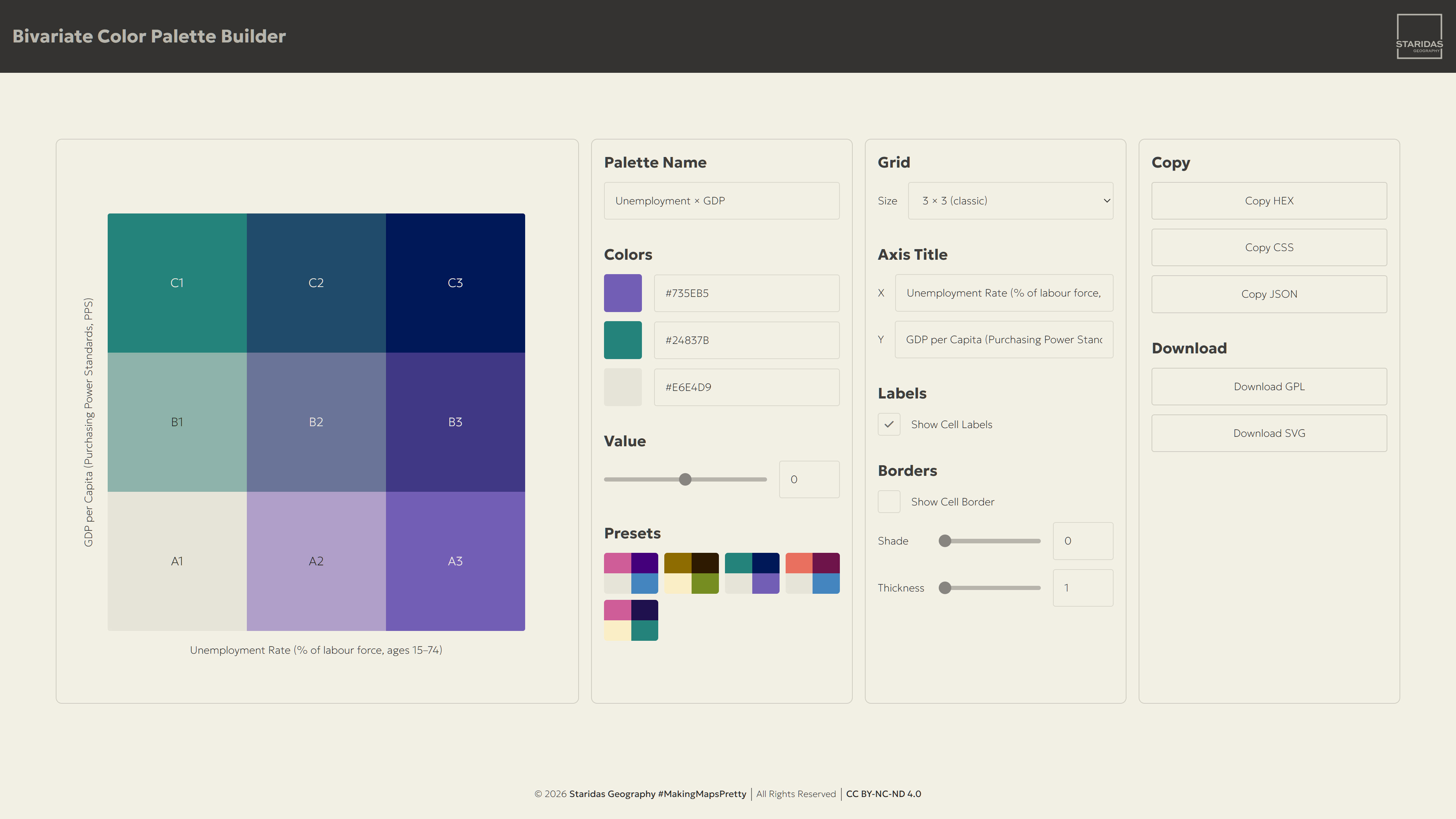
This is where the whole thing gets to prove itself. Picture 7 shows the actual setup, the Teal & Indigo preset selected in the builder, which was then pulled into QGIS as a GPL file and grabbed as an SVG for the legend. From there I built a real bivariate map, with real data, around that palette.
The two variables are GDP per Capita (PPS) and Unemployment Rate, both from Eurostat, 2024, at NUTS 2 level, the mid-sized regional unit Eurostat uses across the EU. GDP per capita is in Purchasing Power Standards, so wealth is comparable across countries even with different prices and currencies, and unemployment is the share of the labour force aged 15 to 74 without work.
I ranked each variable into three classes, low, mid, high, and combined the two rankings with an expression in QGIS into a single cell index, the same A1 through C3 indexes from the grid, then symbolized the layer with those nine values pulled straight from the imported palette by name.
Those nine cells aren't just color swatches, each one is an actual economic profile. Along the bottom row, A1 is modest but stable, low income and low unemployment, A2 is a step down in income with moderate joblessness, and A3 is the hardest corner, low income and high unemployment together, which is where a lot of Greece, the Balkans, and parts of southern Spain and Italy land.
The middle row is closer to the European center of gravity, B1 solid with a tight labour market, B2 basically the average region on both counts, and B3 a middling economy still carrying high joblessness.
The top row is where it gets interesting, C1 is the dream case, high income and a tight labour market, places like Munich, C2 is wealthy with some labour slack, and C3 is the real paradox, high income and high unemployment at once, which shows up in big capital-region economies like Stockholm, Paris, and Madrid, huge output per person sitting right next to a large pool of people out of work.
Once the map itself was styled, I built the print layout in QGIS and dropped in the legend, the same SVG the builder exports, brought into Illustrator to clean up the typography and match the rest of the layout. Et voila, my bivariate map!
Epilogue
I built the Bivariate Color Palette Builder because I got tired of the palette being the reason a map never happened. Picking three colors was never the hard part, it's turning them into a coherent, evenly blended grid that stopped me every time. That's over now. Whatever bivariate map I've been putting off, I finally have no excuse left.
If you've ever had the data, had the story, and stalled at exactly the same spot I did, this is for you too. Pick a base, pick your two "highs," let the math handle the rest, and you'll have a coherent, perceptually smooth grid in less time than it took to read this sentence. And because it exports straight into a .gpl for QGIS and a fully vector .svg for Illustrator, it doesn't stop at a pretty preview in a browser tab. It's meant to actually leave the page and end up on a finished map.
Happy bivariate color palette building!
Spiros