Prologue
In the realm of modern cartography, we often find ourselves caught between the clinical efficiency of GIS-generated maps and the timeless, soulful artistry of historical prints. While modern software allows us to render global datasets in seconds, the results often lack the specific aesthetic power found in early 20th century lithography, like the warmth in the ochres of mountain ranges and the textured resonance in the indigos of the sea.
This post is dedicated to bridging this gap by capturing the "Color DNA" of these printed masterpieces and bringing their sophisticated color logic into the digital workspace. In the guide that follows, I will walk you through a professional workflow using QGIS to perform high-level color sampling. Rather than relying on generic software defaults, we will use a custom-built processing model to "reverse-engineer" a high-resolution 1928 map of Iceland from the David Rumsey Map Collection.
You will learn how to:
- Integrate Custom Models: Load and utilize specialized .model3 and .qml files to automate your workflow.
- Master Preprocessing: Set up your environment correctly, from CRS management to creating dynamic scratch layers.
- Execute Precise Sampling: Use the model to extract and calculate color data across multiple dimensions—including RGB, HSV, CMYK, and HEX.
- Leverage Dynamic Postprocessing: Set up "Live" attribute forms so that your data updates automatically as you move points across the source map.
By the end of this post, you’ll see how the static ink of a vintage print can be transformed into a living, functional digital palette, allowing you to dress your modern GIS layers in the elegant attire of a century-old classic.
Collect the Resources
The Source Map
The first step is to acquire a high-quality source map to serve as our color reference. For this exercise, I visited the David Rumsey Map Collection and selected a physical-political map of Iceland. This specific piece is one of my personal favorites, boasting a vibrant and incredibly interesting color palette (Picture 1).
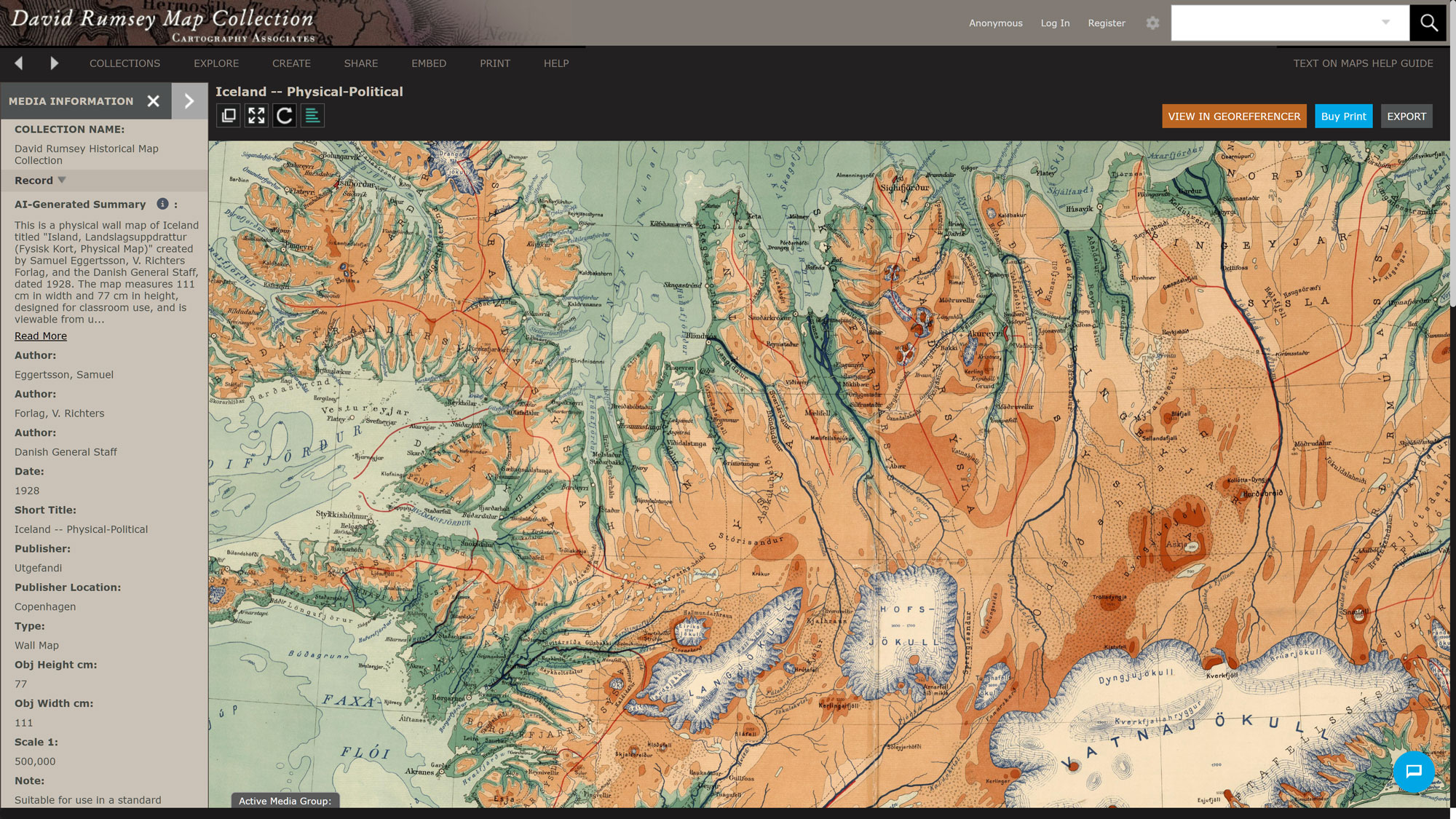
The map is typically provided in a zipped archive. After downloading, I extracted the files to a local directory, which included the image itself and a metadata text file. I made sure to download the highest resolution available to ensure the most accurate color sampling results during the processing stage.
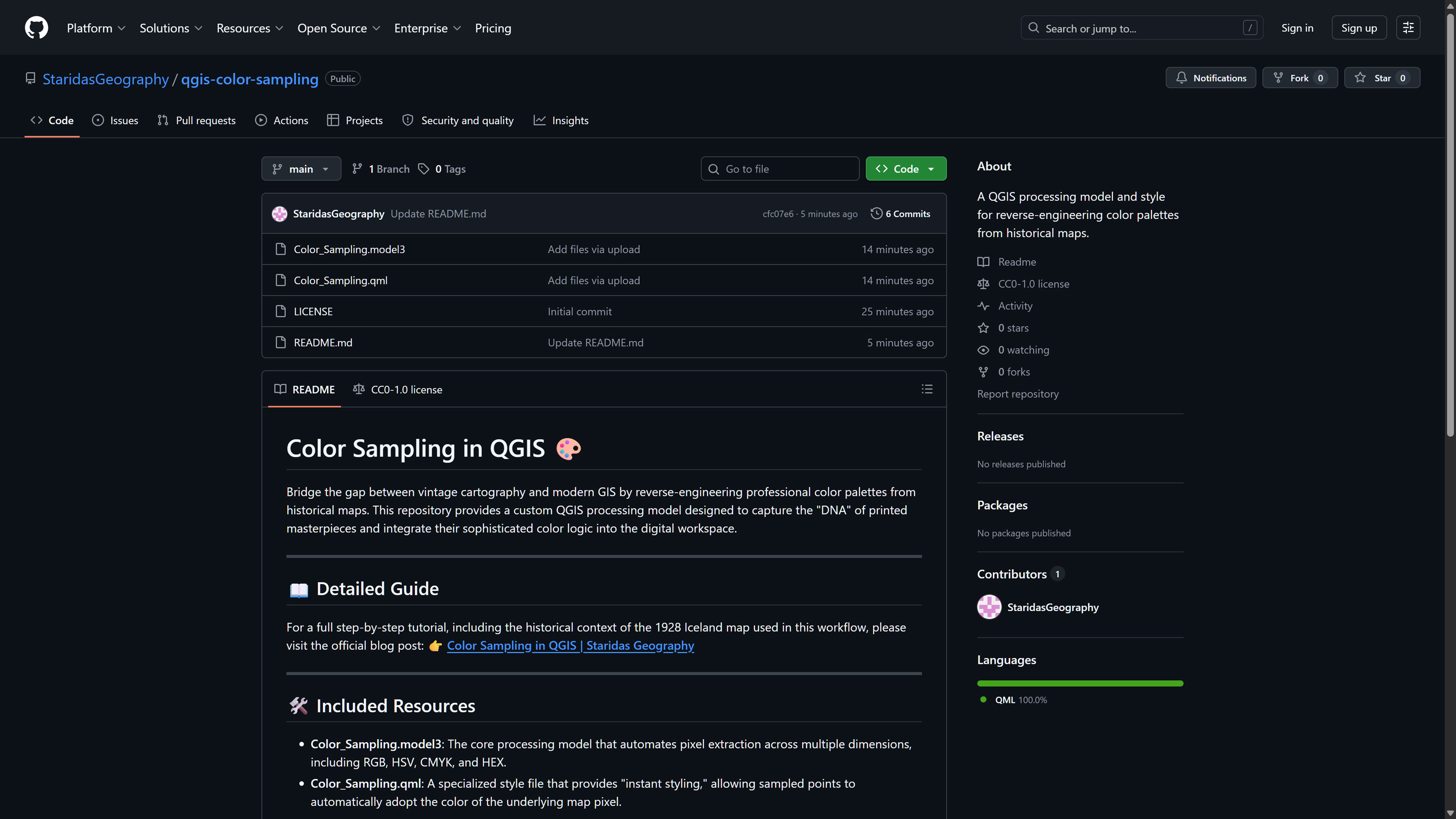
Next, I visited the Color Sampling repository on GitHub (Picture 2) to gather the necessary tools. I downloaded two essential files:
- Color_Sampling.model3: The processing model that handles the core calculations.
- Color_Sampling.qml: The QML style file used to automatically visualize the output data.
The model file performs the heavy lifting by extracting pixel values, while the QML file ensures the resulting point layer reflects those colors immediately. I saved both files into a dedicated project folder on my local drive for easy access.
Preprocessing
Add Model to Processing Toolbox
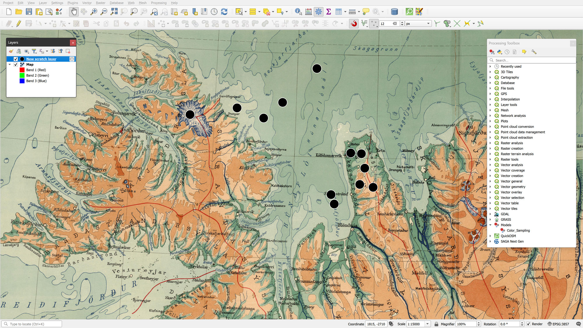
Once inside QGIS, I opened the Processing Toolbox. By clicking the "Models" icon (resembling three gears) at the top of the panel, I selected "Add Model to Toolbox" from the dropdown menu. I navigated to my saved Color_Sampling.model3 file and clicked OK. The model now appears under the "Models" section of the toolbox, ready for use.
Add the Source Map
To bring in our reference image, I navigated to Layer > Add Layer > Add Raster Layer. In the Data Source Manager, I selected the Iceland map downloaded earlier.
Maps from the David Rumsey Collection are generally not georeferenced, meaning the image will initially default to Null Island (coordinates 0,0). Since our goal is strictly color sampling rather than geographic analysis, georeferencing isn't strictly necessary. However, for a smoother workflow, I assigned EPSG:3857 (Web Mercator) as the Coordinate Reference System (CRS) for both the layer and the project (Project > Properties > CRS).
Finally, I renamed the raster layer to Map in the Layers Panel; this specific naming is vital for the postprocessing automation we will set up later.
Create a New Temporary Scratch Layer
Next, I created a New Temporary Scratch Layer via Layer > Create Layer. I set the geometry type to Point and ensured the CRS matched the project (EPSG:3857). This layer serves as the vehicle for our sampling locations.
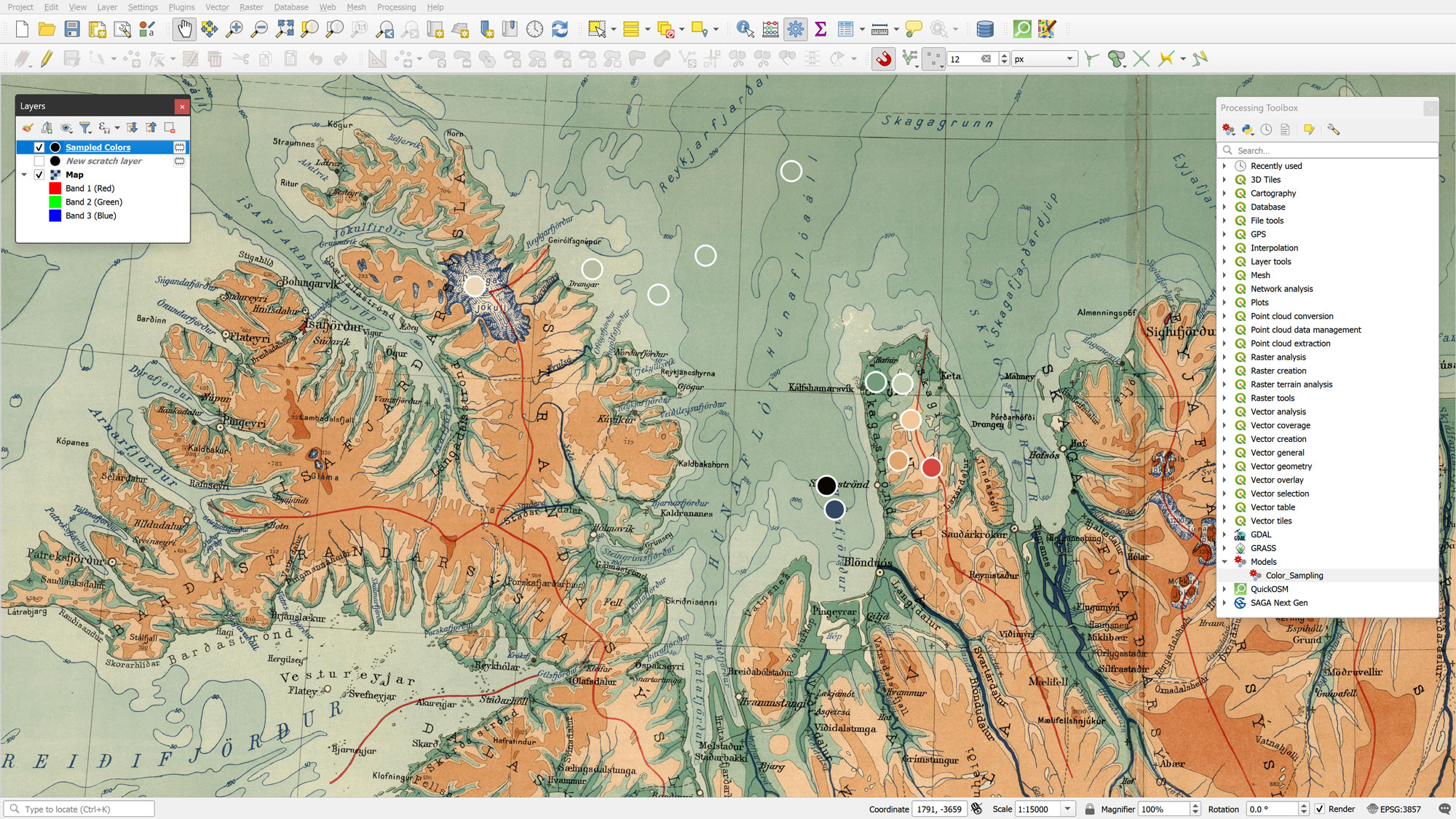
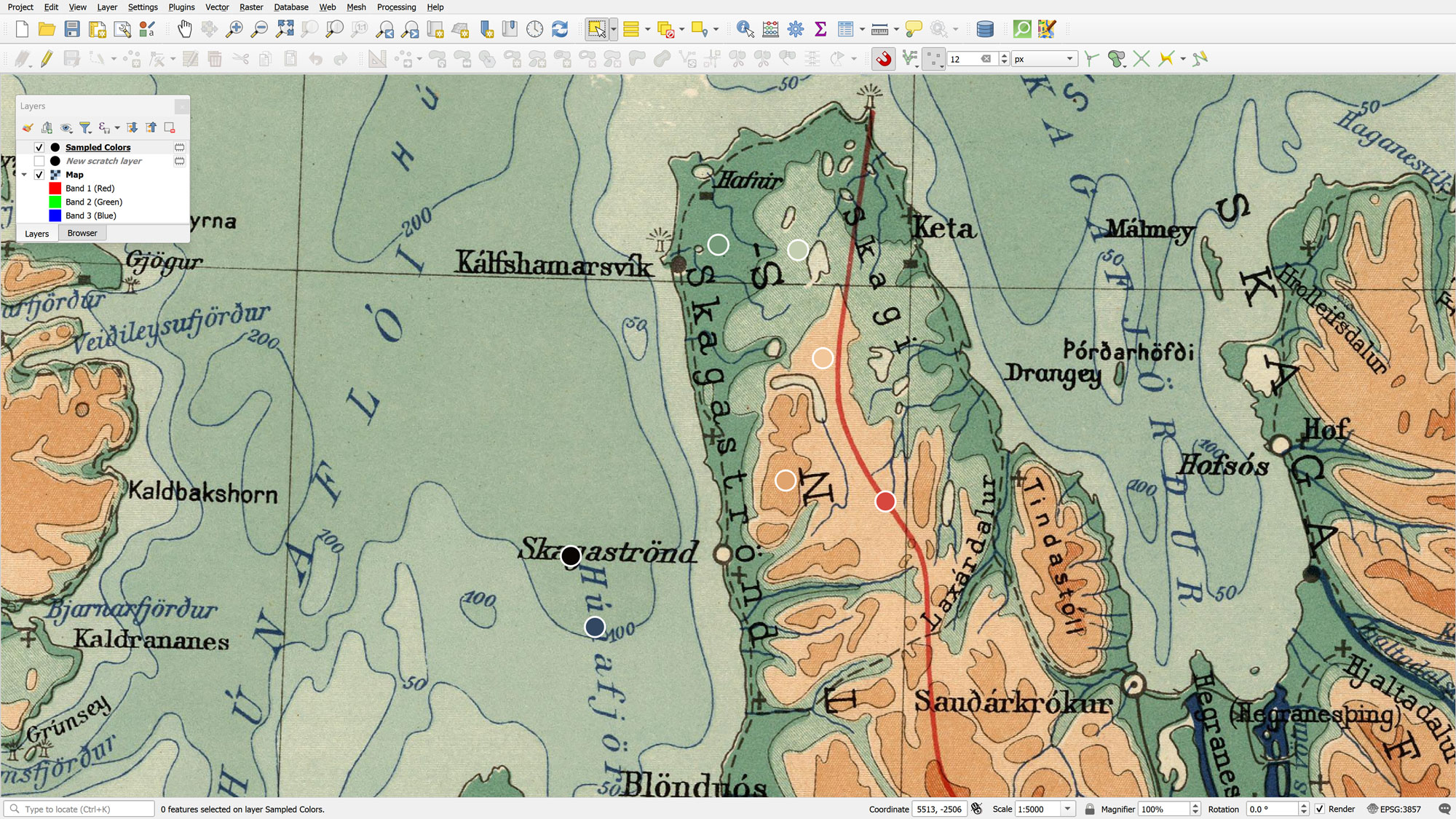
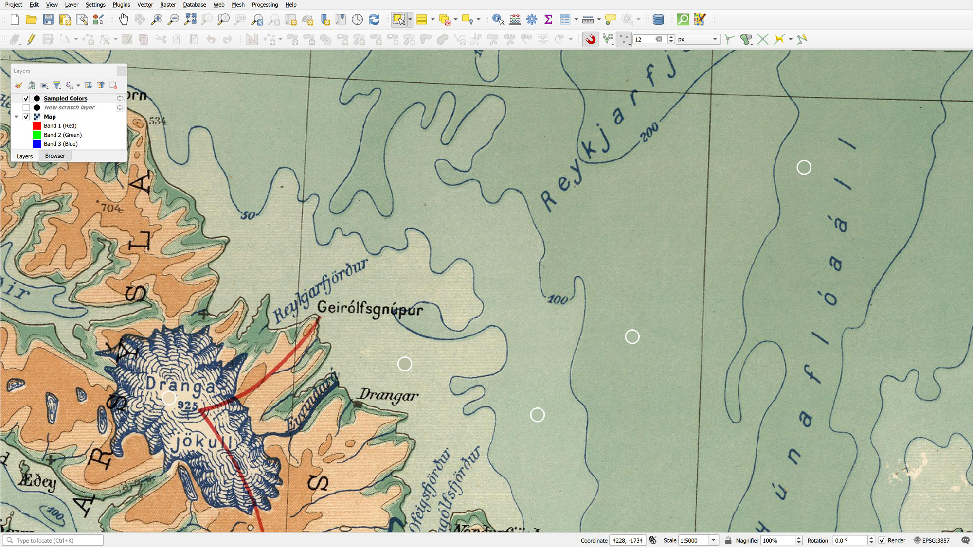
I didn't need to manually add any attributes, as the model will generate these automatically. With the layer in Edit mode, I used the Add Point Feature tool to drop points onto the map in areas where I wanted to capture specific colors. Once finished, I saved the edits and toggled off the Editing Mode.
At this stage, my workspace included the added Color_Sampling model, the source map renamed to Map, and the New scratch layer (Picture 3).
Processing
Running the Color Sampling Model
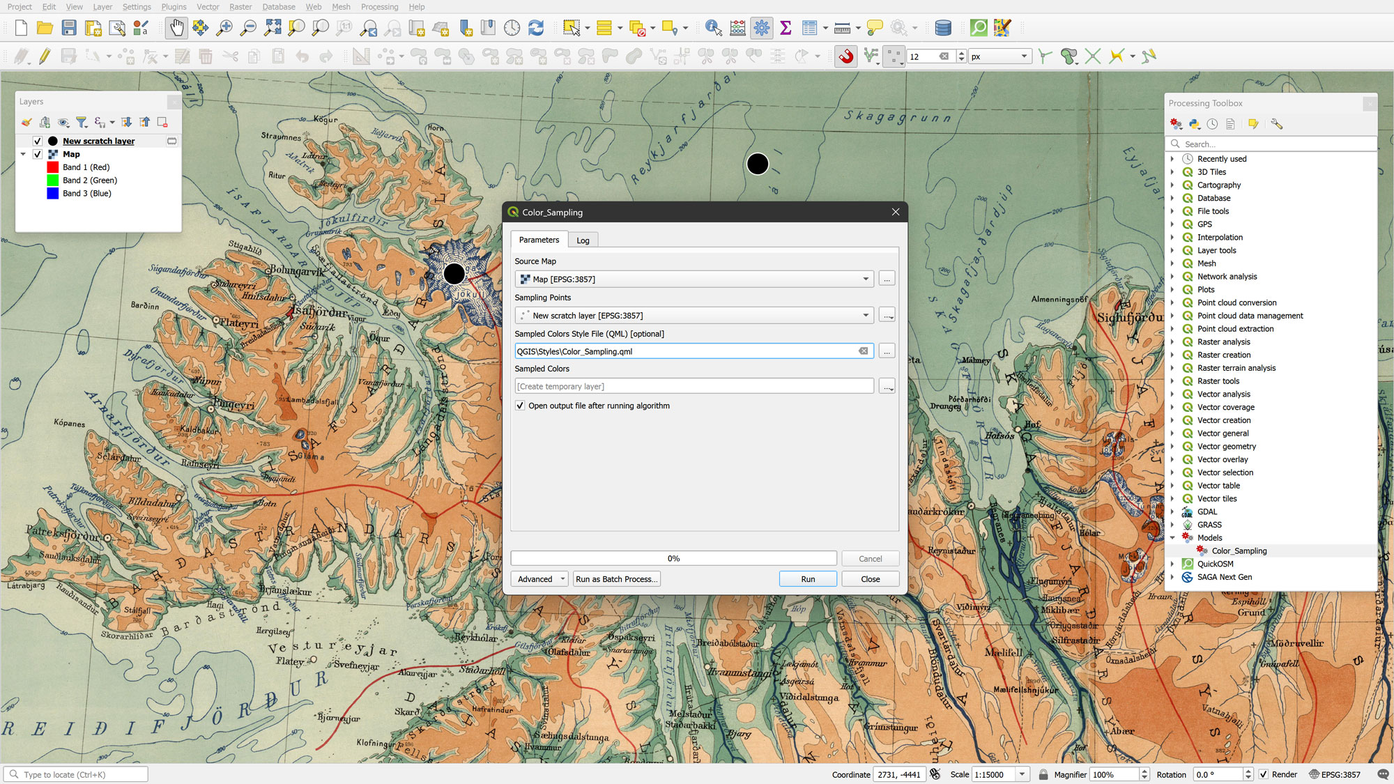
With the environment prepared, I ran the Color_Sampling model from the Processing Toolbox. The dialog (Picture 4) requires three inputs:
- the Map raster as the Source Map,
- the New scratch layer as the Sampling Points, and
- the Color_Sampling.qml as the Style File.
I left the output as a temporary layer for this demonstration, though it can be saved permanently if needed.
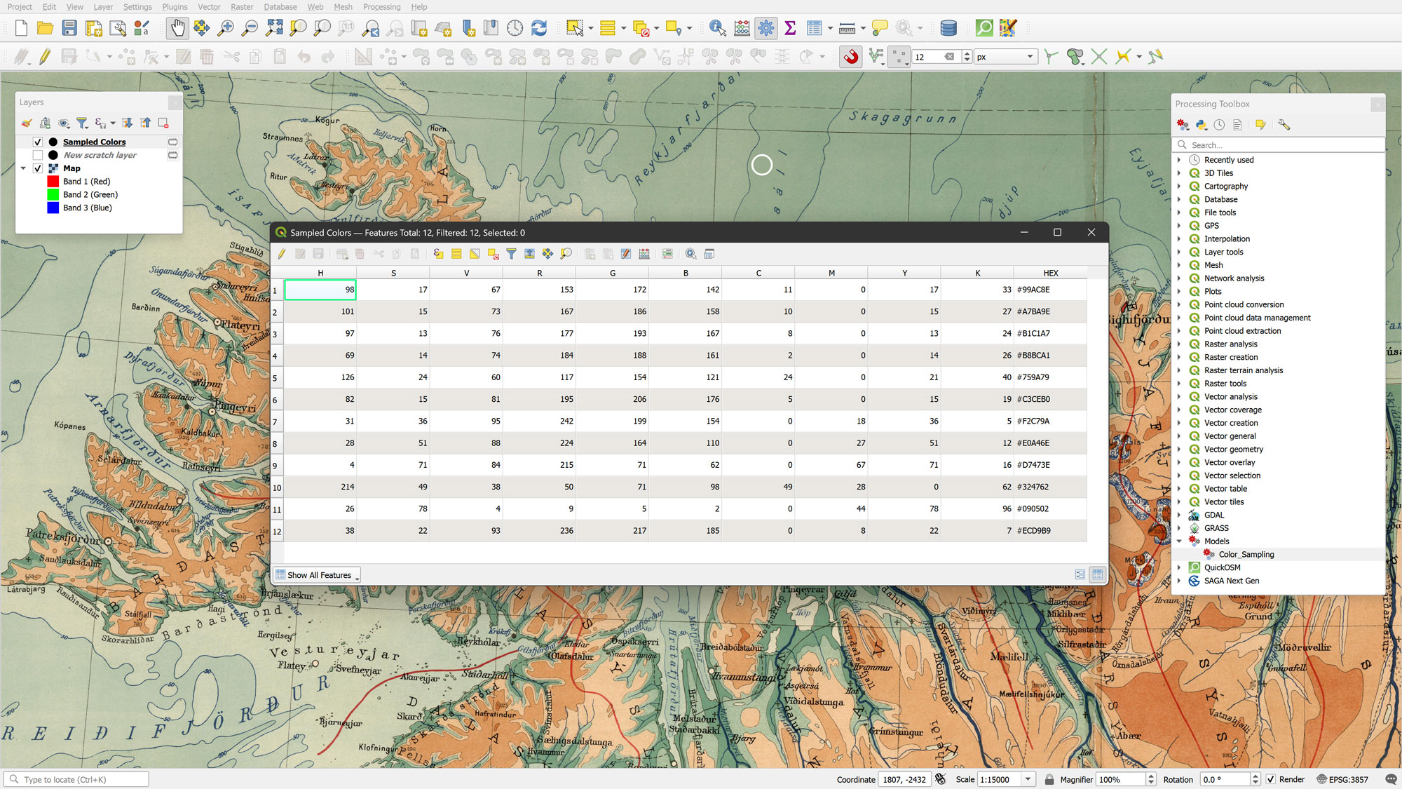
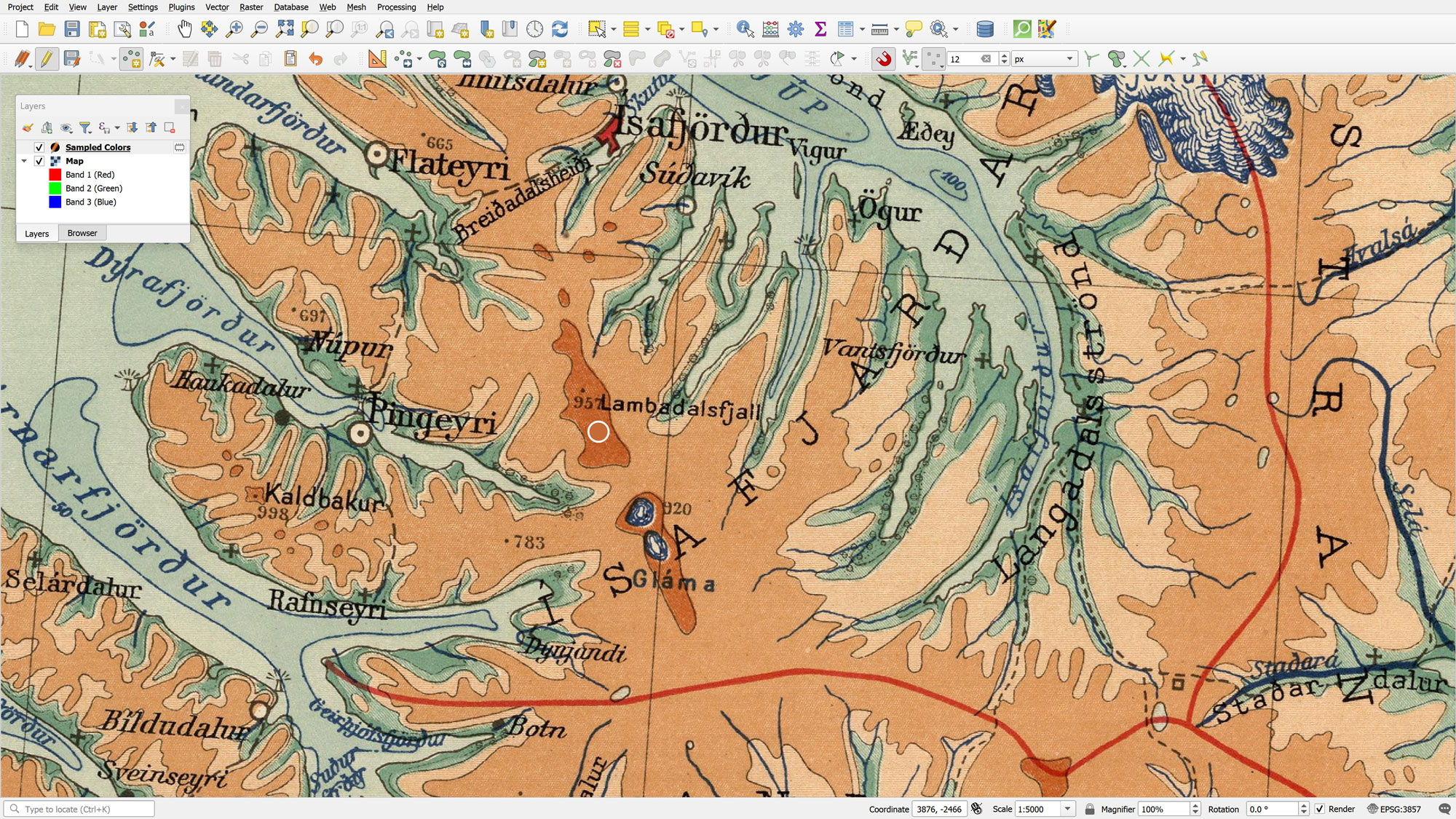
Upon clicking Run, the model generates a new point layer called Sampled Colors. This layer inherits the geometry of the New scratch layer, but features a fully populated attribute table. Thanks to the QML style, each point is instantly colored to match the pixel it sits on (Picture 5).
The resulting attribute table is comprehensive. The model extracts the Red, Green, and Blue band values and stores them in R, G, and B fields (Picture 6). It further calculates values for the HSV (Hue, Saturation, Value) and CMYK (Cyan, Magenta, Yellow, Key or Black) color spaces, along with a HEX string for web use.
Styling the Sampled Colors Point Layer
The color values generated by the model can be used to style the features of the Sampled Colors point layer by using the built-in color functions of QGIS. More specifically, the color_rgb() function could be used to color these features with their R, G and B values. Similarly, the values from the H, S and V fields could be used inside the color_hsv() function to color the features of the Sampled Colors layer point. Finally, since the model has also stored the C, M, Y and K values, these can also be used to color the features of the Sampled Colors point layer with the color_cmyk() function. These functions should look like this:
"HEX"
color_rgb("R","G","B")
color_hsv("H","S","V")
color_cmyk("C","M","Y","K")
The HEX field is particularly useful as it can be applied directly as a string. By using these as Data Defined Overrides within the Marker Symbol settings, the points become a living reflection of the source map's palette (Picture 7).
Postprocessing
Dynamic Variables and Advanced Editing
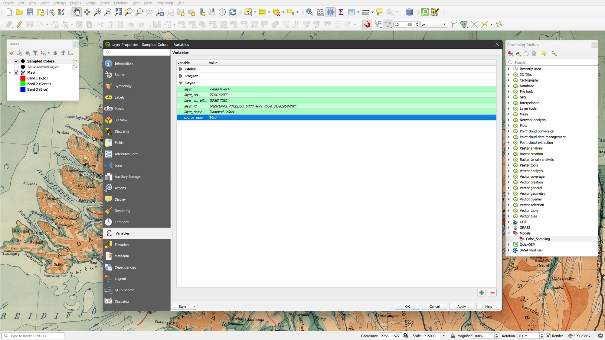
To make the Sampled Colors point layer even more powerful, I utilized a layer variable named source_map, which is automatically generated by the .qml file during the model execution. This variable acts as the essential link between the point layer and the raster source, enabling the logic required for real-time color updates.
By default, its value is set to Map. If you followed the preprocessing steps and renamed your raster to Map, the connection is already active. However, if you prefer a different name for your source map, you simply need to go to the Layer Properties > Variables of the point layer and enter your desired name into the value field for the source_map variable.
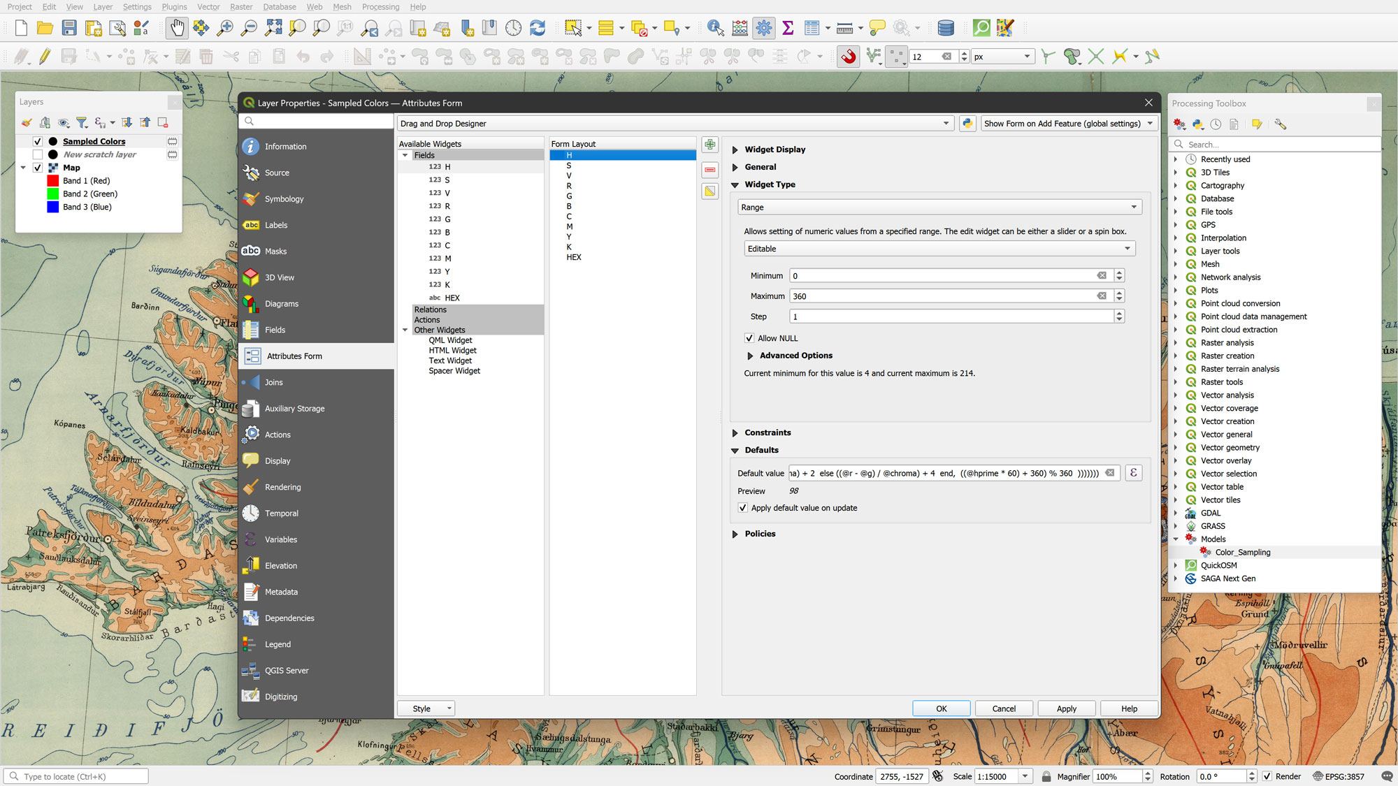
By enabling Edit mode on the Sampled Colors layer, I can add new points or move existing ones. Because I configured the Attributes Form with default values that trigger on update (Picture 9), QGIS automatically will recalculate the R, G, B, H, S, V, C, M, Y, K, and HEX values the moment a point is added or moved to a new location.
Automation and Results
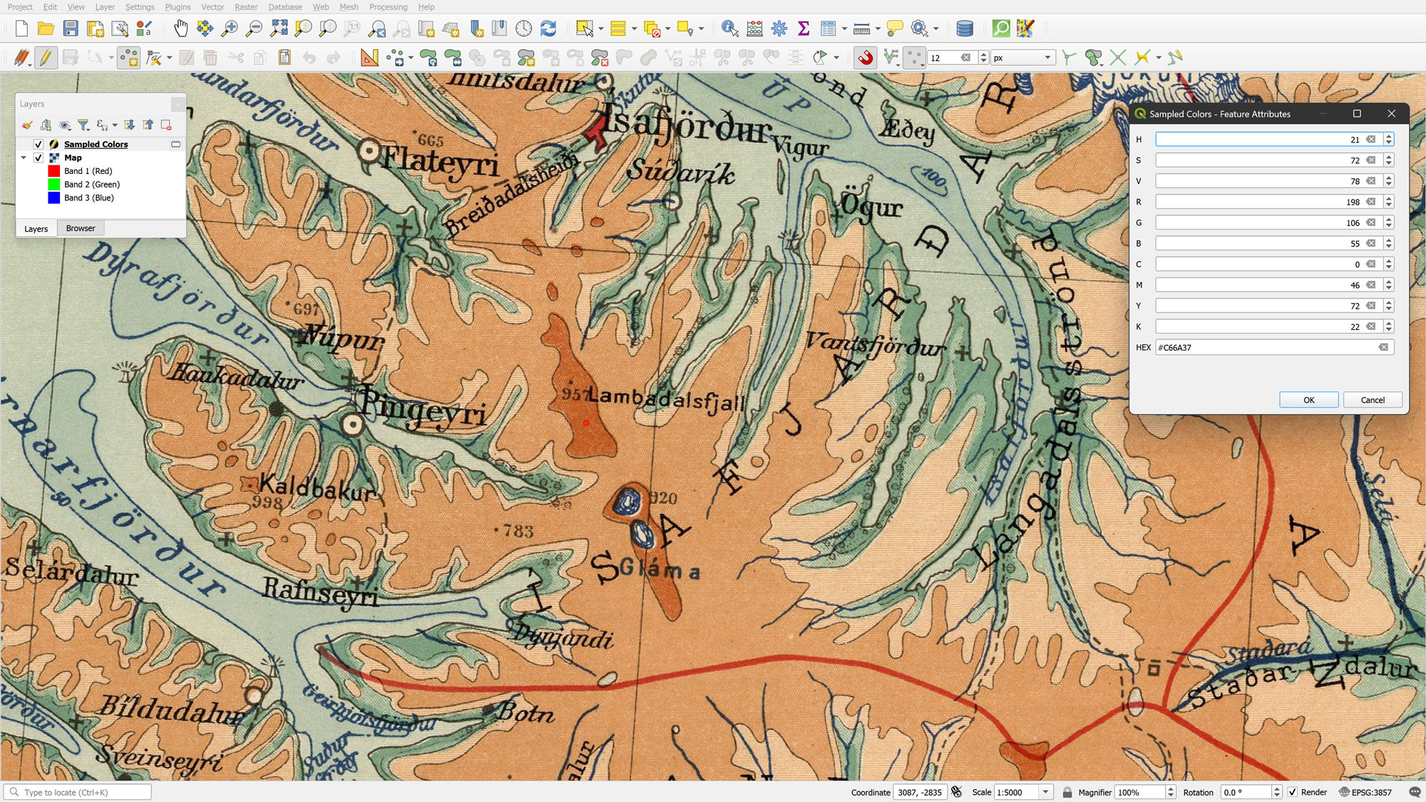
When adding a new feature all attributes are calculated automatically, and the custom attribute form appears with all color data pre-calculated (Picture 10). This allows for a very fluid "pick-and-move" workflow to refine a palette.
For this Iceland map, I sampled colors across varying elevations and depths. By sorting the resulting data by the Hue (H) field, I was able to reconstruct the original vintage elevation color scheme. The final result is a clean, professional color palette (Color Palette 1) that preserves the aesthetic soul of the 1928 original while being ready for use in any modern mapping project.
Epilogue
What began as a beautiful scan of a 1920s lithographic print has ended as a fully functional, multi-dimensional design tool. By combining the automated power of the Color Sampling Model with the flexibility of QGIS expression-based styling, we’ve successfully translated a historical aesthetic into a format that speaks to modern mapping software.
This workflow is about more than just finding a "nice blue" or a "soft green." It’s about understanding the harmony of a palette that was originally designed for the printing press. By sampling these colors and sorting our results by the Hue (H) field, we were able to mathematically reconstruct a gradient that was once achieved through the careful layering of ink, a level of nuance often missing in standard, out-of-the-box GIS symbology.
I encourage you to take these tools and apply them to your own favorite historical sources. Whether you are aiming to replicate the muted tones of an old engraving or the bold, vibrant lithography of the early modern era, the ability to "sample with soul" will invariably elevate your digital cartography. The most beautiful maps of the future are often hidden in the palettes of the past.
Happy color sampling!
Kindest regards from Crete, Greece.
Spiros