Prologue
In a previous blog post, How to Fold a Map in ArcGIS Pro, I shared a step-by-step guide to simulating the physical folds of a traditional paper map within the ArcGIS Pro Map environment. The process involved creating, editing, and styling spatial data to mimic the look and feel of a folded map.
But what if I wanted to apply that folding effect to the Layout instead? Typically, once I finish designing the Map, I move on to the Layout stage, where I add essential components like legends, scale bars, credits, overview maps, and supplementary maps. If the folding effect is applied only to the Map, the additional Layout elements remain unaffected—leaving the final product looking incomplete and not entirely realistic.
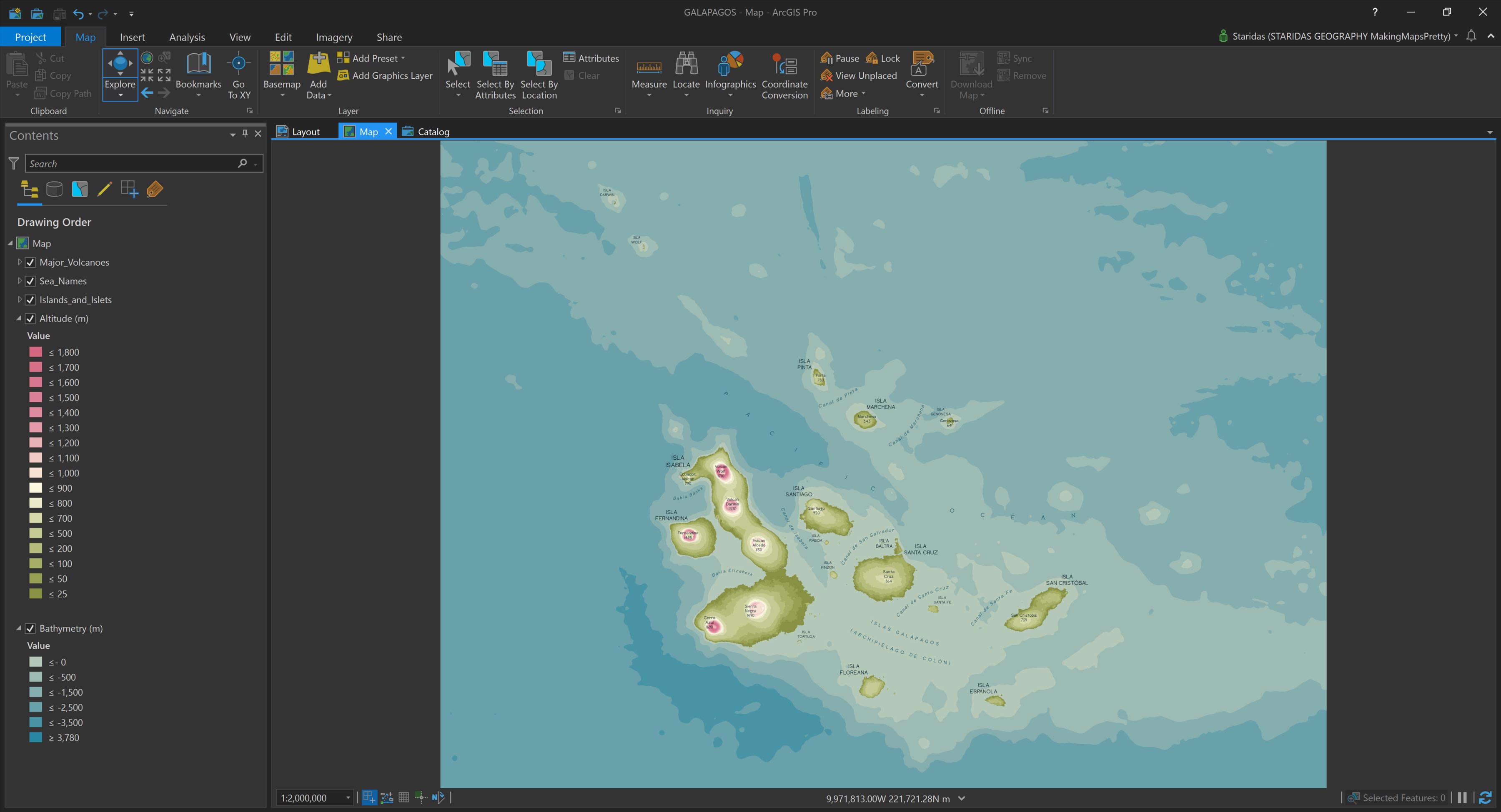
Recently, in a moment of longing for distant, exotic destinations, I found myself designing a Pretty Map of the Galapagos volcanic islands (Picture 1).
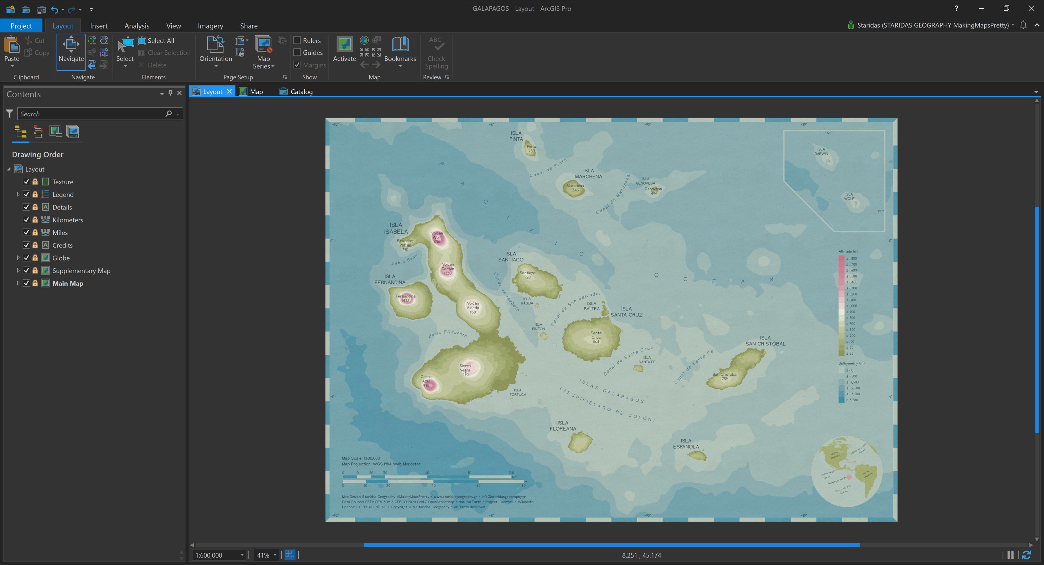
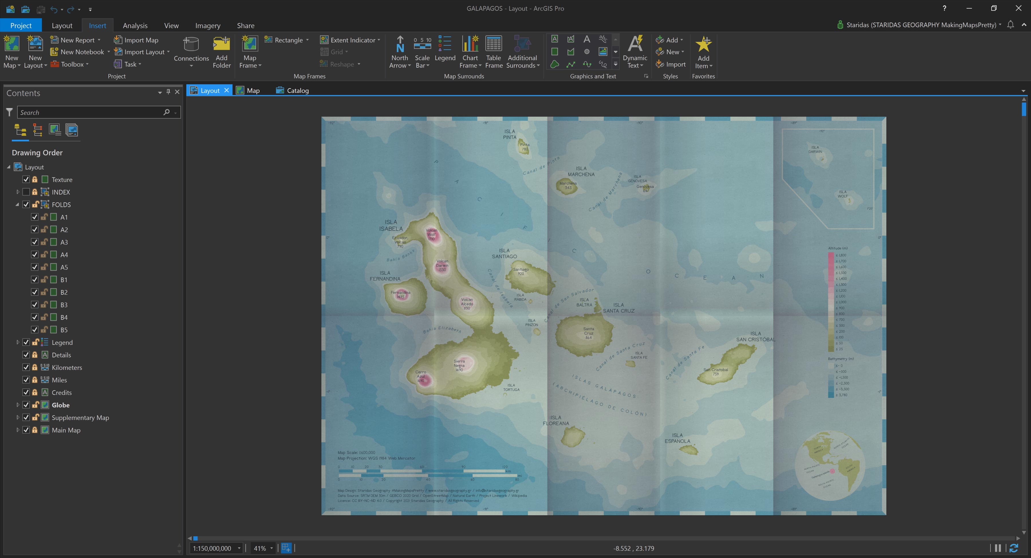
After simplifying, classifying, styling, and labeling the data, I decided to transfer the map to a Layout, thinking it would make a great candidate for print. In the Layout, I added various design elements, as shown in Picture 2.
I placed credits and scale bars in the bottom-left corner, added a small globe in the bottom-right as a reference map, positioned a stylized legend in the middle-right, and included a supplementary map in the top-right corner to show the two tiny outlying islets northwest of the main Galapagos group. To complete the look, I overlaid a subtle texture to give the map a more vintage, paper-like aesthetic (see Picture 2).
I was so pleased with the result that I proudly shared it on Twitter and LinkedIn, then sank back onto my couch to relax.
Moments later, my phone buzzed with a LinkedIn notification. A group of students had posted a beautifully folded map they had created, and it made me realize—my carefully crafted Galapagos Layout was still “unfolded.”
Too tired to relaunch ArcGIS Pro—and having become something of a morning person—I quickly turned to a simpler solution: I used the Pretty Map Folding with CSS Pen on CodePen to simulate the folds on the fly. (You can try it yourself by following the instructions in the post How to Fold a Map with CSS.)
And with that, I drifted off to sleep, gazing at the animated Pen and dreaming of new ways to bring the folding effect to life within the Layout environment of ArcGIS Pro.
Sweet dreams!
Simulate the Folds
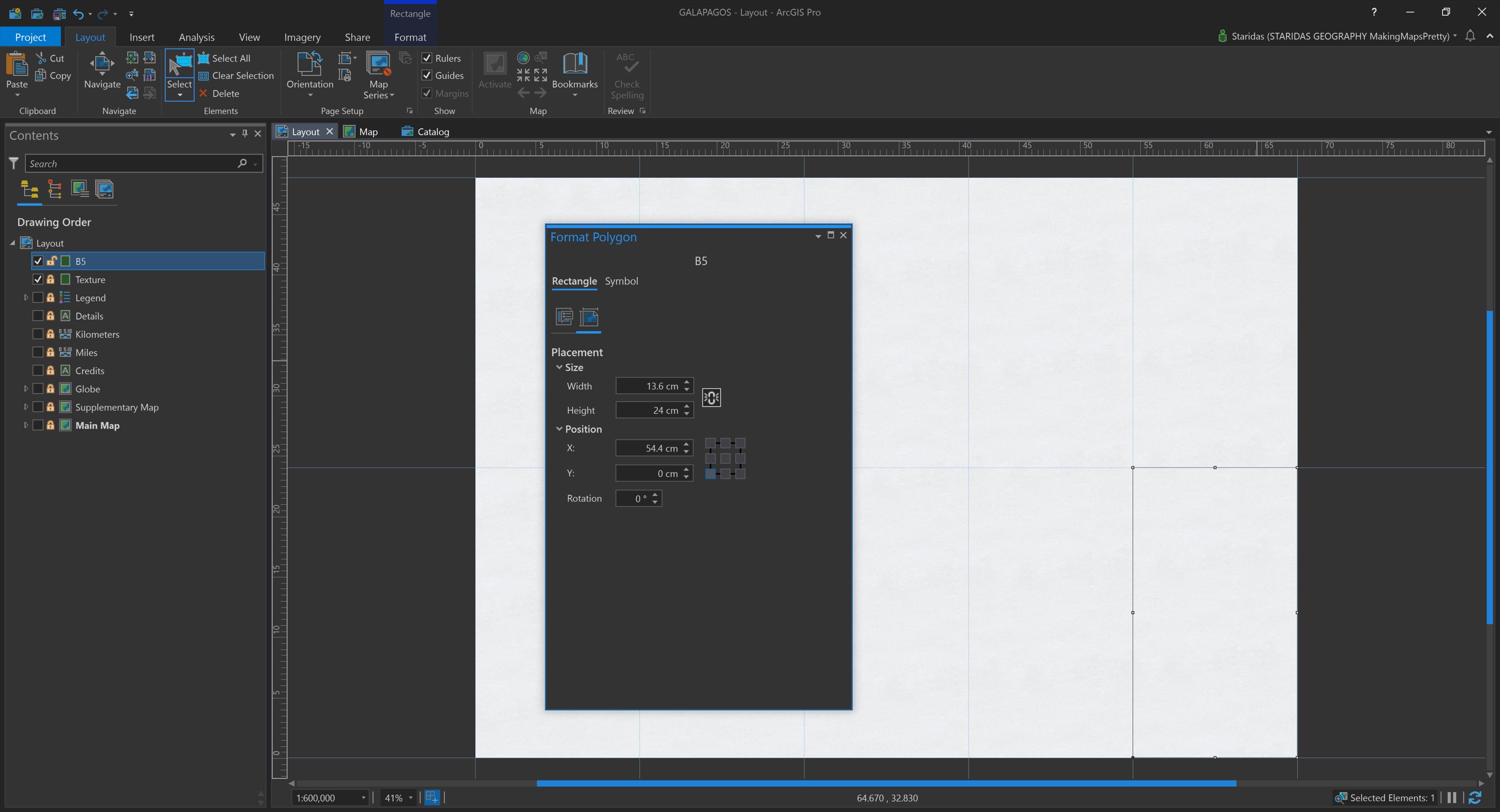
A new, cheerful day begins, with coffee, music, and ArcGIS Pro. In the Layout view, I set out to simulate map folds using a grid of graphic rectangles. Knowing that my Layout measures 68 cm wide by 48 cm high, I planned to “fold” it five times horizontally and two times vertically.
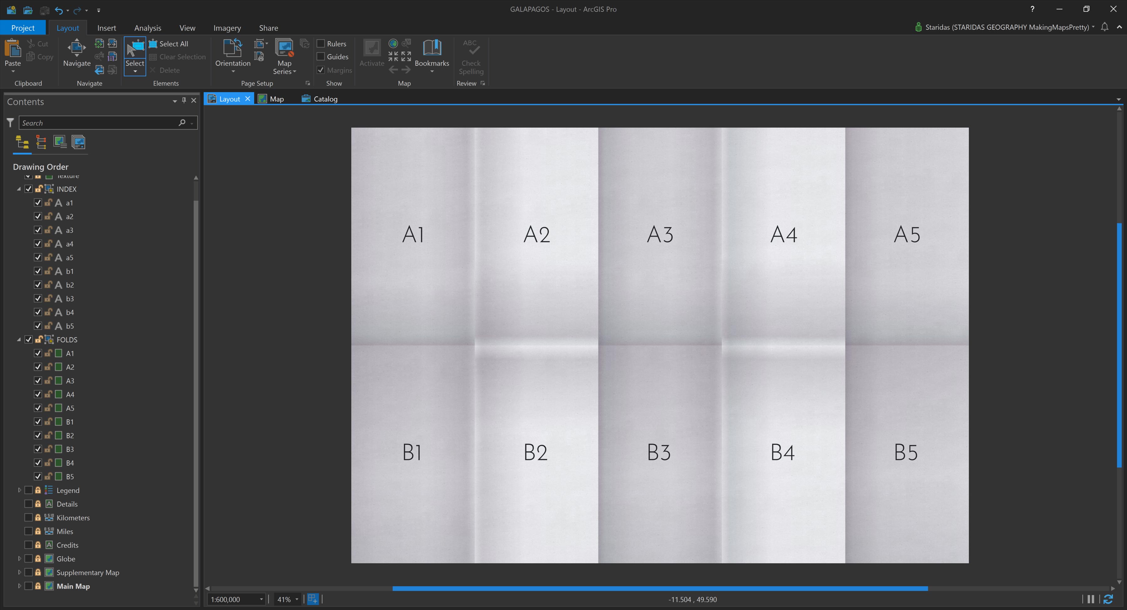
This division means each fold segment—or rectangle—should measure 68 ÷ 5 = 13.6 cm in width and 48 ÷ 2 = 24 cm in height. Using the graphic tools in the Layout view, I created ten adjacent rectangles that match these dimensions (Picture 3).
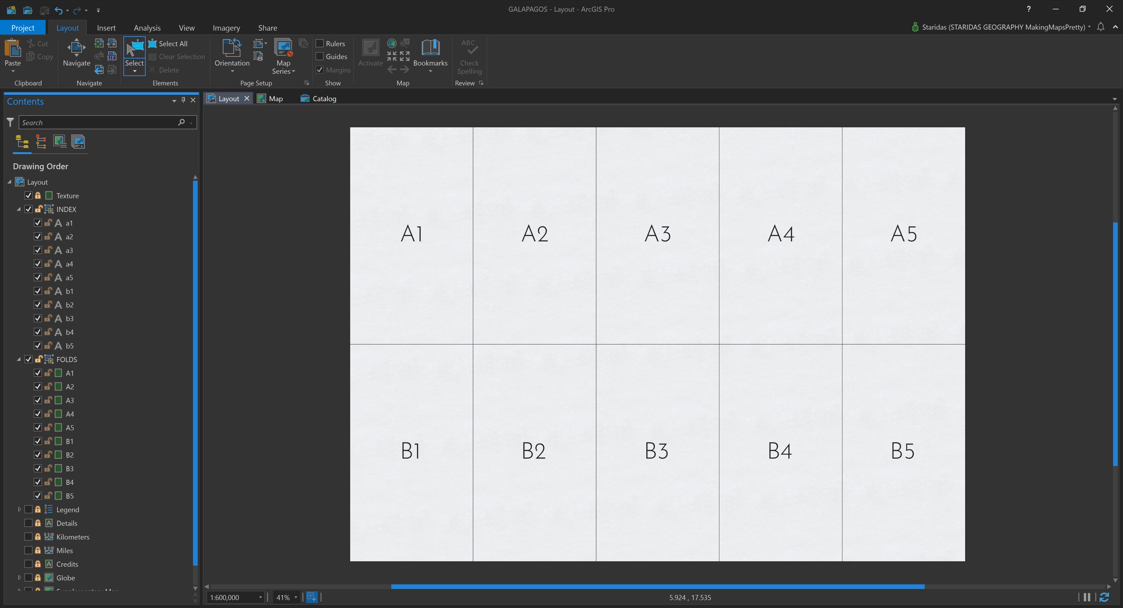
Each rectangle functions as a cell in a grid, which can be indexed for reference. To make this structure clear, I added ten text elements, labeling each cell appropriately (Picture 4).
The final step is to apply a specific gradient styling to each rectangle, carefully pairing light and dark tones to create the illusion of folded paper. With thoughtful styling, these graphic elements start to bring the illusion to life, right inside the Layout.
Style the Folds
In my previous blog posts, I’ve always assumed an imaginary light source coming from the left side of the map. Based on this, I used three symbolic layers of shading to simulate folds:
- A general shading layer that differentiates surfaces facing the light from those turned away,
- A layer representing the vertical fold edges, and
- A layer for the horizontal fold edges.
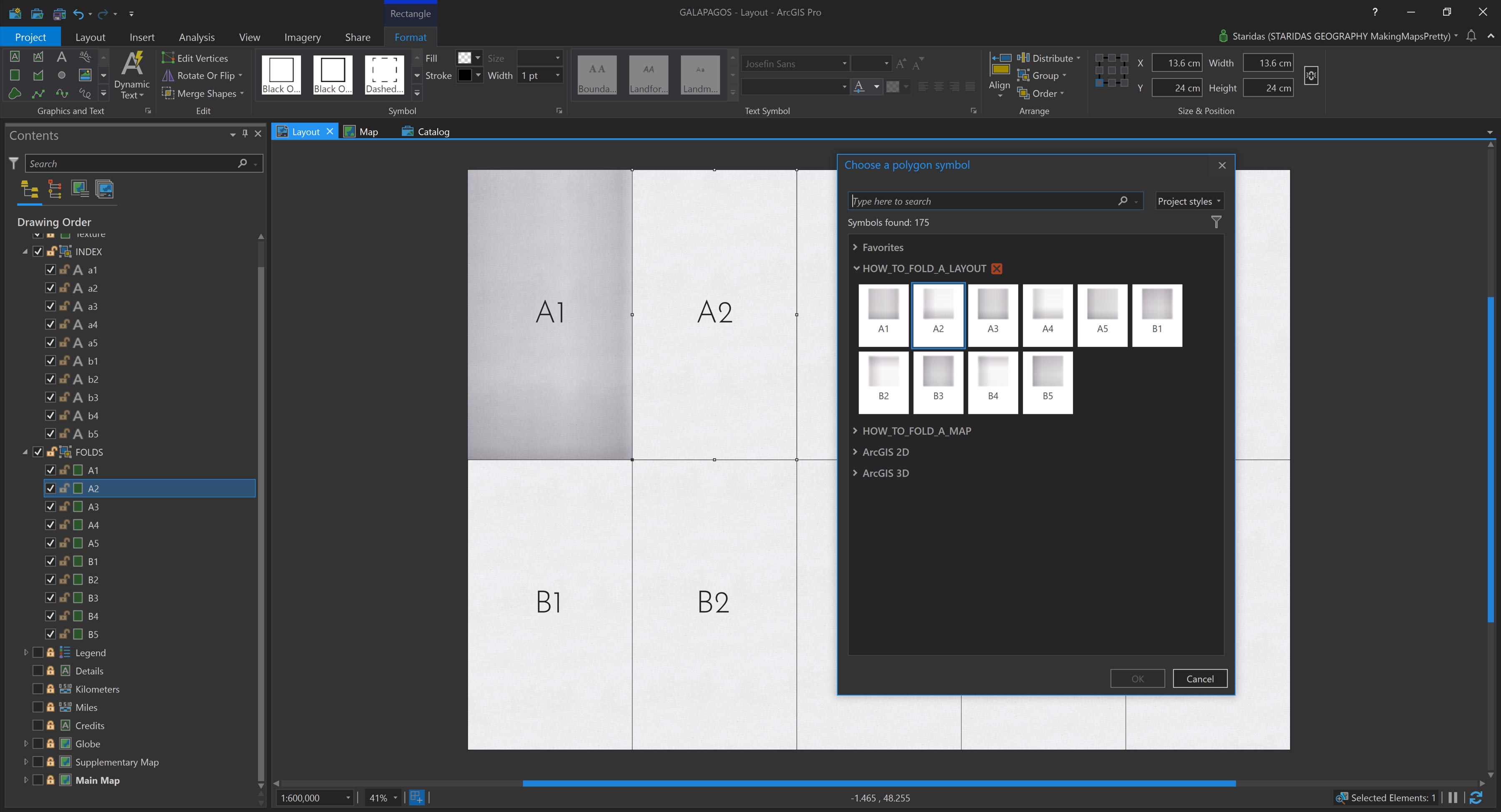
In earlier workflows, I achieved this effect by stacking and blending three separately styled layers of the same dataset. However, in this new approach, I embed all three shading effects directly within the symbology of each graphic rectangle, using Symbol Layers (Picture 5).
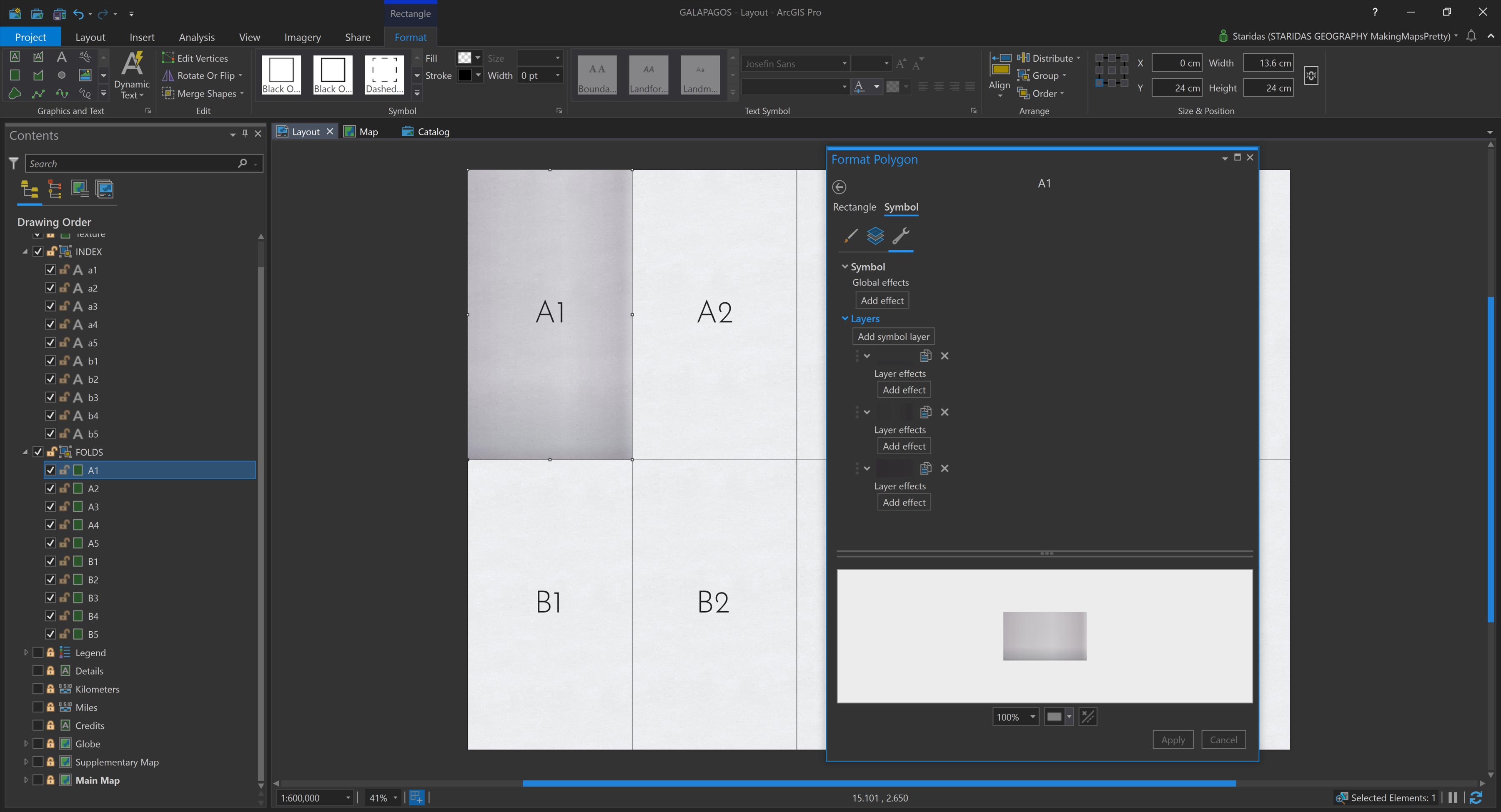
Each Symbol Layer is then styled using a Gradient Fill. This process is repeated individually for every single graphic rectangle. Yes, it’s a bit of meticulous work, but trust me, the final visual payoff is well worth the effort (Picture 6)!
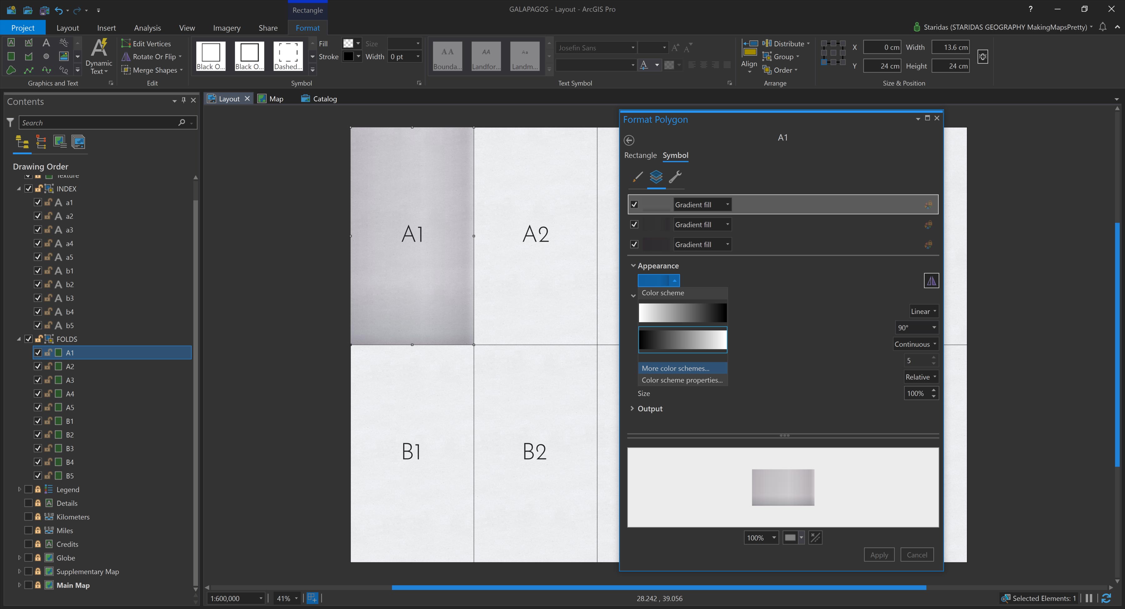
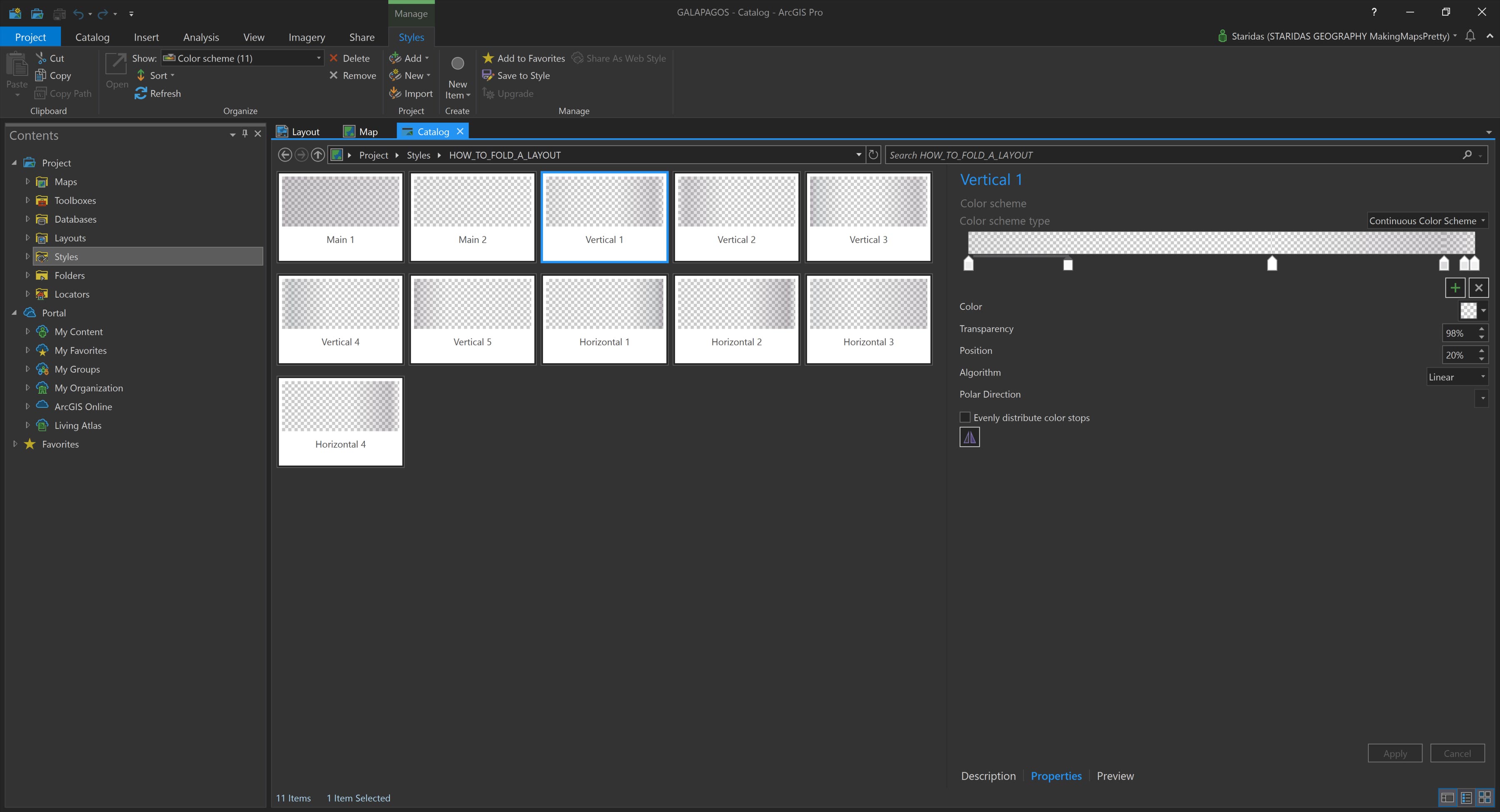
The gradients aren’t chosen randomly. I reused the same gradients I developed in my earlier blog posts, which I had saved in a dedicated Style file in ArcGIS Pro for easy reuse (Picture 7).
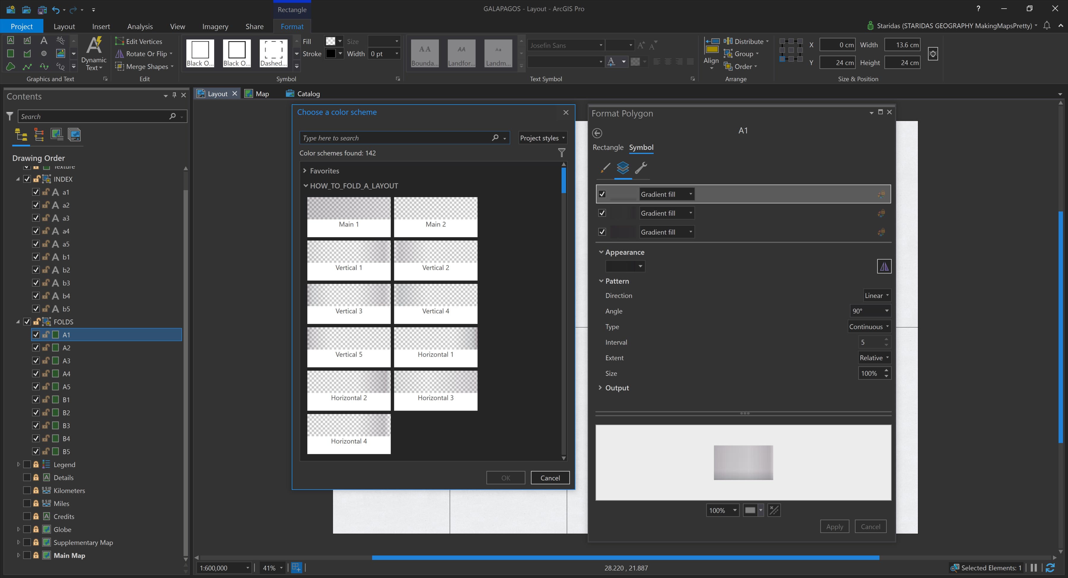
I only had to define and save these gradients once. Then, for each rectangle, I simply selected the three appropriate gradients based on its position within the fold grid.
If you’d like to try this yourself, I’ve included Table 1 below, which shows the exact gradient combinations used for each grid cell.
| Cell | Main | Vertical | Horizontal |
|---|---|---|---|
| A1 | 1 | 1 | 1 |
| A2 | 2 | 2 | 2 |
| A3 | 1 | 3 | 1 |
| A4 | 2 | 4 | 2 |
| A5 | 1 | 5 | 1 |
| B1 | 1 | 1 | 3 |
| B2 | 2 | 2 | 4 |
| B3 | 1 | 3 | 3 |
| B4 | 2 | 4 | 4 |
| B5 | 1 | 5 | 3 |
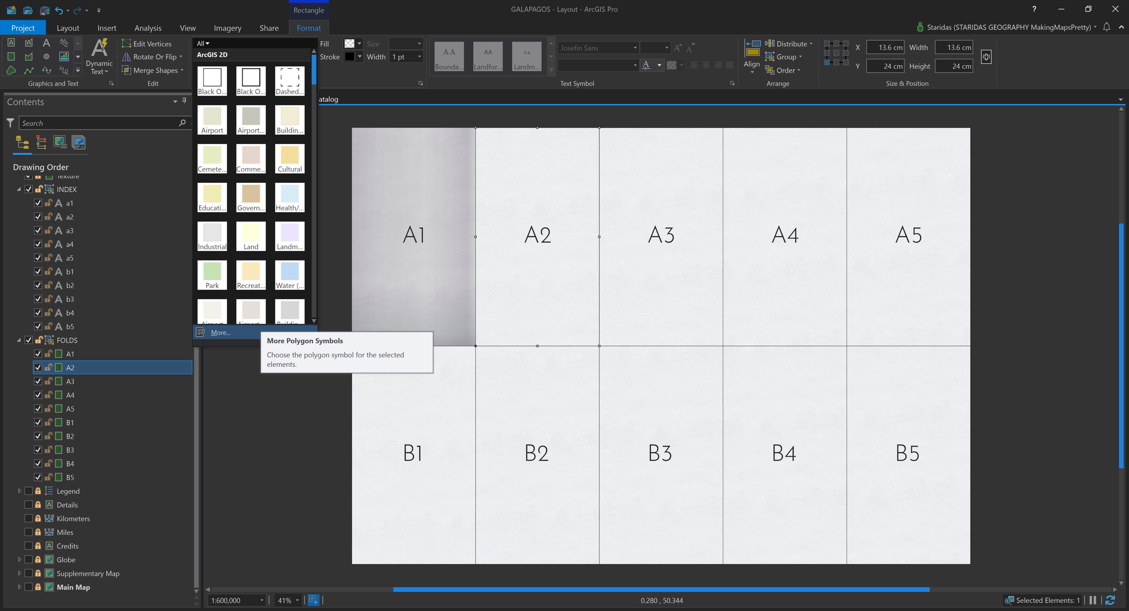
To make the process even more efficient, I saved the combined set of three gradients for each rectangle as a single Polygon Symbol in my ArcGIS Pro Style file. This means that for each graphic rectangle, I don’t need to manually apply multiple gradient layers. Instead, I simply select the rectangle and assign its predefined symbol from the saved Style. It’s a quick, consistent, and scalable way to apply the fold styling across the entire Layout (Pictures 8 and 9).
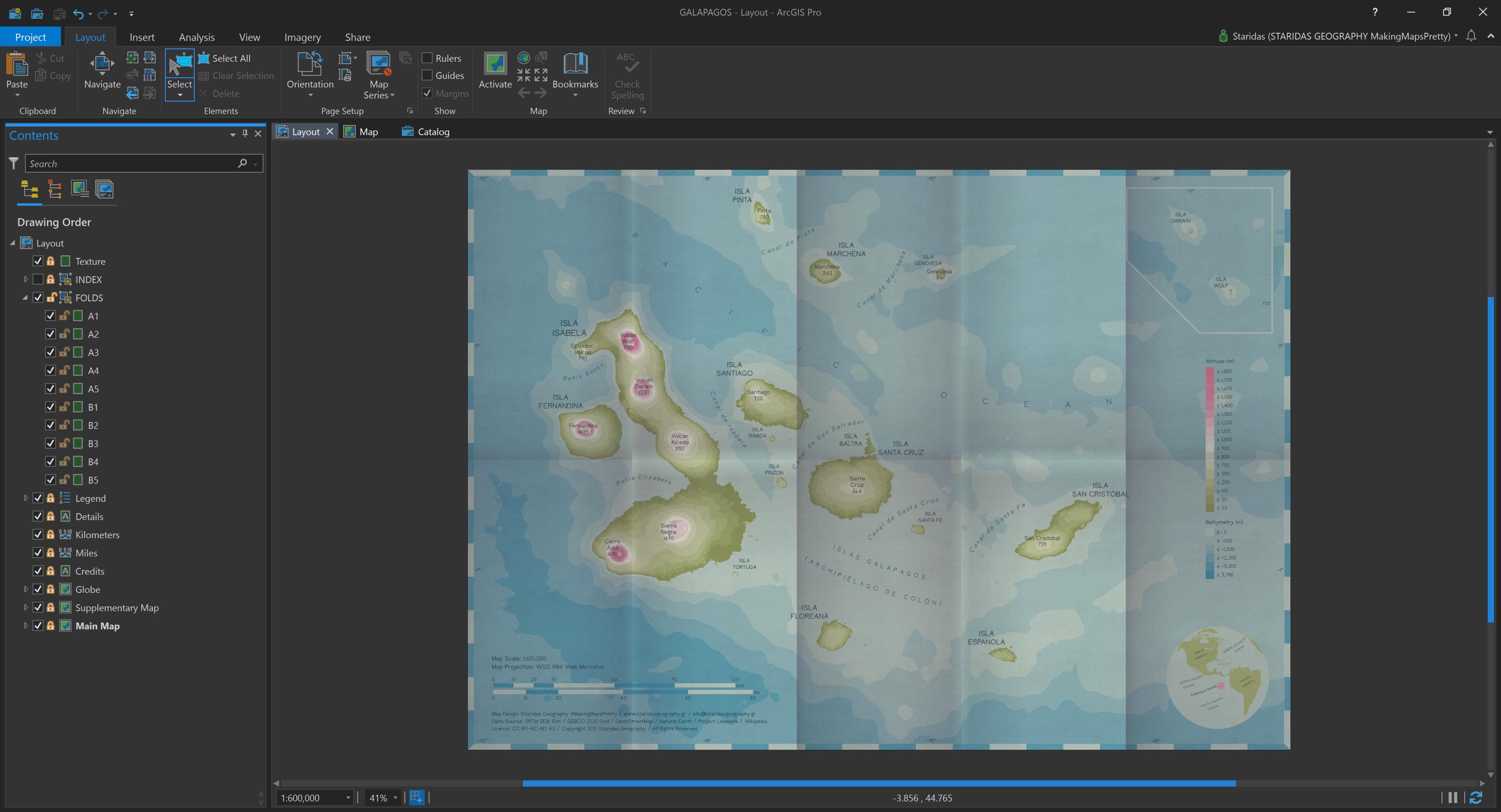
After repeating this process for all ten rectangles, I end up with a grid of aptly shaded graphic elements. Together, they convincingly simulate the folding effect across the entire Layout (Picture 10).
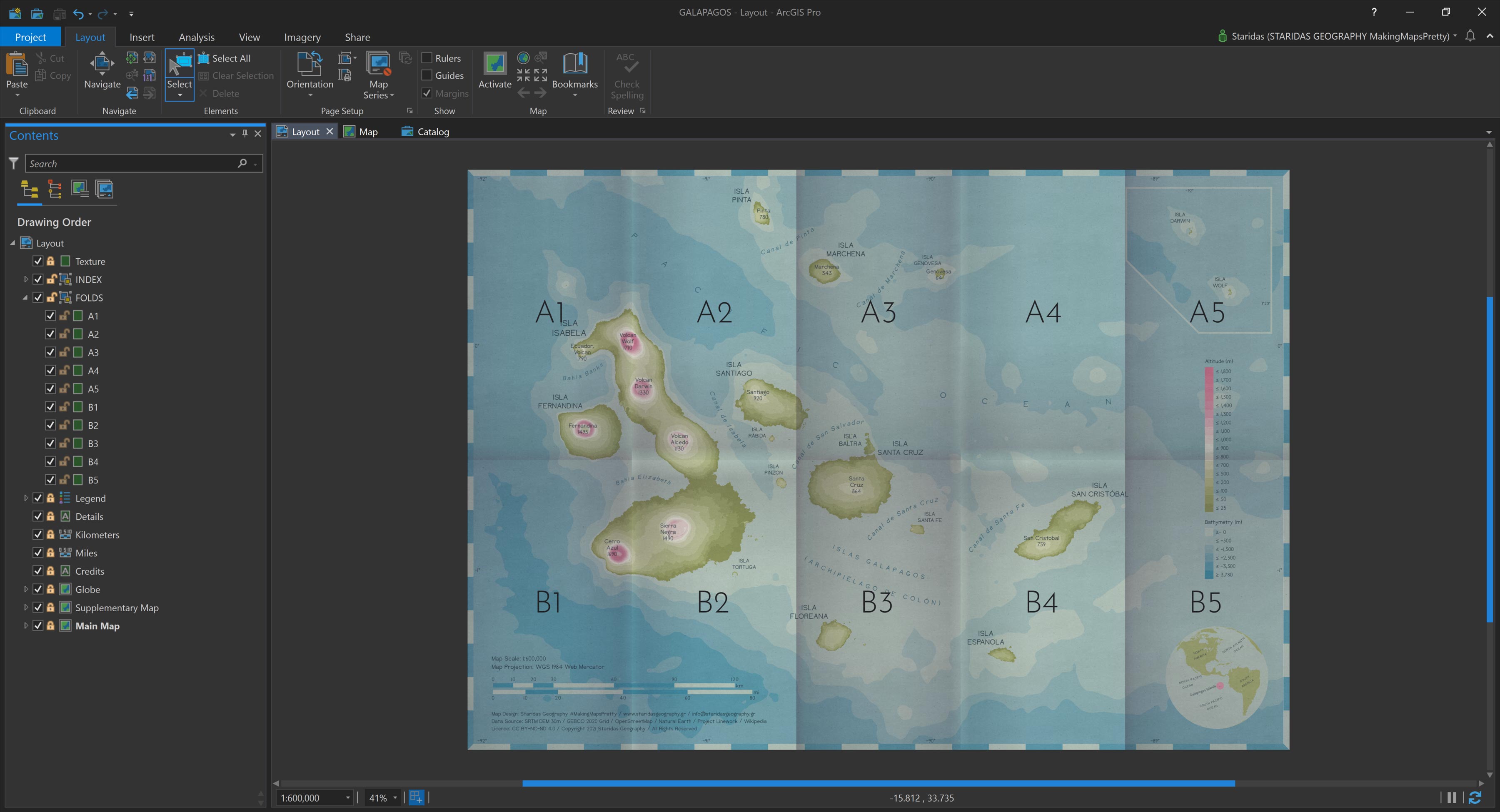
The real magic happens when I turn on all the layers beneath the graphic rectangles. At that moment, not just the Map itself, but also every other component of the Layout, like legends, scale bars, overview maps, credits, appears to follow the same folding pattern. The result is a seamlessly integrated visual effect that brings the entire Layout to life (Picture 11).
The ArcGIS Pro Style file
To make future Layout “foldings” much easier, I created a dedicated Style file in ArcGIS Pro, where I saved the Polygon Symbol for each of the ten graphic rectangles in the folding grid (Picture 12).
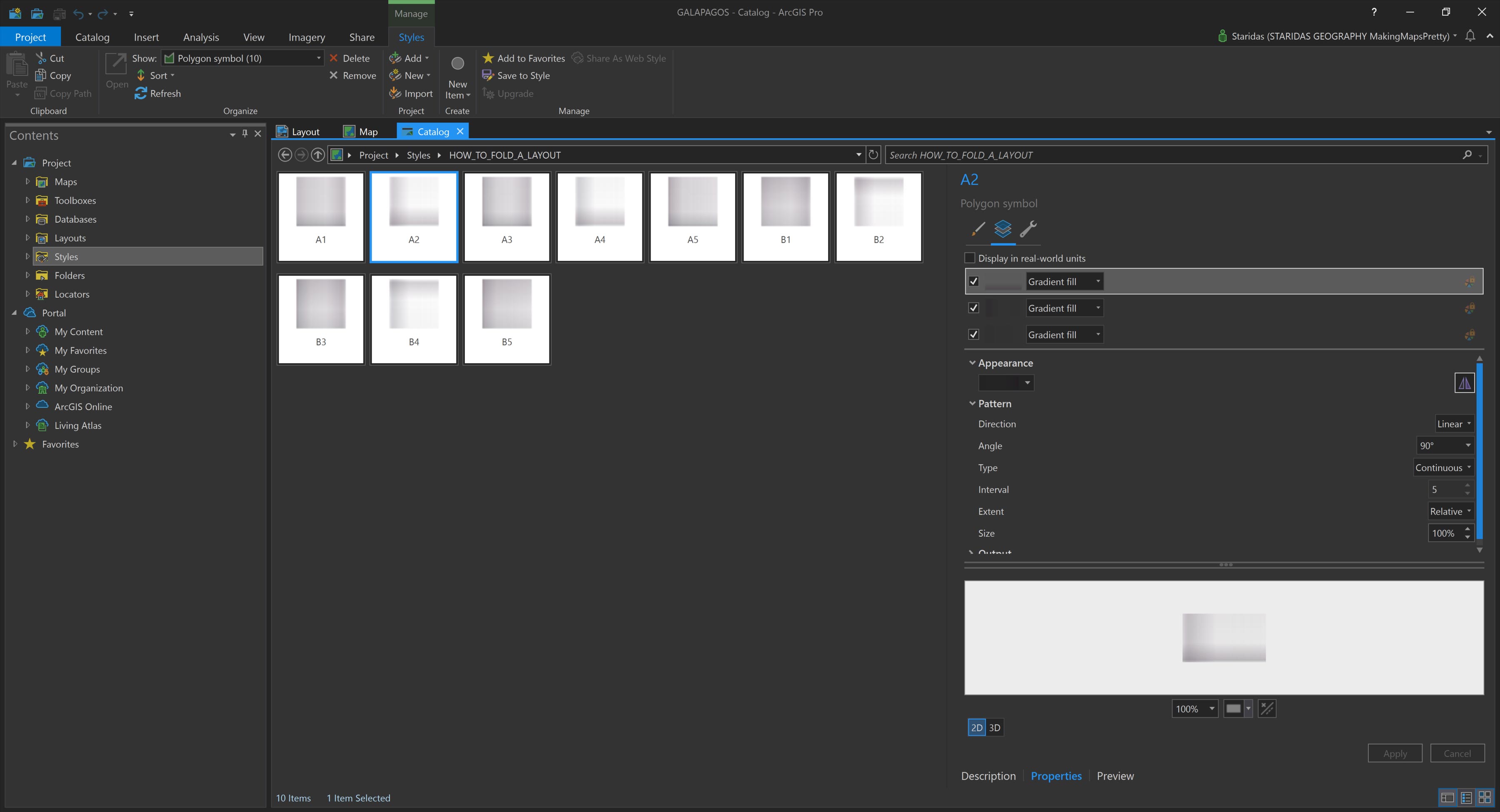
In the same Style file, I also stored all the individual gradient fills used in the shading process (Picture 13).
While this setup greatly streamlines the process, there are a few limitations to keep in mind. Currently, the Layout environment in ArcGIS Pro does not support a global transparency setting for graphic layers. Unfortunately, this means there’s no simple slider or setting to adjust transparency across all fold elements at once.
Instead, to tweak the overall transparency, you must manually adjust the gradient stops within each individual graphic rectangle's symbol. Yes, it can be a bit cumbersome, but for now, it’s the only available method. (Unless, of course, an ArcGIS Pro developer happens to read this! Please add transparency sliders and blend modes for Layout graphics!)
Another consideration is color lightness. The gradients I used are based on transparency variations of a single base color, which in this case is a bit on the darker side. In future projects, I may opt for a lighter variation, which would again require updating each color stop in each gradient individually.
The hue of the gradients is also worth considering. While the current hue is fairly neutral, it might not always harmonize well with every underlying map color scheme. Depending on the visual tone of the map being “folded,” you may need to experiment with alternative hues, which again involves editing each gradient stop.
Still, as Uncle Charles (Darwin) wisely said:
It is not the strongest of the species that survives, nor the most intelligent… it is the one most adaptable to change.
So don’t hesitate to experiment with the gradients, and tailor them to your own cartographic needs.
Finally, for those interested in using or building on this technique, I’ve uploaded the ArcGIS Pro Style file to my ArcGIS Online account, available for download under a CC BY-NC-SA license. Please respect the terms of the license and enjoy folding your own beautiful maps!
Folded Layout best practises
Simulating folds on a Layout isn’t just a visual gimmick, it’s both aesthetically pleasing and practically useful, especially when preparing a map for actual paper printing.
When a real paper map is folded, it’s physically divided into discrete folded sections or “cells.” Applying that same structure digitally provides a valuable framework for organizing all Layout elements with precision and spatial awareness.
Take Picture 14, for example. Notice the Supplementary Map located in the top-right corner of the Layout. Its left edge aligns exactly with the fold line, creating a sense of imbalance and tension in the composition.
Even small misalignments can have a noticeable impact. Consider the Globe in the bottom-right corner. It doesn't appear centered within its designated fold cell, which subtly disrupts the harmony of the Layout (Picture 14).
Simulating the folds helps expose these minor placement issues that might otherwise go unnoticed. While each one may seem insignificant on its own, together they contribute to a sense of visual dissonance, or as I like to call it, cartographic asymphony.
To correct this, I simply adjusted the width of the Supplementary Map and nudged the Globe slightly to the left, ensuring they both align more harmoniously with the fold grid. The result is a more balanced and visually coherent Layout (Picture 15).
Epilogue
As I wrap up this post, I want to extend a heartfelt thank you to all my readers and followers. I hope this inspires you to experiment, not only with folding your Maps or Layouts, but anything you think might look more expressive when folded, creased, or even a little wrinkled.
Remember: things that look perfectly smooth often haven’t seen much use. A folded map is a map that’s been handled, studied, and trusted, a map that has worked.
So go ahead—download the Style File for ArcGIS Pro (licensed under CC BY-NC-SA) and start folding. And when you do, share your creations! There's something deeply satisfying about seeing folded maps pop up online and knowing that, in some small way, I’ve contributed to their story.
Happy mapping and happy folding!
Kindest regards from Crete, Greece!
Spiros