This article was published on November 4, 2020, by John Nelson on the Esri ArcGIS Blog, under the title Digital Map Folding Part 1: 2D.
Prologue
Creating a map is exciting — that much is obvious! But what’s not so obvious is how to fold one properly. When it comes to paper maps, we’ve all experienced the frustration of trying to return them to their perfectly folded original state.
Fortunately, folding a map in a digital environment is much simpler. In the following paragraphs, I’ll walk you through the method I’ve developed and refined to digitally simulate the folds of a traditional paper map.
Understanding the Layout
The first step I take whenever I start a new map project is defining the layout. This depends on several factors—especially if the final product will be a printed paper map.
I begin by asking both myself and the client a series of important questions: What is the map’s purpose? What theme will it follow? Who is the intended audience? In what environment will the map be used? What scale is most appropriate? These considerations, among others, help shape the final design.
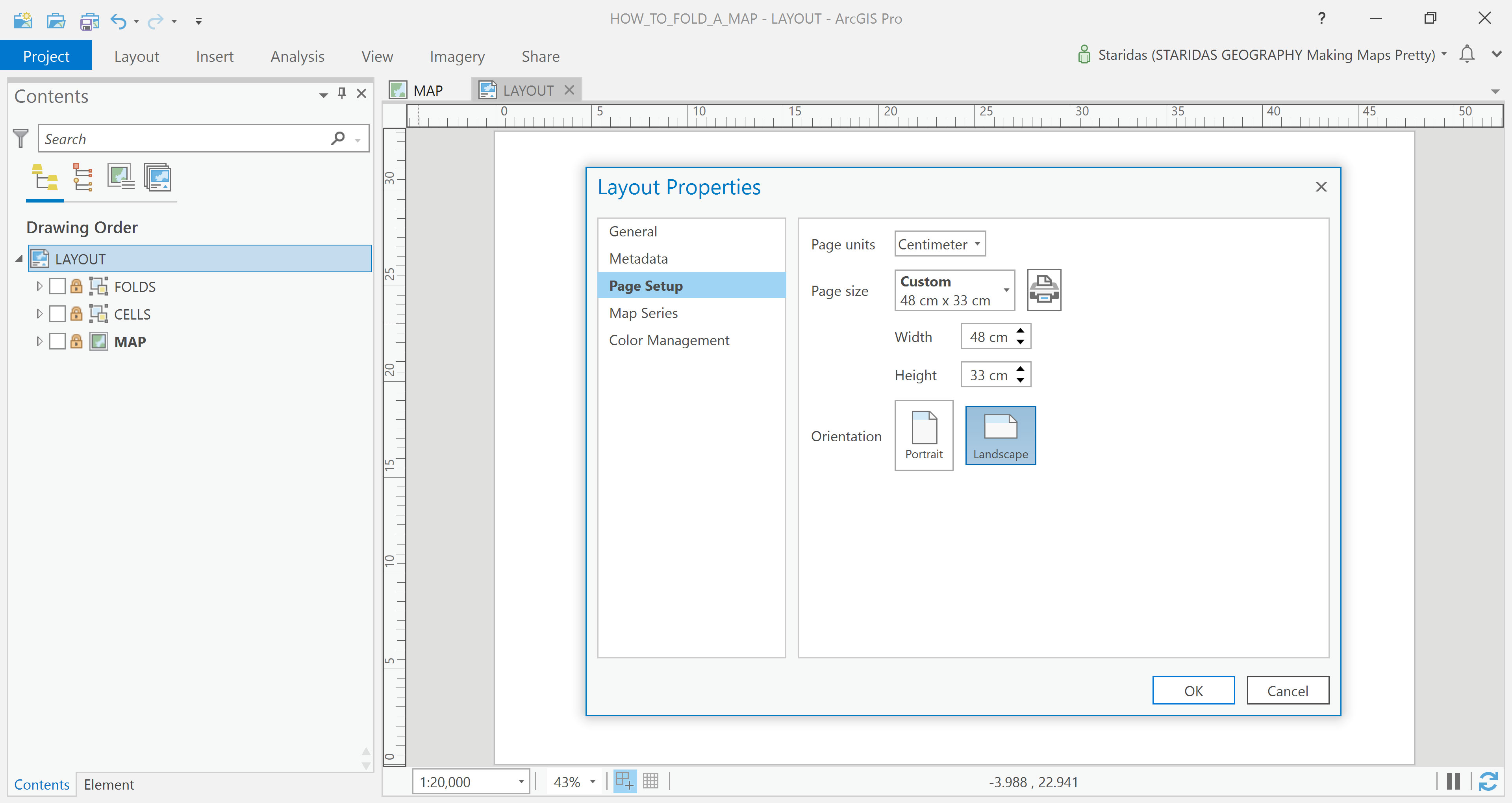
Once I’ve developed a clear understanding of the project’s requirements, I move on to design the simplest yet most crucial element: the layout. At its core, this is just a rectangle representing the area of interest.
In this case, I’ve started with a layout measuring 48 cm in width and 33 cm in height (Picture 1).
Understanding the Folds
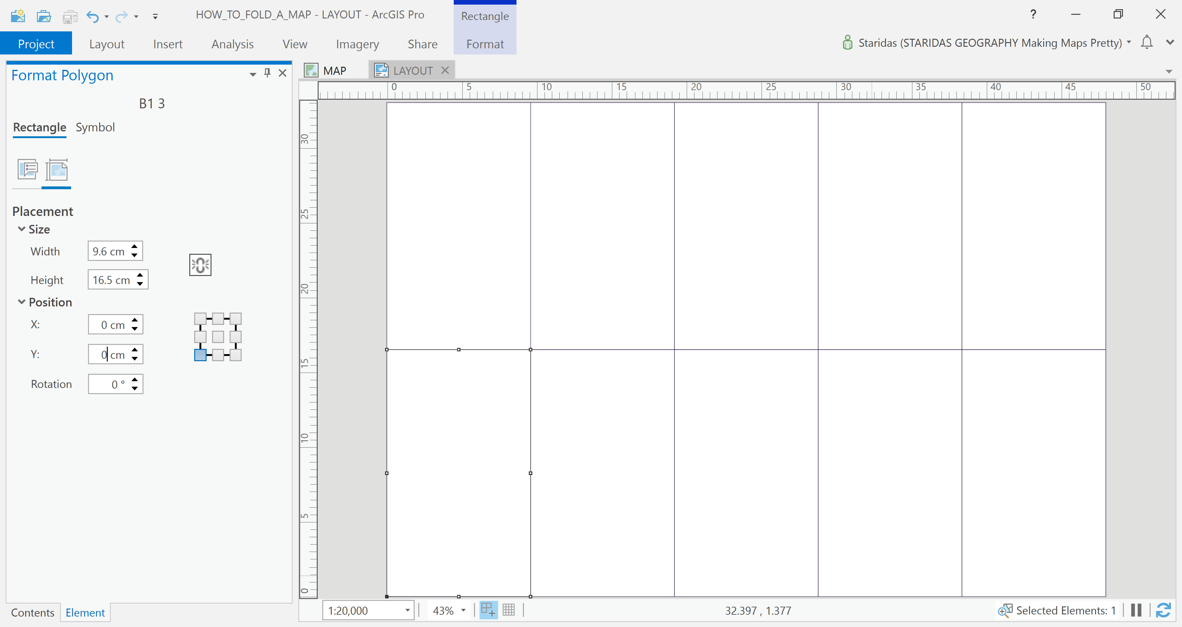
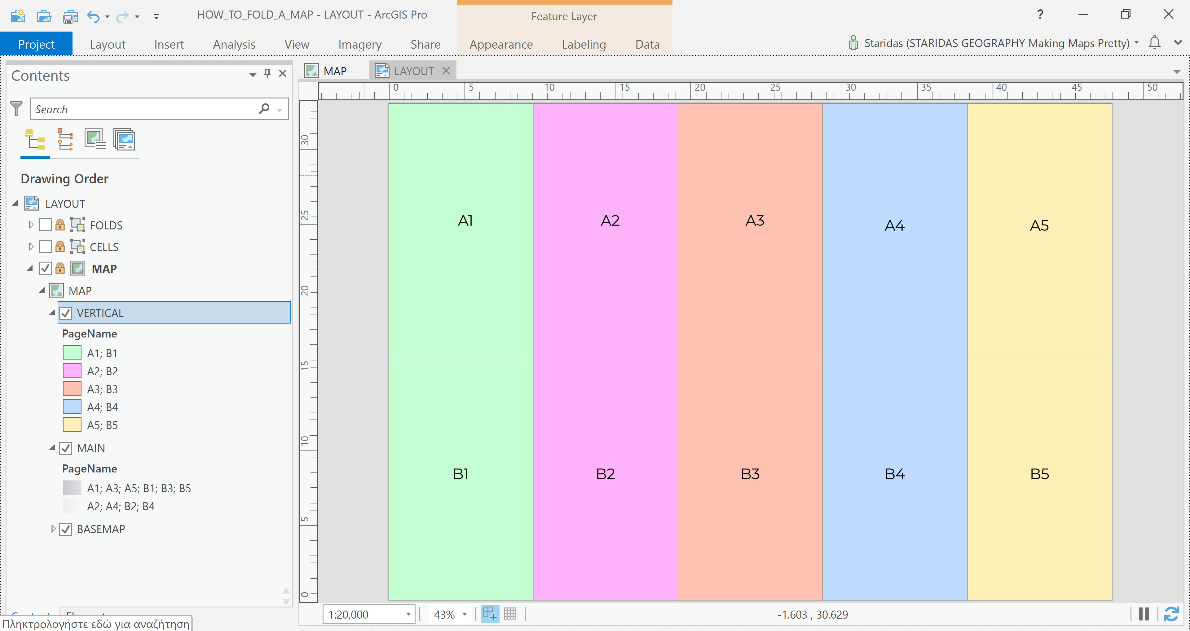
Since this map is intended for print and eventual folding, careful planning is required once again. Folding a map isn’t arbitrary—it involves a thoughtful approach and a series of decisions. The most important concept to understand is that the folds divide the layout into a grid of equally sized cells, both in width and height. The lines between these cells represent the folds themselves, while the cells represent the sections of the map between those folds.
In my example, I’ve chosen to fold the map once horizontally, which splits it into two horizontal sections, and four times vertically, dividing it into five vertical sections.
This results in a total of ten equal-sized cells. Each cell measures 9.6 cm in width (48 ÷ 5) and 16.5 cm in height (33 ÷ 2).
To simulate this in ArcGIS Pro, I drew graphic rectangles corresponding to these cell dimensions, effectively creating a visual representation of the folded structure (Picture 2).
Simulate the Folds
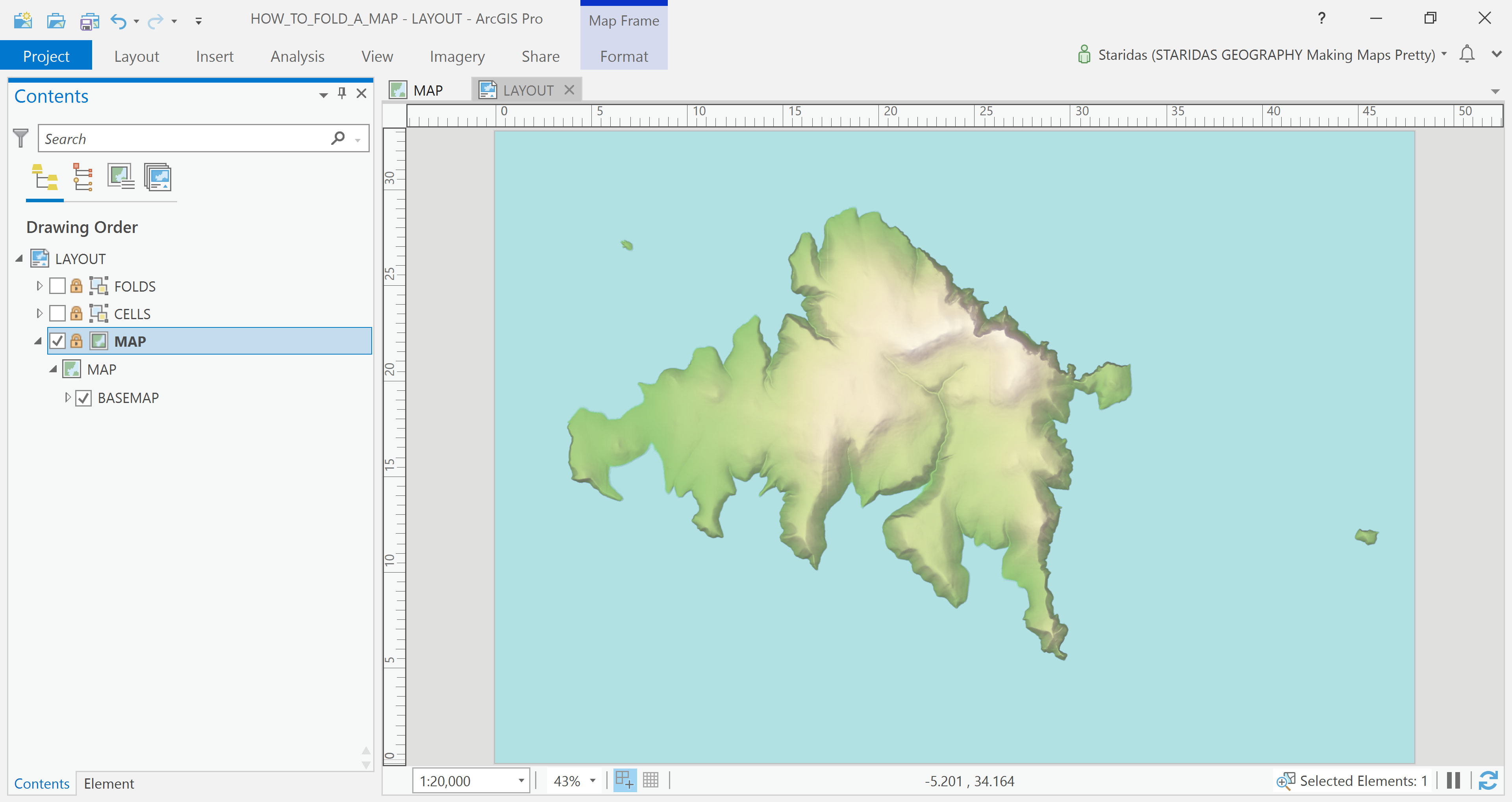
At this stage, I’m ready to load the map by inserting a Map Frame. In this example, the Map Frame matches the layout in dimensions. However, what distinguishes it from a simple graphic element is that it’s georeferenced—it’s aware of the real-world coordinates and includes a defined map projection, geographic extent, and map scale (Picture 3).
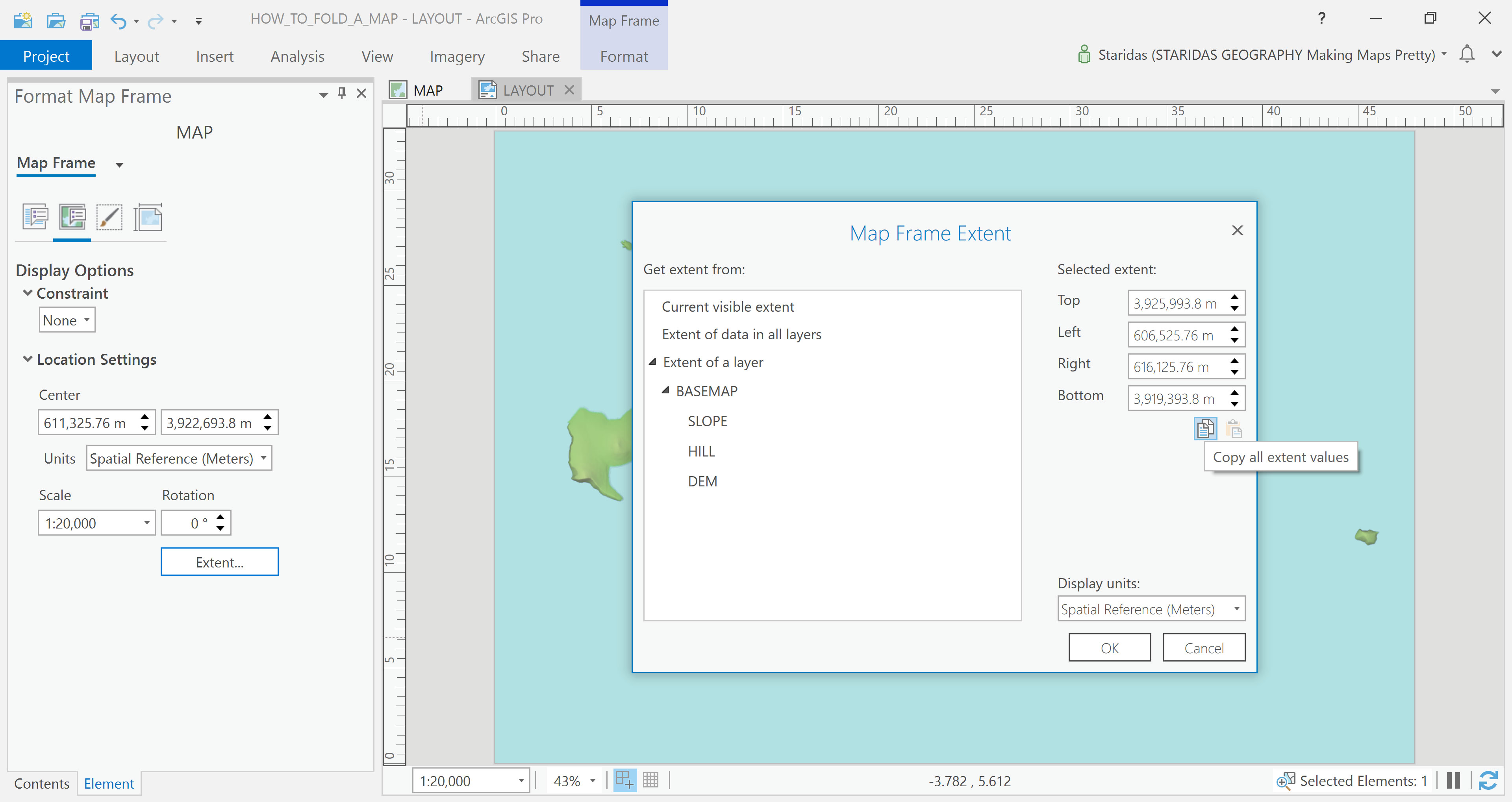
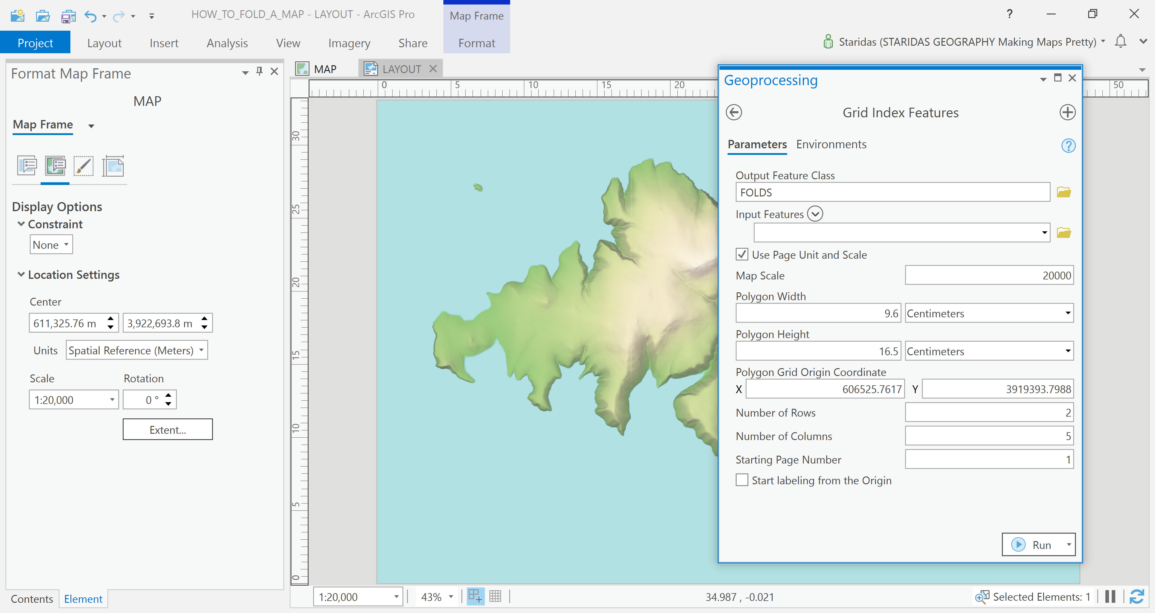
In this case, the map uses a scale of 1:20,000 and is projected in the Greek Grid system (EPSG:2100). The coordinates defining the map’s extent can be easily accessed—and copied—through the Display Options section within the Format Map Frame dialog (Picture 4).
To simulate the folds of the map, I use one of my favorite tools: the Grid Index Features tool. By this point, I’ve already defined all the necessary parameters the tool requires to generate a grid that mimics the map's folds. With everything in place, I simply fill in the fields, hit the Run button, and let the tool create the grid layout ( Picture 5).
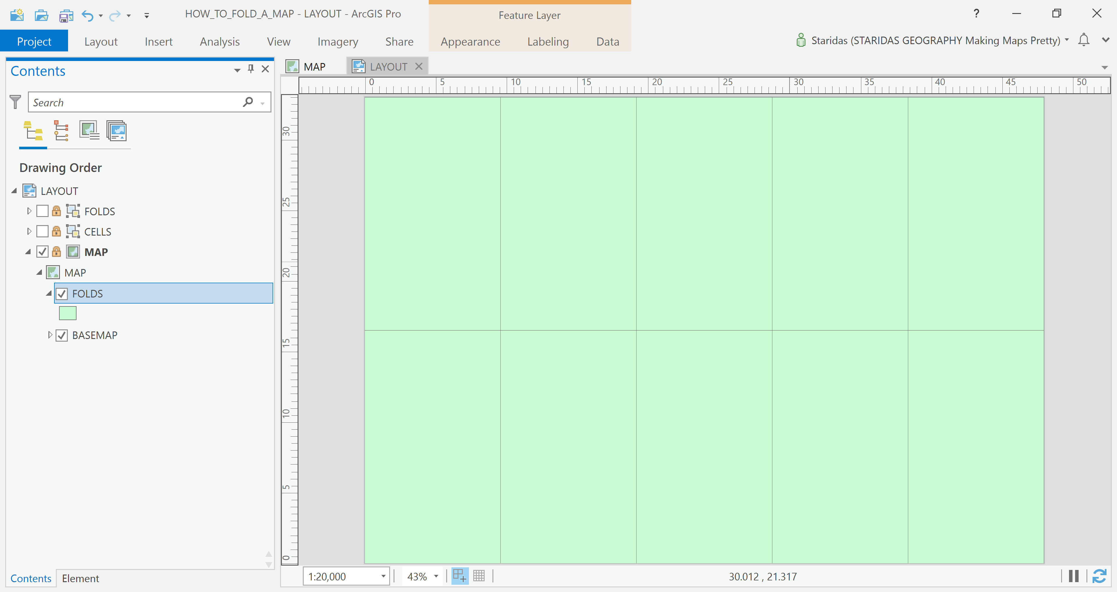
A new feature layer is now created, and it visually matches the graphic cells I drew earlier. The key difference, however, is that this layer is part of the map itself—it’s georeferenced and dynamically linked, meaning it moves and adjusts along with the map’s extent and scale (Picture 6).
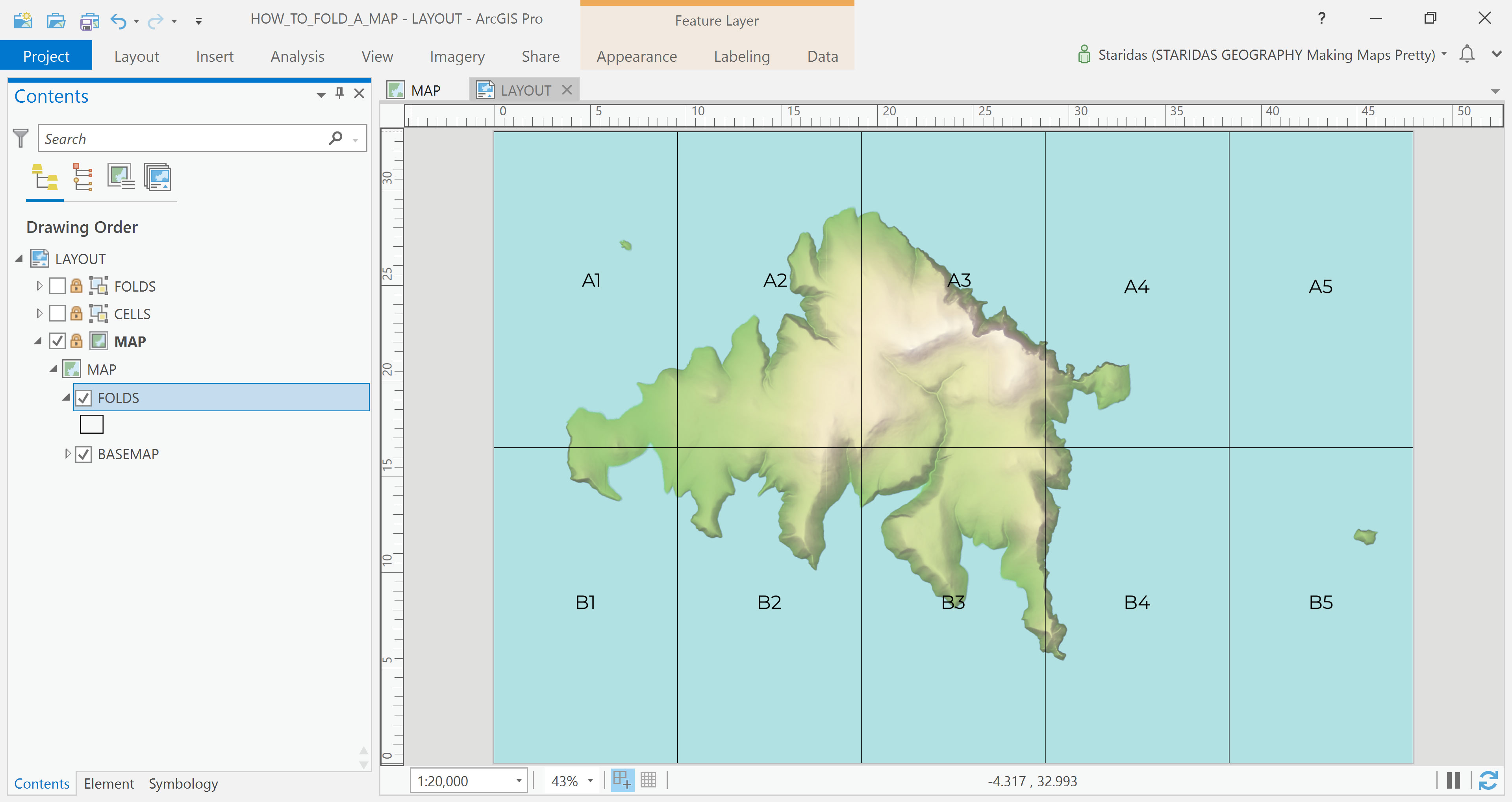
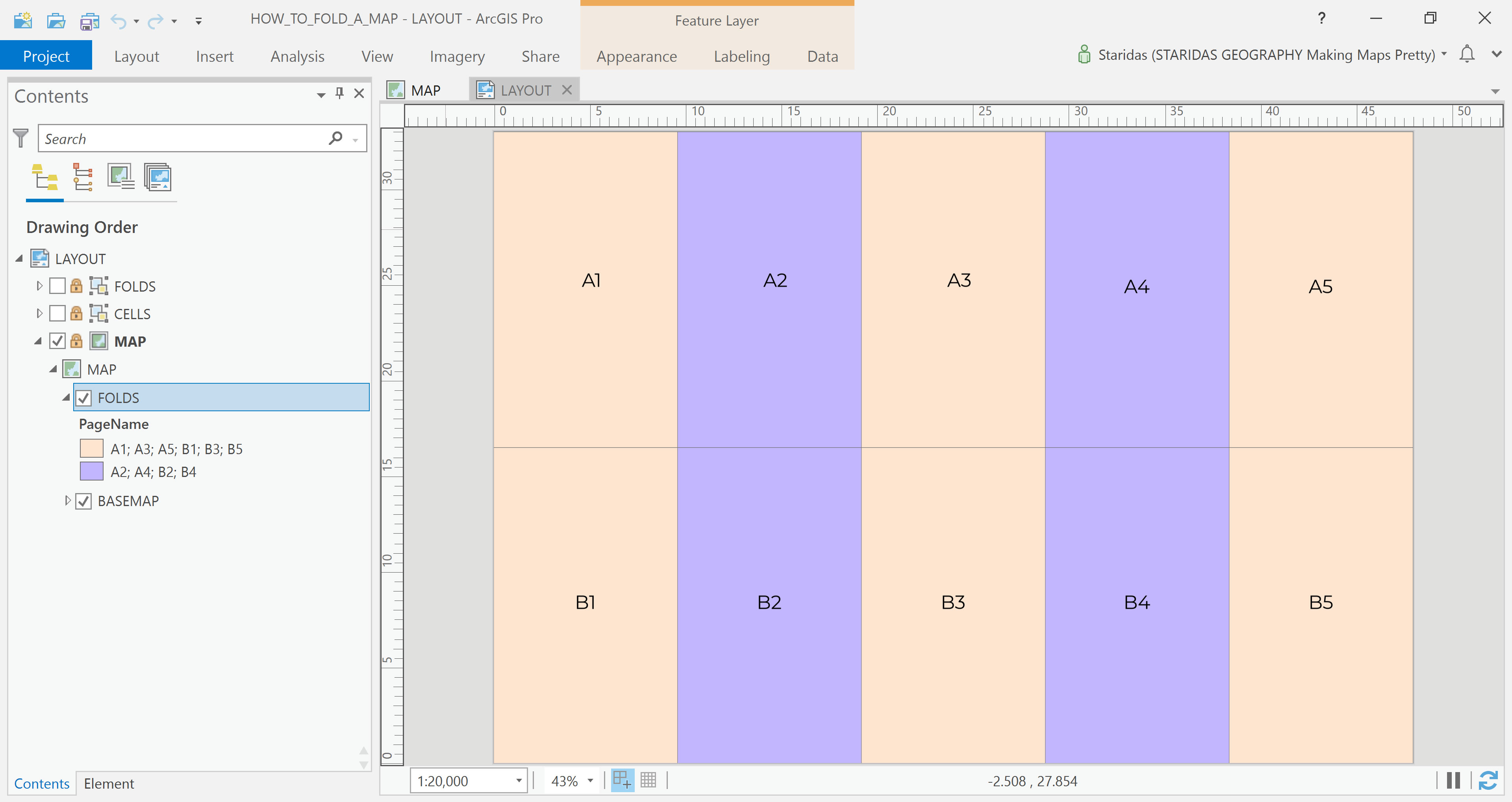
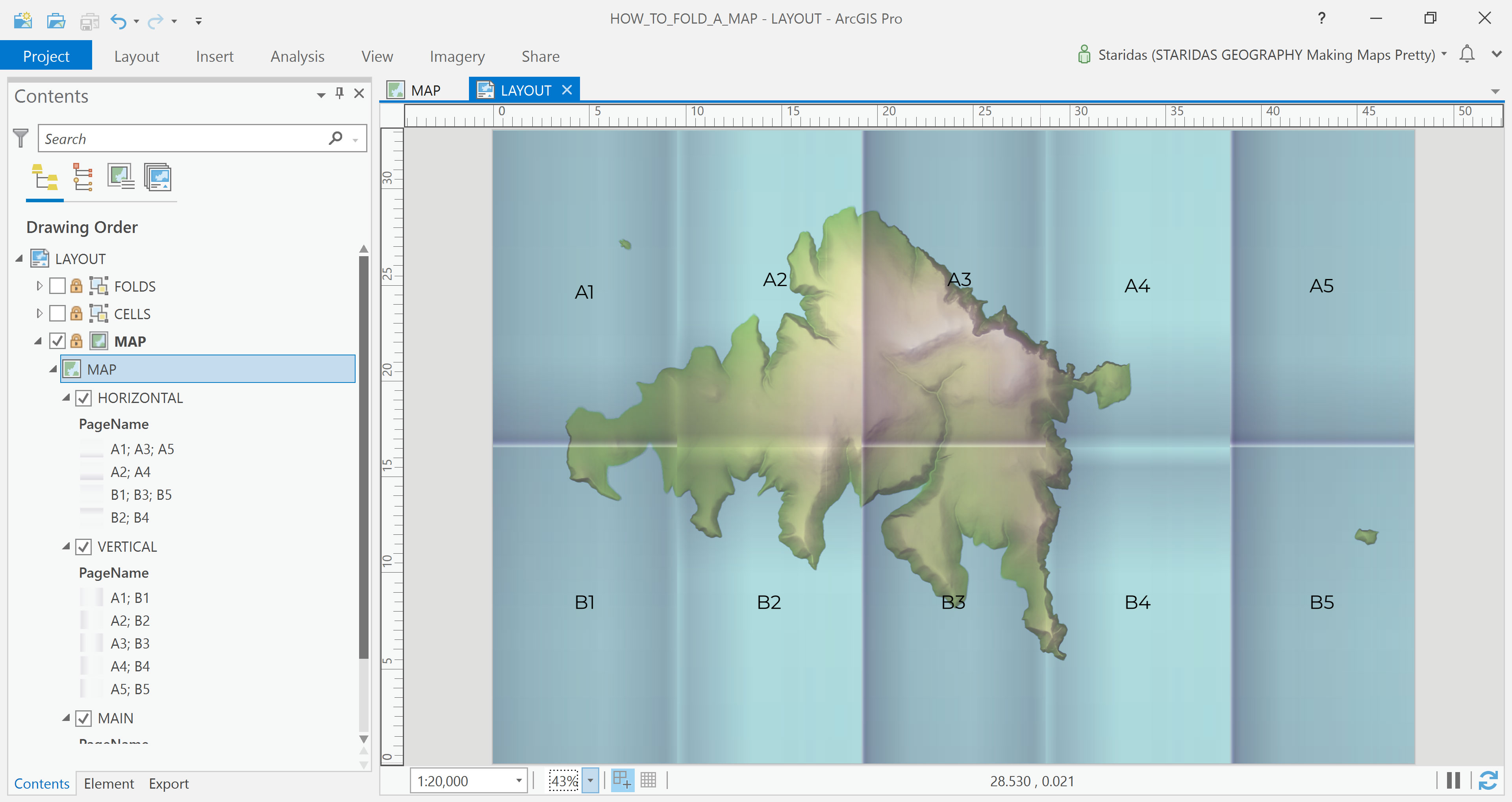
Each cell in the newly created grid now has its own unique name. The cells in the first row are labeled A1 to A5, while those in the second row are labeled B1 to B5. This naming convention helps in easily identifying and referencing each section of the folded map (Picture 7).
Now, the final step is to observe how light interacts with folds in real-world conditions and replicate that effect using appropriate symbology. By analyzing highlights and shadows created by creases on actual paper maps, I can apply similar visual cues—such as subtle lines, gradients, or transparency—to the digital map, giving it a realistic folded appearance.
Understanding the Light
To accurately simulate how light interacts with folds, it’s important to first understand the physical nature of those folds. Take, for example, Picture 8 below (just for illustration—I'm not replicating this exact one): some fold edges appear to rise above the map’s surface, resembling mountain ridges, while others seem to sink into the map, much like valleys.

This visual difference is key. Raised folds catch more light and cast subtle shadows to one side, while sunken folds appear darker along their crease, with highlights along the opposite edge. Recognizing this contrast is essential for realistically mimicking folds through digital symbology.
Another key observation is that the fold edges fall into two main orientations: vertical and horizontal, which makes sense given that the map is folded four times vertically and once horizontally. Furthermore, since the folding style is accordion-like, each fold alternates between facing the light and being tucked away from it.
Assuming an imaginary light source coming from the left, I can translate these physical characteristics into visual ones using gradients. To simulate the effect realistically, I’ll create three separate shading layers:
- A generic shading layer to differentiate folds that face the light from those that are partially hidden (like alternating peaks and valleys).
- A vertical folds layer, highlighting and shadowing the vertical fold edges based on how they interact with the light direction.
- A horizontal folds layer, doing the same for the horizontal fold edges.
By layering these effects thoughtfully, the final map will visually suggest a realistic folded structure, enhancing both its aesthetic and tactile feel.
Simulate the Shades
The Generic Shading Layer
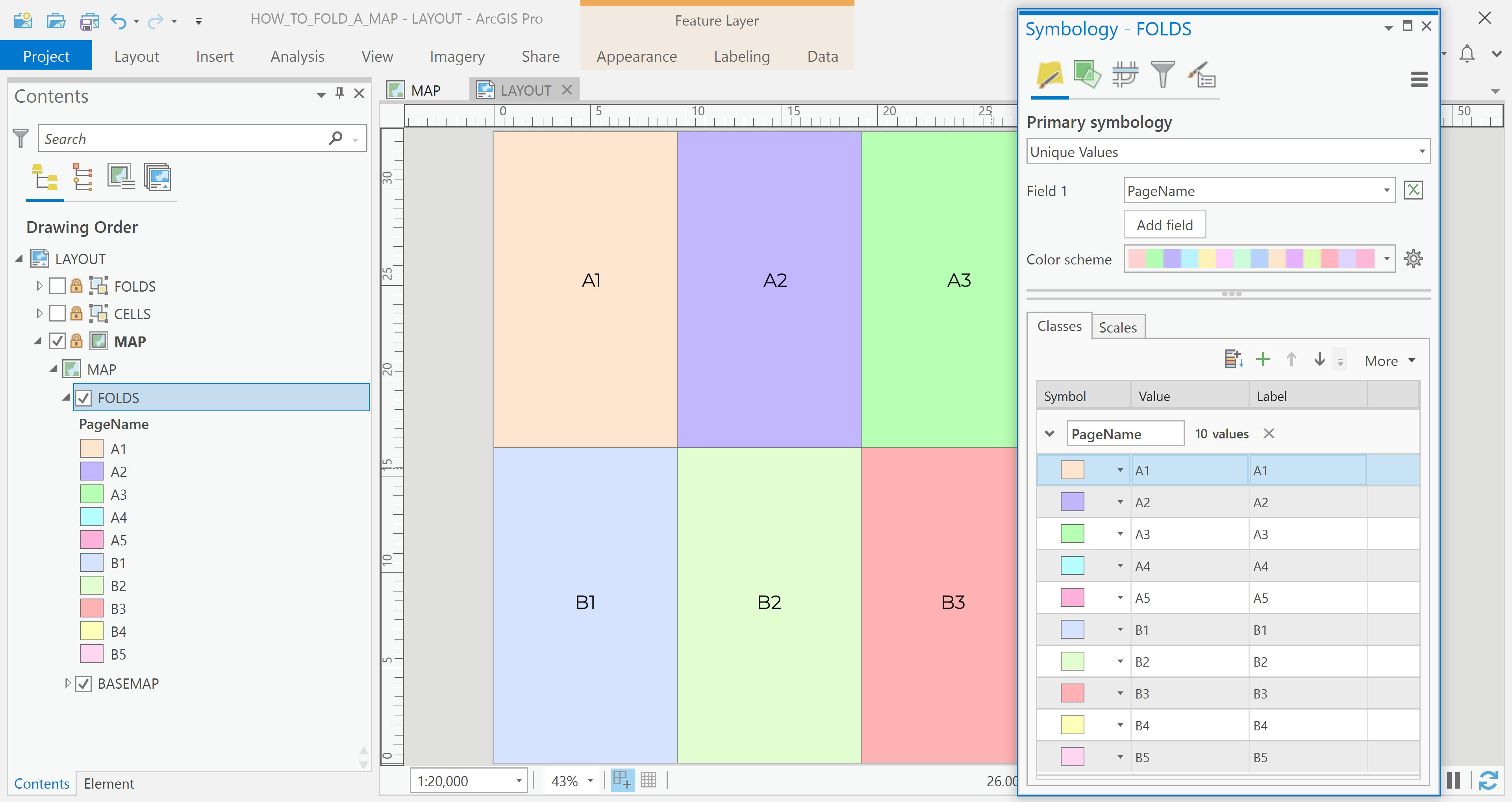
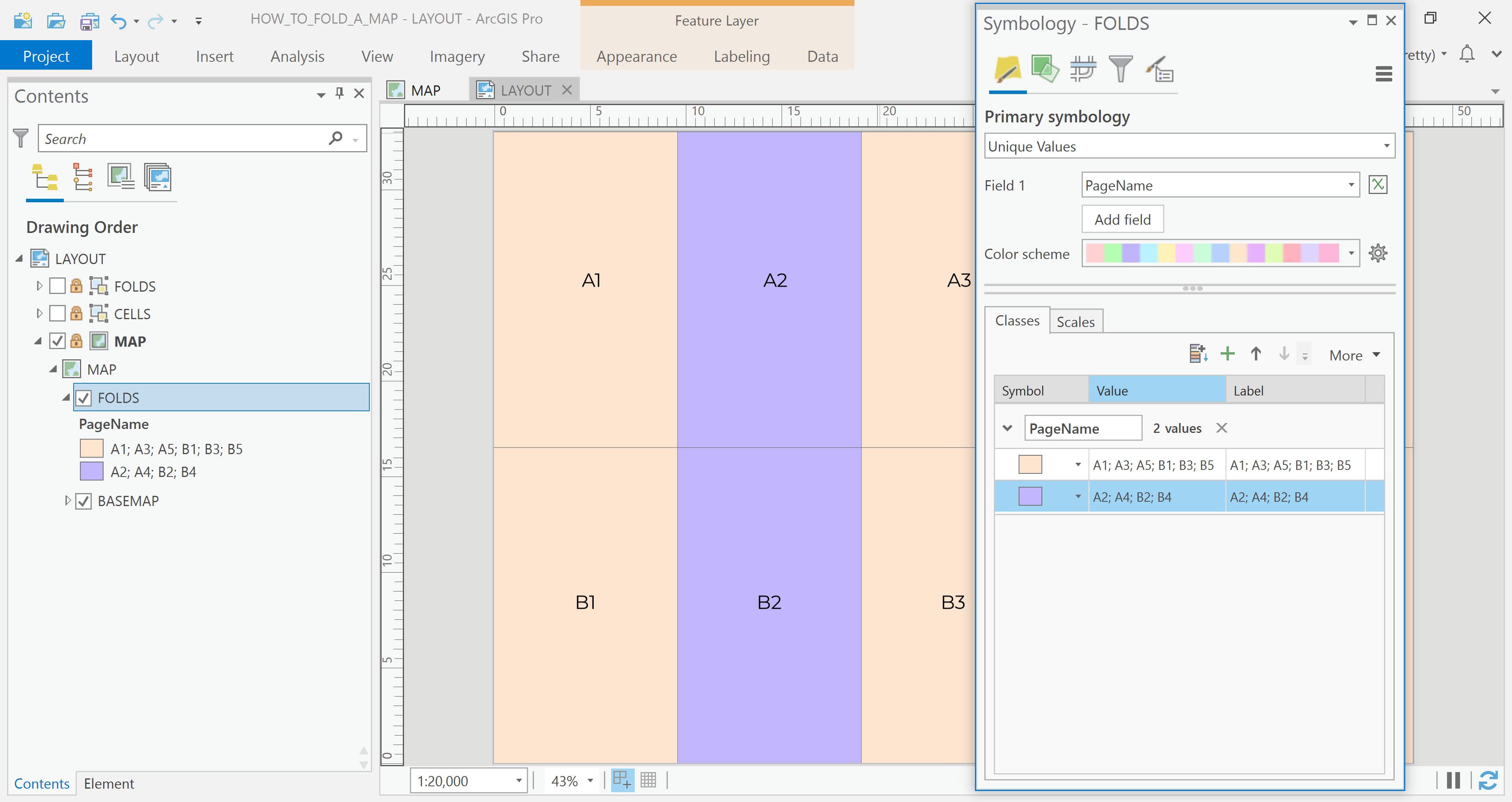
Let’s start by creating the generic shading layer. I begin by applying Unique Values symbology to the folds feature layer, using the PageName field to distinguish each cell individually (Picture 9).
Next, I group the folds based on their exposure to the light source, which I’ve assumed comes from the left. This results in two distinct groups (see Picture 10):
- Folds facing the light: A1, A3, A5, B1, B3, B5
- Folds hidden from the light: A2, A4, B2, B4
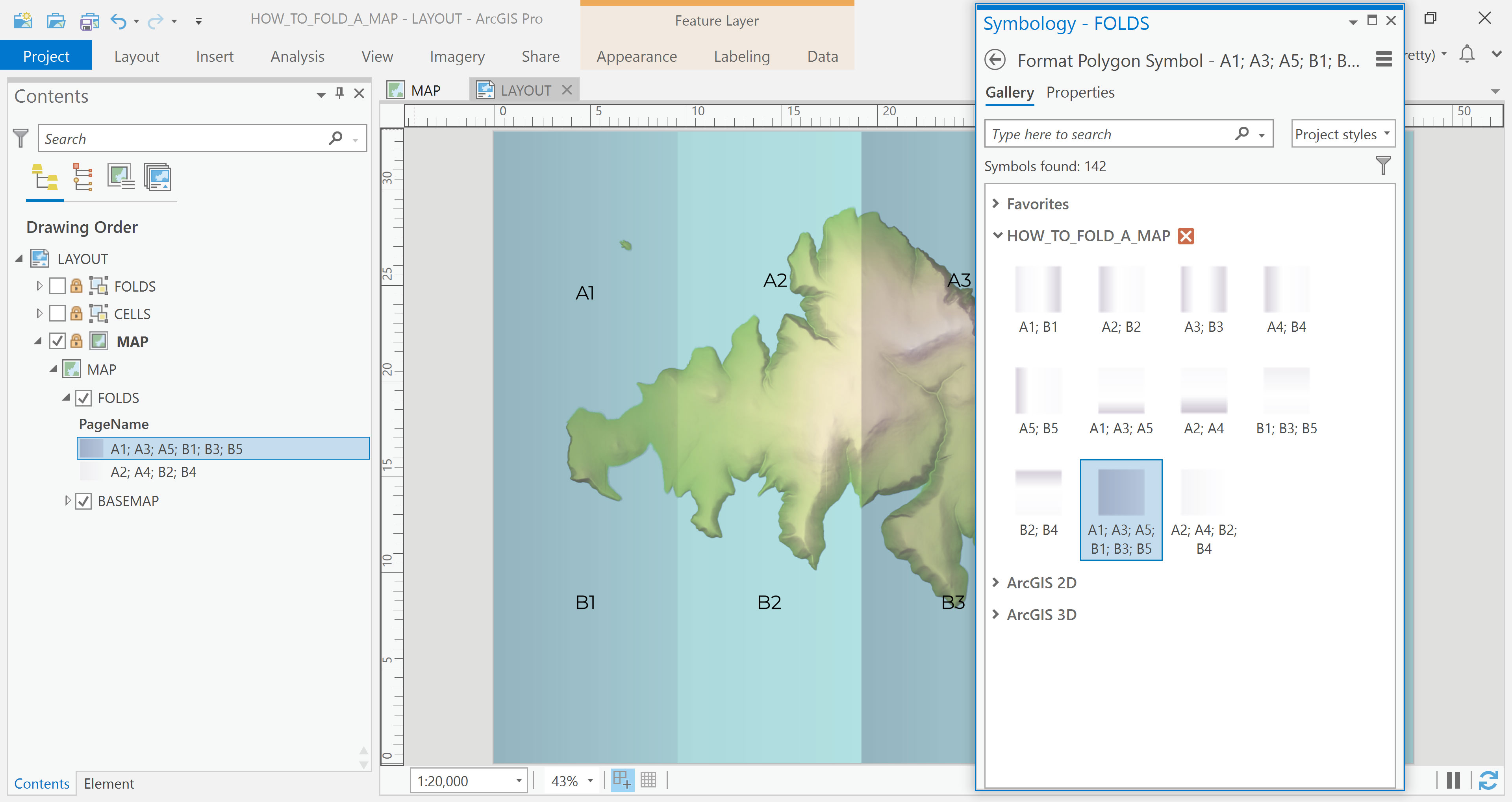
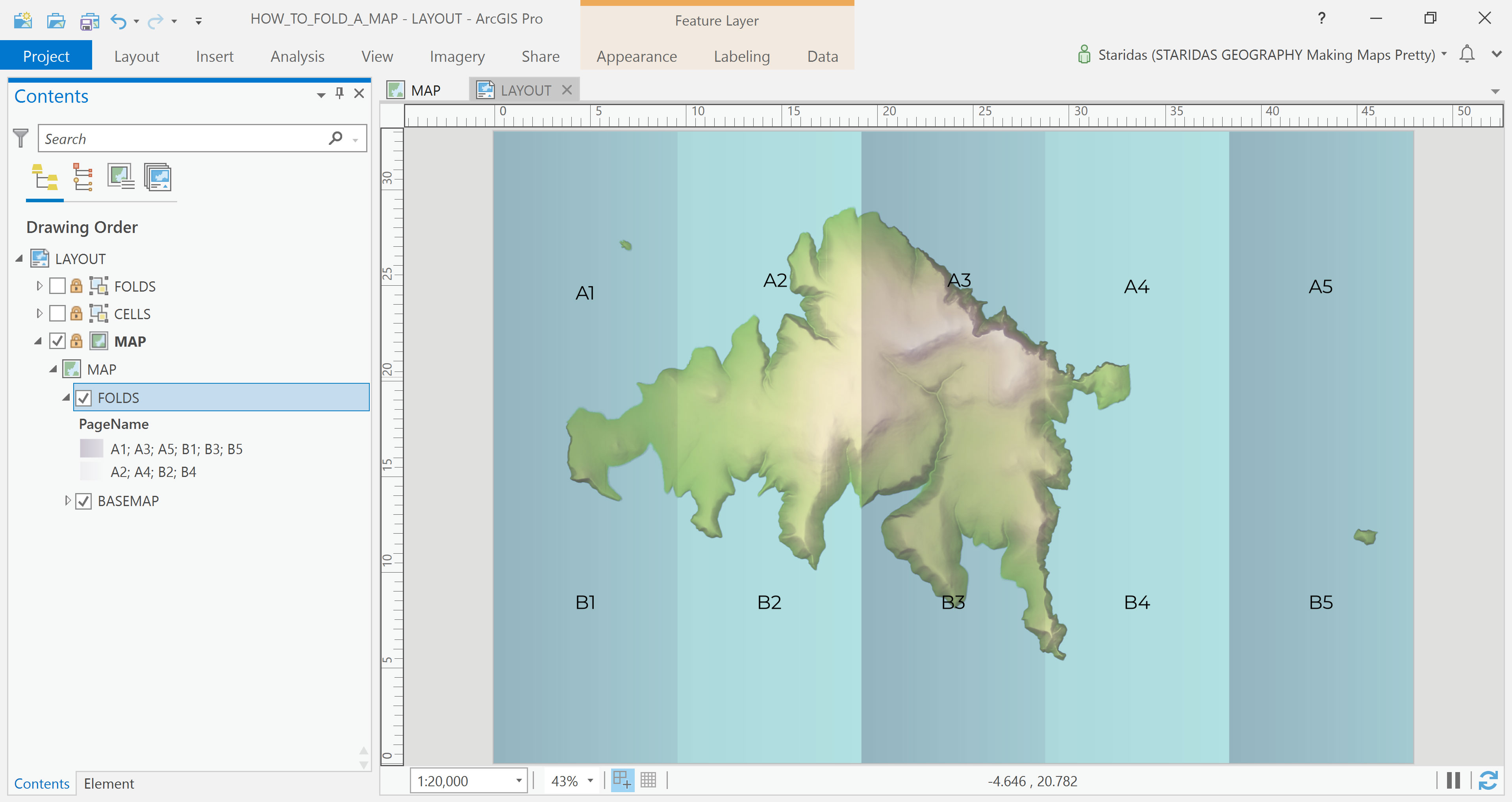
With these groups established, I can assign a lighter gradient to the first group and a darker gradient to the second. This contrast effectively simulates the alternating peaks and valleys of an accordion fold, bringing depth and realism to the digital map layout (Picture 11).
Now, I need to create a suitable gradient. After a great deal of trial and error, I finally developed a gradient that achieved the desired effect. I saved it and published it in an ArcGIS Pro Style File. With that ready, I applied the corresponding symbols from my style to the two groups in my feature layer (Picture 12).
Et voila!
The Vertical Folds Layer
At this point, the map already resembles a folded accordion, visually convincing enough on its own. But let’s take it a step further by simulating the fold edges. That’s where the magic really happens.
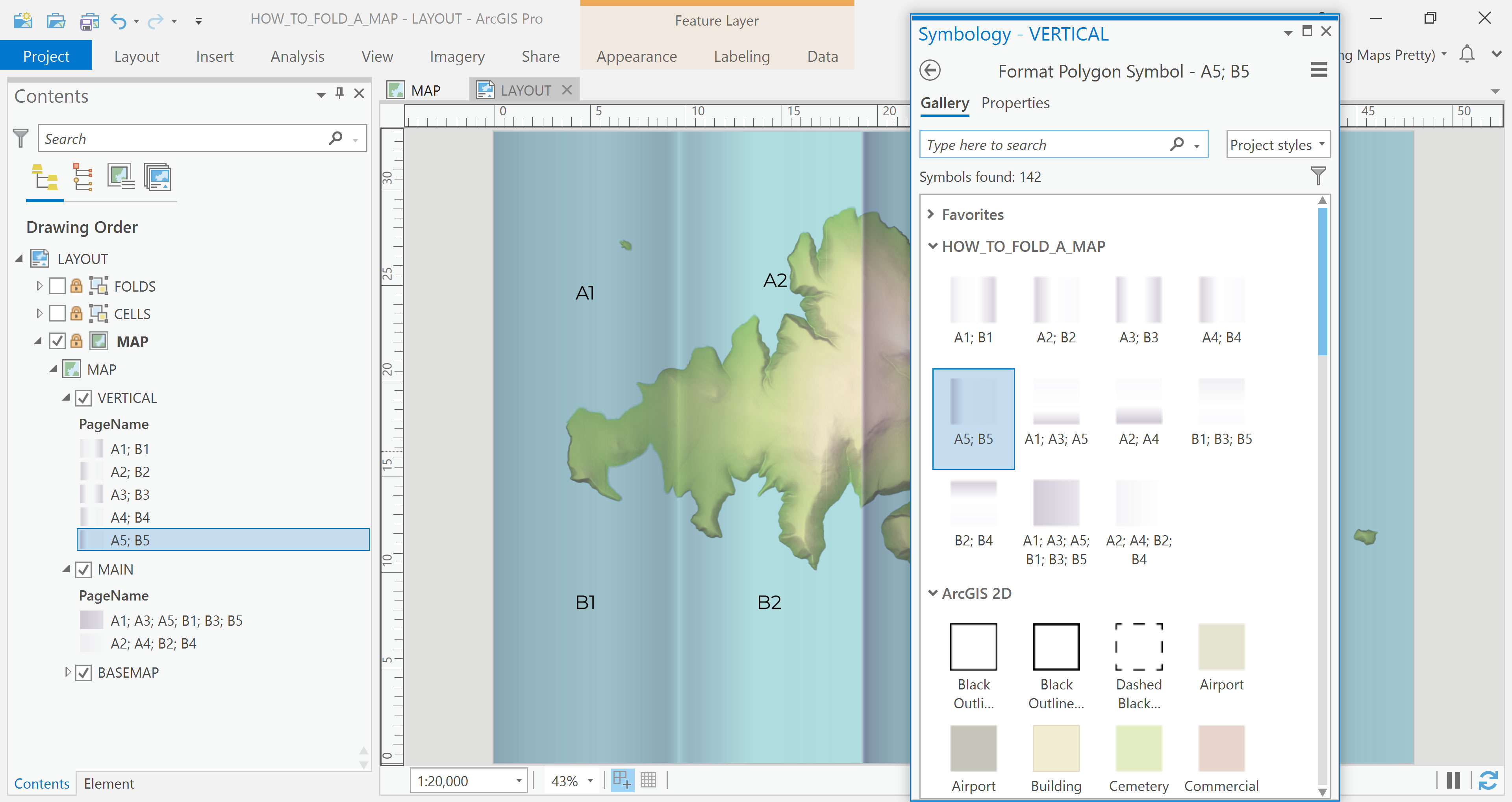
To begin, I rename the original layer to MAIN, then add the same feature layer again to the table of contents, this time renaming it to VERTICAL. I apply Unique Values symbology to the VERTICAL layer using the PageName field, just like before. However, this time I group the features differently (see Picture 14):
- Group 1: A1 and B1,
- Group 2: A2 and B2,
- Group 3: A3 and B3,
- Group 4: A4 and B4,
- Group 5: A5 and B5,
Once again, I’ve saved the gradients for these groups in my custom style, so I simply assign each group its corresponding symbol from the saved style (Picture 15).
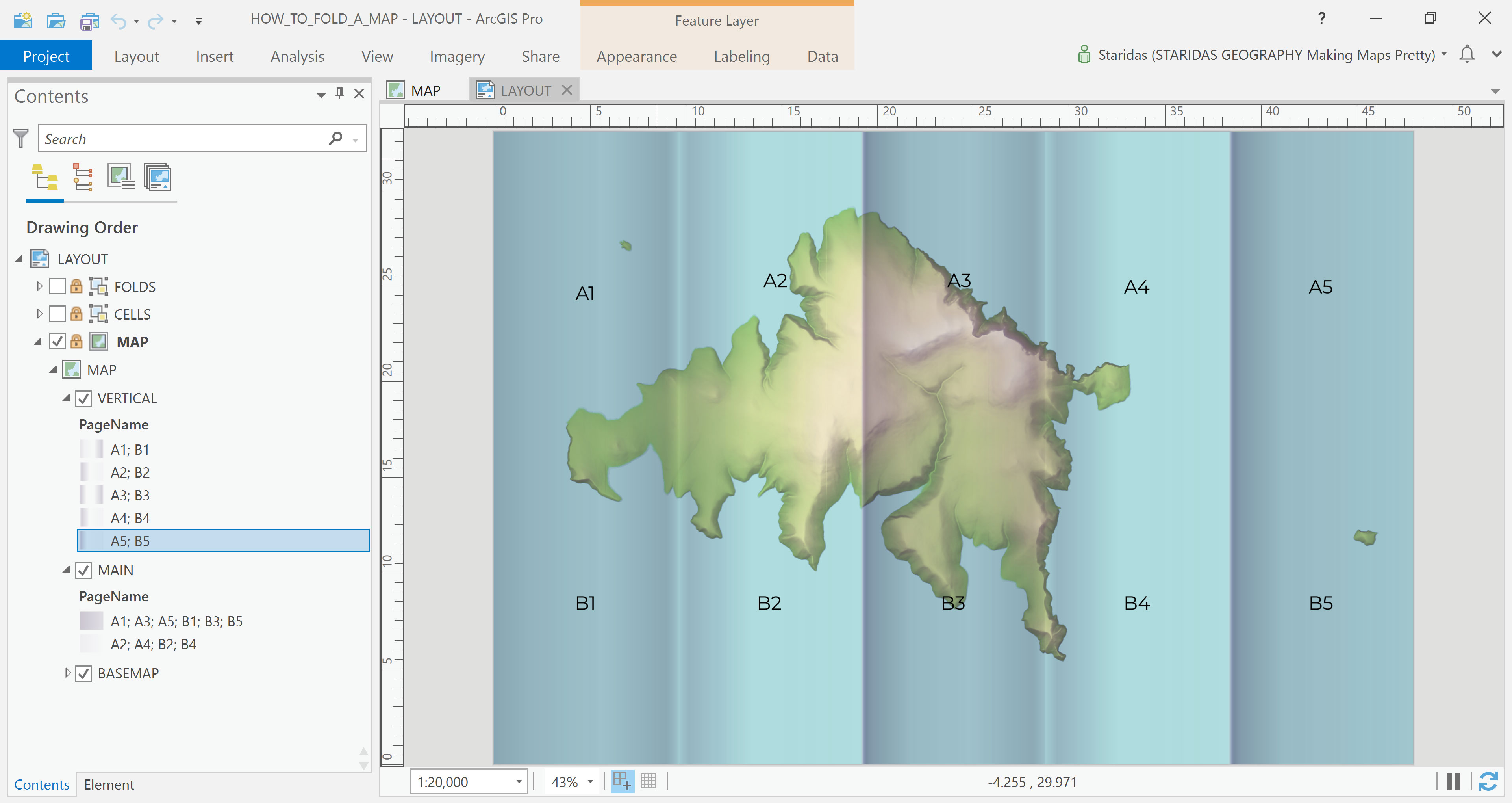
What I’ve effectively done here is enhance the vertical fold edges. The folds that protrude from the map act like mountain ridges, featuring a bright side and a shadowed side. In contrast, the folds that sink into the map resemble valleys, with darker slopes and a lighter center (Picture 16).
The Horizontal Folds Layer
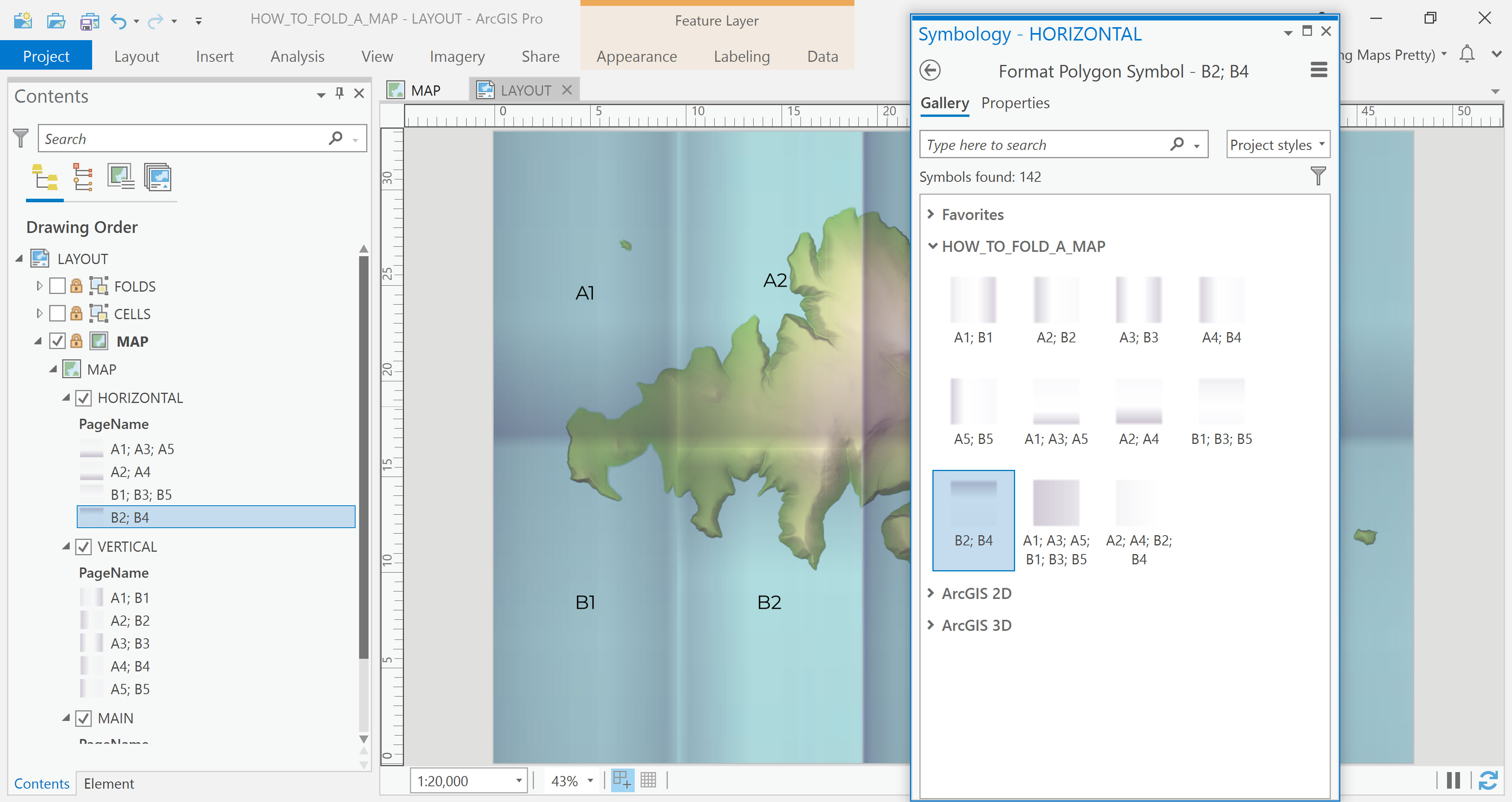
Now it's time to add the third layer—the one that will simulate the horizontal fold. I load the same feature layer once more and rename it HORIZONTAL.
I apply Unique Values symbology to the HORIZONTAL layer using the PageName field, and I group the features as follows (see Picture 17):
- Group 1: A1, A3 and A5,
- Group 2: A2 and A4,
- Group 3: B1, B3 and B5,
- Group 4: B2 and B4.
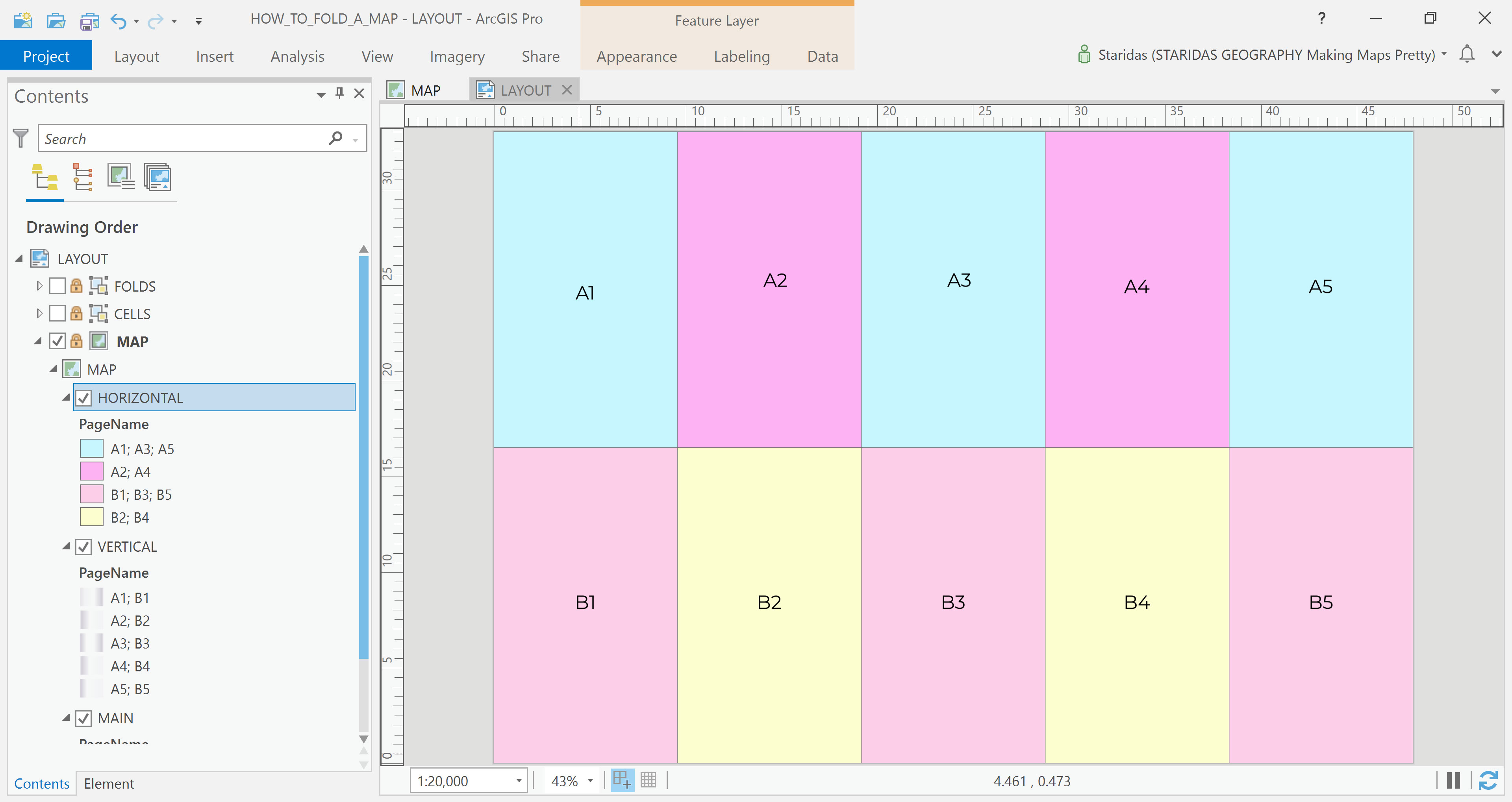
Then, I assign each group its corresponding symbol from my saved style (Picture 18).
With this, I’ve enhanced the horizontal fold edges, which behave just like the vertical ones, only in the opposite direction.
Bringing It All Together
The final step is to fine-tune the overall transparency of the three layers. By adjusting their opacity levels relative to each other, I’m able to achieve more natural and realistic shadow effects that enhance the illusion of folded paper (Picture 19).
Epilogue
This concludes the walkthrough of my method for simulating folded paper maps in ArcGIS Pro and thank you for reading. I hope this approach proves both practical and inspiring in your own cartographic work.
You’re welcome to adapt the gradients to fit the specific needs of your own project. I’ve shared the Style File on my ArcGIS Online account, available for download under a CC BY-NC-SA license.
Kindest regards from Crete, Greece!
Spiros