This article was originally published on August 16, 2021, by John Nelson on the Esri ArcGIS Blog under the title Styling OpenStreetMap Data with Arcade in ArcGIS Pro.
Introduction
This blog post explores how to style and label data from the OpenStreetMap database using ArcGIS Pro to create visually compelling maps. A key part of this process is understanding the structure of OpenStreetMap data, the various data types, and their corresponding attribute schemas.
For this demonstration, I chose Luxembourg, a small European country, as the focus. Its size makes it a manageable and effective example. However, the same approach can be applied to any location worldwide, as long as OpenStreetMap data is available for that area.
All OpenStreetMap data used in this post was downloaded via Overpass Turbo using specific queries in GeoJSON format. The data was then converted into feature classes using the JSON to Features geoprocessing tool.
In the following sections, I will demonstrate how to style and label this data using Arcade wherever possible. I believe Arcade offers significant advantages for ArcGIS users by streamlining workflows and improving efficiency.
If you'd prefer to skip the step-by-step process outlined here, you can access my completed ArcGIS Pro project directly via my ArcGIS Online account. The entire project has been uploaded as a compact Map Package, which you are free to use under a CC BY-NC-SA 4.0 license.
Map and Layout Preparation
In ArcGIS Pro, I begin by creating a new map, which I rename "Luxembourg." From the Basemap Gallery (found under the Map tab in the Layer group), I choose the OpenStreetMap basemap.
Using the Locate pane, I navigate to Luxembourg and open the Map Properties dialog box. Under the Coordinate Systems tab, I search for and select the "Luxembourg 1930 Gauss" projected coordinate system (EPSG:2169).
Next, I create a new layout with dimensions of 100 cm by 70 cm, naming it "Luxembourg." I add a new Map Frame linked to the Luxembourg map, then zoom in and center the view on the country's boundaries. I also set the map scale to 1:100,000.
Since this will be a single-scale map, I set the same value as the Reference Scale. This ensures consistent symbol sizing and labeling throughout the map.
With the map framework in place, I'm ready to begin adding layers. These layers fall into three main categories, Cultural, Physical and Transportation Features, which include:
| Features | Geometry | Overpass Turbo |
|---|---|---|
| Countries Boundaries | Polyline | Query |
| Countries Areas | Polygon | Query |
| City of Luxembourg Area | Polygon | Query |
| Urban Areas | Polygon | Query |
| Populated Places | Point | Query |
| Features | Geometry | Overpass Turbo |
|---|---|---|
| Forests | Polygon | Query |
| Water Bodies | Polygon | Query |
| Rivers | Polyline | Query |
| Features | Geometry | Overpass Turbo |
|---|---|---|
| Roads Back | Polyline | Query |
| Roads Front | Polyline | Query |
For those who would like to explore and use the same OpenStreetMap data, I’ve included a direct link to Overpass Turbo with the corresponding query already set up. Just click Run and export the data in your preferred format.
You can also change the area of interest. In the provided queries, the extent is set to Luxembourg, but you can easily modify it using the [bbox: bottom, left, top, right] format. If you're wondering how to find the exact coordinates for your own area of study, check out the official Set the map extent topic in the ArcGIS Pro documentation—it's a great resource to guide you through the process.
Before diving into the styling and labeling of each individual layer, it's important to first install the fonts that will be used throughout the map. I've chosen to use a sans-serif font for cultural features and other general map elements, and a serif font for physical features.
For this purpose, I selected Source Sans and Source Serif, two of my favorite fonts from the Google Fonts collection.
Note: If these fonts are not already installed on the system, ArcGIS Pro must be closed before installation. After installing the fonts, restart ArcGIS Pro to ensure they are recognized.
In the following sections, I will walk through the process of adding, styling, and labeling each layer individually, step by step, leading to the creation of a complete street map of Luxembourg.
Cultural Features
Countries Boundaries
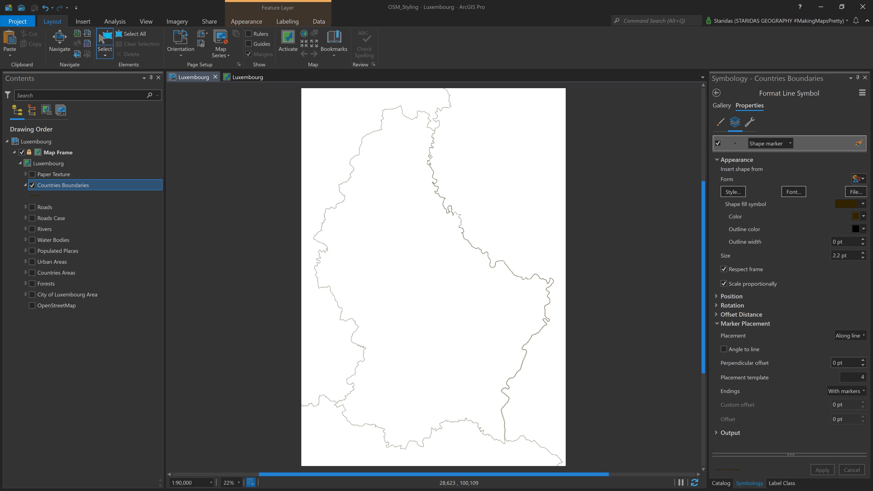
The first layer to be styled is the administrative boundaries of Luxembourg and its neighboring countries: Belgium, France, and Germany. OpenStreetMap provides administrative boundaries at various levels. For this project, we need level 2 administrative boundaries, represented as polylines.
I begin by adding the administrative polylines to ArcGIS Pro and styling them using a shape marker. I set the marker size to 2.2 pt and choose the color #332200. In the Marker Placement properties, I select Along line for placement, set the placement template to 4, and choose With markers for the line endings (see Picture 1).
In the Contents pane, I rename this layer to Country Boundaries.
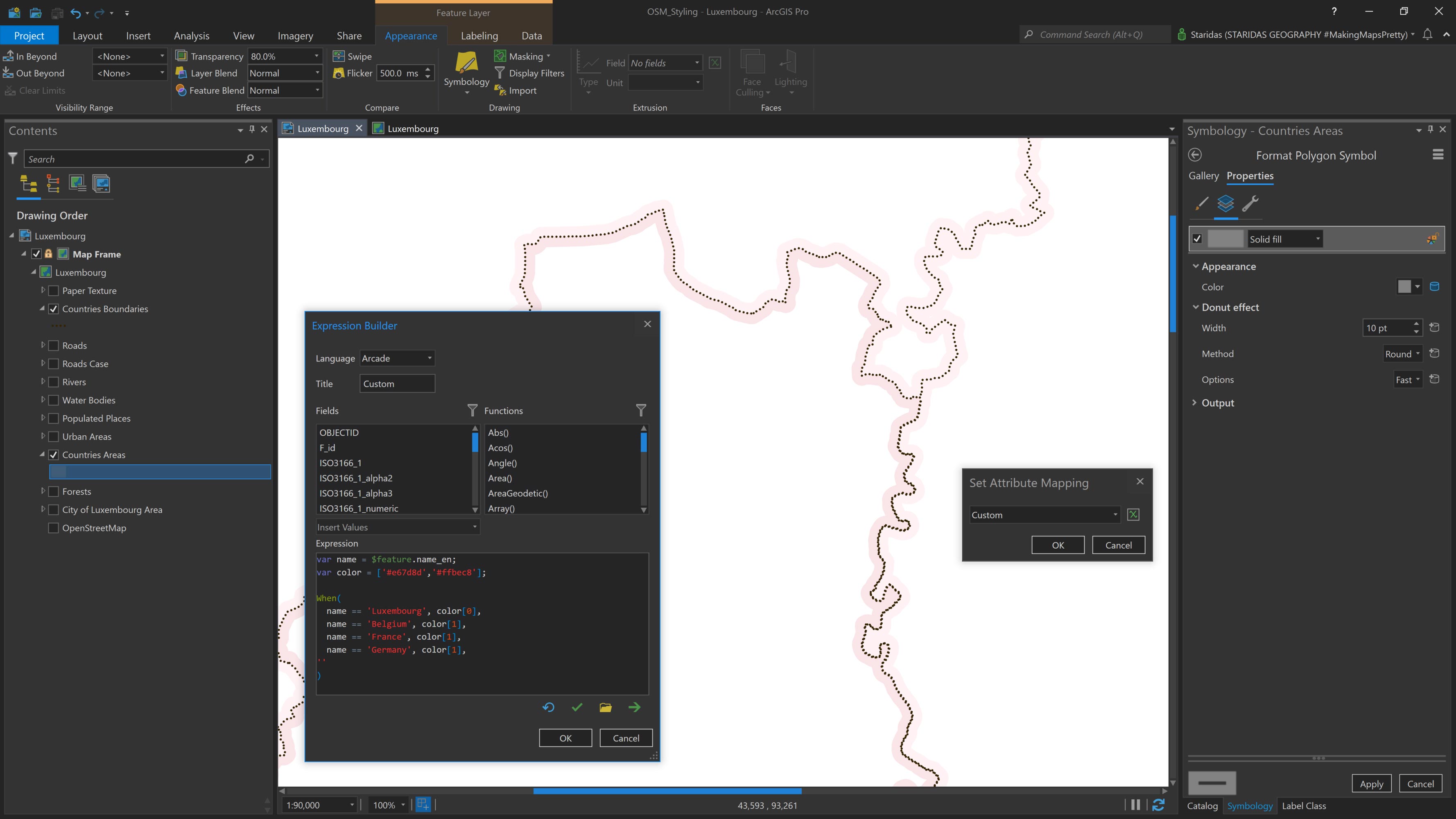
Countries Areas
The Countries Areas layer represents the same administrative boundaries from OpenStreetMap, but in polygon geometry. I'll use this layer primarily to highlight the countries' boundaries and to label each country.
First, I add the Countries Areas layer to the Contents pane and open its Symbology properties. I choose a Solid fill style and apply a Donut effect. For the Donut settings, I set the Width to 10 pt and the Method to Round.
Next, I want to apply different colors to Luxembourg and its neighboring countries. To achieve this, I use an Arcade expression.
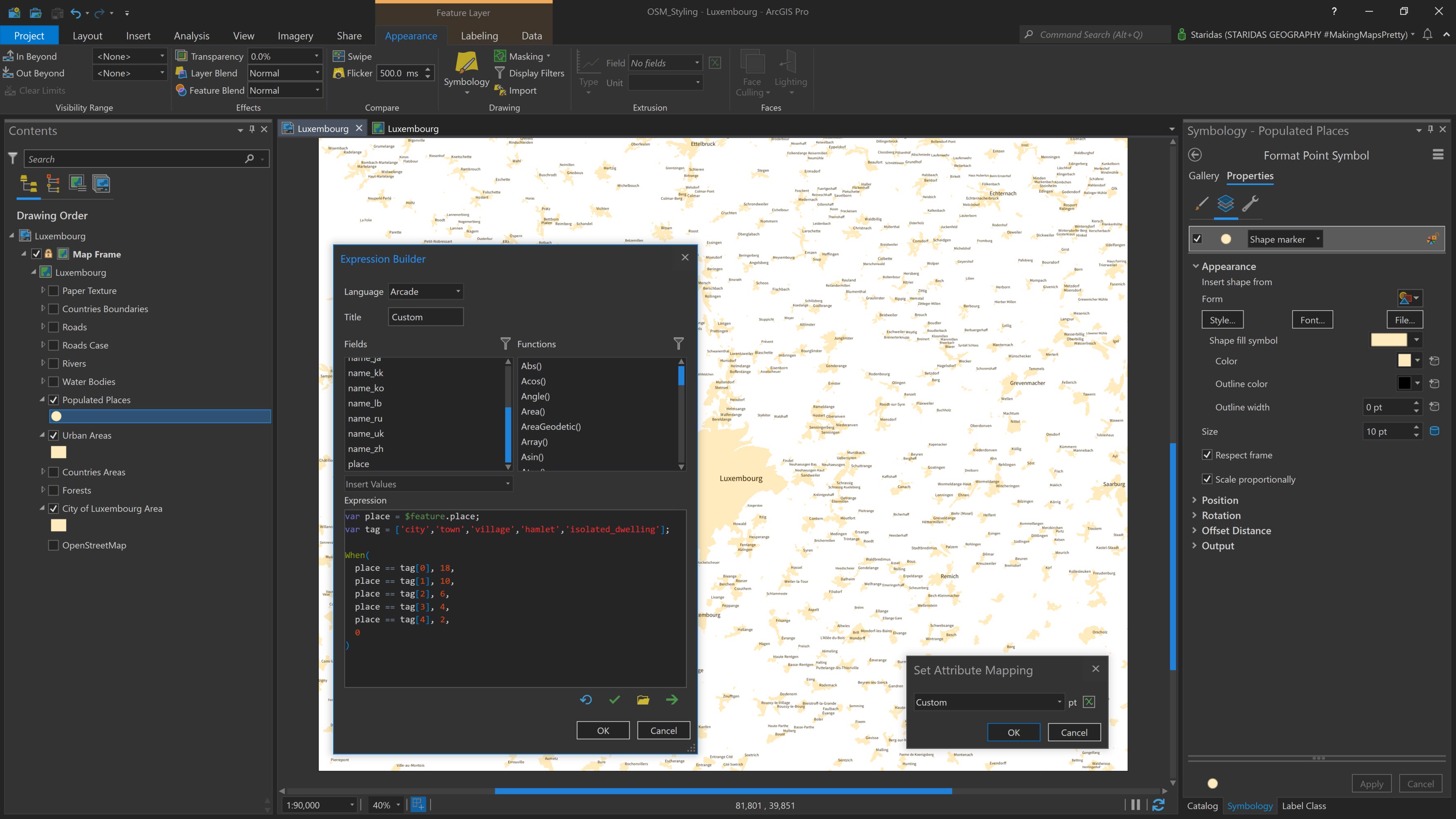
In the Symbology pane, I navigate to the Vary symbology by attribute tab and enable the option Allow symbol property connections. Then, under the Symbol layers tab in the Symbol properties, I click the database icon that appears next to the Color setting (see Picture 2). This opens the Set Attribute Mapping dialog, where I enter the following expression:
var name = $feature.name_en;
var color = ['#e67d8d','#ffbec8'];
When(
name == 'Luxembourg', color[0],
name == 'Belgium', color[1],
name == 'France', color[1],
name == 'Germany', color[1],
''
);
In this expression, I first declare a variable named name to represent the name_en attribute of the feature layer. Then, I define a second variable, color, which holds an array of HEX color values. In this case, the array includes just two colors: #E67D8D and #FFBEC8.
Next, I use the When() function to set up a series of conditional statements. Essentially, I'm saying: when the country name is "Luxembourg," assign the first color in the array to the polygon; when the country name is "Belgium," assign the second color, and so on for each neighboring country.
After completing the expression, the Countries Areas layer is styled as shown in Picture 2.
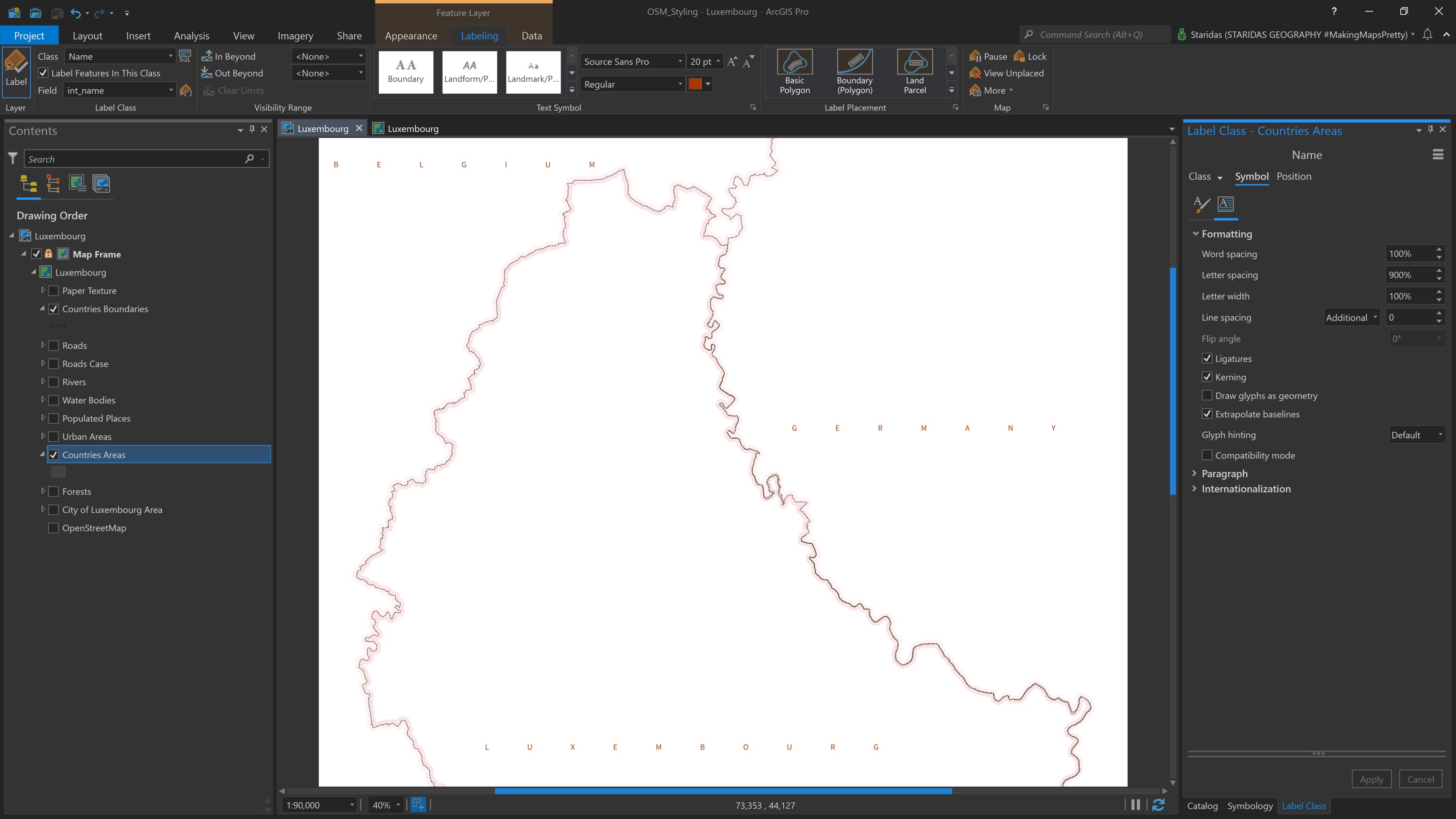
Next, I label the Countries Areas layer using the values from the int_name field, which represents the international name of each country. For the font, I select Source Sans Pro Regular, set the font size to 20 pt, and choose #A83800 as the font color.
I also apply the following text styling: Uppercase for the text case, 900% for letter spacing, and a Regular label placement. At this stage, the map appears as shown in Picture 3.
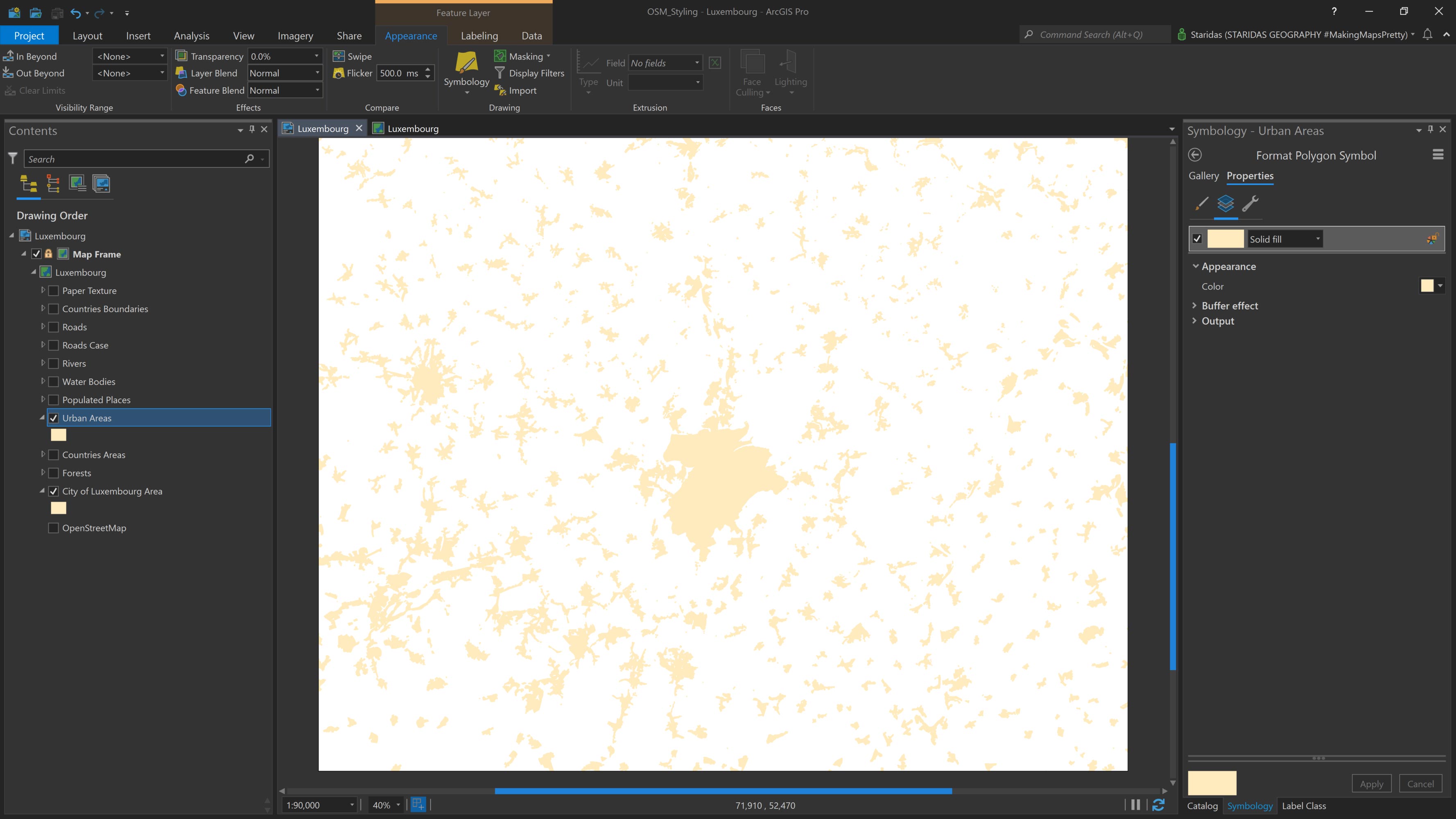
City of Luxembourg & Urban Areas
Urban Areas represent the regions where people live and engage in typical urban activities, such as housing, commerce, and services. In OpenStreetMap, these areas are categorized under the Residential land use type and are provided as polygon geometries.
I add the Urban Areas polygon layer to the map, then open its Symbology properties. I apply a Solid fill with the color #FFEBBE and add a Buffer effect with a width of 1 pt (see Picture 4). This buffer effect helps subtly highlight the boundaries of these areas for better visual distinction.
However, in the case of the City of Luxembourg, I notice that the residential land use polygons do not form a continuous urban fabric. To better emphasize the city's prominence, I decide to include its administrative boundary area as well. OpenStreetMap provides this as a Level 8 administrative boundary.
I add the City of Luxembourg polygon and style it using the same symbology as the Urban Areas layer. The result is shown in Picture 4.
Populated Places
The Urban Areas layer and the City of Luxembourg polygon are useful for illustrating the urban fabric, but they lack name attributes in their tables. As a result, they cannot be used to label the populated places they represent.
To address this, I use a separate layer that contains the names of populated places. OpenStreetMap provides this information under the Place category. These features are available in point geometry and are classified into several types. For this project, I select the following categories: City, Town, Village, Hamlet, and Isolated Dwelling.
After combining these into a single point layer, I add it to the map and rename it Populated Places. While the main purpose of this layer is to label populated places, there are cases where OpenStreetMap does not include a corresponding urban area polygon. To prevent labels from appearing without any visible context, I also style the point layer using a Shape marker with the color #FFEBBE.
I control the marker size using an Arcade expression, based on the type of place. The expression is as follows:
var place = $feature.place;
var tag = ['city','town','village','hamlet','isolated_dwelling'];
When(
place == tag[0], 18,
place == tag[1], 10,
place == tag[2], 6,
place == tag[3], 4,
place == tag[4], 2,
0
);
In the expression, I begin by declaring a variable named place, which references the place attribute in the Populated Places feature layer.
Next, I define a variable called tag, assigning it an array of values that correspond to OpenStreetMap tags within the Place category. These tags, such as city, town, village, hamlet, and isolated_dwelling, are values stored in the place field of the attribute table.
I then use the When() function to build a conditional expression. The logic is straightforward:
- When the place is "city", assign a marker size of 18
- When it is "town", assign a size of 10
- For "village", use 6
- And so on for each place type
After applying the expression, the map appears as shown in Picture 5.
Now it's time to label the Populated Places layer, and I'll do this using an Arcade expression that dynamically adjusts the font size based on the type of place. I open the Label Properties and, under Label Expression, I enter the following code:
var place = $feature.place;
var tag = ['city','town','village','hamlet','isolated_dwelling'];
var name = $feature.name;
When(
place == tag[0], '<fnt size="20">' + name + '</fnt>',
place == tag[1], '<fnt size="14">' + name + '</fnt>',
place == tag[2], '<fnt size="10">' + name + '</fnt>',
place == tag[3], '<fnt size="09">' + name + '</fnt>',
place == tag[4], '<fnt size="08">' + name + '</fnt>',
''
);
First, I declare the variable place, which references the place attribute from the feature layer. Then, I define the variable tag, which holds an array of values corresponding to the OpenStreetMap Place category tags (such as city, town, village, etc.), drawn from the place field in the attribute table.
Next, I declare a name variable, which refers to the name attribute, the field I'll use for labeling.
Using the When() function, I construct a series of conditional statements to control font size through the <FNT> text formatting tag. The logic is as follows:
- When the place is "city", label the feature with its name and set the font size to 20 pt
- When it's "town", set the font size to 14 pt
- For "village", use 10 pt
- And so on for the remaining place types
After completing and applying the expression, the labels render as shown in Picture 6.
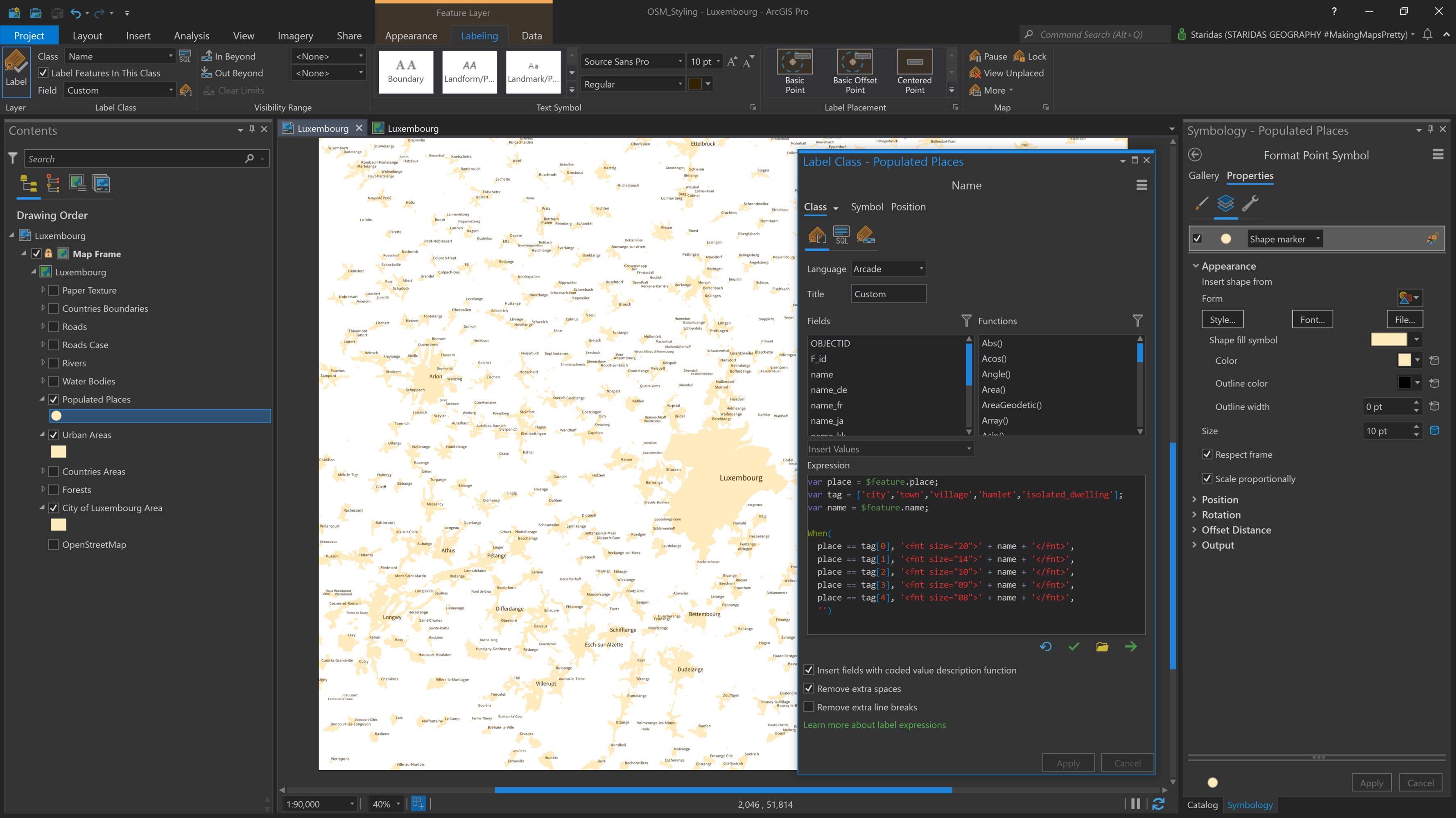
The Arcade expression serves two purposes in this case: it defines the label content, which is simply the name field, and it controls the font size for each label based on the place type.
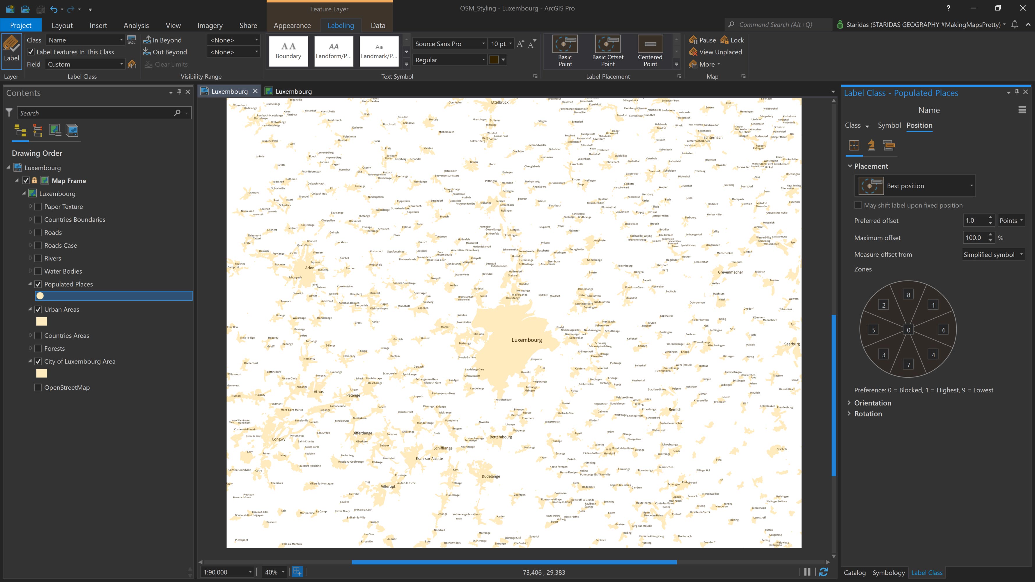
For all labels, I use the Source Sans Regular font with a color of #332200. In the Placement properties, I set the Placement to Best position, uncheck the Stack label option, and enable the Hard constraint under the Label buffer settings (see Picture 7).
Physical Features
Forests
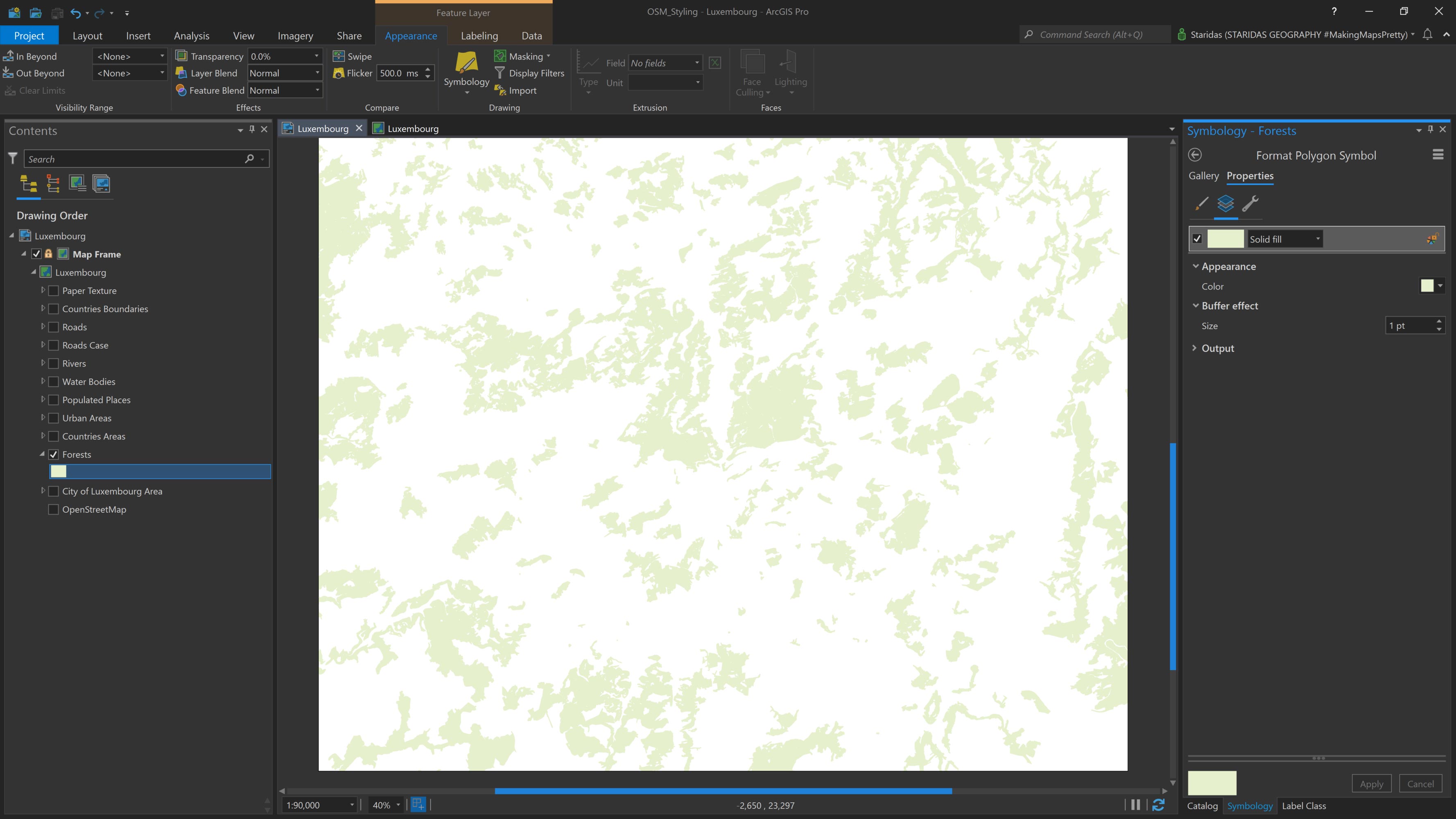
Fortunately, Europe offers a well-balanced mix of built and natural environments. OpenStreetMap includes a specific Land Use tag for Forests, represented in polygon geometry, which I use to highlight green areas on the map.
In ArcGIS Pro, I add the Forests layer to the Contents pane. I symbolize the polygons with a Solid fill using the color #E6F0CD, and I apply a Buffer effect of 1 pt.
This subtle buffer helps to slightly emphasize the edges of the forested areas, giving them clearer definition. The result is shown in Picture 8.
Water Bodies
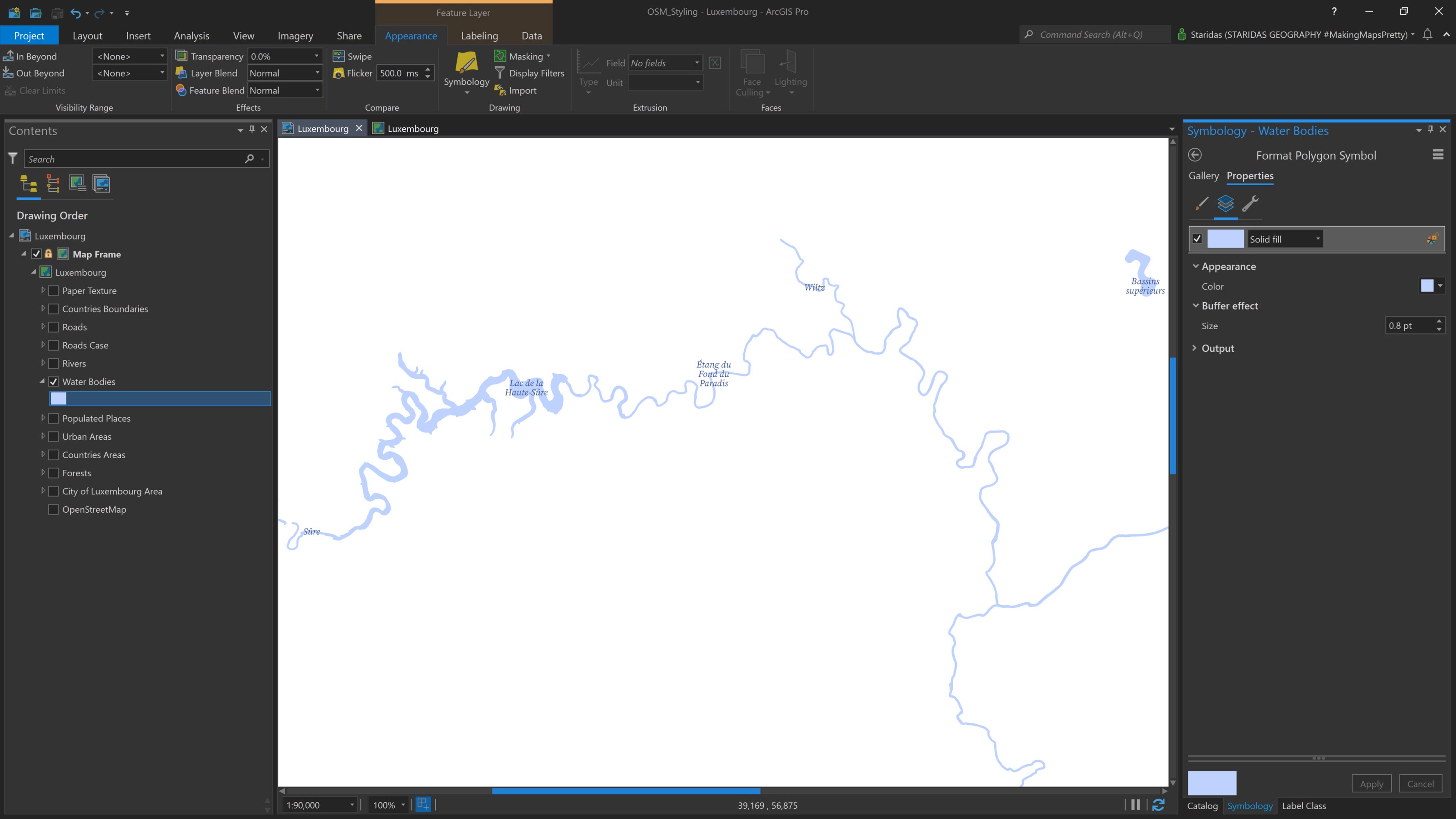
The Water Bodies layer includes lakes, either physical or artificial, as well as rivers with a remarkable surface. OpenStreetMap has the category Natural, which is used to describe all natural and physical land features, including those with the tag Water in polygon geometry. I will use these features for the Water Bodies on the map.
So, at the Contents pane I add the Water Bodies and I symbolize them with a Solid fill with a Color of #BED2FF and a Buffer effect of 0.8 pt. The map looks like the one in Picture 9.
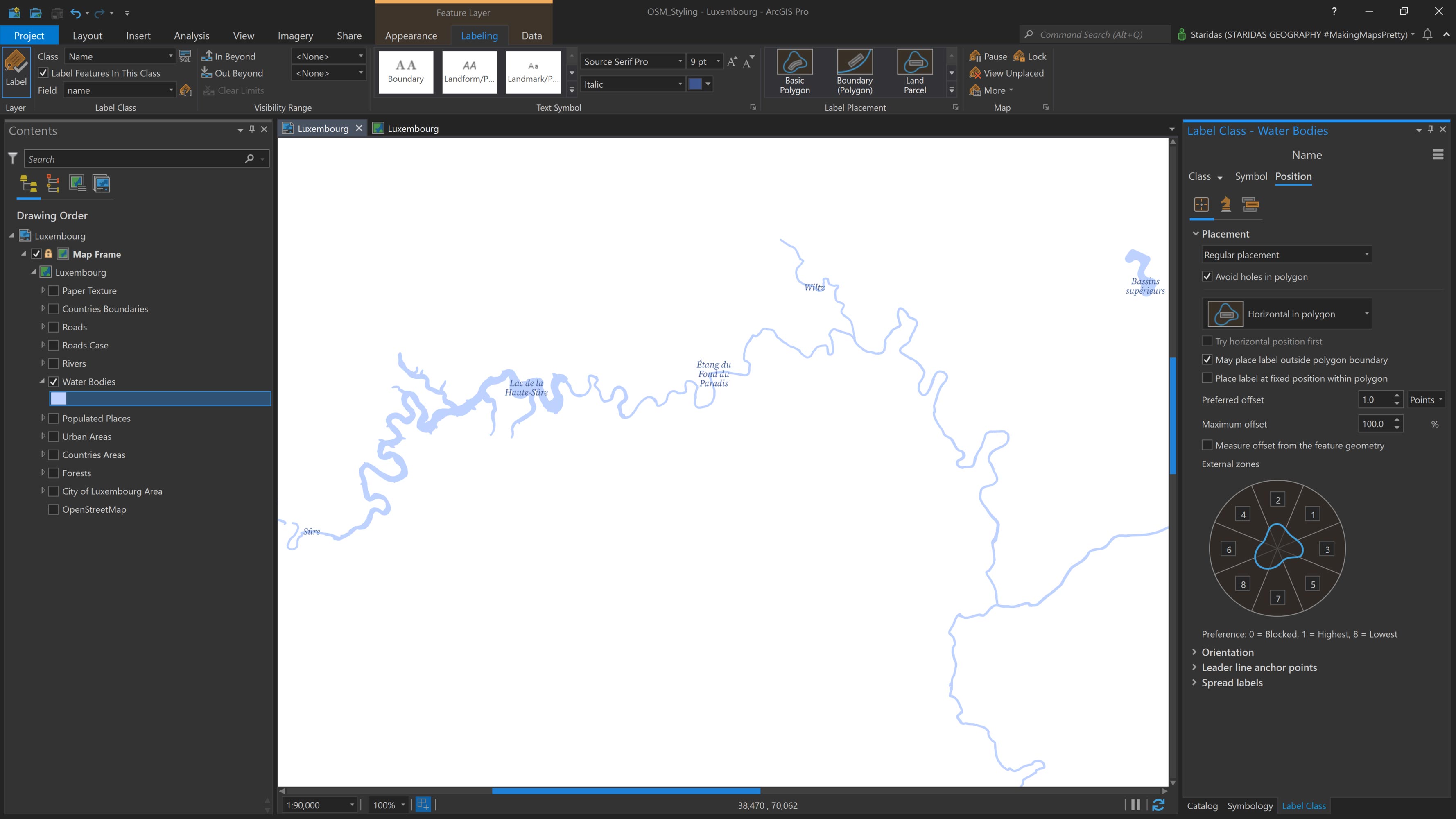
The Water Bodies layer includes a name field in its attribute table, which I use for labeling. In the Label Expression, I simply enter $feature.name.
For the labels, I choose the Source Serif Italic font, set the font size to 9 pt, and use #3D568F as the font color (see Picture 10).
Rivers
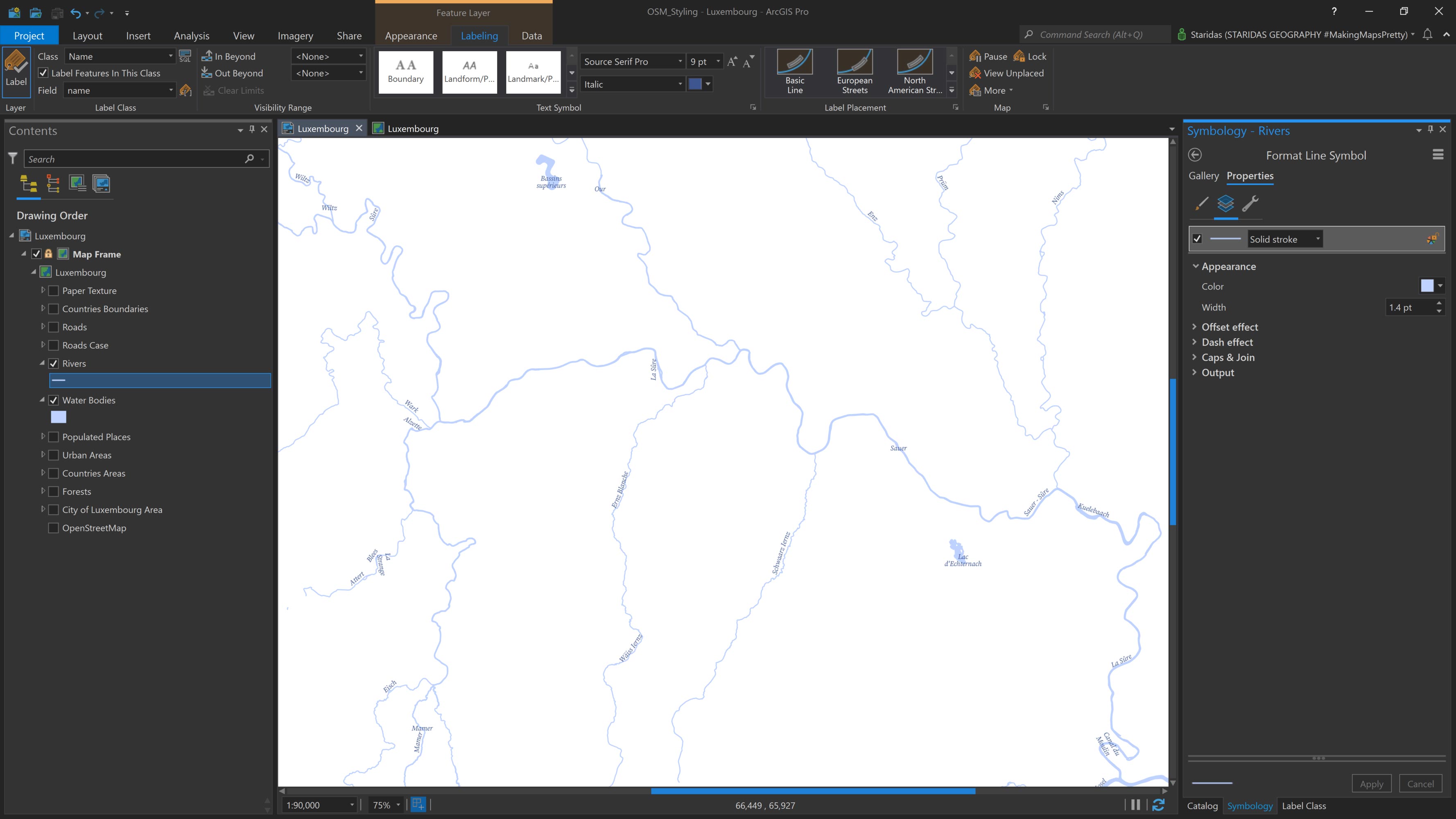
For rivers and other linear surface water features, OpenStreetMap provides the Waterway category in polyline geometry. From this category, I use features tagged as river and stream to represent rivers on the map.
In ArcGIS Pro, I add the Rivers feature layer to the Contents pane. I symbolize it with a Solid stroke, using the color #BED2FF and a width of 1.4 pt. The result is shown in Picture 11.
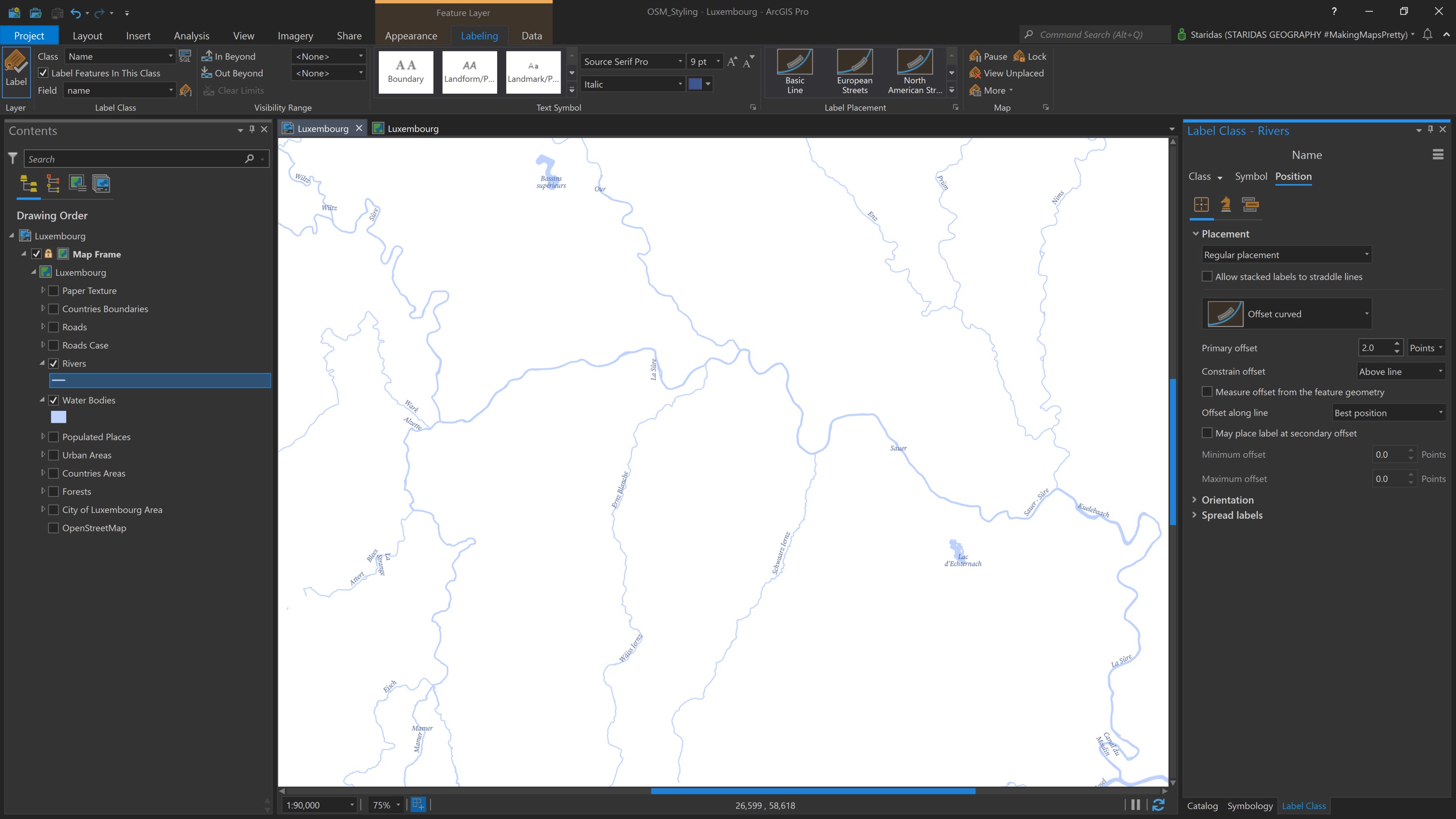
The Rivers layer includes a name field in its attribute table, which I use for labeling. In the Label Expression, I enter $feature.name.
For the font, I select Source Serif Italic, set the font size to 9 pt, and use #3D568F as the font color.
In the Placement properties, I choose Regular placement with Offset curved positioning and set the Primary offset to 2.0 points. The result is shown in Picture 12.
Transportation Features
OpenStreetMap provides a dedicated category for roads, called Highway, which includes a wide range of tags to describe all types of roads—ranging from major motorways to the smallest alleys.
For the purpose of this map, I don't need to include every road type, as the chosen scale (1:90,000) is best suited for county- or small-country-level mapping. Therefore, I focus only on the road features tagged as motorway, trunk, primary, secondary, and tertiary. To ensure a seamless and complete road network, I also include their corresponding link roads, identified by the tags motorway_link, trunk_link, primary_link, secondary_link, and tertiary_link.
These ten tags are stored as values in the highway field within the attribute table of the Roads feature layer.
To achieve the desired cartographic effect, I add the Roads layer twice to the map.
The first instance is used to create the casing for the roads and is named Roads Back. The second is used to symbolize the road types themselves and is named Roads Front.
Roads Back
The Roads Back layer (also referred to as Roads Case) is relatively simple to style. Once added to the Contents pane, I open its Symbology properties and apply a Solid stroke with the color #CD8966.
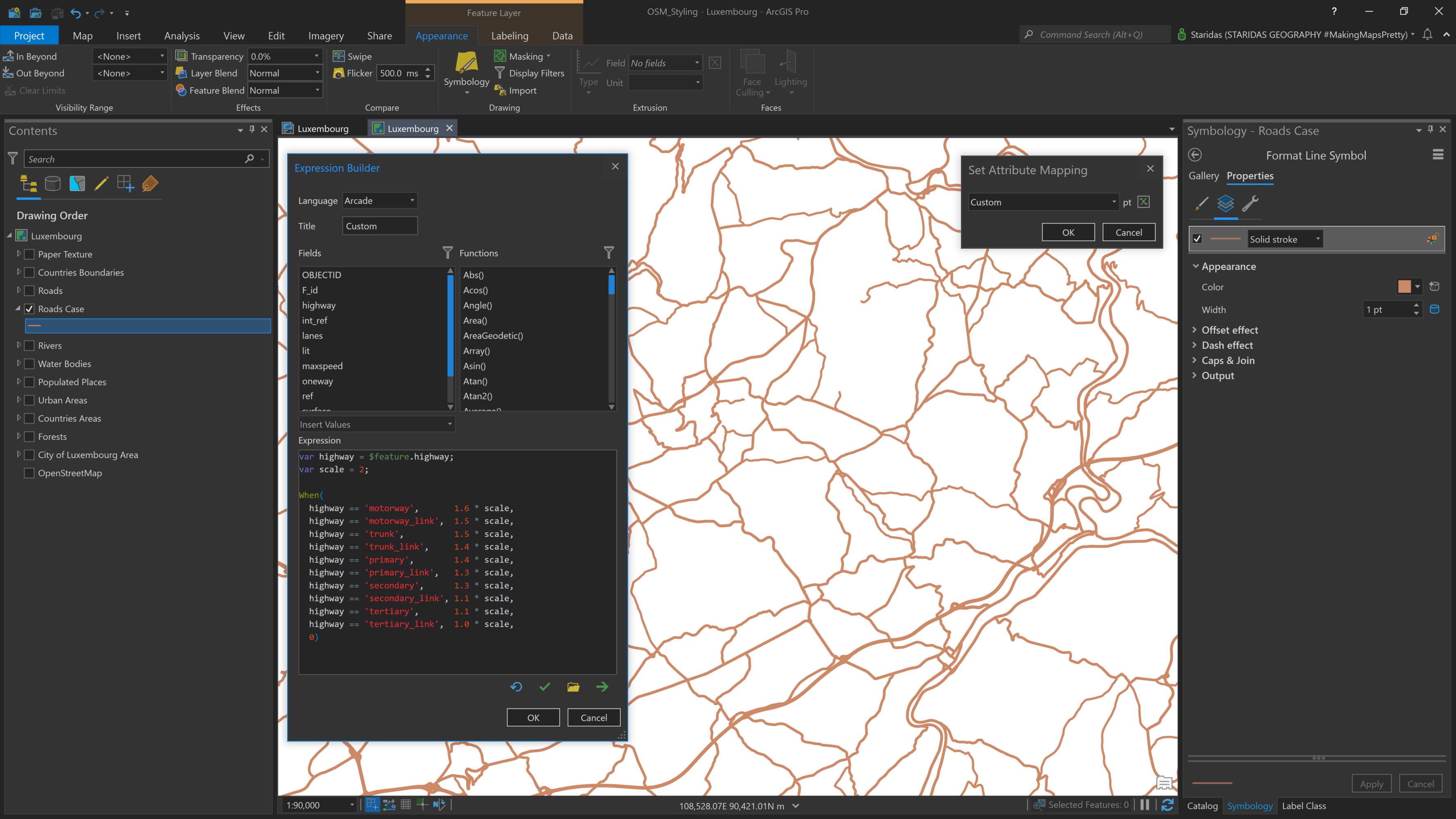
To visually distinguish between different road types, I use an Arcade expression to vary the line width based on the road classification. As mentioned earlier, each road type is represented as a value in the highway field within the roads layer's attribute table.
The expression is as follows:
var highway = $feature.highway;
var scale = 2;
When(
highway == 'motorway', 1.6 * scale,
highway == 'motorway_link', 1.5 * scale,
highway == 'trunk', 1.5 * scale,
highway == 'trunk_link', 1.4 * scale,
highway == 'primary', 1.4 * scale,
highway == 'primary_link', 1.3 * scale,
highway == 'secondary', 1.3 * scale,
highway == 'secondary_link', 1.1 * scale,
highway == 'tertiary', 1.1 * scale,
highway == 'tertiary_link', 1.0 * scale,
0
);
In this expression, I first declare a variable called highway, which references the highway attribute of the feature layer ($feature.highway). I then define a second variable named scale and assign it a value of 2.
Using the When() function, I construct a set of conditional statements to control the line width based on the road type. For example:
- When the highway value is motorway, the line width is set to 1.6 pt × scale
- For trunk, the width is 1.5 pt × scale
- For primary, 1.4 pt × scale, and so on
This approach ensures a proportional difference in width between road types, while also allowing me to uniformly adjust all line widths by simply modifying the scale factor.
The result is shown in Picture 13.
Roads Front
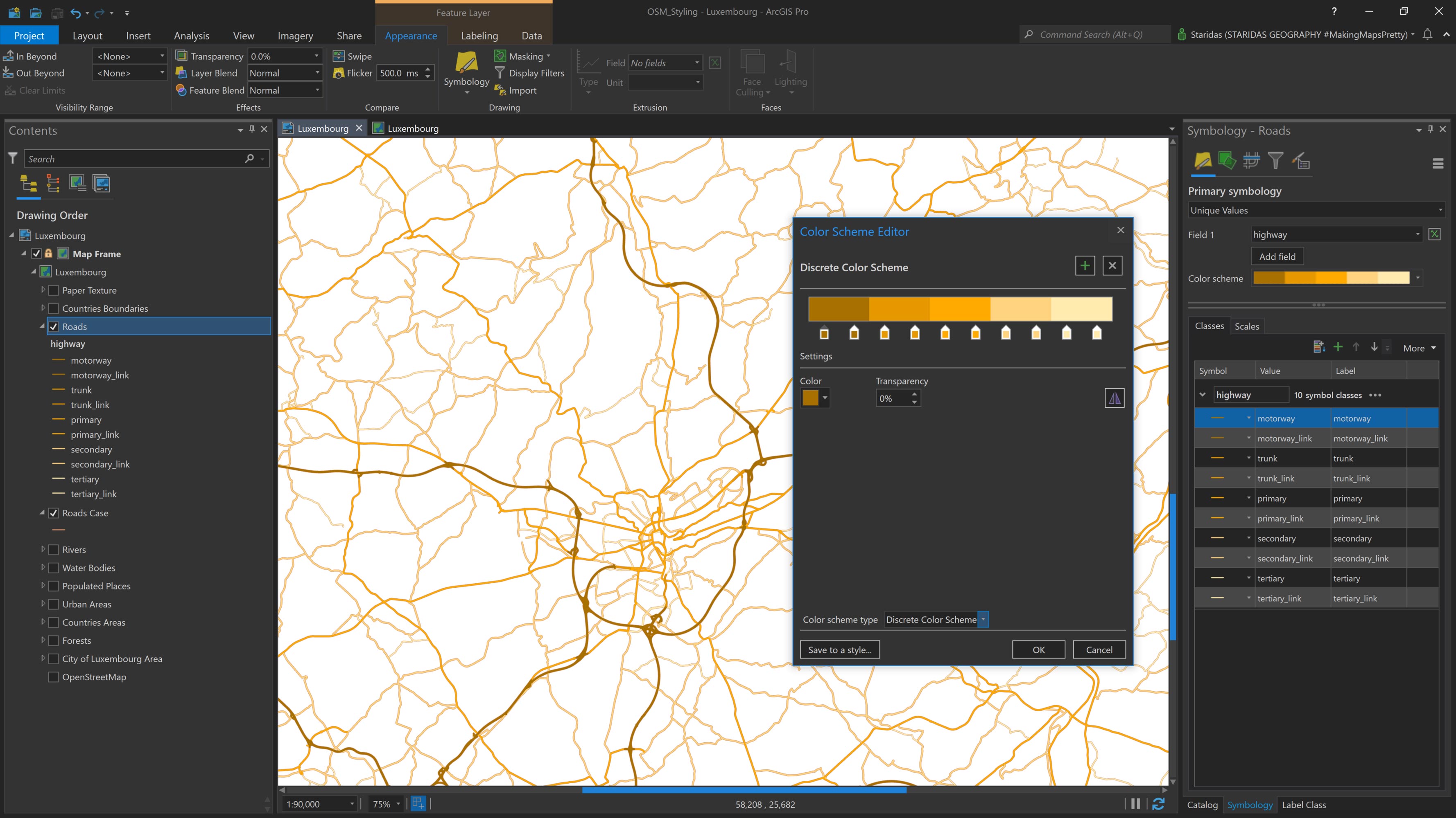
The Roads Front layer is a bit more complex to style and label. To start, I open its Symbology properties and, under the Primary symbology tab, I select Unique Values based on the highway field (see Picture 14).
Next, I rearrange the order of the symbol classes to match the road type order used in the previous Arcade expression. This can be done using the up/down arrows or by dragging each class into the correct position.
Rather than manually setting the color for each symbol class, I use the Color Scheme Editor (see Picture 14). I select a Discrete Color Scheme and create ten color stops—one for each road type. Although there are five main road types and their corresponding link types, I choose to treat them as separate classes for more precise styling.
As shown in Color Palette 1 and Picture 14, the colors I use for the five road types and their respective HEX values are:
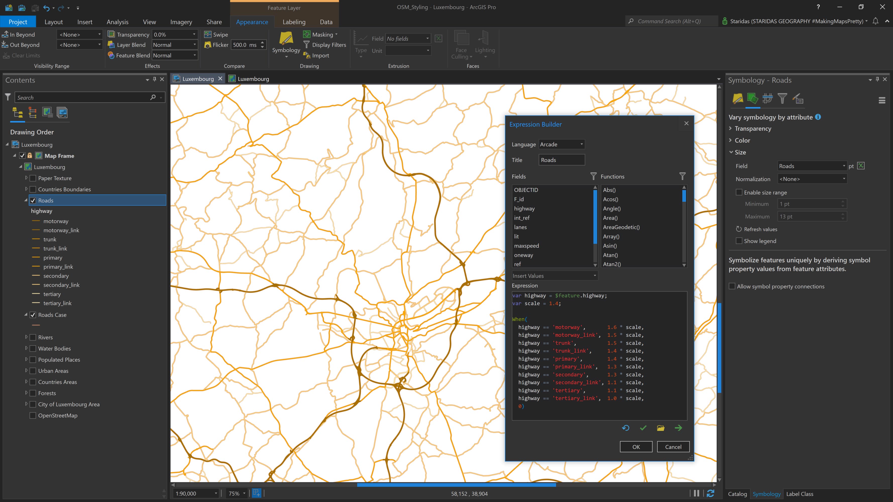
Visually distinguishing each road type by color is one important step—but just as important is differentiating them by line width. To achieve this, I navigate to the Vary symbology by attribute tab within the Symbology properties of the Roads Front layer (see Picture 15).
Since I want to vary the symbology by size, I focus on the Size section and open the Expression Builder to enter an Arcade expression (see Picture 15). The expression is as follows:
var highway = $feature.highway;
var scale = 1.4;
When(
highway == 'motorway', 1.6 * scale,
highway == 'motorway_link', 1.5 * scale,
highway == 'trunk', 1.5 * scale,
highway == 'trunk_link', 1.4 * scale,
highway == 'primary', 1.4 * scale,
highway == 'primary_link', 1.3 * scale,
highway == 'secondary', 1.3 * scale,
highway == 'secondary_link', 1.1 * scale,
highway == 'tertiary', 1.1 * scale,
highway == 'tertiary_link',  1.0 * scale,
0
);
This Arcade expression is identical to the one used to control the line width of the Roads Back layer (see Picture 13). The only, yet crucial, difference is the value of the scale variable, which is set to 1.4 for the Roads Front layer.
Although the relative widths for each road type remain the same, they are now multiplied by a smaller scale factor, resulting in thinner lines compared to the Roads Back layer. This ensures that the Roads Front layer sits neatly within the casing of the Roads Back layer, creating a clean, layered cartographic effect.
The final result is shown in Picture 15.
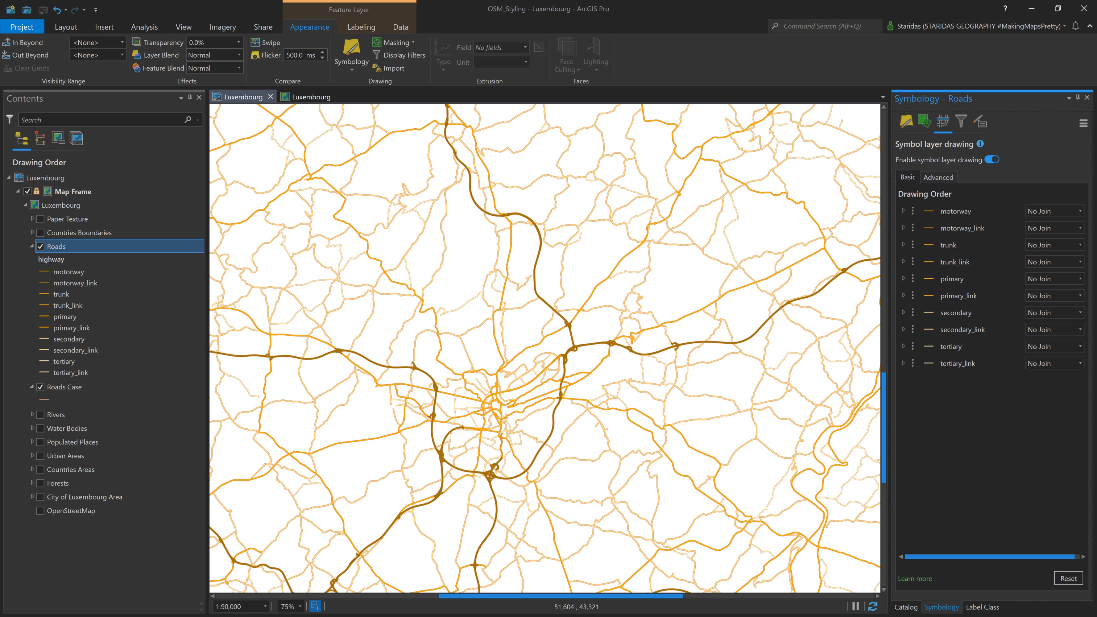
Another crucial step is to enable Symbol Layer Drawing for the Roads Front layer. To do this, I go to the Symbol Layer Drawing tab and check the option Enable symbol layer drawing.
This allows the road types to be drawn in a customized order, ensuring that more prominent road classes are visually prioritized over less prominent ones. The drawing order should match the structure shown in Picture 16.
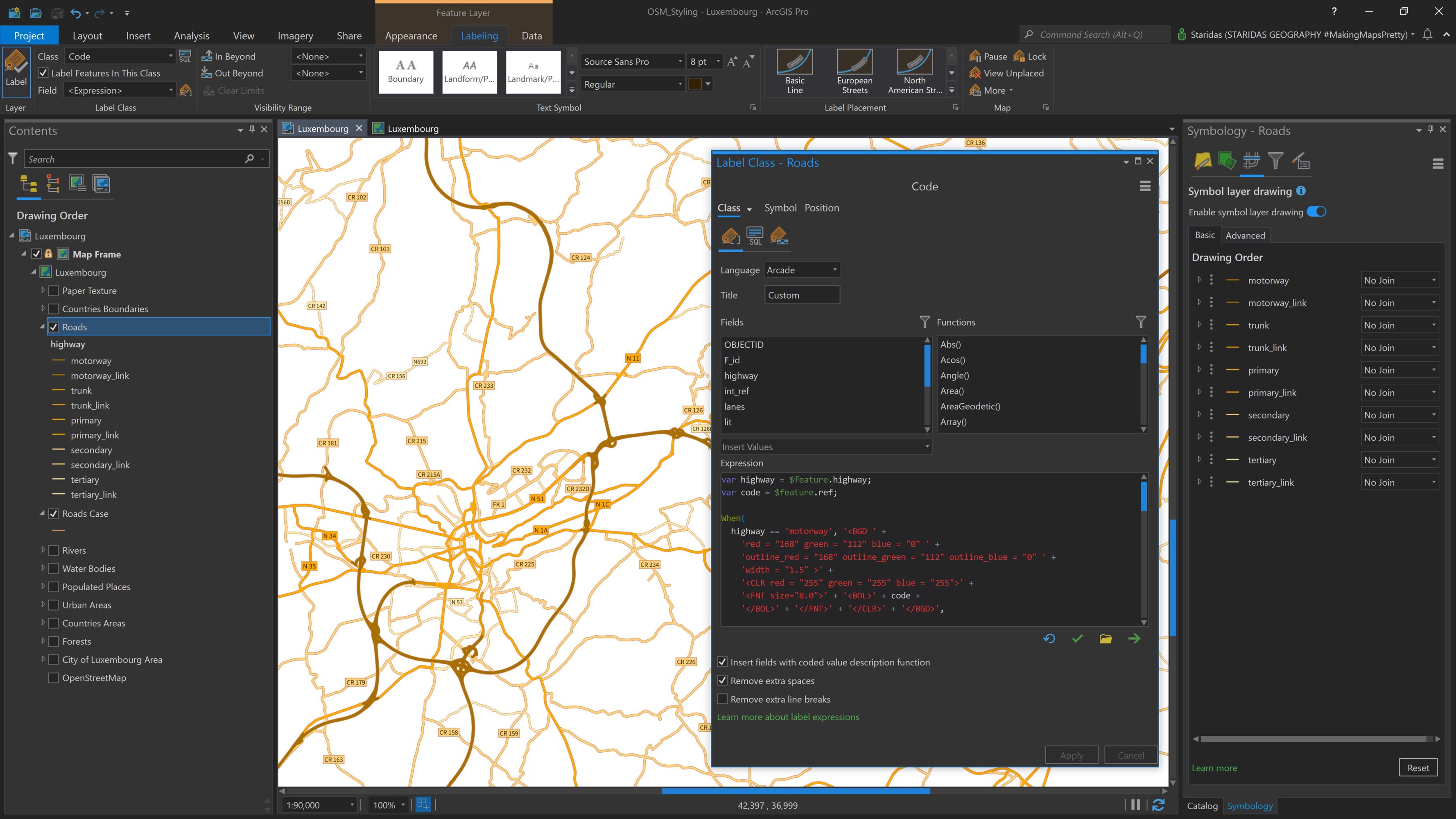
Now it's time to label the Roads Front layer. OpenStreetMap includes a ref field in the attribute table of the highway features, which contains the official road codes. I'll use this field to label each road.
Since I want the label style to vary by road type, one option would be to create multiple label classes—but instead, I use a more efficient method: Arcade expressions with Text Formatting Tags.
Text Formatting Tags provide a powerful way to manually style labels directly within an Arcade expression. I use them to create label boxes with custom fills, outlines, colors, and font sizes. The tags I use are:
- <BGD> to define the label's background color, outline color, and outline width
- <CLR> to set the font color
- <FNT> to specify the font size
- <BOL> to make the text bold
For consistency, I select Source Sans Regular as the font in the Labeling contextual tab. While I could define the font directly in Arcade, setting it once here is sufficient, since I'm using the same font throughout.
Next, I open the Label Expression Builder and enter the following Arcade expression:
var highway = $feature.highway;
var code = $feature.ref;
When(
highway == 'motorway', '<BGD ' +
'red = "168" green = "112" blue = "0" ' +
'outline_red = "168" outline_green = "112" outline_blue = "0" ' +
'width = "1.5" >' +
'<CLR red = "255" green = "255" blue = "255">' +
'<FNT size="8.0">' + '<BOL>' + code +
'</BOL>' + '</FNT>' + '</CLR>' + '</BGD>',

highway == 'trunk', '<BGD ' +
'red = "230" green = "152" blue = "0" ' +
'outline_red = "205" outline_green = "137" outline_blue = "102" ' +
'width = "0.5" >' +
'<FNT size="7.0">' + code + '</FNT>' + '</BGD>',

highway == 'primary', '<BGD ' +
'red = "255" green = "170" blue = "0" ' +
'outline_red = "205" outline_green = "137" outline_blue = "102" ' +
'width = "0.5" >' +
'<FNT size="7.0">' + code + '</FNT>' + '</BGD>',

highway == 'secondary', '<BGD ' +
'red = "255" green = "211" blue = "127" ' +
'outline_red = "205" outline_green = "137" outline_blue = "102" ' +
'width = "0.5" >' +
'<FNT size="6.5">' + code + '</FNT>' + '</BGD>',

highway == 'tertiary', '<BGD ' +
'red = "255" green = "235" blue = "175" ' +
'outline_red = "205" outline_green = "137" outline_blue = "102" ' +
'width = "0.5" >' +
'<FNT size="6.0">' + code + '</FNT>' + '</BGD>',
''
);
This is a longer Arcade expression, so I’ll break it down step by step. First, I declare a variable named highway, which references the highway attribute of the feature layer ($feature.highway).
Then, I declare a second variable called code, which represents the ref attribute ($feature.ref). The highway variable is used to differentiate label styles by road type, while the code variable provides the actual label text.
I then use the When() function to build a conditional structure that defines the label formatting for each road type. For example, for motorways, the expression states:
If highway == "motorway", then:
- Set the background color using RGB values: red = 168, green = 112, blue = 0
- Set the outline color with the same RGB values
- Set the outline width to 1.5
- Label the feature using the value of the ref field (code)
- Apply a font size of 8 pt
- Make the label bold
This logic is repeated for each road type, with adjustments to the RGB color values as needed. All colors are specified in RGB mode to ensure precise visual control.
For the final label placement, I choose Regular placement with Centered horizontal positioning. The completed labeling appears as shown in Picture 17.
Putting all Features Together
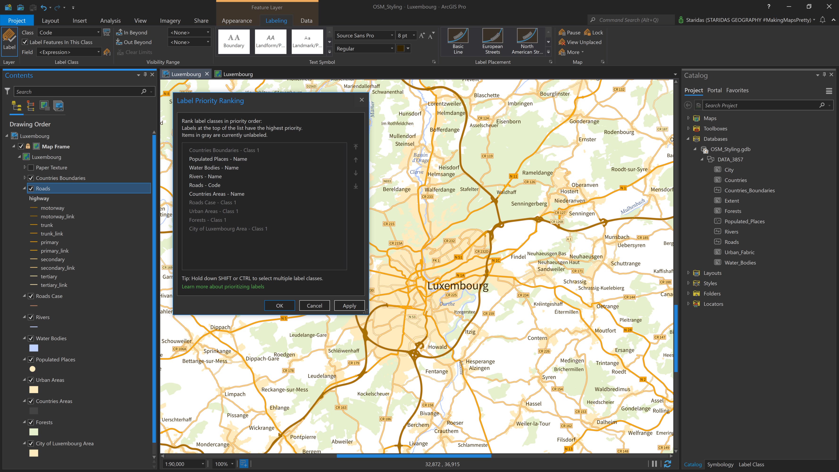
With all features now styled and labeled, it’s time to turn on all layers to see how they work together visually. At this stage, an important final step is to define the label hierarchy, which labels should take precedence when there’s overlap.
To manage this, I open the Label Priority Ranking panel and rearrange the label classes based on their relative importance, ensuring that the most critical labels appear clearly on the map. The updated ranking is shown in Picture 18.
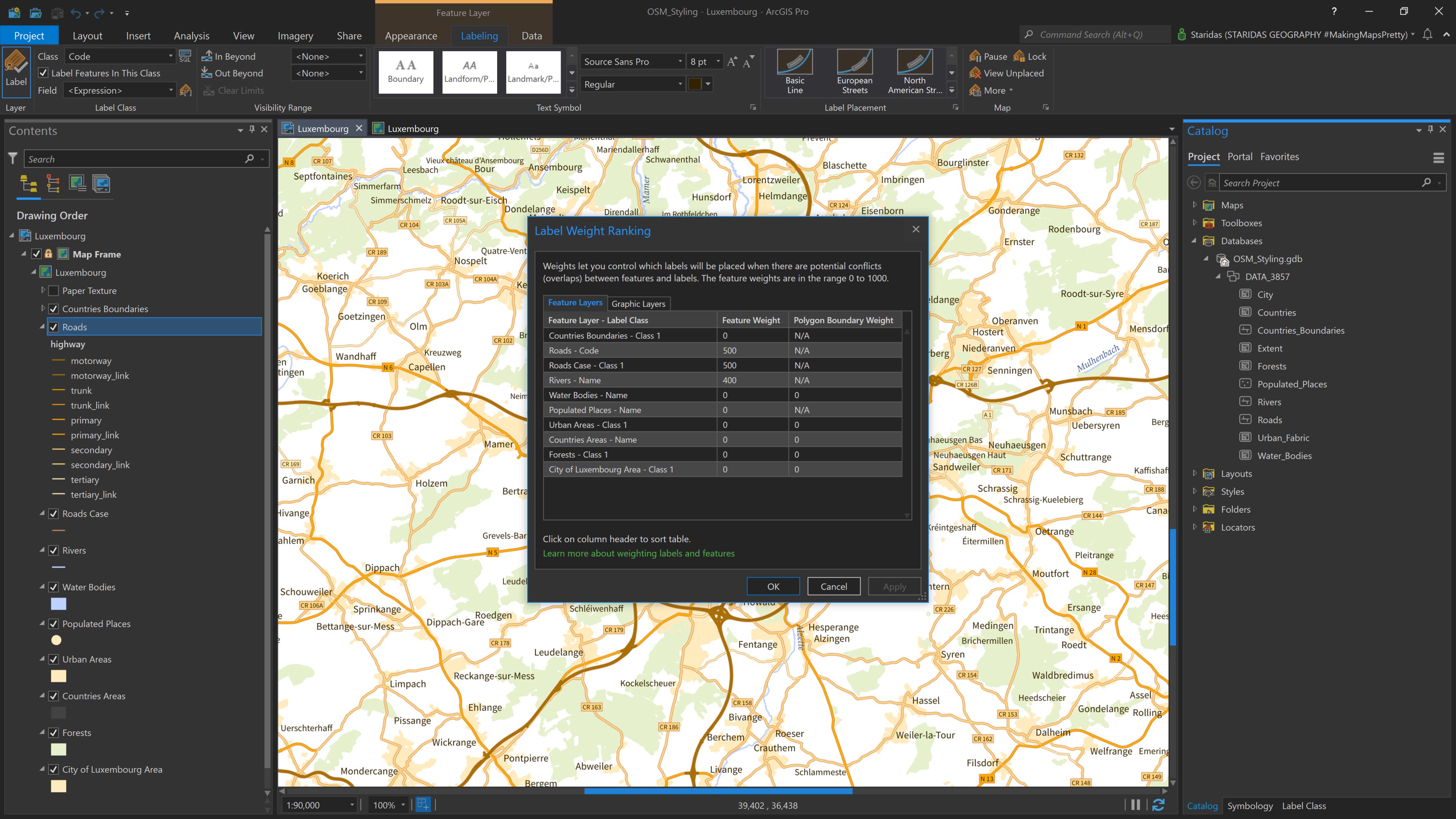
It’s also important to assign feature weights using the Label Weight Ranking dialog. This helps control how labels interact with features on the map. For example, preventing important features from being obscured by labels. The settings I use are shown in Picture 19.
Paper Texture
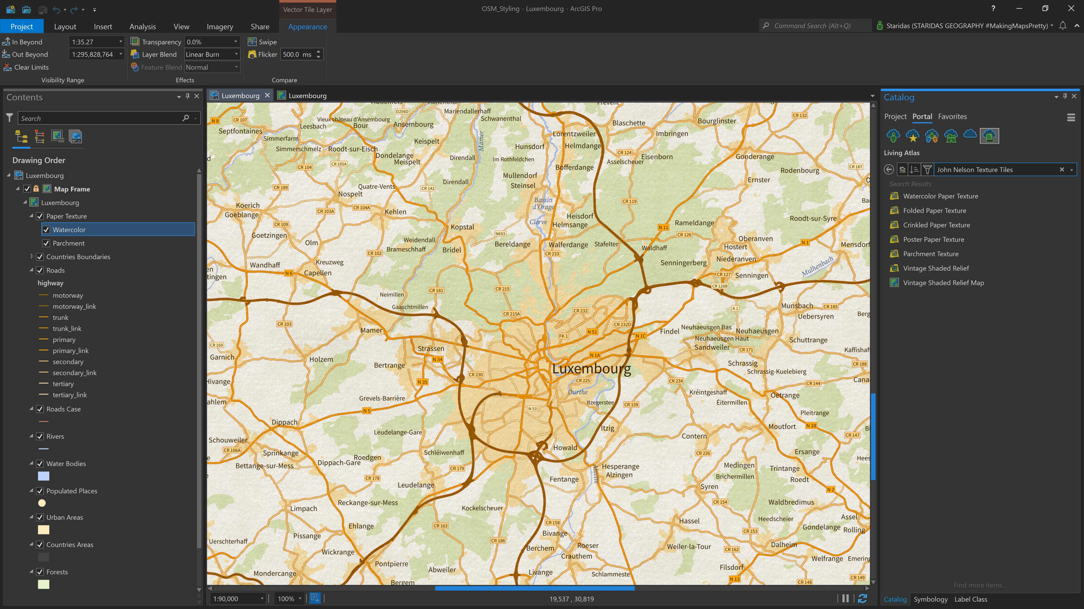
The final touch for the map is to add a paper texture, giving it a more tactile and stylized appearance. The Living Atlas offers a variety of high-quality Texture Tiles, including several that mimic different paper surfaces.
I access these directly from the Living Atlas via the Catalog pane, as shown in Picture 20. For this map, I add two textures: Watercolor Paper Texture and Parchment Texture.
I place both layers at the top of the Contents pane and apply a Linear Burn layer blend to each. This blending mode allows the textures to interact subtly with one another and with all the map layers beneath them, creating a cohesive and aesthetically pleasing finish (see Picture 20).
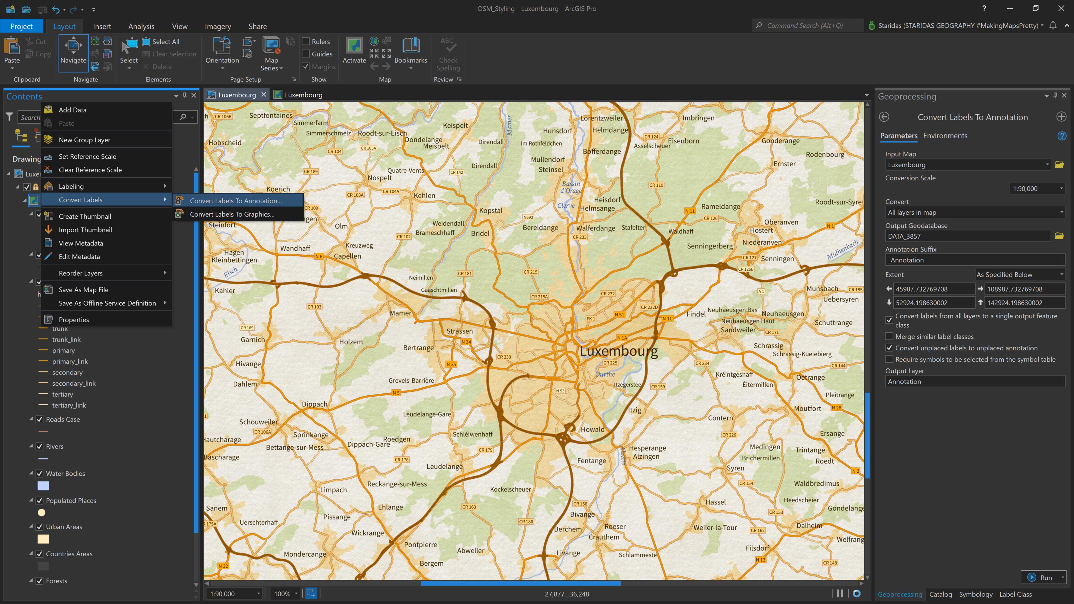
By default, dynamic labels are drawn above all map layers, including textures. This means that labels from all features will appear on top of the paper texture, which can look unrealistic and visually disconnected from the map design.
To fix this, a good practice is to convert all labels into a single annotation class (see Picture 21). Once converted, you can simply drag the annotation layer below the paper texture layers in the Contents pane. This allows the textures to overlay the labels slightly, creating a more natural, printed-map effect.
Conclusion
As we reach the end of this article, I truly hope you found it helpful and enjoyed following my approach to understanding and styling OpenStreetMap data in ArcGIS Pro.
I’ll admit—I’m a bit obsessed with Arcade! But if it’s not your preferred tool, rest assured that you can always achieve excellent results using ArcGIS Pro’s classic symbology and labeling options.
To make things easier, I’ve uploaded the entire ArcGIS Pro project featured in this article as a compact Map Package to my ArcGIS Online account. It includes all the associated layers, symbology, and Arcade expressions. You’re welcome to download and use it freely under a CC BY-NC-SA 4.0 license.
I would like to express my sincere thanks to Esri and John Nelson for sharing my article. It is a true honor to see my work featured on the Esri ArcGIS Blog, and it’s incredibly rewarding to know that others may benefit from the techniques I’ve developed.
And if you’ve read this article, enjoyed it, found it useful, or learned something new, don’t forget to like, share, or leave a comment on Esri’s posts on Twitter or Instagram. Your feedback and engagement mean a lot! I’m always open to feedback, suggestions, or ideas for improving these workflows and styling methods, so please don’t hesitate to reach out!
Kindest regards from Crete, Greece!
Spiros