A map of the world that does not include Utopia is not even worth glancing at...
– Oscar Wilde
Prologue
There is a map of a place that does not exist. It was engraved in copper sometime around 1595 by Abraham Ortelius, the same Flemish cartographer who produced the first modern atlas, and it depicts, with full cartographic ceremony, the imaginary island of Utopia as described in Thomas More's novel of 1516. It has cities with names drawn from a dozen languages, rivers named after whatever they lack, mountains, forests, ships at sea, and a sea monster in the waters. Only one copy is known to survive. It is, by any measure, one of the strangest and most beautiful objects in the history of cartography.
This article is the story of my obsession with that map, and of everything I did to bring it into the twenty-first century. It begins with More's novel and the maps that accompanied its earliest editions, moves through Ortelius' extraordinary reimagining of the island, and then follows my own journey: studying the map in depth, digitizing and recording all its fictional geographical features in QGIS, and working with Gemini AI to analyse the invented place names, the cities, rivers, and mountains, exploring their linguistic origins and meanings. From there it goes into Adobe Photoshop, where I recoloured the originally colourless copperplate engraving from scratch, applying watercolour techniques, complementary colour theory, and a Wacom tablet to give the map the palette I felt it had always deserved.
And it ends with code, HTML, CSS, JavaScript, and MapLibre GL JS, built into an Interactive Web Mapping Application that lets anyone navigate the island of Utopia, click on its cities, read their stories, and get genuinely, happily lost in a place that has never existed. The Interactive Web Mapping Application is deployed and live. Feel free to explore it yourself before reading, after reading, or both. It is fully responsive, optimised for all screen sizes, and built on MapLibre GL JS.
If you have ever cared about maps, about the history of ideas, about colour, about design, or about the particular pleasure of going very deep into something that most people walk past without a second glance, this post is for you.
A Brief History of Utopia
The story of Utopia begins with a book. In 1516, the English lawyer, humanist, and statesman Sir Thomas More published a slim Latin novel titled De optimo reipublicae statu deque nova insula Utopia, today known simply as Utopia. More coined the word from the Greek ou-topos (no place) and possibly eu-topos (good place): a deliberate pun on an island that is ideal, yet nowhere to be found. Written probably at the encouragement of his friend Erasmus, the book describes a fictional traveller, Raphael Hythlodaeus, who recounts the political and social arrangements of the island nation of Utopia to More and a companion. The name Hythlodaeus is itself laden with meaning, combining the archangel Raphael, bearer of truth, with a Greek surname meaning roughly "speaker of nonsense." The narrator, in other words, cannot be fully trusted. This ambiguity is at the heart of More's brilliant creation.
In Utopia, land is held communally, men and women are educated equally, and religious tolerance is near-absolute. The island has 54 cities, all built to look exactly alike, a spatial expression of equality and justice. The most important of these is Amaurotus, whose name in Greek means "misty place" or "dark, faint, obscure", a capital city that, like the island itself, is impossible to quite pin down. More used the fictional geography as a vehicle to comment freely on the social and political controversies of his own time. He was later executed in 1535, after refusing to acknowledge Henry VIII as Supreme Head of the Church of England, and was canonised by Pope Pius XI in 1935.
The first edition of Utopia was accompanied by a small woodcut map, a simple but significant image showing the island as a crescent-shaped landmass with a harbour, drawn to illustrate Raphael's descriptions. This map was included and updated in several early editions, like the one in 1518, establishing a visual tradition that Utopia was not merely a literary concept but a place, a place you could, at least imaginatively, locate on a page.
Nearly eighty years later, that tradition was taken to its most spectacular conclusion. Around 1595–1596, the great Flemish cartographer Abraham Ortelius, creator of the first modern atlas, the Theatrum Orbis Terrarum, produced a magnificent copperplate engraved map of Utopia. Titled VTOPIAE TYPVS (A Map of Utopia), the map was engraved to the dimensions of 380 × 475 mm and survives today in a single known copy, now in the collection of the King Baudouin Foundation, entrusted to the Plantin-Moretus Museum in Antwerp.
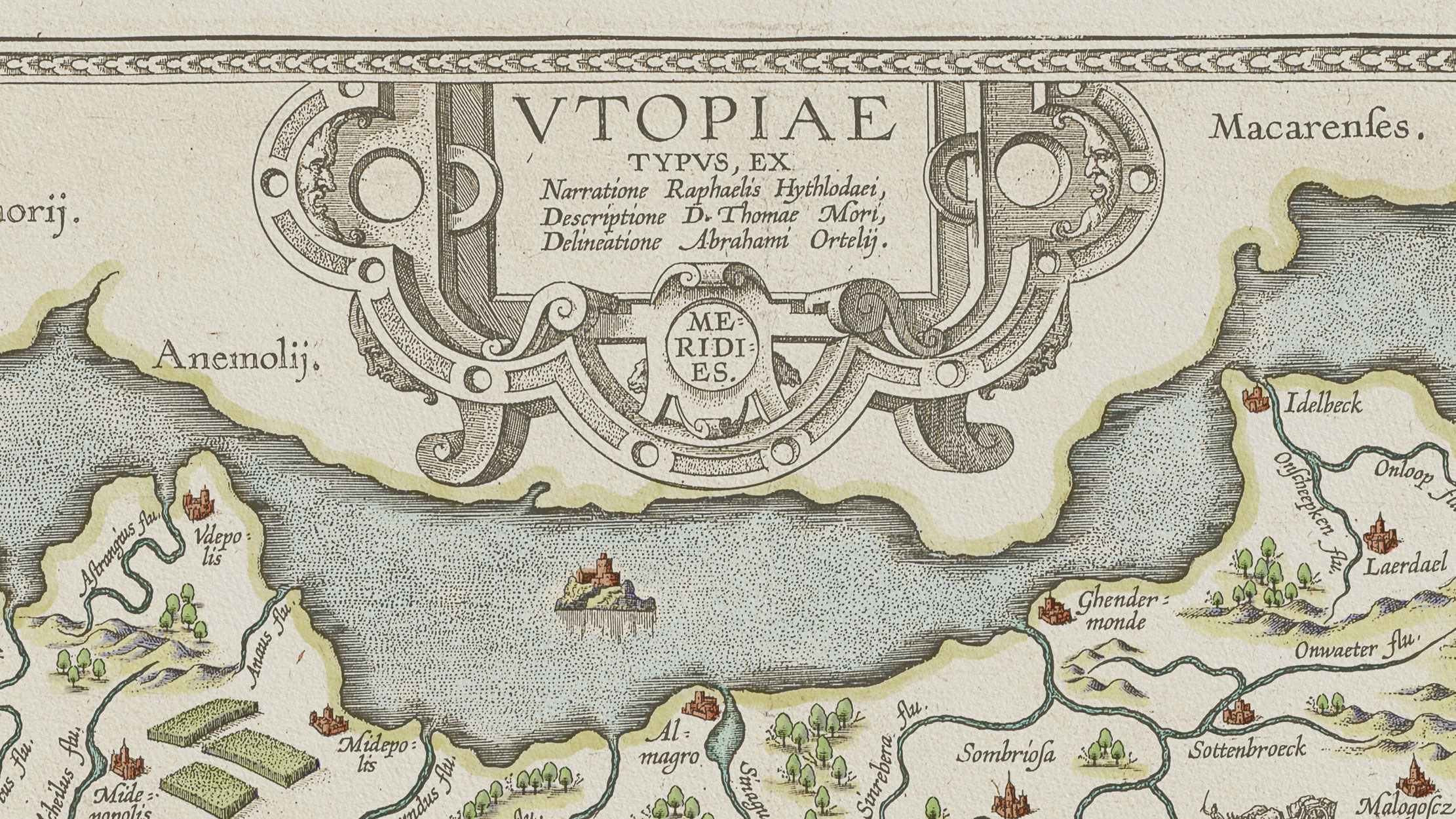
The map is a remarkable document, and its making was a collaborative act of learned friendship. It was initiated by Johannes Matthäus Wacker von Wackenfels (1550–1619), a multilingual jurist, poet, and imperial adviser who was part of the intellectual elite of late Renaissance Europe. Wacker sent Ortelius a list of 54 place names for the cities of Utopia, drawn from more than ten languages — Ancient Greek, Latin, German, Italian, French, Spanish, Dutch, Polish, Turkish, and others — so that, as Wacker wrote to his friend Jacob Monau, "each nation may recognise something of its own in this Utopia." The river names were produced in the same spirit, each one meaning some variation of "river without water," "river without fish," or "river without banks," in whatever language the creator chose to employ. Even the rivers of Utopia have nothing in them.
Ortelius took the 54 cities and added one more: "Favolia", named after the Antwerp scientist Johannes Baptista Favolius, bringing the total to 55. He also quietly slipped tributes to his closest collaborators into the river names: "Ortileus flu." (an anagram of his own name), "Felsius flu." (after Wackenfels), and "Mavonius flu." (after Monau). It is a map signed not in the corner, but hidden in the landscape itself.
The map was dedicated to Wacker von Wackenfels and appears to have been produced as a gift for a small circle of humanist friends. Ortelius reportedly had twelve copies printed, and beyond those, no others are known to have survived. The sole extant copy went to Britain — one of those twelve — and eventually found its way into the Belgian royal collection. There is no text on the verso of this copy, suggesting it was made as a presentation piece rather than for commercial publication.
What makes Ortelius' map so extraordinary is not just its erudition, but its ambition. This is a fully realised cartographic portrait of an imaginary world, complete with cities, rivers, mountains, forests, coastlines, ships at sea, and a sea monster in the waters. It applies the full visual grammar of sixteenth-century cartography to a place that, by definition, does not exist. It is at once a cartographic masterpiece, a Renaissance joke, and one of the most tender documents in the history of friendship and scholarship.
Collection & Preparation of the Utopia Map
I downloaded Ortelius' Map of Utopia from the Plantin-Moretus Museum website, which provides a free version available for download. Their page also mentions that a higher-resolution version can be provided upon request, so I contacted the curator, and they very kindly sent it to me. As it turned out, the version I had already downloaded from their site was sufficient for my purposes, and I proceeded with that. I owe a sincere thank you to the museum curator for their trust and generosity.
The full credit for the map is as follows:
Abraham Ortelius, Map of Utopia, c. 1595–1596. Copper engraving, 380 × 475 mm. Coll. King Baudouin Foundation, Charles Vreeken Fund, entrusted to the Plantin-Moretus Museum, Antwerp. Figure: Collectie Stad Antwerpen, Michel Wuyts & Bart Huysmans.
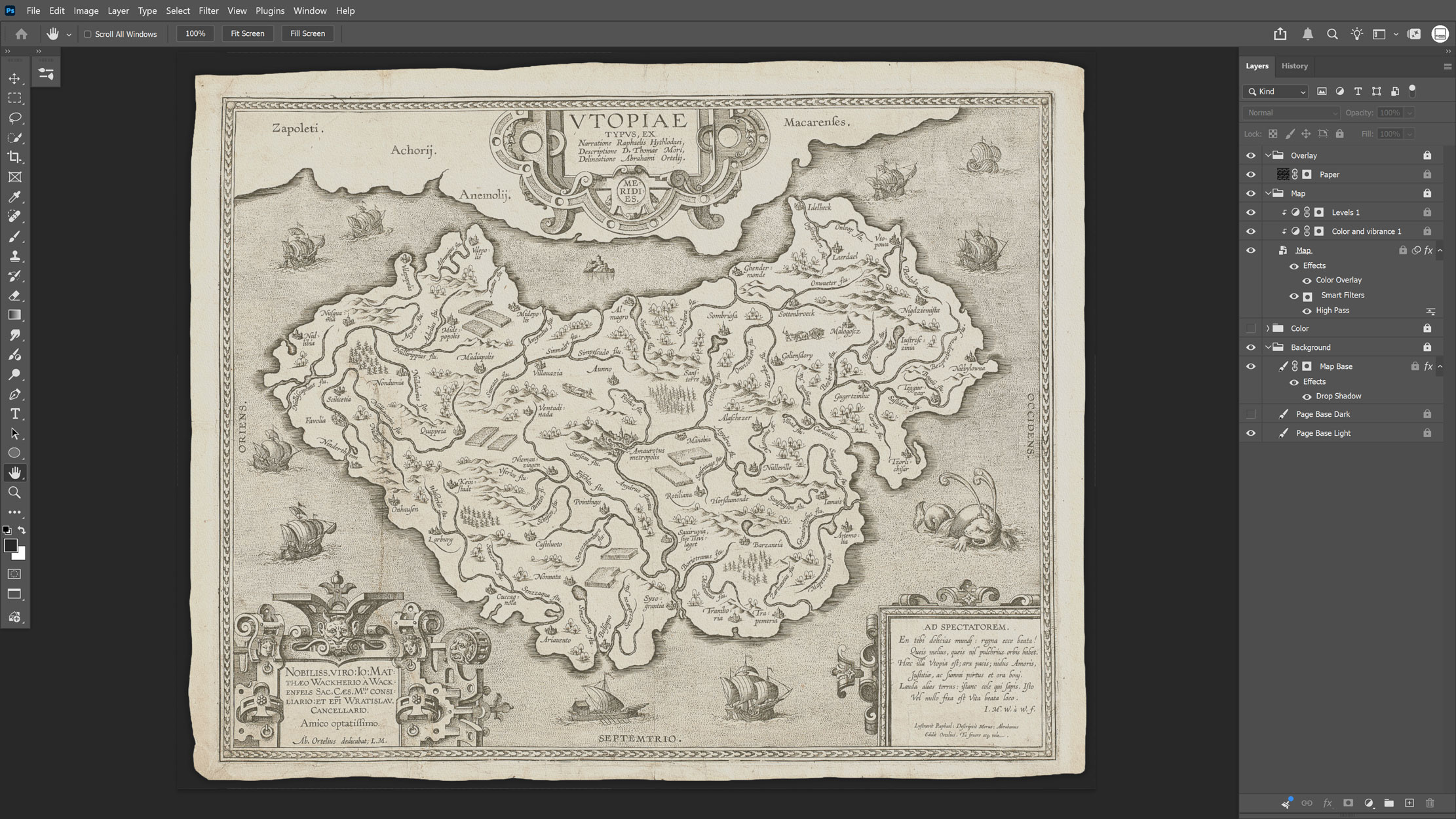
Once I had the scan, I imported the colourless engraving into Adobe Photoshop, where I corrected its contrast and overall appearance, and repaired any visible flaws in the scan. The colourless version as it appeared in Photoshop is shown in Figure 2.
Recoloring in Adobe Photoshop
Inside Photoshop I thoroughly examined the map and identified all the categories of imaginary features it contains: cities, rivers, mountains, trees, crops, and so on. I then divided these features into two groups: those that form the ground, like the sea, the land, the land vignette along the coast, and the rivers, and those that form the figure, like the cities, crops, trees, mountains, and the marine elements such as the medieval ships and their sails. Establishing this figure/ground relationship gave me a clear framework for selecting colours.
I wrote down a complete list of every identified feature, organised by figure and ground, and then moved on to choosing and applying colours. I was careful to balance the extent of each feature on the map with the perceived intensity of its colour, and to make decisions consistent with the medium I was trying to evoke: watercolour. For the watercolour effect itself, I used Kyle's custom brushes in Photoshop, which simulate watercolour in various brush sizes. I painted each colour on its own separate layer, and applied everything manually using a Wacom Intuos drawing tablet, which worked beautifully with Photoshop.
Figure 3 focuses on a detail from the central part of the map, showing all the inland imaginary geographical features and allowing a direct comparison between the original colourless copperplate engraving (left) and my recoloured digital version (right). As you can see in Figure 3, I also applied an aquarelle paper texture over all the colour layers and the original map, to further enhance the sense of something hand-painted in watercolour.
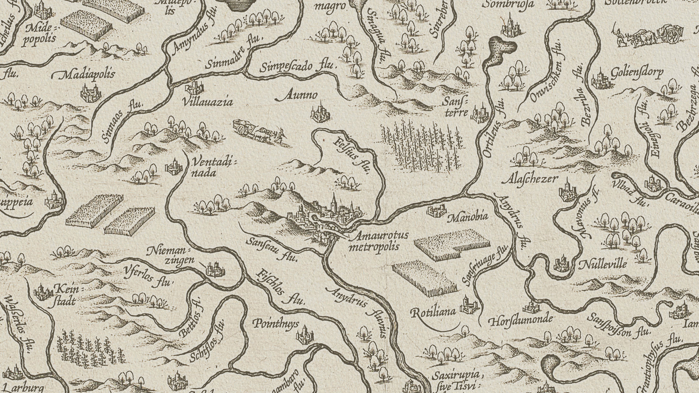
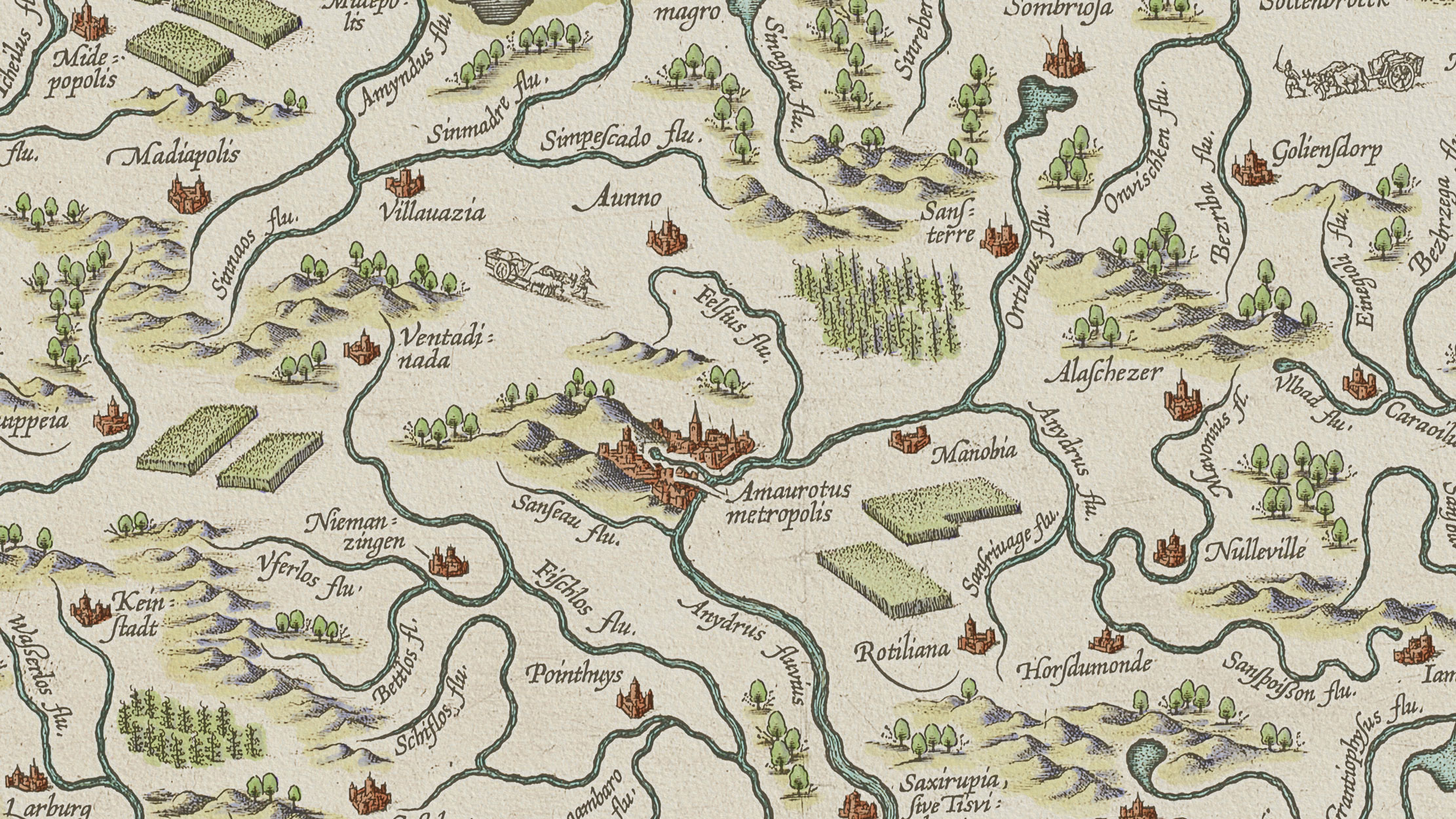
Table 1, at the end of this chapter, lists all the colours I applied to the map and includes a detailed analysis of their three dimensions: hue, saturation, and value (brightness). For each dimension, both the named value and a visual bar chart are provided, making it easy to understand the relationships between colours, their contrasts and harmonies.
Figure 4 shows only the digital watercolours as applied in Photoshop, without the overlying copperplate engraving. This figure presents my colour selections for each feature of the map and also illustrates the complementary shading techniques used throughout. In the following paragraphs all colours are explained and justified
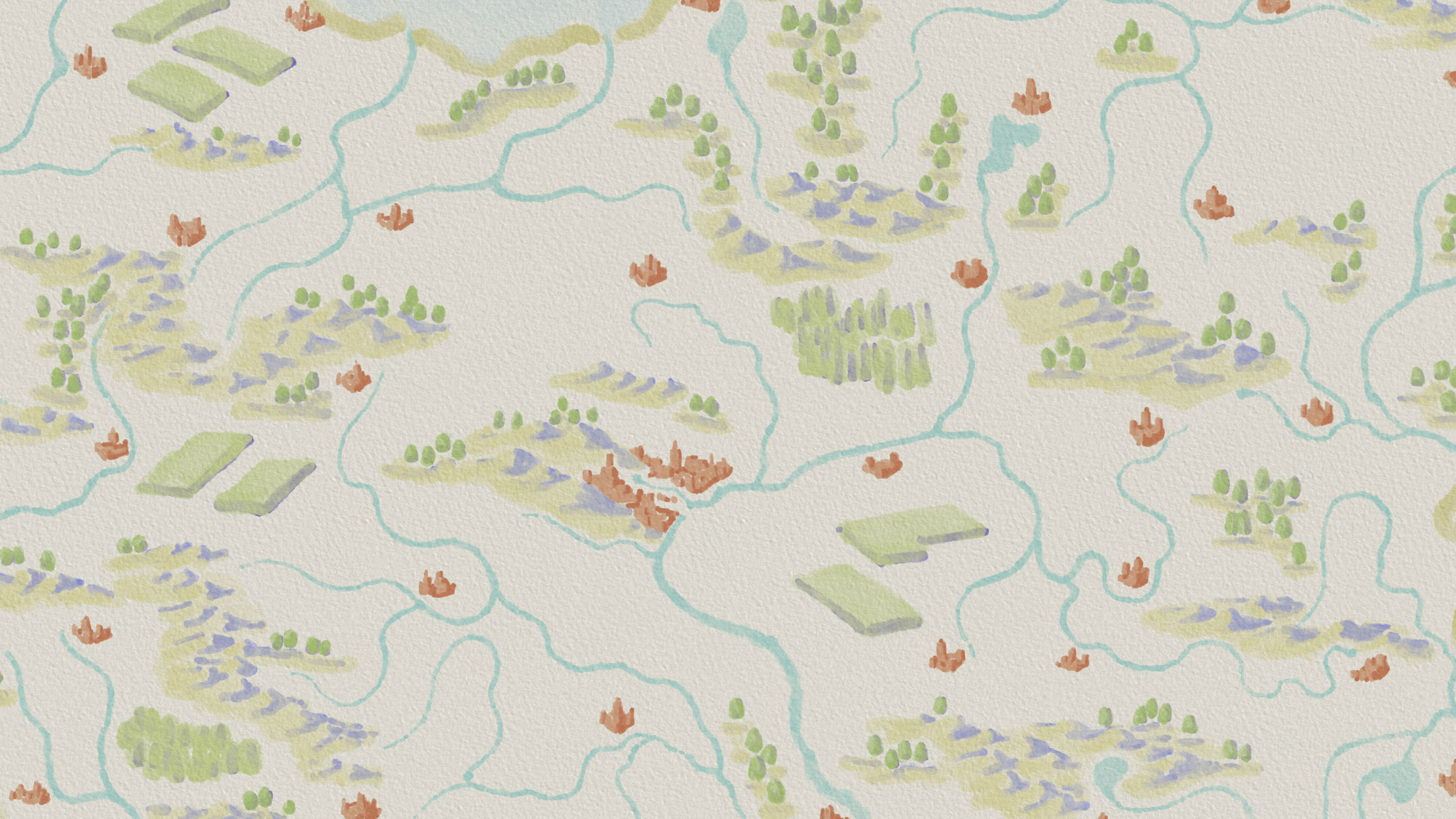
The Cities
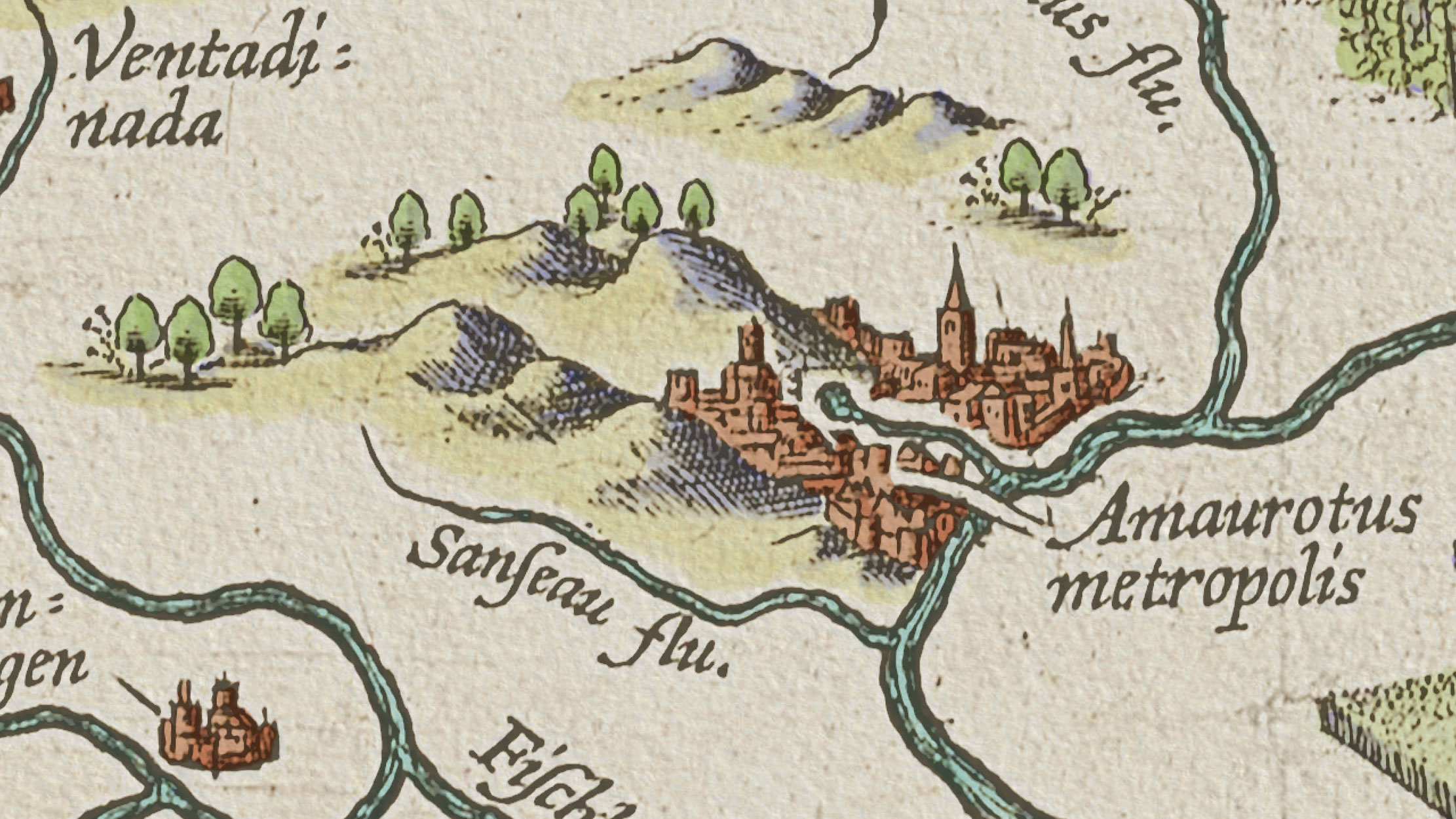
Thomas More, in his original novel, described the imaginary island of Utopia as having 54 cities, all built to look alike, a physical embodiment of equality and justice. Ortelius added one more and depicted all 55 cities on his map. The cities of Utopia are fortified settlements, drawn with outer walls, internal buildings, and watchtowers. The way they are engraved implies a light source at the top-left corner of the design: each city has a sunny side, typically facing west, and a shaded side, typically facing east. I took advantage of this pattern and applied colour City 1 to the sunny sides of the cities and colour City 2 to their shaded sides.
These two red-hued colours form a monochromatic sequence: the first is lighter and less saturated, and the second is slightly darker and more saturated (see Table 1). This pairing enhances the three-dimensional appearance of the cities and also gives the map a feeling of late afternoon, the sunny sides glowing like a summer sunset. The red of the cities is also the most saturated and visually prominent colour on the entire map — and the only red. By making full use of this contrast in both hue and saturation, the cities immediately catch the eye at first glance.
Figure 5 shows the capital of the imaginary island: Amaurotus metropolis, the only city name taken directly from More's original novel. All the other city names were entirely invented by Ortelius. The application of the two city colours is clearly visible in Figure 5: the sunny side faces the imaginary setting sun, while the shaded side recedes into shadow.
Crops and Trees
Next came the greens. These divide into two categories: crops and trees. Both belong to the organic, nature-made features of the map and, unlike the cities, they lack a structured geometric pattern. Even so, I wanted to give them a three-dimensional quality to match the look and feel of the rest of the map, not a flat, decorative colouring, but something with depth.
The crops are represented as mostly rectangular, isometric-looking blocks, a design choice by the original engraver that worked perfectly for my purposes. I applied the colour Crops 1 (a yellow-green hue) to their visible surfaces, which already read as isometric. To push the three-dimensional illusion further, I applied colour Crops 2 (a purple hue) to the shaded, sun-hidden sides of the crop blocks.
The choice of purple is not arbitrary. This is a technique borrowed from traditional watercolour painting: using the complementary colour for shadows. Crops 1 and Crops 2 are true complementaries since their hues sit at 70° and 250° respectively on the colour wheel (see Table 1). I applied Crops 2 beneath Crops 1, so the purple only breathes through in the shaded areas. The effect is subtle and most readers won't consciously register the purple. But you'll feel it. The idea is not to see it, but to sense it. Figure 6 shows two blocks of crops where the interplay of these two colours is visible.
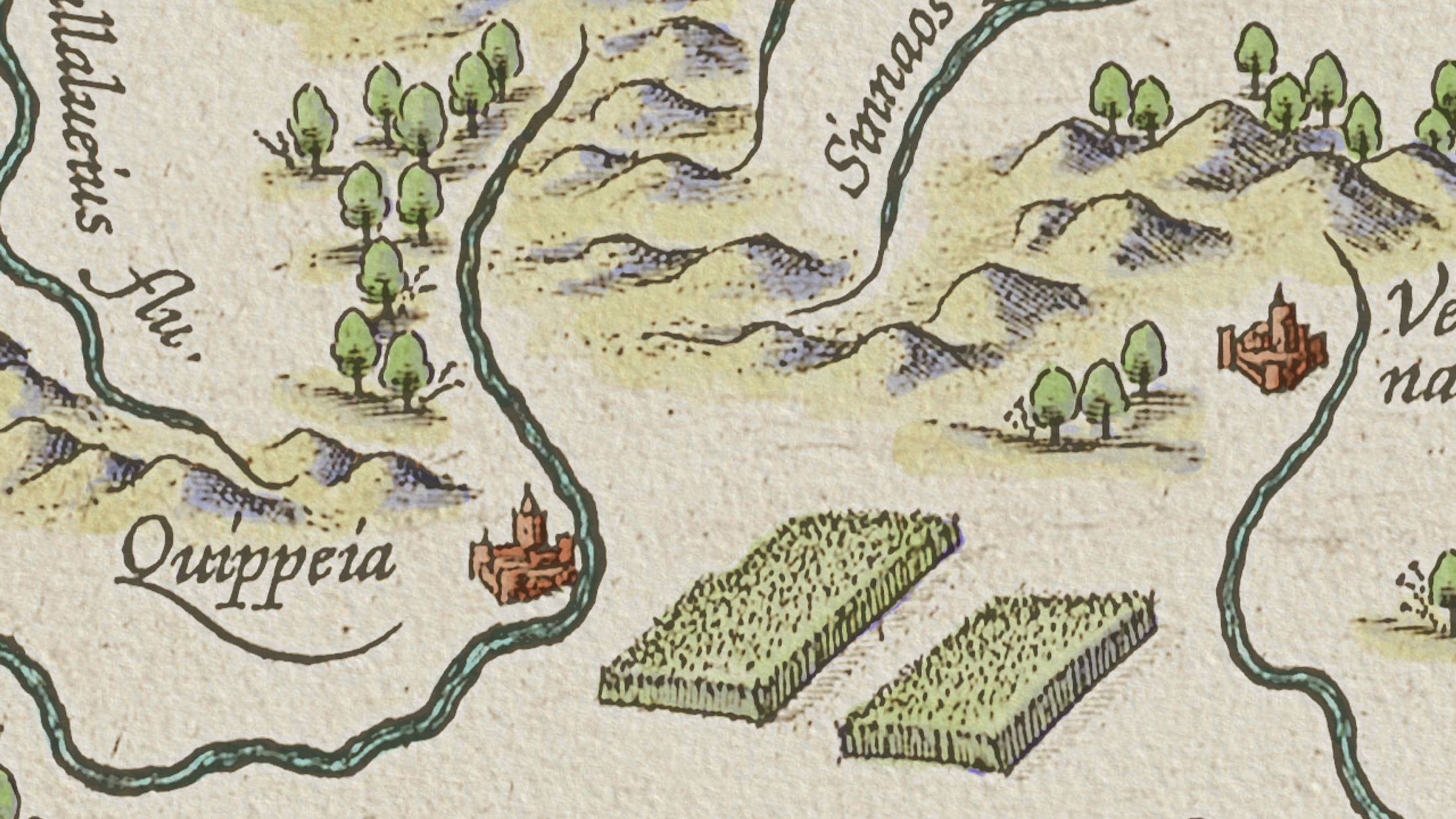
The green of the crops is lighter and less saturated than the green used for the trees. This was a deliberate decision: crops occupy a larger area on the map than trees, and a lighter, less intense colour produces a better visual balance.
The hue of the crop green also leans more toward yellow, again intentional, since cultivated land tends to appear yellowish-green or even straw-coloured in nature, whereas wild forest trees are a deeper, cooler green. Following this logic, it made complete sense to use the colour Tree 1, a greener, more saturated, and darker green, for all the trees (see Table 1). Semiotically, this green says: wild nature, forest. For the trees' shaded sides, I applied Tree 2, the complementary of Tree 1 (hues at 80° and 260°, as shown in Table 1), following the same watercolour shadow technique used for the crops.
Figure 6 is in fact an excellent close-up for comparing both sets of complementary colour pairs — Crops 1 and Crops 2 alongside Tree 1 and Tree 2 — and for seeing why smaller features on the map deserve darker, more saturated colours while larger-extent features call for lighter, more restrained ones.
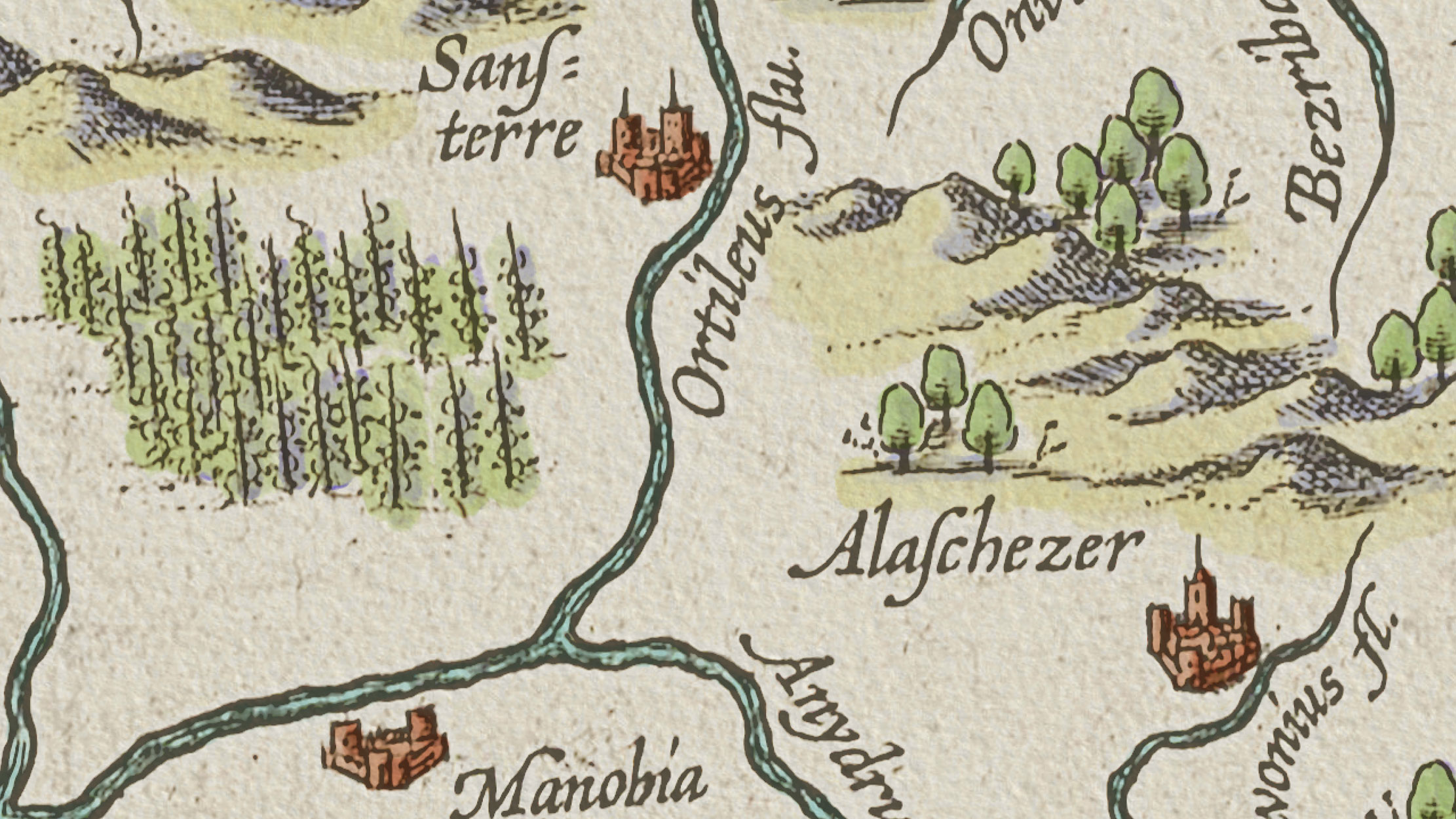
Figure 7 shows a third category of green feature, a group of plants that look very much like vineyards. I am not entirely certain what they are, but they read as cultivated plants, and since grapes are undeniably a form of cultivation (and wine feels like an entirely appropriate companion for reading a Utopia map, let alone making one) I applied the same colours I used for the other crops: green on the sunny parts and purple in the shadows.
Mountains
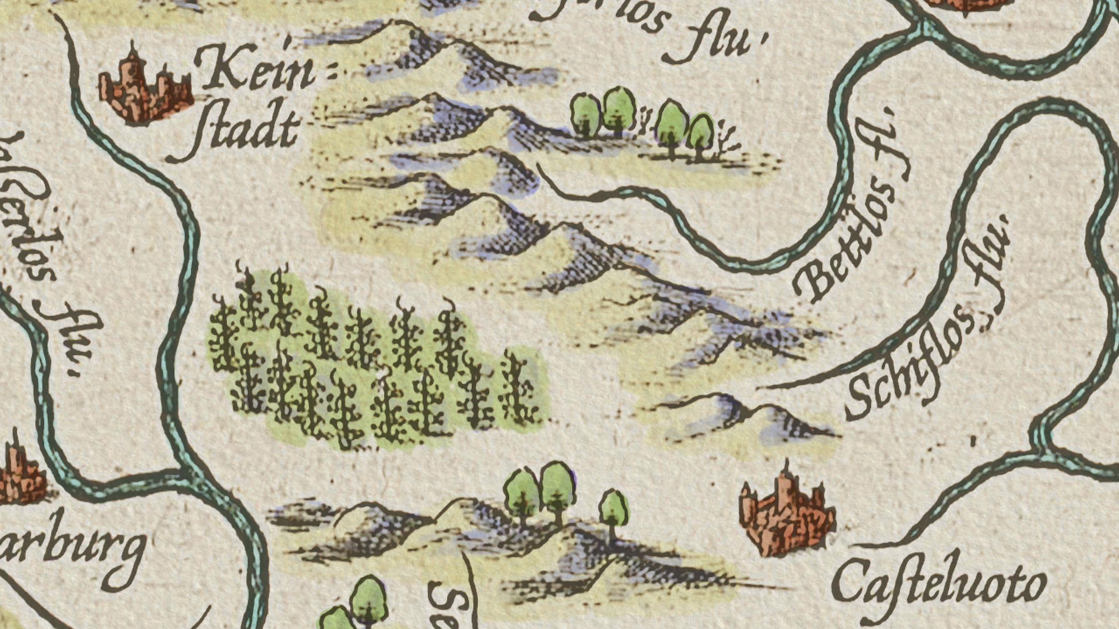
The mountains are depicted in the traditional perspective style of sixteenth-century copperplate engraving: hatch and cross-hatch patterns indicate the shaded sides, the sunny sides are left unworked, and simple lines trace the ridgelines as seen from an oblique angle. To make the mountains stand out even more and give them convincing three-dimensional presence, I applied the same technique as before: two complementary colours, one warm for the sunny sides and one cool for the shaded sides.
For the sunny sides, I chose Mountain 1, a very bright, low-saturation pale yellow (see table 1). The mountains occupy considerable space in the composition, so following the same logic I established for the crops, I opted for a colour with low intensity but enough presence to clearly differentiate itself from the background.
For the shaded sides, I used Mountain 2, the complementary blue, which shares the same brightness level but is slightly more saturated (see table 1). Rather than layering the yellow heavily over it, I let the blue breathe and prevail in the shadow areas, with only very light, subtle touches of yellow on top. This creates an immediate illusion of depth by exploiting both the complementary contrast and the colour temperature contrast between warm and cool, a well-established technique in painting for suggesting recession and light.
Figure 8 shows a north-south mountain range where the application of Mountain 1 and Mountain 2 on the sunny and shaded sides is clearly visible. The figure also illustrates how the full colour palette of the map works together in visual balance, and reveals the intended visual hierarchy: the red cities are seen first, the bright green trees second, the crops third, and the mountains settle quietly behind them, receding toward the land.
Rivers
The rivers belong to the ground. Having spent considerable time on the figure features, it was now time to address the actual land of the imaginary island and the waterways that flow through it. The rivers of Utopia emerge from the mountains and wind their way across the land until they reach the sea.
I coloured them with Rivers, a very bright, low-saturation cyan (see Table 1). I chose cyan rather than blue deliberately, because cyan is the complementary of red and I wanted the rivers to visually resonate with the red cities, the two most clearly identifiable feature groups on the map. The red-cyan complementary pairing means the two colours enhance each other's intensity while simultaneously signalling their opposition: cities belong to the figure; rivers belong to the ground.
This pairing also exploits colour temperature contrast. Warm colours tend to advance visually, cool colours tend to recede, and although some cartographers have argued against this effect, it is well established in fine art, and it is a useful tool for reinforcing figure/ground separation.
The high brightness of the river colour was also a practical necessity: the engraver has placed dense line hatching along the riverbanks, and a low-brightness colour would disappear beneath all that pattern work. The low saturation, on the other hand, keeps the rivers grounded, present but not screaming for attention.
Figures 5, 6, 7, and 8 all include rivers, showing how the bright, low-saturation cyan cooperates with the rest of the palette and sits comfortably against the neutral colour of the land.
It is worth noting that Figure 7 includes the Ortileus River, a fictional river whose name is, in fact, an anagram of Ortelius' own name, placed there by the cartographer to quietly honour himself. I will leave it to the reader to form their own opinion on this act of self-reference.
Land & Coast Vignette
After finishing the inland features, I made the decision to leave the land itself without colour to let the paper texture speak for itself and simply imply the presence of land. After all, the island of Utopia is clearly legible as land without any additional colouring: it is defined by its coastline, by the dense horizontal hatching the engraver placed along its shores to separate it from the sea, and by the mass of engraved detail across its entire surface.
Leaving the land uncoloured is a technique with deep roots in historical cartography. Throughout many centuries, mapmakers would sometimes colour the sea and leave the land as bare paper — or do the reverse. In an age when pigments were expensive, this was partly a practical economy, but it was also a compositional choice that gave the ink-worked surface a chance to breathe.
Today, when digital tools make colouring effortless and cost-free, cartographers have a tendency to fill every surface with colour. The result is often visual noise. The old mapmakers, constrained by necessity, sometimes made better colour decisions than we do. So, I left the land colourless and allowed the inland features to bloom against the slightly weathered, textured surface of the paper.
That said, following another ancient practice, I did colour a narrow strip along the coastline on the land side, the coast vignette. For this I used Coast Vignette, which shares the same yellow hue as the sunny sides of the mountains (Mountain 1), but with decreased brightness and increased saturation (see Table 1), creating a monochromatic harmony among the yellows of the mountains, the coast vignette, and the overall warm tone of the paper texture.
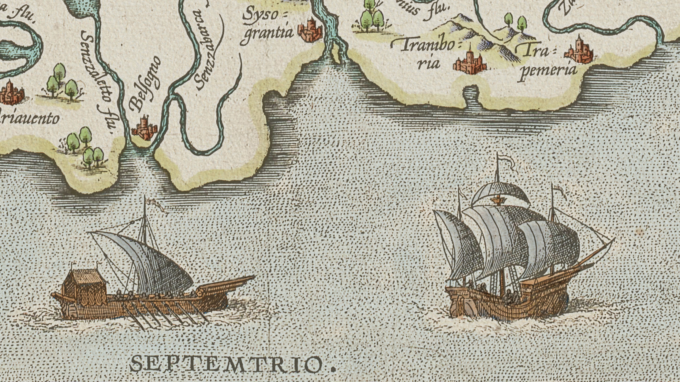
Figure 9 shows a close-up of the coast vignette, illustrating its relationship with the inland features and with the sea. The coast vignette reinforces the separation between land and sea and is a small but meaningful visual touch that connects this map to centuries of cartographic tradition
The Sea
The sea is the most restrained colour on the entire map. It is painted with Sea, a cyan colour sharing the exact same hue as Rivers, but with an extremely low saturation of just 5%, pushing it almost to grayscale (see Table 1). Its brightness is slightly increased to 95%, ensuring it remains visible beneath the dense stippled dot pattern the engraver used to fill the sea's surface.
These choices were not accidental. The sea occupies the largest single area in the map composition, and it belongs firmly to the ground in the figure/ground relationship. A colour this quiet and unassuming cannot compete visually with the cities, trees, or mountains, and that is precisely the point.
Sharing the same hue as the rivers is also intentional. One recurring observation I have made from studying historical maps is that the most skilled cartographers maintained as limited a palette as possible within a single design. Part of this was economic, as pigments were expensive and had to be stretched, but the discipline it imposed produced maps of remarkable visual calm. The cartographer was forced to do more with less: to vary brightness and saturation within a single hue rather than introducing new colours at every turn. This is a lesson that modern cartography would do well to revisit.
The sea and rivers together form a monochromatic colour harmony, sharing the same hue but differing in saturation and brightness. This grounds them both as water, visually related, semiotically related.
The near-grey quality of the sea also activates a subtle optical effect. The land surrounding the sea, the coast vignette, the mountains, and the warm paper texture, is predominantly yellowish. The brain, perceiving yellow-adjacent tones next to the nearly neutral sea, projects the complementary of yellow, which is blue, onto the sea, making it read as slightly bluer than it actually is. This is simultaneous contrast, the same principle exploited by Impressionist painters in their pursuit of optical colour mixing. It makes the map a richer, more active visual experience than a simple reading of its colour values would suggest.
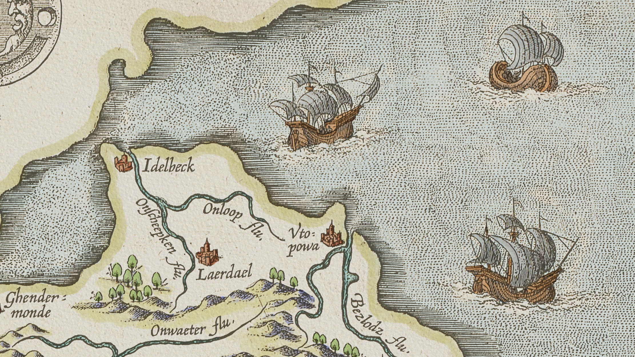
The 16th Century Ships
Scattered across the sea are several sixteenth-century sailing ships, complex, beautifully engraved objects that required more than one or two colours to bring to life properly. >For the sails, I used Sail 1 and Sail 2, both extremely desaturated colours, effectively coloured grays, each with a saturation of just 5% and a brightness of 80% (see Table 1). They differ only in hue: Sail 1 is cyan (180°) and Sail 2 is red (0°). Red and cyan are complementary, so I applied the red to the shaded parts of the sails and the cyan on top. In the sunny areas the cyan reads lighter and cleaner; in the shaded areas it reads darker and more muted, weighted down by the underlying red.
For the ships' hulls I used three colours. Boat 1 and Boat 2 both have an orange hue (30°) and the same saturation (50%), but their brightness levels differ, 90% and 40% respectively, producing one orange and one brown from the same colour family (see Table 1). These also form a monochromatic harmony: Boat 1 covers the main wooden surfaces of the hulls, while Boat 2 picks out details such as wooden planking and rigging elements.
For the shadows across the hulls, I applied Boat 3, the complementary of the orange pair, with a blue-cyan hue (210°), the same brightness as Boat 1 (90%), but a higher saturation (70%) to keep it vivid beneath the orange layers. Together, these colours produce a convincing, lively recolouring of the engraved ships, as shown in Figures 9 and 10.
The Sea Monster
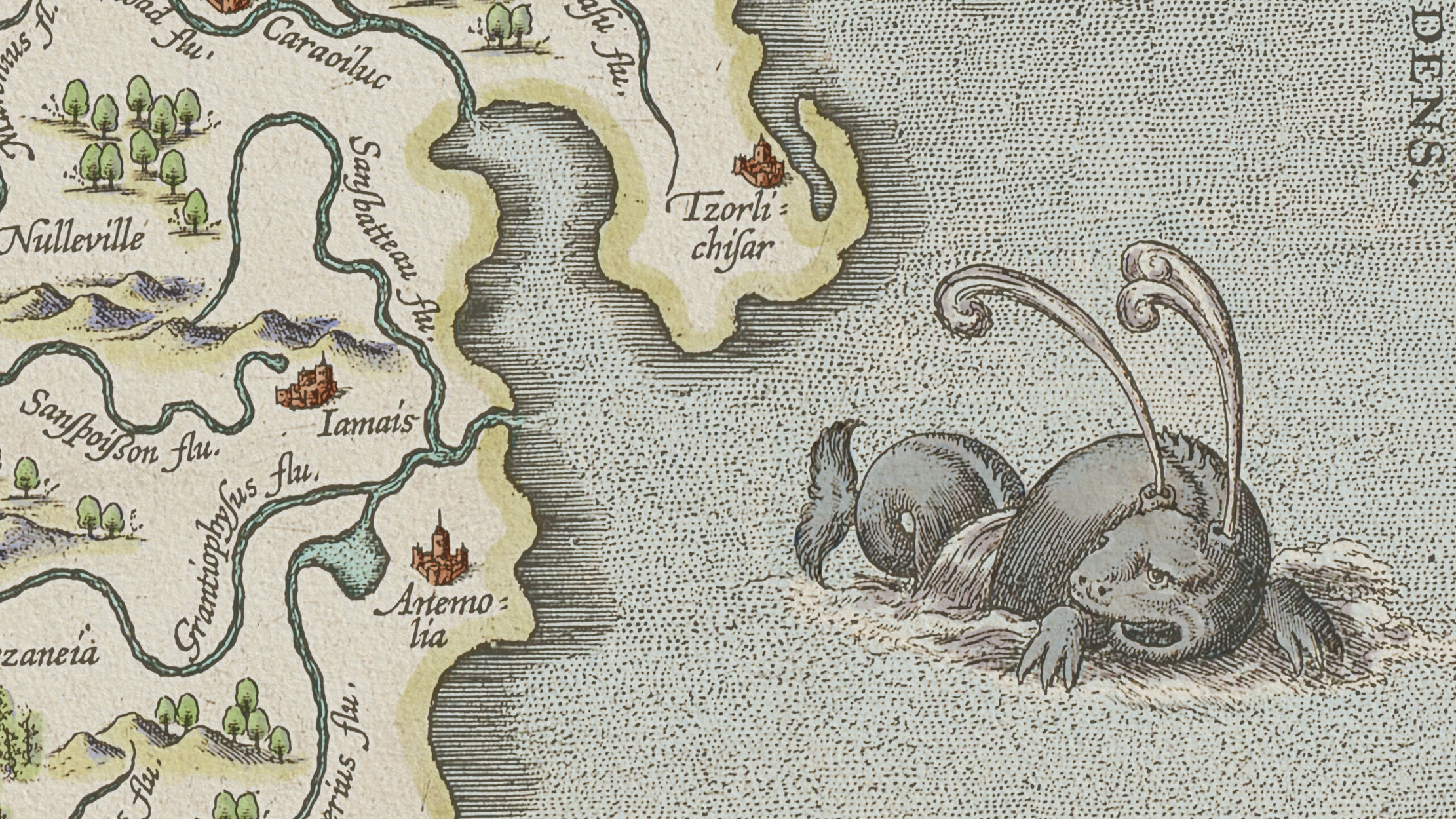
No serious sixteenth-century map is complete without a sea monster and Ortelius knew this better than anyone. He populated many of his maps with imaginary creatures, and the Map of Utopia was no exception.
For the sea monster, I introduced no new colours. Instead I worked with the same colours already used for the ships. Boat 3 covers the shaded parts of the monster's body, and Sail 2 is layered on top to heighten the three-dimensional quality of its form. Successive layers of Boat 2 and Sail 1 were then applied across the entire body. The result fits naturally alongside the ships in the sea — the same colour language, but arranged differently, making the monster's identity unmistakable.
The water foaming from the monster's nostrils, and the churning waves beneath its body as it swims, were deliberately left uncoloured, with only the faintest touches of Sail 2 in the shadows. This creates the impression of white foam and breaking water, the same treatment I also applied beneath the ships, if you look closely enough. Figure 11 shows the sea monster in detail.
The Final Recoloured Version
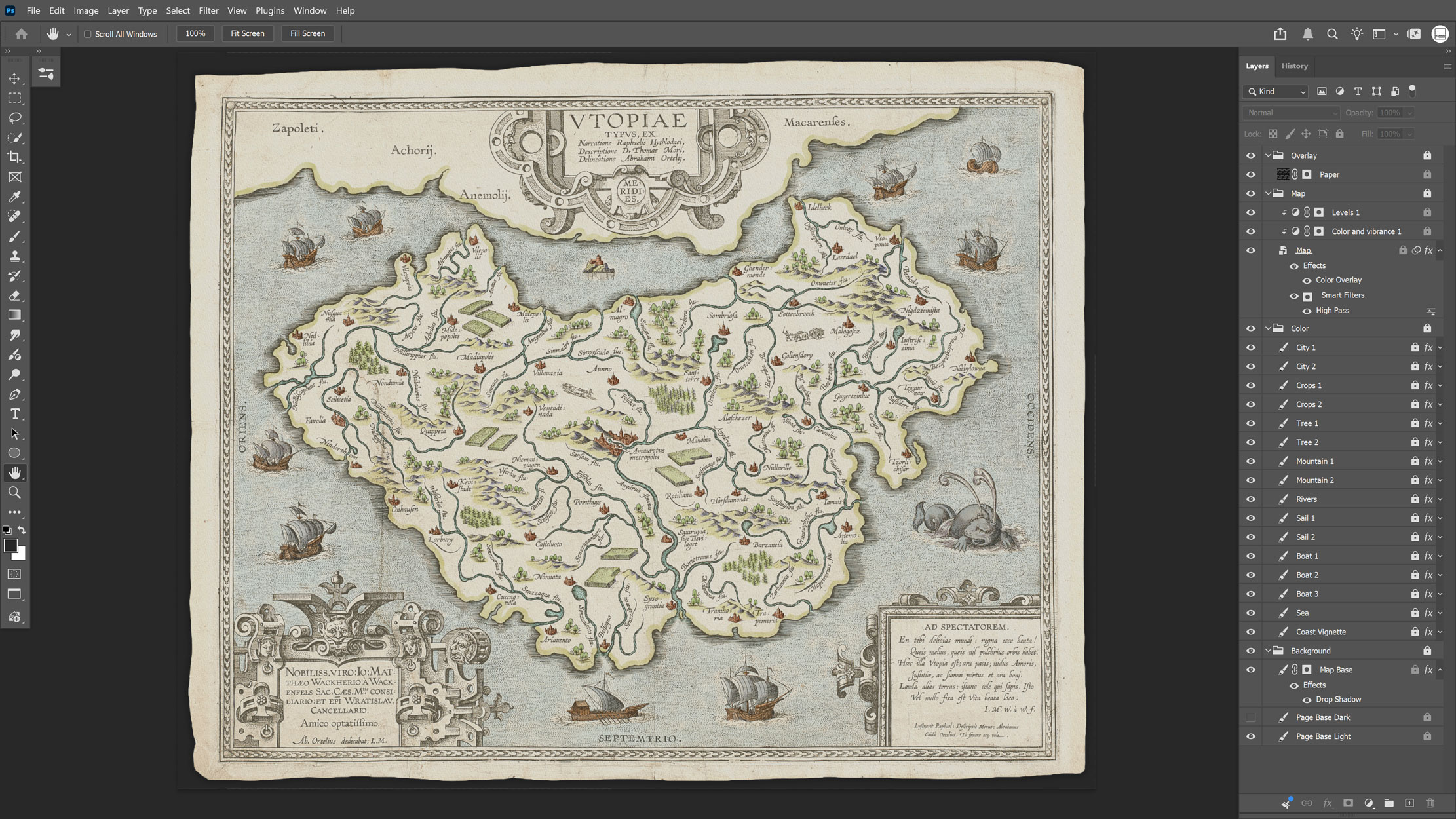
The final coloured version of the map is shown in Figure 12, in a Photoshop screenshot that also reveals how the layers are organised. Each colour has its own layer, all non-destructively adjustable, meaning the colours can be changed at any time without altering the original. In future versions, I may well revise them.
Once colouring was complete, the final map was exported as a web-optimised JPEG from Photoshop. This single image file serves a dual purpose in the Interactive Web Mapping Application: it acts as the basemap, and it is also the source image for all the city icons.
Geospatial Analysis of the Map
Before developing the Interactive Web Mapping Application, I needed to extract data from the original map and produce a GeoJSON data source from it.
I imported the original scanned map into QGIS and carefully examined every geographical feature visible on it. Extremely helpful at this stage was the existing registry of Ortelius' map at orteliusmaps.com, which documents all the fictional toponyms, their language of origin, and a brief explanation of each name. Using this registry as a foundation, I asked Gemini AI to combine the language of origin and the meaning of each name into a descriptive text for every feature. Gemini performed remarkably well, producing readable, informative descriptions that I would later incorporate into the application, allowing users to understand what each fictional place name means and why Ortelius chose it.
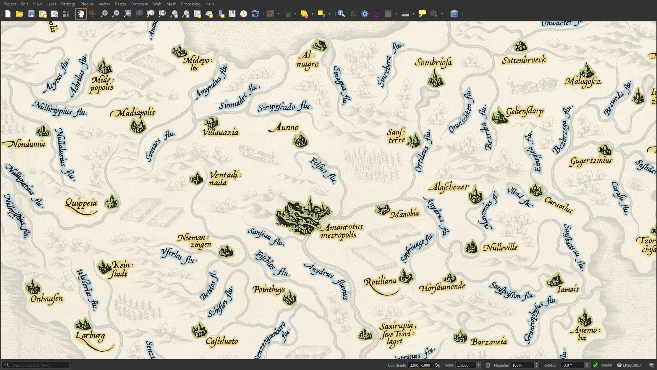
I digitized all the features in QGIS, converting them to polygon features. To do this, I used raster analysis algorithms, specifically, reclassified the map to separate the black pixels (the actual engraved information) from the white pixels (the background). I then vectorized the reclassified map, extracted the black elements, and converted them to polygon features. I populated the attribute table with the name, type, language of origin, name analysis, and spatial extent of each feature. The extent data was particularly important for the next stage: generating the city icons in the web application.
One detail worth mentioning: the Map of Utopia depicts an imaginary place, so the moment I imported it into QGIS, the software positioned it at Null Island, with the coordinates of its top-left corner at [0,0]. I could not imagine more appropriate coordinates for Utopia other than the Null Island, a place not mentioned by Ortelius, but perhaps the most fitting location in the world for a place that is, by design, nowhere at all. I left it there, and made sure the project CRS was set to EPSG:3857, a metric projected coordinate system. This allowed me to calculate the extent of each digitized feature in metres, effectively creating a local reference system anchored at Null Island.
Figure 13 shows the digitized features extracted from the scanned map, converted to vector polygons and colour-coded by type: cyan for river names, yellow for city name labels, green for the city footprints. However, at this stage of the project I decided to include only the city footprints as a point layer in the Interactive Web Mapping Application, so I exported only the centroids of the city polygons.
The resulting GeoJSON is a point layer with coordinates in EPSG:3857, relative to the map's extent, with properties including each city's name, its Gemini-generated description, and the bounding box coordinates of its footprint. With the data prepared and exported, I was ready to design and build the Interactive Web Mapping Application.
The Interactive Web Mapping Application
With the recoloured map exported as a web-optimised JPEG from Photoshop, and the city data ready as a GeoJSON from QGIS, I moved on to designing and developing the Interactive Web Mapping Application that would bring the cities of Utopia to life in a playful, narrative, and interactive way.
I wrote the application in VS Code using HTML, CSS, and JavaScript, building the map and city icons using the MapLibre GL JS library. The following sections describe the interface of the application, including the main map window, the paper-cut city icons, the side panel, and the custom attribution panel.
The Main Map
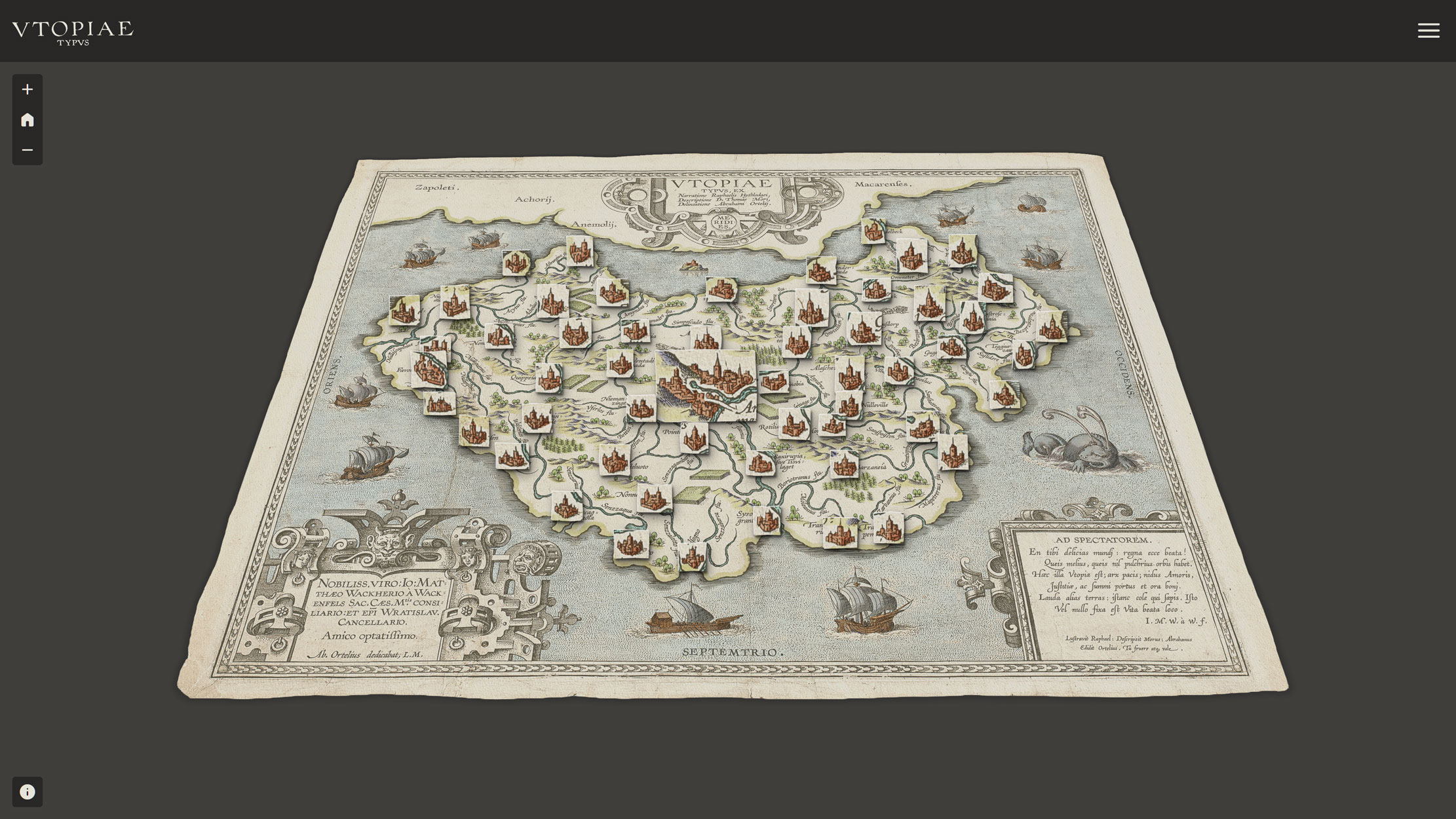
The main map window and its interactive elements are shown in Figure 14. The map uses my recoloured version of the Utopia map as its basemap. Navigation is fluid: the user can zoom in and out, pan, rotate, and tilt the map, while MapLibre GL JS renders it as a fully three-dimensional model.
I added custom navigation controls in the top-left corner, allowing the user to zoom in and out or return to the default view. At the top of the screen, a header displays the map's logo, the words VTOPIAE TYPVS, digitized directly from the title cartouche of the original map. The header also includes a menu icon that toggles the side panel open and closed.
I replaced MapLibre's default attribution button with a custom one that matches the style of the navigation controls. It sits in the bottom-left corner and opens a custom attribution panel.
The City Icons
All 55 cities are represented as point features in the GeoJSON, positioned precisely over their corresponding locations on the basemap. Rather than using default marker styles, which would have been entirely at odds with the spirit of the project, I designed custom markers in which each icon shows the actual city as drawn and coloured on the map.
The technique I used leverages MapLibre GL JS and the CSS background-position property. Every marker sources the same image: the basemap itself. Each marker's icon is simply a precisely cropped window into the basemap at the location of its city. This means the application loads only a single image — the Utopia map — and derives all 55 icons from it dynamically. No individual icon files, no hours spent cropping in Photoshop, and no performance penalty.
The mechanism behind this is the bounding box data I calculated in QGIS for each city. Having the xmin, ymin, xmax, and ymax coordinates of every city's footprint, JavaScript and CSS can calculate the exact position and size of each icon automatically. The system is completely dynamic: change the basemap, recalculate the bounding boxes, and the icons update themselves.
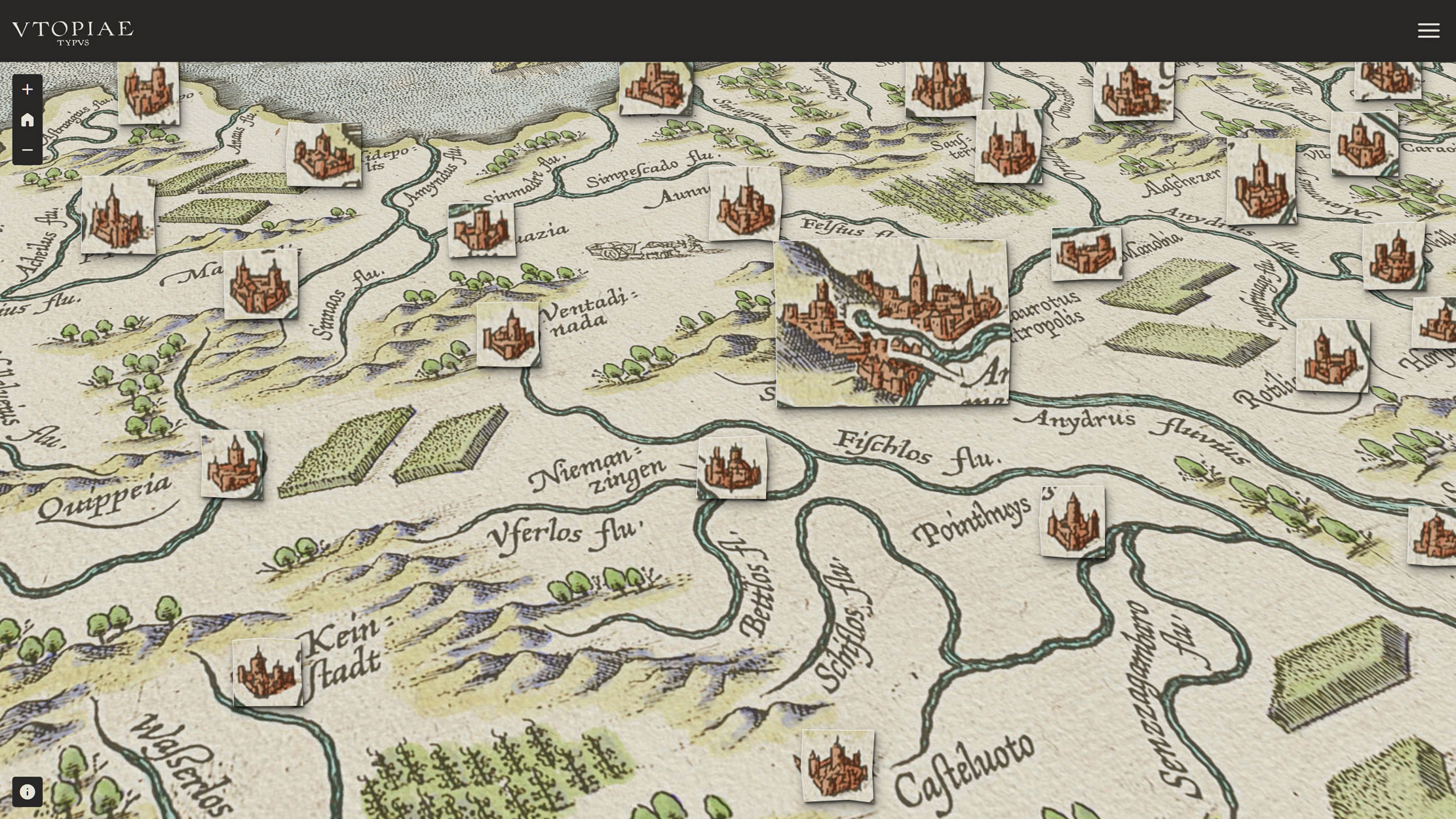
Figure 15 shows a tilted, zoomed view of the map with the city icons visible. Because this is a MapLibre map with full 3D tilt support, the icons appear to lift off the basemap surface and they rotate and tilt with the map, giving the impression of small paper objects placed on top of it.
One further touch: since this is a sixteenth-century copper engraving printed on paper, I wanted the icons to feel physically hand-made. Using the CSS clip-path: polygon() property, each icon is given a randomised irregular polygon clip at every page load, so it appears to have been cut out by hand with scissors. Every icon is cut differently, and every map load produces a different set of cuts. Combined with a drop shadow property, the icons pop off the basemap surface and feel alive.
The Side Panel
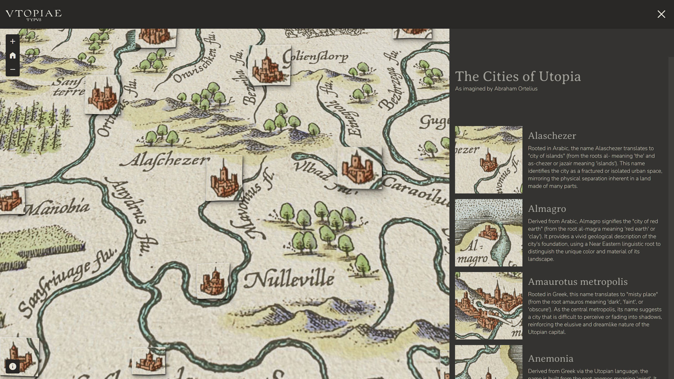
The side panel contains a scrollable list of all the cities of Utopia. The list is not static, but it is generated dynamically from the same GeoJSON used for the city point features on the map. This means the list and the map are fully linked.
Clicking on a city in the list causes the map to zoom in and centre on that city. The user can navigate the map narratively, as if reading a book about the cities of Utopia, where every entry is a live location. Conversely, clicking on a city icon on the map causes the side panel to scroll and bring that city to the top of the list. If the side panel is closed when the user clicks a city icon, it opens automatically and scrolls to the right entry, keeping the experience seamless and encouraging the user to move naturally between the map and the list.
As shown in Figure 16, each entry in the side panel displays the city icon, the city name as invented by Ortelius, and the Gemini AI-generated description of the name's origin and meaning. The icons in the side panel use the same CSS background-position technique as the icons on the map: they are generated dynamically from the basemap image and the bounding box data, not from separate cropped files.
The Custom Attribution
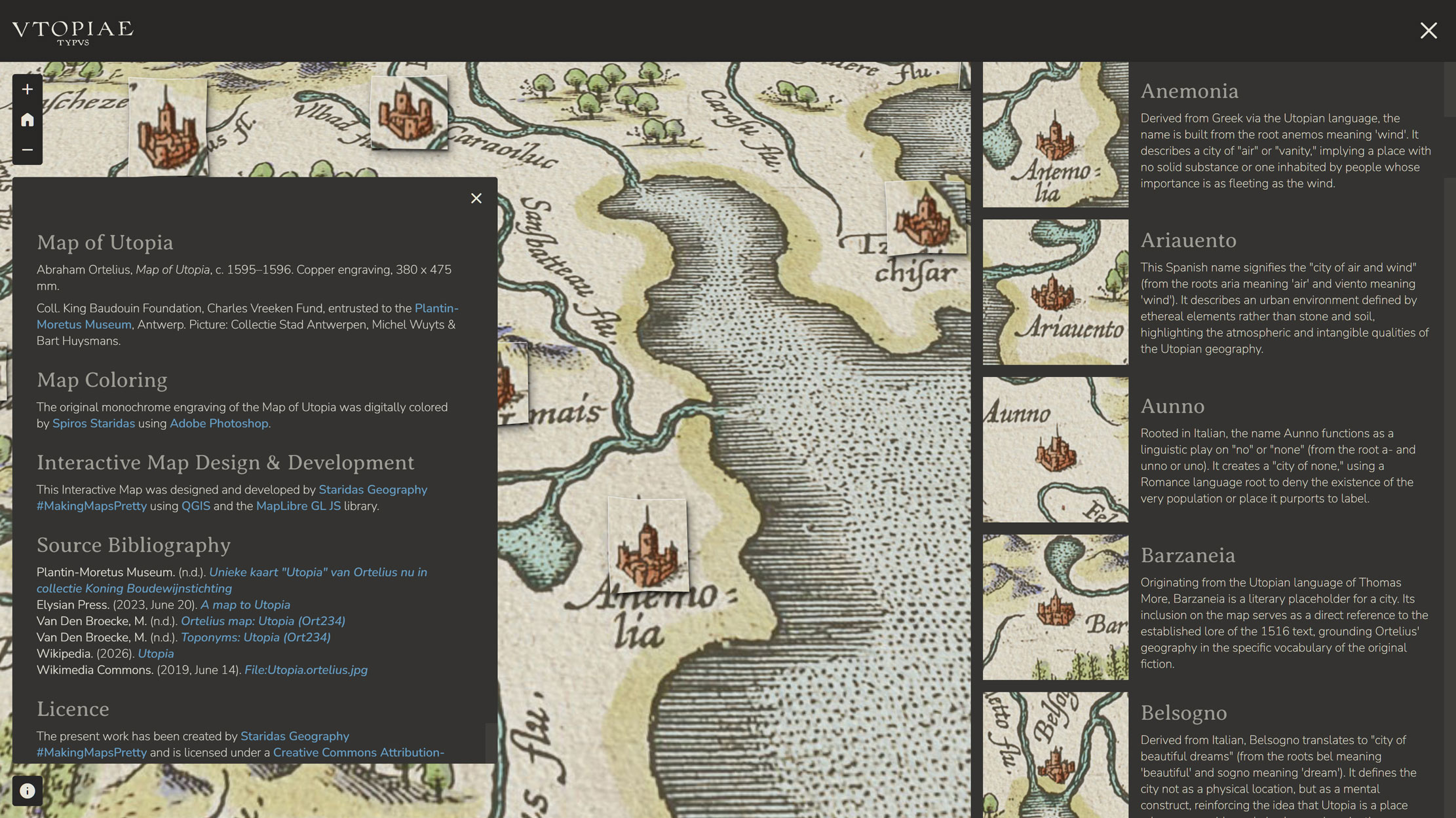
Figure 17 shows the custom attribution panel, styled to match the rest of the application. It credits the Plantin-Moretus Museum and the Utopia Map, lists the bibliographic sources used to build the content, and acknowledges the software and libraries used in the project, including QGIS and MapLibre GL JS.
Next Steps
This is version one of the Interactive Web Mapping Application. The map works, the cities are there, the side panel tells their stories, and the icons cut themselves into new shapes every time the page loads. But version one is exactly that: a beginning. The application was always conceived as something that would grow, and there are clear directions already mapped out for where it goes next.
The most immediate addition planned for the next release is a rivers layer in the side panel. Just as the cities have their own list, with icons, names, and descriptions, the rivers of Utopia deserve the same treatment. Their names are every bit as deliberate and inventive as those of the cities: each one means some variation of "river without water," "river without fish," or "river without banks," drawn from more than ten languages — Greek, Latin, German, Italian, French, Spanish, Dutch, Polish, Turkish, and others. Ortelius and Wacker von Wackenfels essentially assembled a polyglot catalogue of absence, naming every waterway on the island after whatever it lacks. That is a story worth telling interactively, and it will be told.
Further down the road, the ambition grows larger. I want this application to become not just a showcase for the Ortelius map, but a collection — a cartographic history of Utopia's mapping across time. The natural starting point is the two woodcut maps that appeared in the first printed editions of More's Utopia: the map included in the 1516 Louvain edition, and the revised version from the 1518 Basel edition. These are the earliest known visual representations of the island, rougher and more schematic than Ortelius' later masterpiece, but historically indispensable. Adding them to the application would allow users to trace the evolution of Utopia as a mapped place: from More's original sketch of a fictional geography, through the refinements of 1518, to the full cartographic flowering of Ortelius' 1595–1596 engraving.
Three maps, nearly eighty years of imagination, and a place that has never existed anywhere except on paper. Each map is a different answer to the same impossible question: what does Utopia look like? More's woodcuts say: something like a crescent island, enclosed and self-sufficient. Ortelius says: something like the whole known world, rendered with full cartographic ceremony and hidden tributes to friends. My application, in its own small way, tries to say: something worth sitting with, something worth zooming into, something worth reading slowly. Future versions will bring the earlier maps into the same space, letting all three answers exist side by side, and leaving the question, as it should be, open.
Epilogue
Making this map was, in the end, an act of the same kind as the one that produced the original. Thomas More invented Utopia as a place to think freely, a fictional geography that let him say things about his own world that could not be said directly. Ortelius turned that invention into a map, because that is what cartographers do: they make the imaginary tangible, they give the formless a shape and a name and a location. Wacker von Wackenfels and Jacob Monau contributed their languages and their scholarship because knowledge, at its best, is a collective act. And the rivers were given names meaning "river without water," because rivers in Utopia are not rivers, but ideas.
I came to this project as a cartographer and a technologist, but I left it as something closer to a reader. Every hour spent in QGIS tracing city walls and river courses, every colour decision made in Photoshop, every line of JavaScript written to make a city icon cut itself out of the basemap, all of it was, in some sense, a way of reading Ortelius' map. Slowly, carefully, at the level of the individual engraved line. What I found there was extraordinary craftsmanship: a man working in copper at the end of the sixteenth century, making a map of a place that does not exist, pouring into it the full depth of his cartographic knowledge and his humanist imagination. Hiding his own name in a river. Distributing the languages of Europe across an island that belongs to none of them. Creating a visual hierarchy that holds together almost five centuries later, as a piece of design, as a piece of art.
Ortelius made this map to please his friends, and I built this Interactive Web Mapping Application to share it with whoever wants to find it. Both feel like the right reasons. If it makes even a few people slow down, zoom in, and wonder what Amaurotus metropolis means, or why the rivers have no water, or where exactly Null Island is, then it has done its job. Some maps are not about finding your way. They are about reminding you that most of the best places are still unmapped.
Bibliography
- Plantin-Moretus Museum. (n.d.). Unieke kaart "Utopia" van Ortelius nu in collectie Koning Boudewijnstichting
- Elysian Press. (2023). A map to Utopia
- Heritage King Baudouin Foundation. (n.d.). Map of Utopia
- Van Den Broecke, M. (n.d.). Ortelius map: Utopia (Ort234)
- Van Den Broecke, M. (n.d.). Toponyms: Utopia (Ort234)
- The Low Countries. (2020). Never get lost again in Utopia
- Wikipedia. (2026). Utopia
- Wikimedia Commons. (2025). File:Utopia.ortelius.jpg