Prologue
Paros is a stunning and well-developed island nestled in the heart of the Aegean Sea, part of Greece’s Cyclades archipelago. A group of local businesses based on the island reached out to me with a unique request: to design a custom paper map specifically tailored to their needs—something informative and accessible that they could offer freely to their visitors. The goal was to create a practical tool that would not only help customers navigate the island but also highlight the businesses and cultural landmarks they felt most proud of.
Specifications
The final concept was a double-sided map, printed on 100g writing paper in a compact format measuring 48 by 33 centimeters. One side would showcase the entire island of Paros, while the reverse would focus on Piso Livadi, the charming seaside village where the businesses are concentrated.

Both maps would feature a curated selection of recommended sights and establishments, plotted clearly to guide travelers through authentic local experiences.
Mapping Process
To begin the process, I first determined the map scales and coverage.
- The larger-scale map of Piso Livadi would appear on one side, set at a detailed scale of 1:4,000 to accommodate building-level precision.
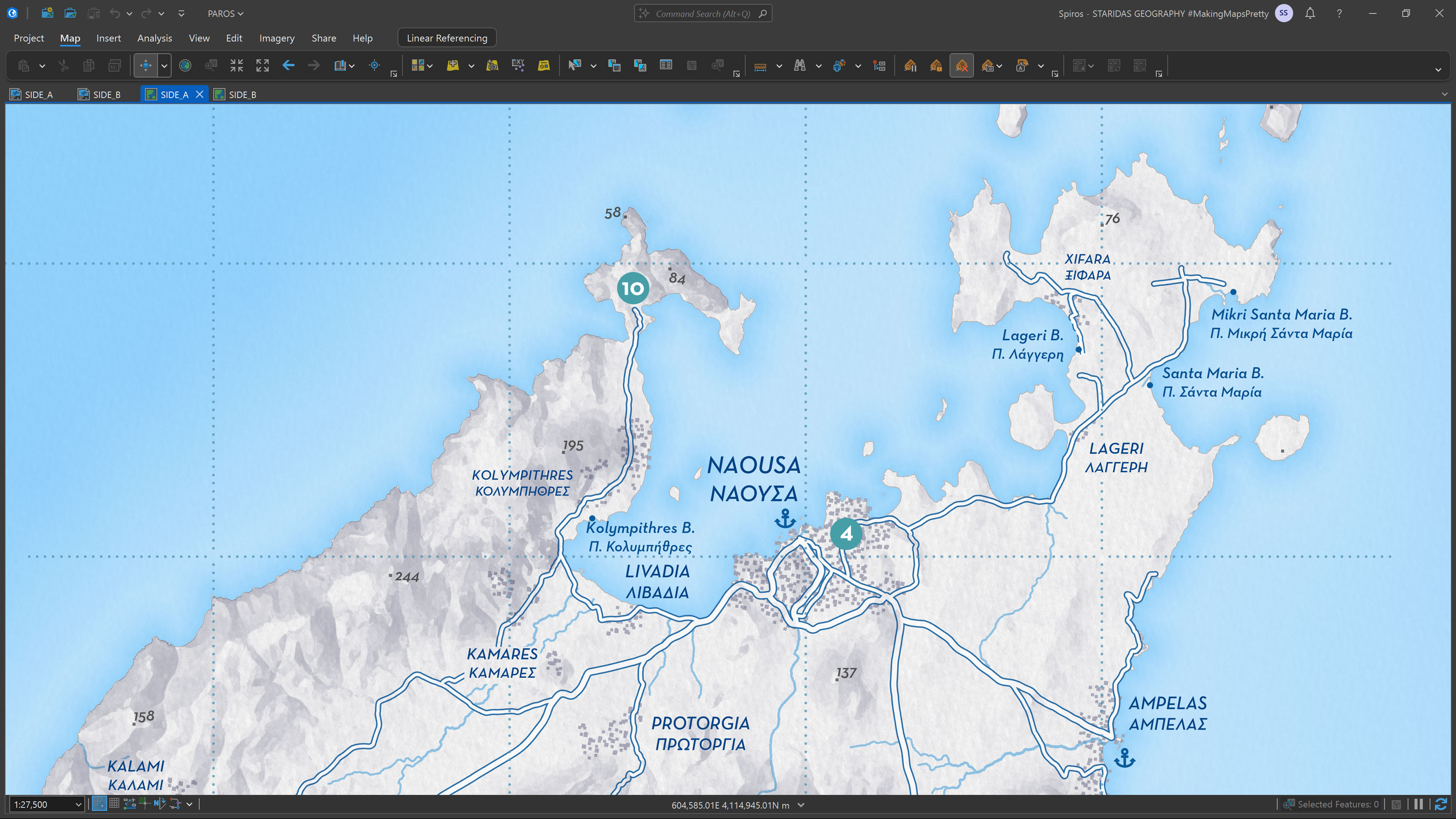
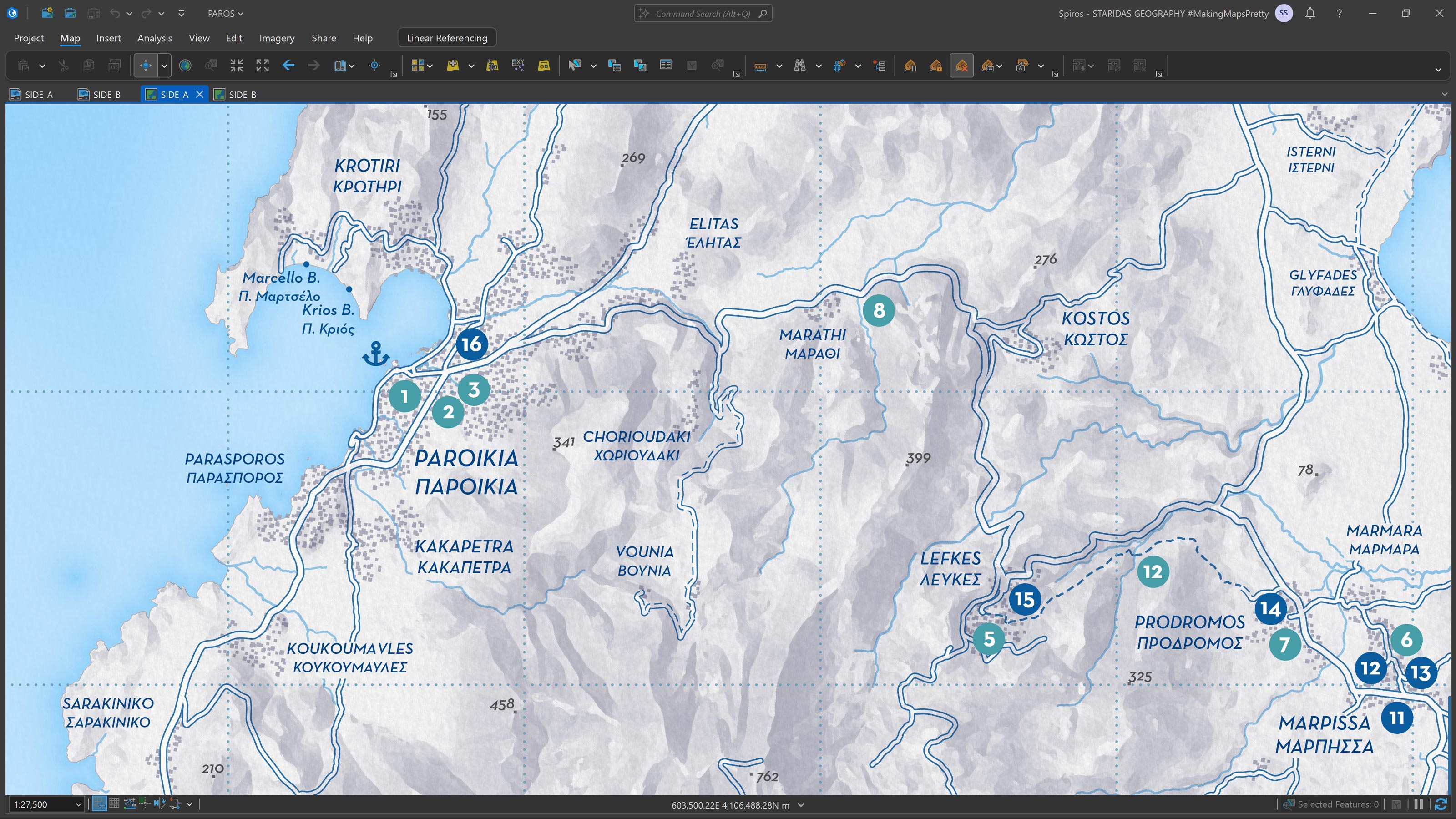
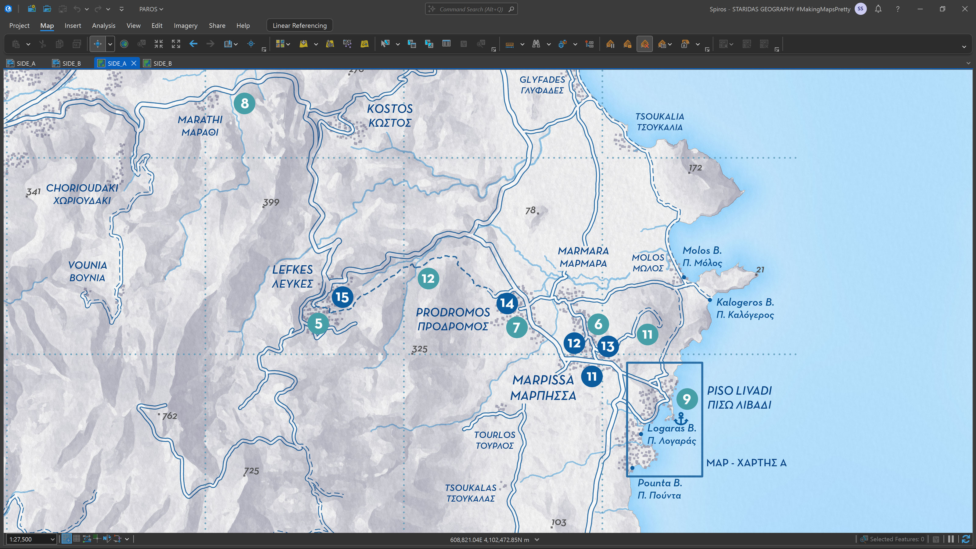
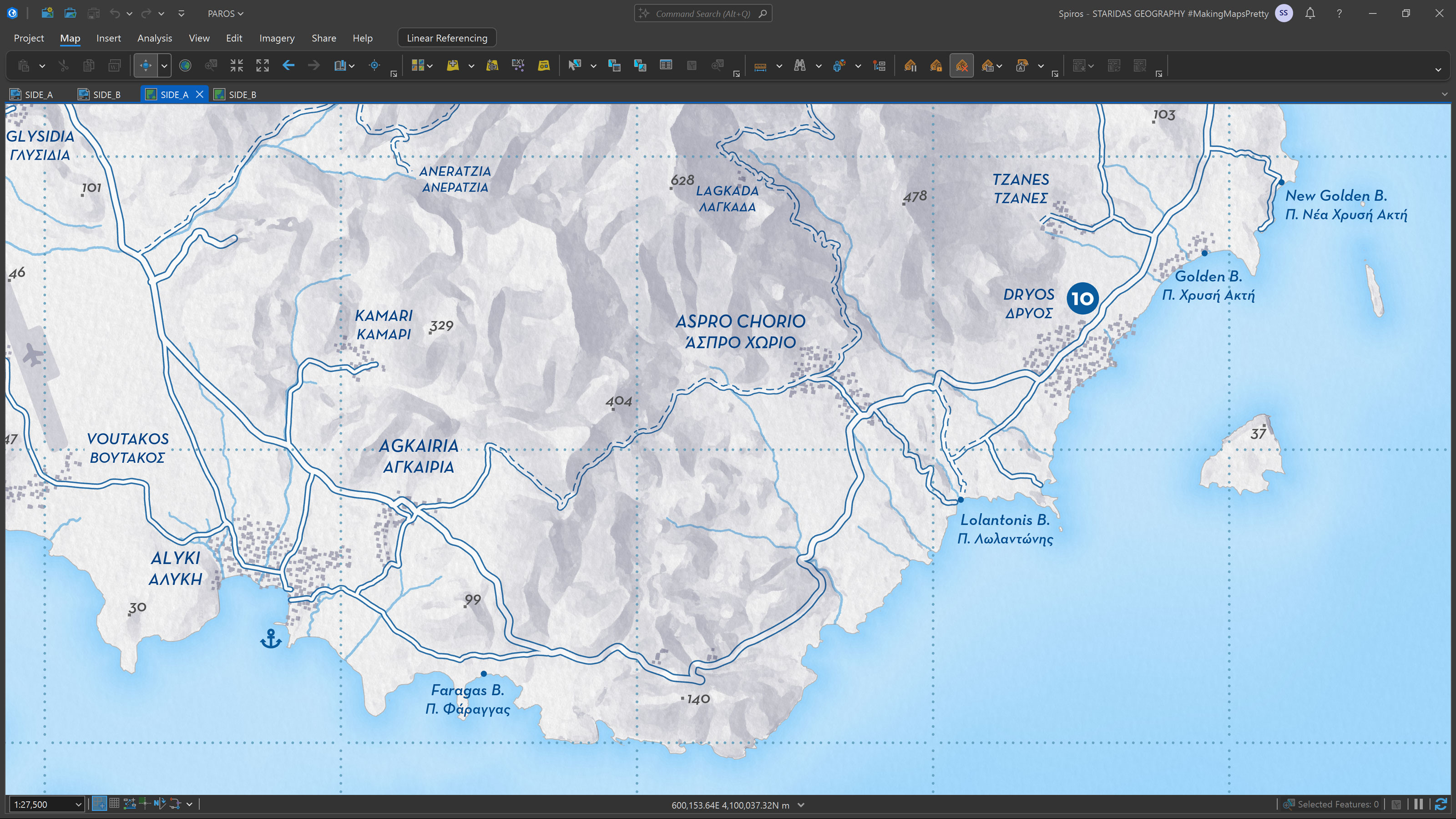
- The island-wide map of Paros island on the opposite side would be presented at 1:55,000, offering a broader view without sacrificing legibility.
For both maps, I developed a grid-based reference system that acted as a local coordinate framework, making it easy to locate points of interest at a glance.

Points of Interest
Once the foundational structure was in place, I moved on to gathering content. The clients proposed around twenty local businesses across the island, ranging from restaurants and cafés to specialized service providers, alongside several traditional villages and culturally significant landmarks.
My task was to translate these suggestions into accurate geographic data. I created a digital point feature layer, carefully placing each location in its exact position on the map. This dataset wasn’t just spatial—it also included a full suite of supporting information such as names, detailed descriptions, business hours, and contact information, all stored in the attribute table.
To visualize this data effectively, I assigned a simple numbered symbol to each location, corresponding to a formatted paragraph of information on the map layout itself. Each number linked directly to a point of interest, allowing readers to seamlessly switch between the visual reference and its description.
Structuring the content this way gave us the flexibility to revise and update information directly within the attribute table—a huge time-saver during the editing process, as we went through numerous refinements to ensure accuracy and tone.
Map Design of Side A: Piso Livadi
With the content finalized, I turned my attention to designing the basemaps themselves, starting with Piso Livadi. Due to the level of detail required at the selected scale, I manually digitized all visible building footprints. These were then integrated with the local road network to create a clean and readable layout of the village's structure.
I also included a series of contour lines to hint at the area’s gentle topography and provide a subtle sense of terrain.

The island of Paros, like its Cycladic neighbors, is defined by its whitewashed architecture and deep blue accents, a visual identity I was determined to echo in the design. I rendered buildings and roads in white, adding selective blue details to reflect the island’s signature look.
To ensure brand consistency, I studied the logos and visual materials of the client businesses, extracting key colors and thoughtfully applying them throughout the map to tie everything together visually.
Map Design of Side B: Paros Island
On the reverse side, which displayed the full island, I maintained the same visual sensibility but simplified the design even further for clarity.
I deliberately left out contour lines to preserve a minimalist aesthetic and instead used Adobe Photoshop to soften and stylize the shaded relief, lending the terrain a more artistic and approachable appearance.
One final touch was the creation of a custom North Arrow, inspired by traditional Cycladic patterns and featuring the two primary brand colors shared by the businesses involved, bringing a cultural and visual signature to the piece.

Final Outcome
The end result was a thoughtfully crafted, double-sided paper map that blends functionality with aesthetic clarity. Inspired by the minimalist charm of Cycladic architecture, the design celebrates the island’s whitewashed buildings and vibrant blue details while maintaining a clean and modern cartographic style.
Each side of the map serves a distinct purpose: the detailed layout of Piso Livadi offers a walkable guide through the settlement, while the island-wide view on the reverse provides broader context and orientation. The numbered system for points of interest allows for intuitive navigation, making it easy for users to switch between map and description with confidence.
Visually, the map reflects the identity of the local businesses it was made for. The color palette, drawn directly from their branding, creates cohesion and reinforces a sense of place. From the hand-drawn building footprints to the custom North Arrow inspired by local motifs, every detail was designed with cultural sensitivity and usability in mind.
The final deliverable is more than just a map. It’s a welcoming introduction to Paros and a curated experience for visitors, carefully connecting them with the island’s culture, businesses, and landscape.