Introduction
Where (and what) is Santorini
A few words first about where this project actually happens. Santorini sits in the southern Aegean Sea, part of the Cyclades, off the coast of mainland Greece. Most people picture it as one island, but it is really a small archipelago of five: Thera, the crescent everyone recognizes, Thirasia facing it across the water, tiny Aspronisi, Nea Kameni, still an active volcano quietly steaming in the middle of the caldera, and Palaia Kameni beside it. The caldera itself, that great flooded crater sitting between them, is the result of one of the most violent volcanic eruptions in recorded history, somewhere around 1600 BC, an event some scholars have connected to the Atlantis myth. It is essentially why the islands look the way they do today, a broken ring of cliffs wrapped around open water, rather than one solid landmass.
In antiquity the place carried other names. It was called Kalliste, then Thera, after the mythical king Thiras, and later, under Venetian rule, the name shifted once more, possibly a blend of Santa + Irene, though that particular origin is disputed and hard to pin down with any real confidence.
Today the whole group goes by Santorini, and the word gets used interchangeably with Thera, its main island, so often that most visitors never realize the two are not quite the same thing. Properly speaking, Santorini is the name of the entire archipelago, not just the crescent shaped island everyone recognizes from postcards and sunset photos.
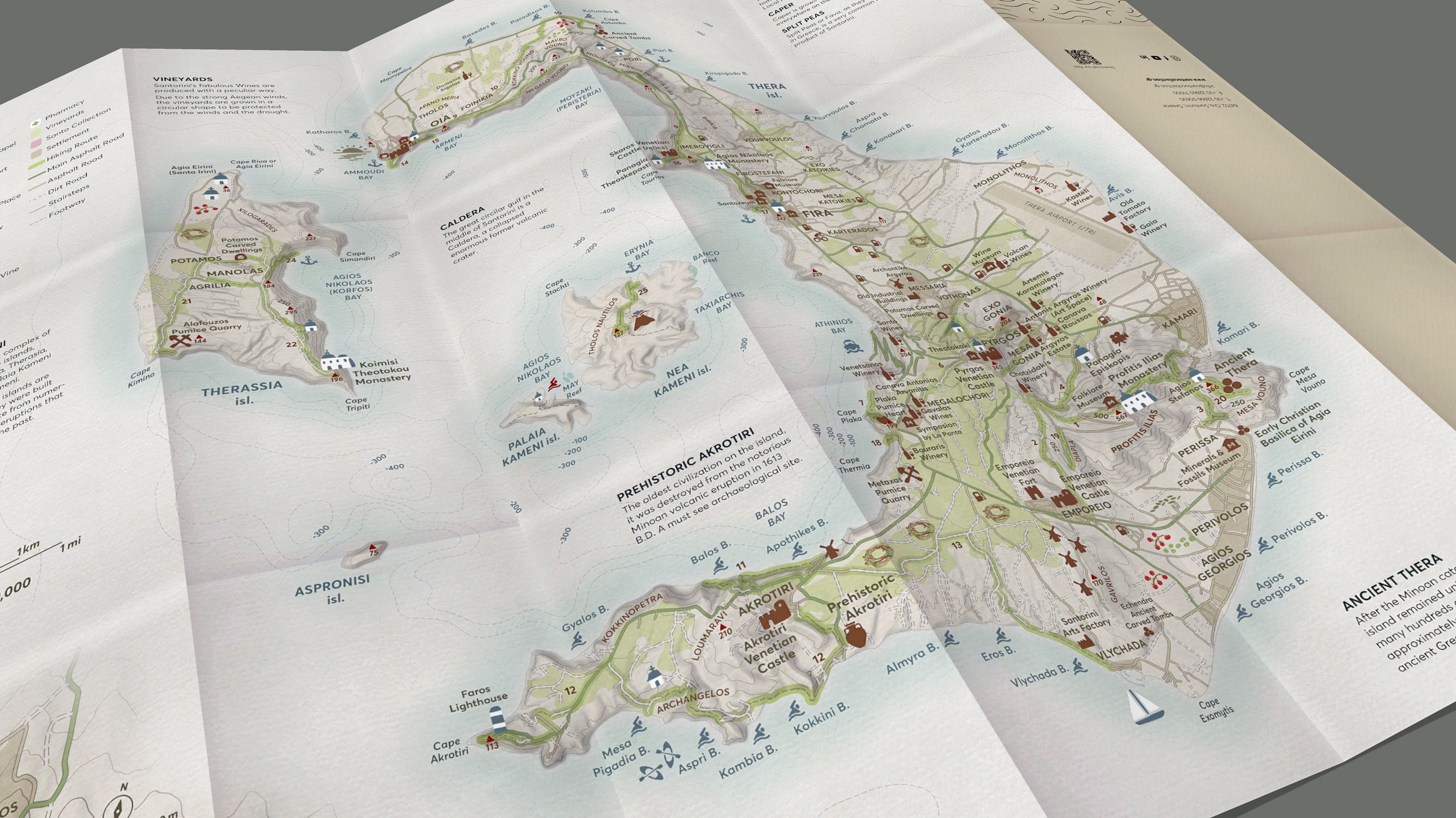
Unfolded Side B of the paper map, showing the full Santorini archipelago, Thera, Therassia, Nea Kameni, Palaia Kameni and Aspronisi, wrapped around the flooded caldera at its center.
Where is Oia
Thera itself holds many settlements, the largest being Fira, sitting roughly at the island's center. Oia sits at its northern tip instead, and it is, without much argument, one of the most beautiful villages in the whole Aegean, the kind of place that ends up on the cover of almost every guidebook written about Greece.
It is a place built for wandering its red volcanic streets without any real destination in mind, past whitewashed cave houses cut straight into the cliff and small blue domed churches tucked between them, for dinner with the entire caldera stretched out below the table, and for standing shoulder to shoulder with strangers near the old castle ruins at the tip of the village, watching one of the most photographed sunsets on the planet slip behind the sea.

Side B of the paper map zoomed on Oia dedicated inset map, showing the village and its surrounding sights, as well as Santo Pure, Santo Mine and The Villas.
My Client
My client for this project is Santo Collection Resorts & Villas, a small, deliberately boutique collection of luxury suites and villas in Oia. The brand describes its own philosophy as one of purposeful travel, built around slow living and a genuine connection to Santorini rather than conventional tourism, and it backs that up with a real sustainability commitment, including LEED certification. That positioning has not gone unnoticed either, the group has been recognized as Europe's Leading Boutique Resort and Greece's Leading Island Villas, and has been featured in Forbes, Vogue and Condé Nast Traveller.
Santo Collection belongs to the Metaxa Hospitality Group, a Greek hospitality company based in Heraklion that has now been running for fifty years and also owns other hotels in Crete, among them Creta Maris and TUI Magic Life Candia Maris. So while Santo Collection is who I actually sit down and work with, it is really one part of a much wider family of properties.
The map's front cover panel, carrying the Santo Collection Resorts & Villas logo and the "Time to Explore" tagline.
My Client's Accommodation Units in Oia
Santo Collection today is made up of three properties, all a short walk from one another on the outskirts of Oia. Santo Pure is an elegant cluster of suites and villas built around quiet, unhurried living, its Cycladic architecture blending into the landscape rather than fighting it, with its own restaurant, spa and breakfast area. Santo Mine is an all suites hotel with an eclectic, cosmopolitan personality, its energy fused with genuine Cycladic character, home to Alme Restaurant and Rhoe Wine Bar. The Villas is the most private of the three, two standalone villas that together host up to sixteen guests, built for groups who want a home rather than a hotel room, complete with a private chef, a sommelier and event planning available on request.
None of this stayed still while I worked on it, which is really the whole point of bringing it up here. The client's properties have grown steadily since I started, and almost every year something changed, a new pool, a new wing, a new spa, a new villa added to the family. Because of that, the map has never really been a finished product I could file away and forget. It is a living document, redrawn and updated as the resort itself keeps expanding around it.
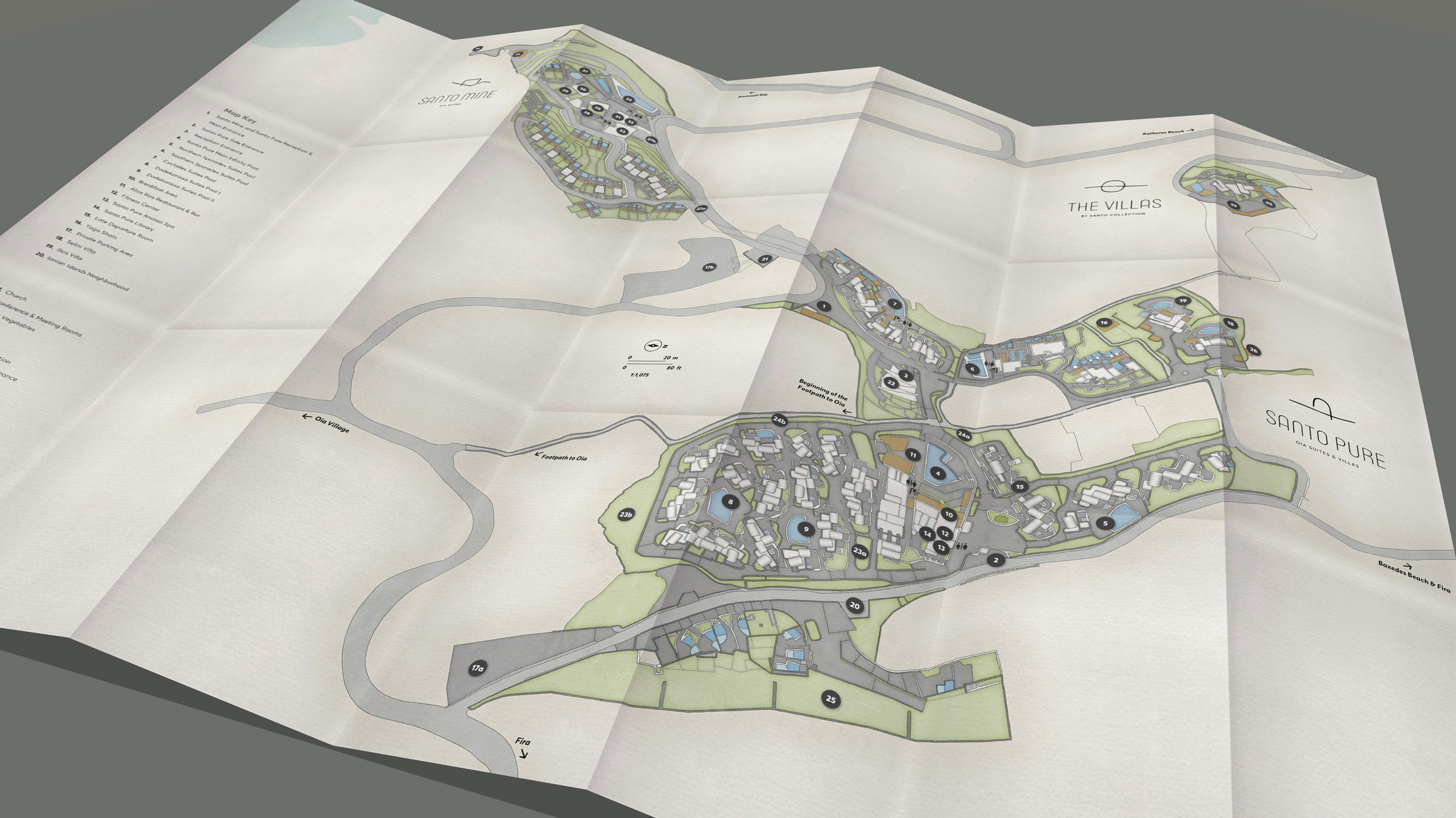
Side A laid out in full, Santo Mine and The Villas at the top and Santo Pure at center. Points of interest are cross-referenced against the numbered map key running down the left edge.
My Client's Cartographic Needs
At its core, the client's cartographic need is simple to state, even if it was not simple to serve. Santo Collection wanted every guest to be able to comfortably find their way, to their own room and to the resort's facilities inside the property itself, and beyond that, to navigate Santorini as a whole once they stepped past the gate. A resort spread across sloping ground in small clusters of suites and villas cannot expect guests to simply figure it out as they go, and neither can an island that confuses even seasoned travelers with its layered roads, footpaths and settlements that blur into one another.
Serving that need meant covering two different scales of navigation at once, the intimate scale of a guest's own unit and the much wider scale of the island itself, and it also meant choosing the right medium to deliver each. That is why the client wanted both a printed map and a digital, interactive one, rather than settling for just one or the other. The two serve genuinely different needs and carry different expectations. One is a physical object a guest holds, folds and keeps in a pocket, something that survives without a signal or a battery. The other lives on a screen, reaches people long before they ever board a plane, and can be updated the moment something on the ground actually changes. Keeping both in sync, so a guest never gets a different story from the paper version than from the website, has been part of the job from day one.
None of this took shape in a single design pass. This project began back in 2016, and since then we have gone through several full redesigns, each one shaped by the client's evolving needs and by a fresh survey of the property as it grew, year after year. As I write this, in 2026, we have just closed ten years of continuous collaboration and successive map editions.
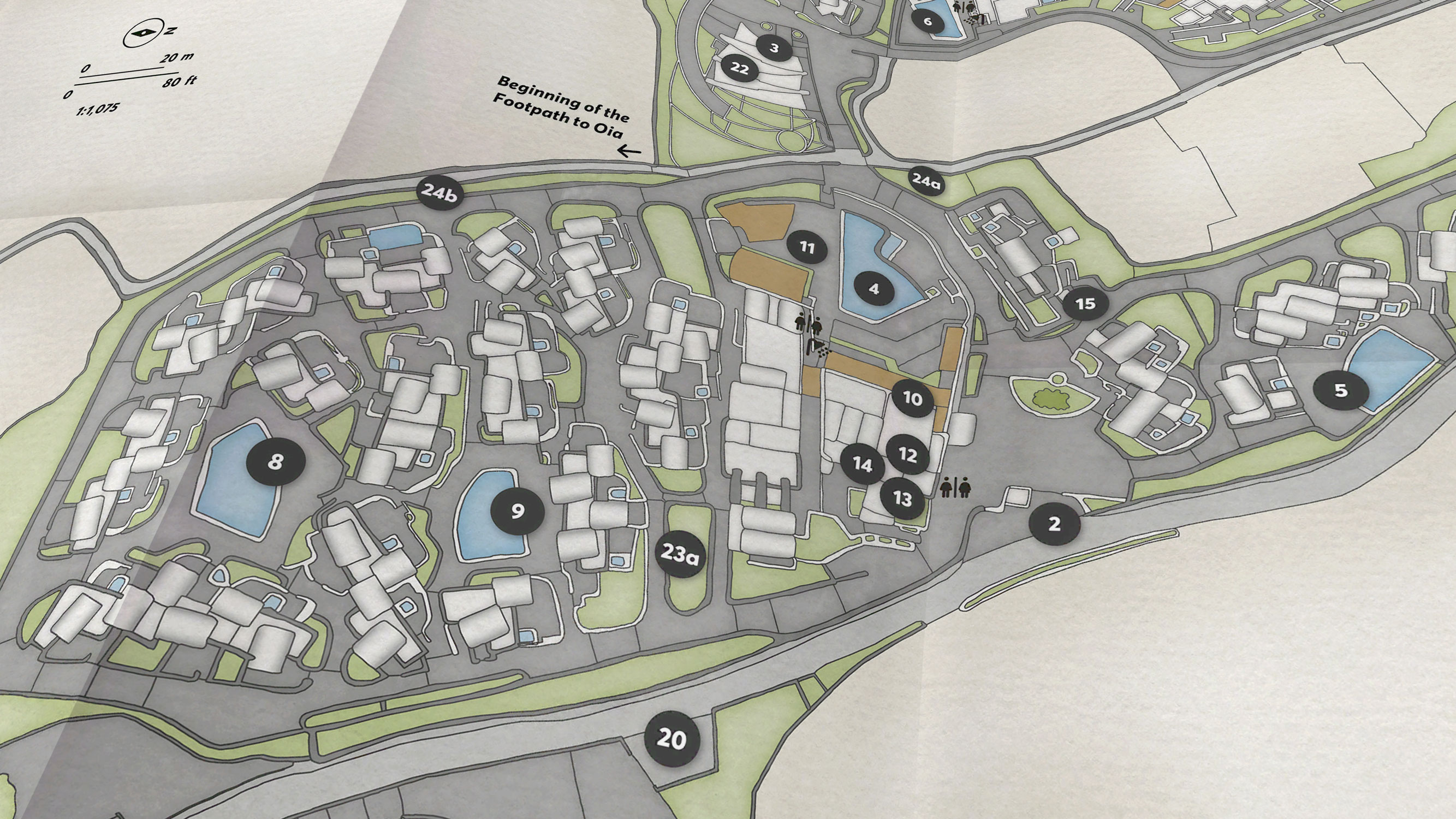
A close-up of Santo Pure's own cluster of suites, pools and facilities, each one numbered and cross-referenced so a guest can move confidently between their room and the resort's amenities.
What Guests Need from the Paper Map
Guests staying at the resorts have fairly practical expectations the moment they unfold this map for the first time. More than anything, they want to actually find their way, to their room, to the restaurant, to the spa, because a resort laid out like Santo Collection behaves more like a small hillside village than a single hotel building, with its own network of paths, steps and alleys winding between the units.
Once they have their bearings, they want to know what is actually available to them, which pool belongs to which building, where breakfast is served, where the gym or the wine cellar is tucked away. And because most guests eventually do want to step outside the resort for an afternoon, they also want a sense of what surrounds them, which beaches are close enough to reach on foot, whether the sand is worth the walk, how far Oia village really is from where they are standing.
Finally, for the days they decide to explore properly, the same map needs to double as a road map for the rest of Santorini, tying the resort back into the island as a whole.
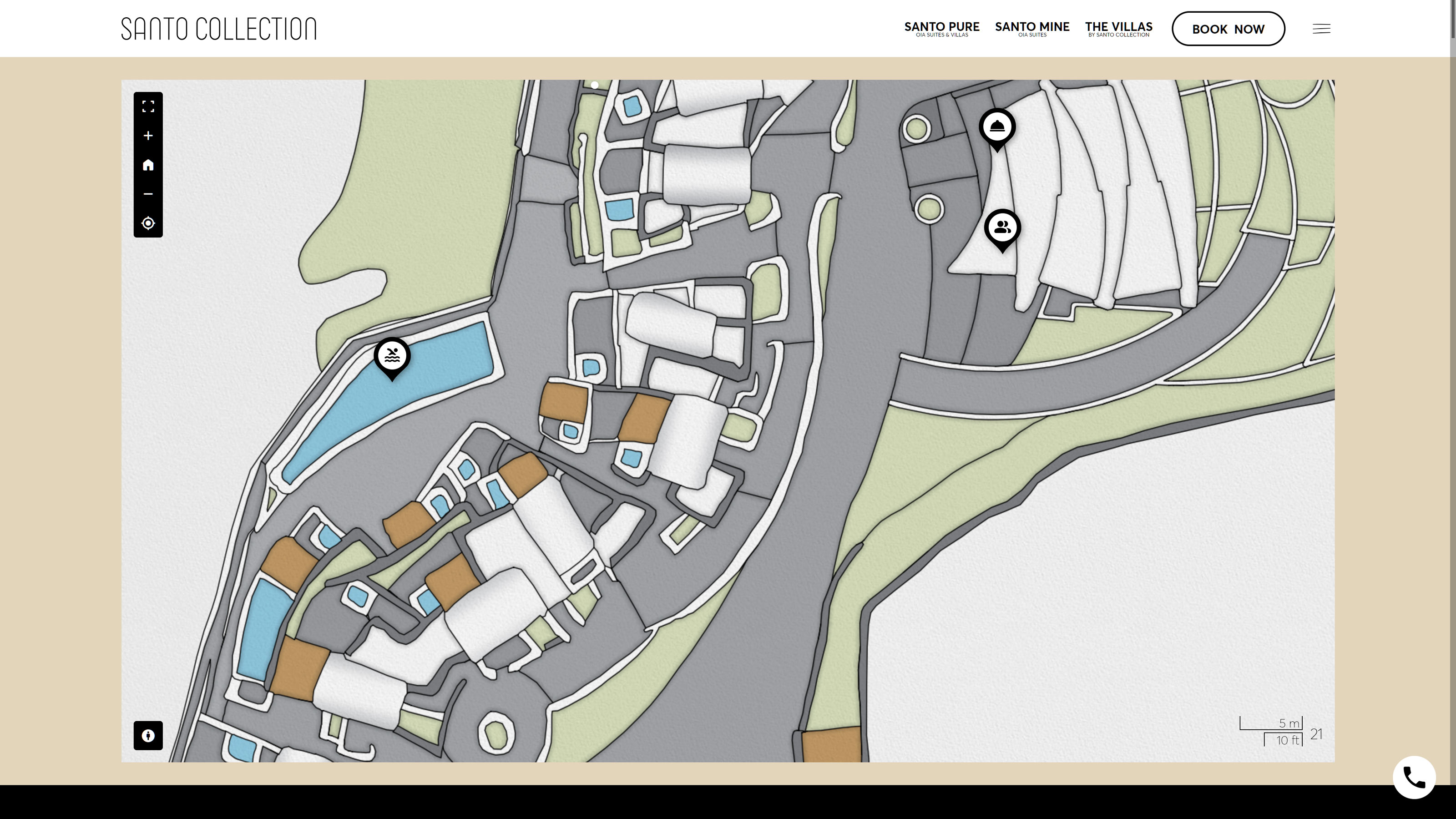
The digital counterpart to the paper map, live on the Santo Collection website, letting guests click through the same points of interest from a browser or a phone screen.
What Guests Need from the Online Map
The online, interactive map is asked to do something slightly different, mostly because of when people actually open it. Most visitors who click into it are not standing in Oia yet, they are somewhere else entirely, planning a trip or simply dreaming about one, so its first job is to keep them informed and give them a real feel for the property before they ever arrive.
Its second job only kicks in once they land, a geolocation feature that lets a guest standing somewhere on the grounds, phone in hand, see exactly where they are on the map and use that to actually find their room, a restaurant, the spa or any other facility inside the resort, without having to stop and ask anyone at the reception, even though the receptionists and the rest of the hotel staff are always more than willing to guide guests personally and make them feel at home.
Santo Collection Paper Map / Side A
The resort side of the map, covering Santo Pure, Santo Mine and The Villas at 1:1,075, with the numbered key to all forty points of interest across the three properties.
The Cartographic Project
I want to say early on that this project is not a simple one, it asks for real attention on paper and on screen at the same time, and juggling both without letting one lag behind the other has been half the challenge from the start. What was asked of me was a single, unified paper map, printed on two sides, that folds and unfolds like a small booklet, together with an interactive, digital map living on the client's own website. And not just one digital map either, but four in total, one general map covering the whole collection and one dedicated map for each of the three units described earlier, Santo Pure, Santo Mine and The Villas, since a guest eventually needs to find their way inside just one of those three worlds, not all three at once.
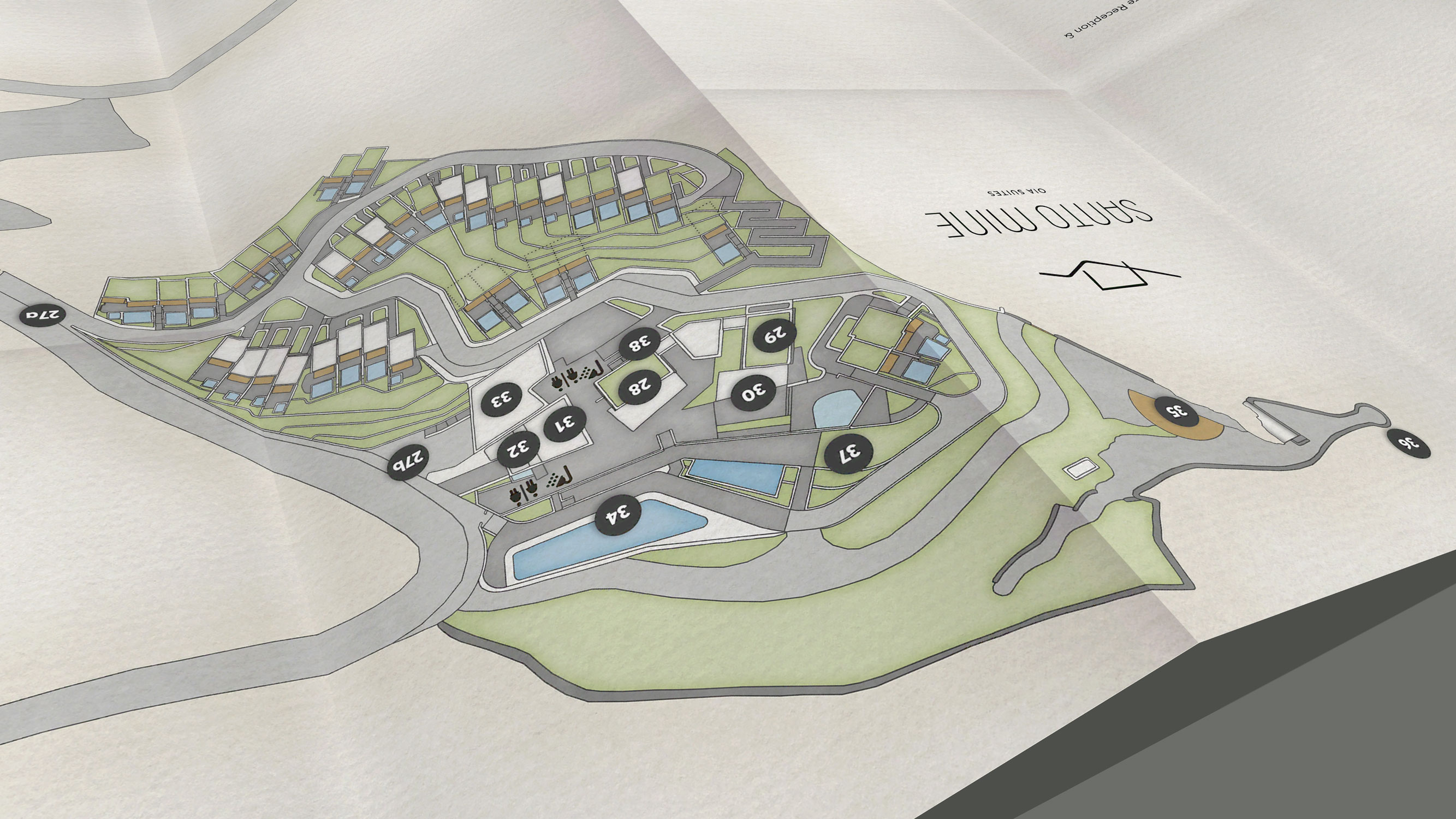
A closer look at Santo Mine's own cluster of suites and pools, each building and amenity carrying its own number in the shared key that runs across all three properties.
The Paper Map
The client wanted a physical map to hand to guests the moment they check in, part welcome gift, part genuinely useful tool they would actually keep in a bag or a pocket rather than leave folded on a nightstand. It needed to help a guest find their way within their own unit first, and then, once they felt comfortable enough to wander further, help them again once they stepped outside the gate to explore Santorini as a whole.
The finished, unfolded map measures a generous 70 by 50 centimeters, large enough to hold both the resort layout and the whole island without either side feeling cramped, folded down into seven vertical columns and three horizontal rows that bring it to a pocket sized 9.7 by 16.5 centimeters once closed. It is printed on a professional offset press, on exceptional 100 gsm paper stock, chosen specifically so the map would survive a week of folding, unfolding and being carried around in the Santorini heat without falling apart at the creases.
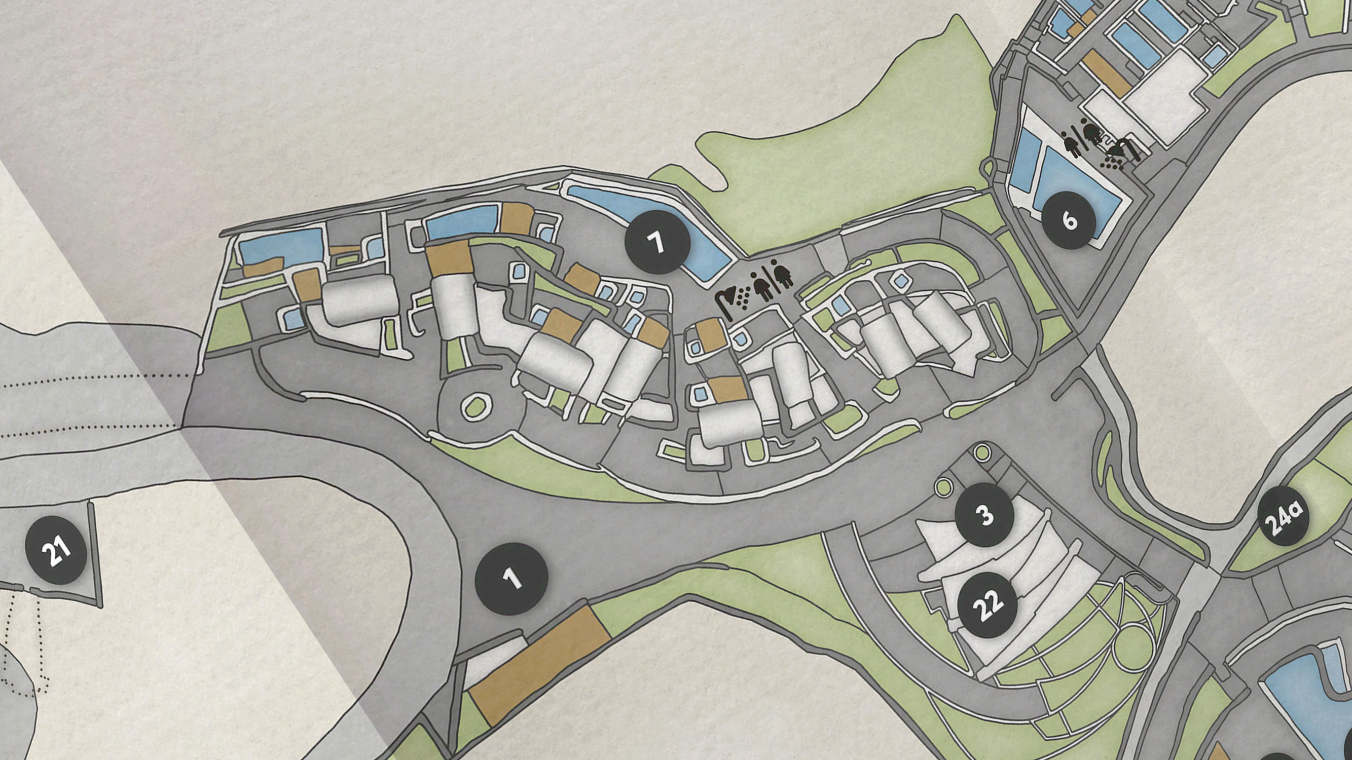
A closer view of the numbered points of interest around Santo Pure's reception and main pool, part of the same key that lets a guest trace their own room back to its building.
Side A is dedicated entirely to the resort itself. Santo Pure, Santo Mine and The Villas are drawn together at a scale of 1:1,075, detailed enough to mark every building, pool, path, garden and parking area across all three properties in one continuous drawing. A numbered key running down the left side lists forty individual points of interest, everything from the main reception and each restaurant to the spa, the wine cellar, the yoga shala, the vineyard and even the composting station tucked away at the back of the grounds.
The official printed version of this map also carries the number of every single guest room, so a visitor is never really lost, they can trace their own room number back to its building and find their way there on foot, room by room, without needing to stop anyone along the way.
From a design point of view this side stays fairly restrained on purpose. Most of the linework began life as hand drawing, later refined digitally, while the fill colors, soft greens for gardens, pale blue for pools, warm grey for paved paths, were applied on screen afterward. What matters most underneath all of it is that the geography is entirely accurate, the finished map was built from real survey data inside a GIS environment, so distances and layouts genuinely match the property on the ground rather than being stylized guesses. Colors and typefaces throughout come straight from the hotel's own visual identity, following its brand guidelines.
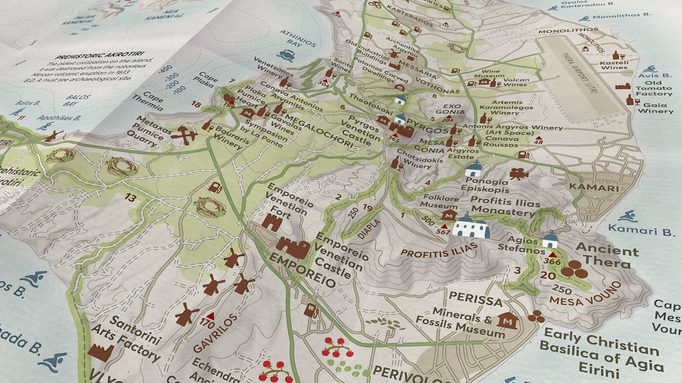
A section of Side B covering Megalochori, Pyrgos and the wine country around them, part of the wider island network a guest can explore once they step outside the resort.
Side B turns outward, away from the resort and toward Santorini as a whole. It maps the island's settlements, its main road network, its beaches and everything else that describes the destination itself and what it actually offers a guest staying at Santo Collection, hiking routes threading along the caldera rim, vineyards grown low and coiled against the wind, local delicacies like tomatoes, capers and split peas, the caldera itself, Ancient Thera, Prehistoric Akrotiri, and a full legend of symbols marking churches, museums, wineries, viewpoints and more. A smaller inset in one corner zooms back into Oia itself, showing the village's own pedestrian street, its shops and its landmarks in more detail than the island wide scale could otherwise afford.
On the design side, every symbol on this half was built to match Side A exactly, same weight of line, same palette, same typographic voice, so the two halves of the same object read as one coherent map rather than two unrelated sheets stitched together by accident.
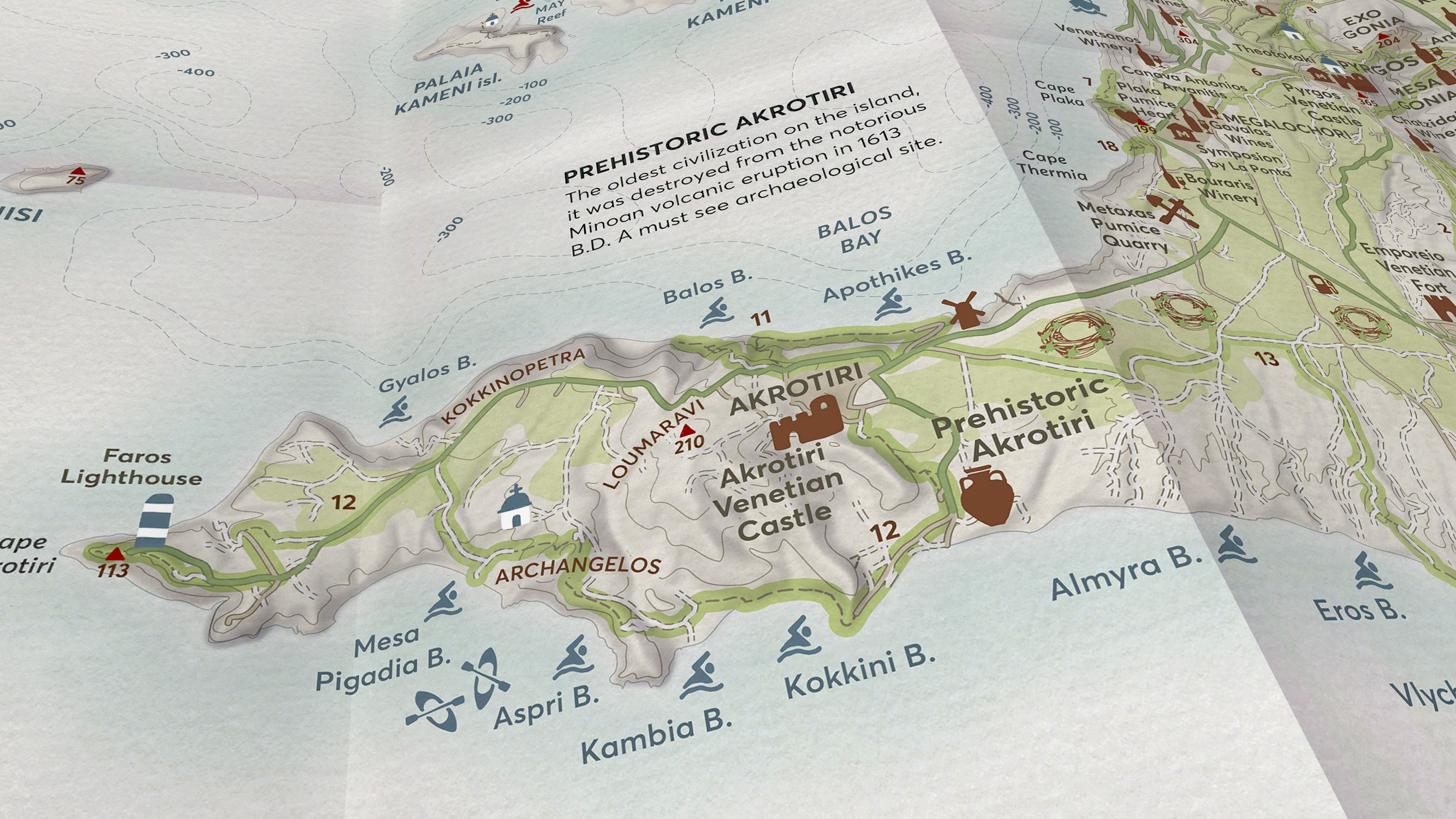
The Akrotiri peninsula on Side B, with its hiking route, Faros Lighthouse and Prehistoric Akrotiri archaeological site, alongside the beaches that fill this stretch of coastline.
The Online Map(s)
The Santo Collection general interactive map lives on their own website, and it runs on a dynamic, multi scale base map that adapts as you zoom in and out, swapping in more or less detail depending on how close you get, and sitting on top of it are the points of interest, each one clickable, each one opening a small info window with a picture, a name and a short description rather than just a bare label.
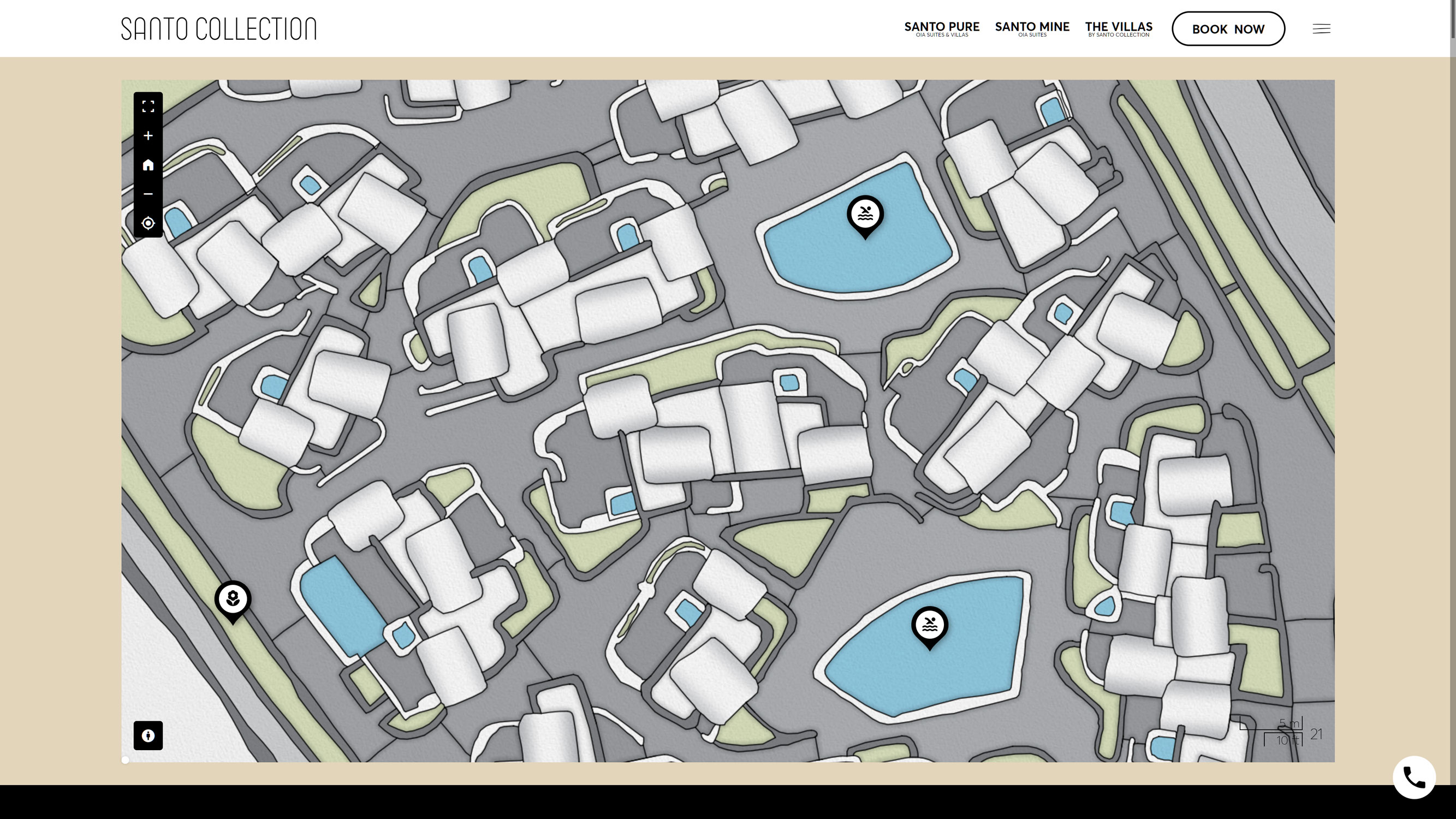
A closer look at the online map's tile layer basemap and pins, each one opening its own info window.
There is also a geolocation feature built into it, the same kind of feature guests actually rely on once they are on the ground. A guest browsing the map from their phone, standing somewhere on the property with a data connection, can use it to find their own position on the map and get their bearings, then navigate to their room or to a restaurant using their device's own GPS instead of guessing.
Beyond that one general map, and because the client specifically wanted a version focused purely on each individual unit as well, we built three more, one for Santo Pure, one for Santo Mine and one for The Villas, each stripped down to just the property a returning guest is actually staying at.
Santo Collection Paper Map / Side B
The island side of the map, covering the whole of Santorini, its settlements, roads, beaches and hiking routes, rendered in the same visual language as Side A.
The Paper Map Design Process
Visual Identity
The hotel had already developed its own visual identity and brand guidelines long before I came on board, put together by a professional design agency, with defined colors, typefaces, logos, iconography and a full style guide behind them. I spent real time studying that identity in depth, because I wanted this map to be inseparable from the rest of the guest experience rather than an accessory that happened to share the same logo. I wanted it to look like it belonged on the nightstand and at the reception desk of the hotel itself, part of the same world as the signage, the stationery and the branding a guest sees everywhere else on the property, not a printed handout that had wandered in from somewhere else.
So I went through the identity element by element and catalogued everything that had any bearing on cartographic rendering, the typefaces, the color palette, the tone of the iconography, and used that catalogue to build a small design system of my own on top of it. That meant defining font families, sizes and styles for every level of the map's information hierarchy, from the resort's own name down to the smallest point label, and deriving a full set of tonal gradations from the identity's core colors so that buildings, paths, water and vegetation could all sit comfortably within the same restrained palette instead of fighting each other for attention. I also wrote a set of linework rules, how thick a path should read against a building outline, how a coastline should differ from a footpath, all of it built to follow the same guidelines the rest of the hotel's printed material already follows, so that a designer looking at this map beside the hotel's own brochure would have no trouble believing they came from the same hand.
Each of the three units also carries its own logo, Santo Pure, Santo Mine and The Villas are each their own brand under the wider Santo Collection name. Fitting three distinct marks onto one shared composition without any of them fighting for dominance, or looking like an afterthought squeezed into a corner, took its own round of careful placement and restraint. It is a small detail in the finished map, but it is exactly the kind of detail that separates a map that merely functions from one that actually feels designed.
Making of Side A
Side A did not begin at a keyboard, and that was a deliberate choice rather than a nostalgic one. I sketched the layout of the property and every one of its buildings by hand, first in soft pencil over a rough plan to work out proportions and composition, by placing tracing paper on aerial imagery, then rendered in watercolor paper. Starting this way keeps a warmth and a human irregularity in the linework that a mouse simply cannot produce on its own, the kind of quality that makes a guest feel like the map was made for their resort specifically, rather than generated for any resort that happened to fit the template.
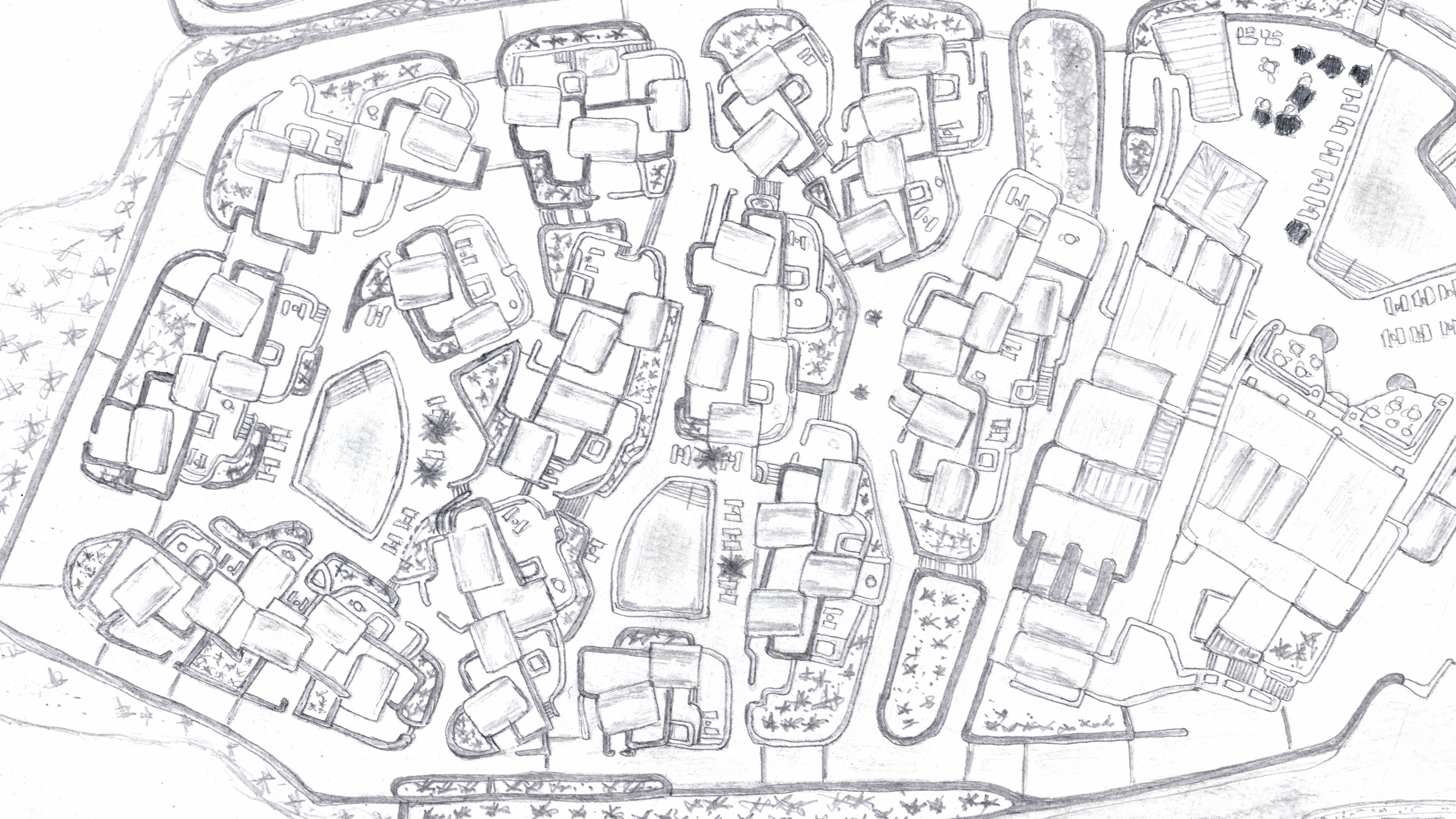
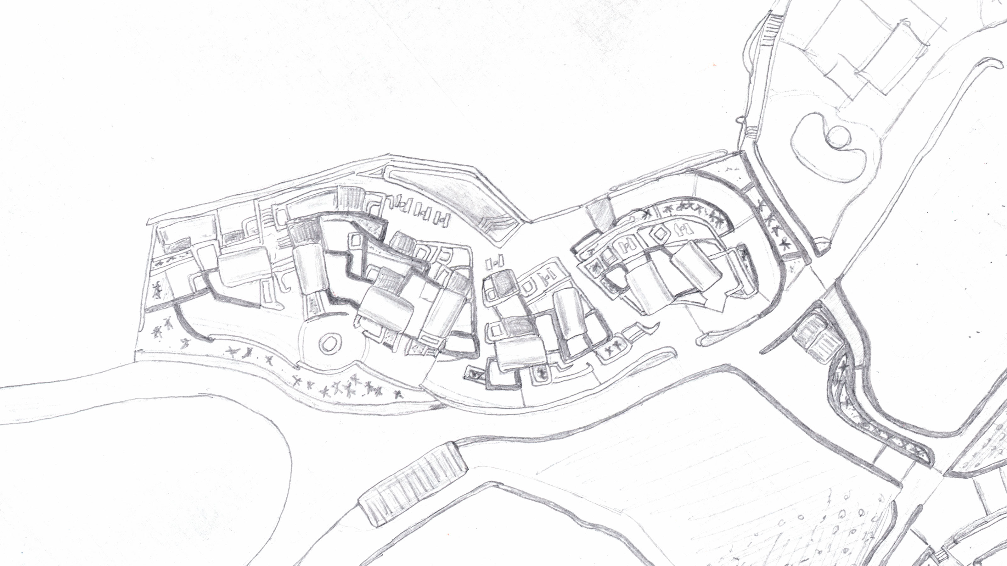
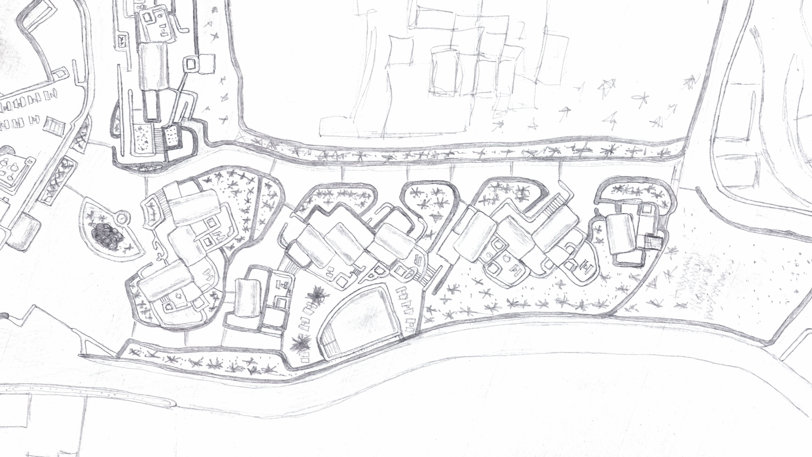
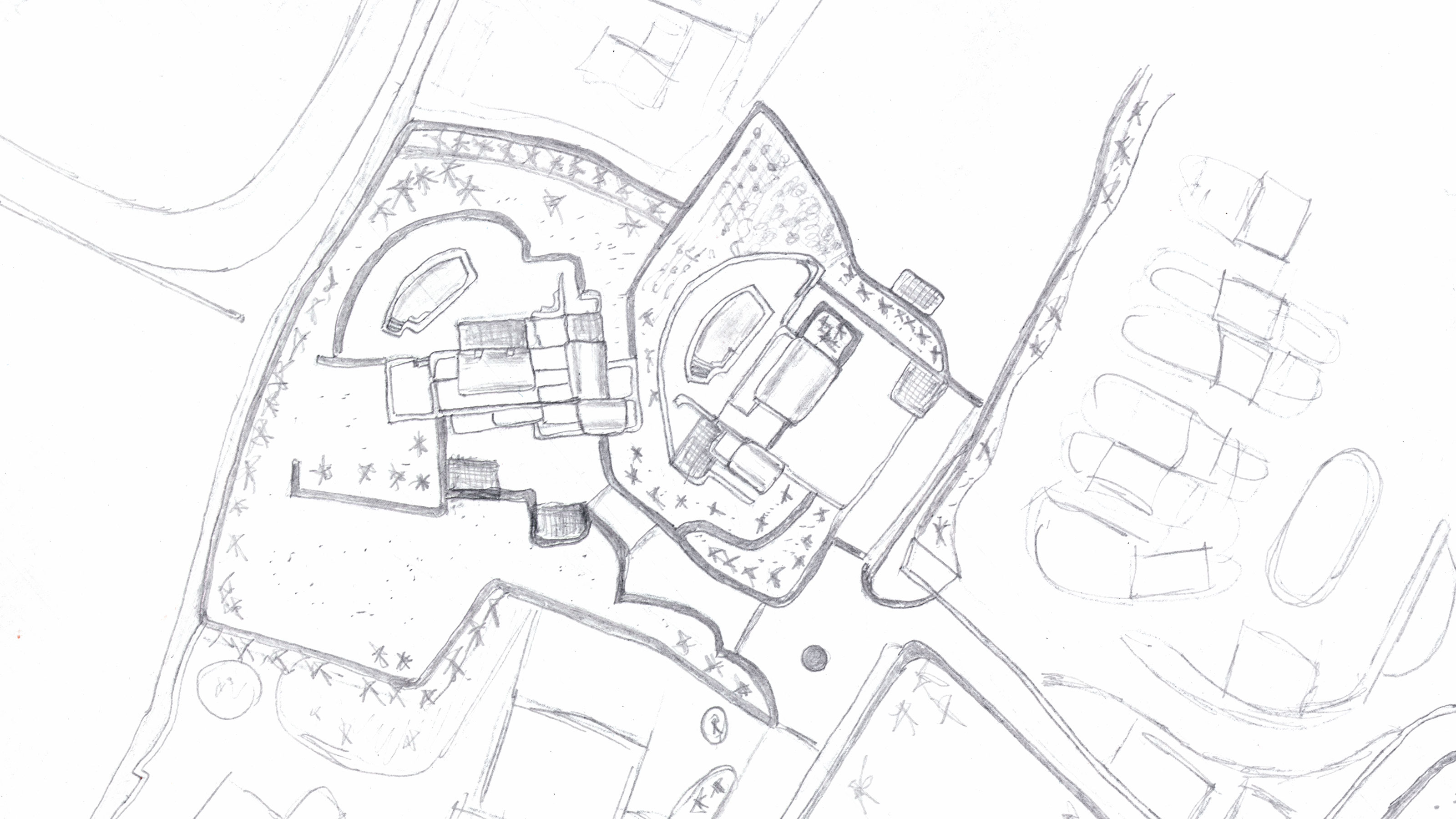
The original pencil sketch of the resort, drawn freehand over tracing paper before being scanned and georeferenced into a working map.
The hard part came next, taking that organic, hand made drawing and making it behave inside a rigid, coordinate based world without losing what made it worth drawing by hand in the first place. I scanned the sketch and georeferenced it, carefully enough to preserve the character of the lines and the slightly imperfect, human quality of the drawing, while still anchoring it correctly inside a GIS environment so it aligned with real world coordinates. Only once that alignment was solid could an actual, properly scaled and dimensioned map be produced from what had started as a sketch on a table, a genuine bridge between illustration and survey grade accuracy.
From there the work shifted from illustration toward cartography proper. Digital coloring filled in the polygons, buildings, pools, gardens and paved areas, and that is really the moment the drawing stops being artwork and starts behaving like a map. Underneath that visible surface I classified every piece of infrastructure and every building and built a database to sit behind it, so each drawn shape corresponds to an actual, named geographic object on the ground rather than just a colored outline someone can admire but never query, update or reuse. That database is the part a guest never sees and never needs to, but it is also the part that lets this whole project stay alive year after year instead of being redrawn from scratch every time something changes.
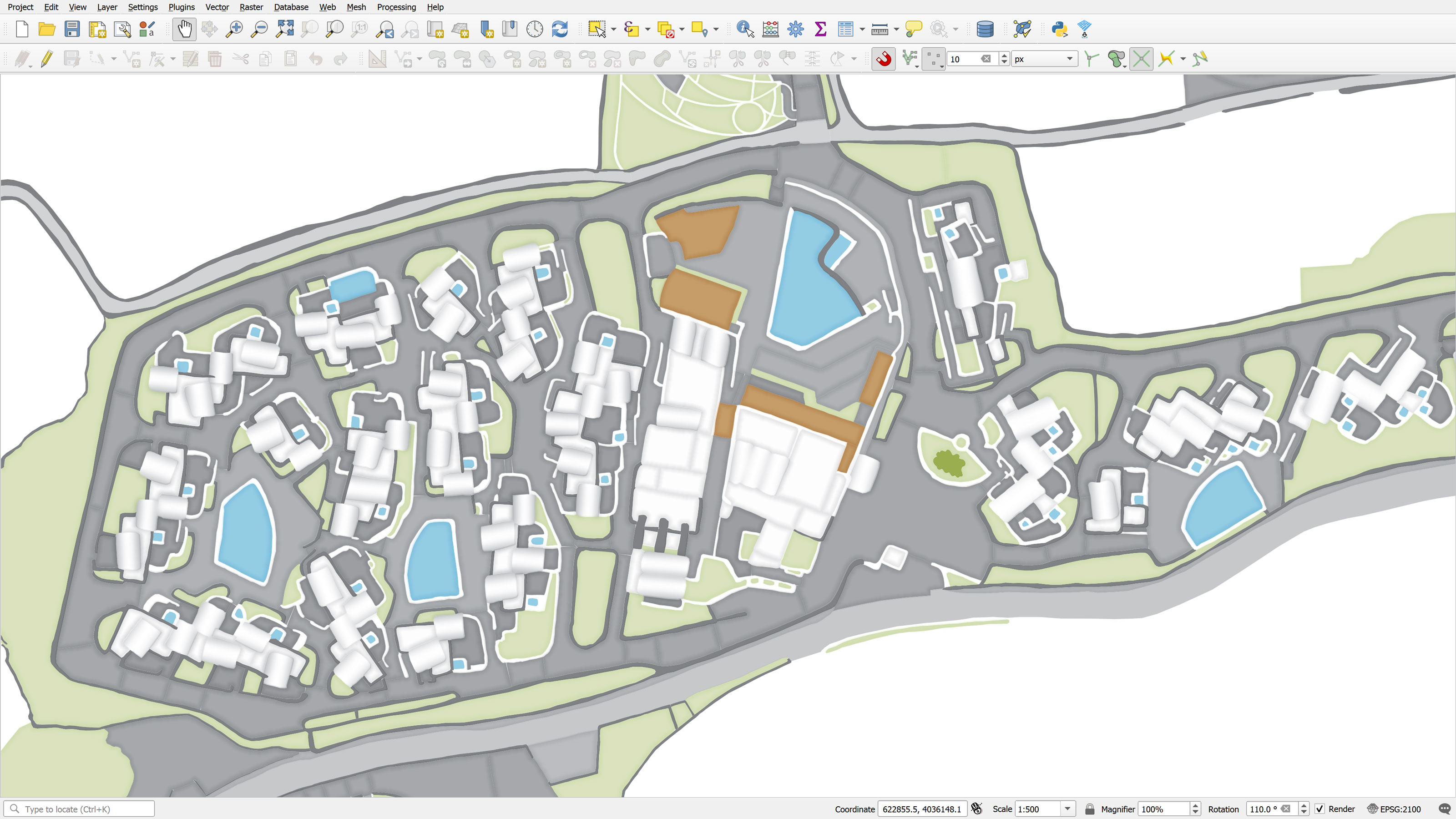
Digital coloring in QGIS where each building, pool, path and garden is classified and filled according to the scanned, georeferenced drawing.
With the structure in place, the more granular work followed. Rooms were numbered, and each number was placed exactly at its real entrance rather than approximated near the building outline, because a wayfinding map that is close enough is not actually doing its job. Points of interest were collected into their own point file, each one tied to real coordinates and paired with a short, carefully written description rather than a generic label, since a point on a map that just says "pool" tells a guest far less than one that tells them which pool, and why it might be the one worth walking to.
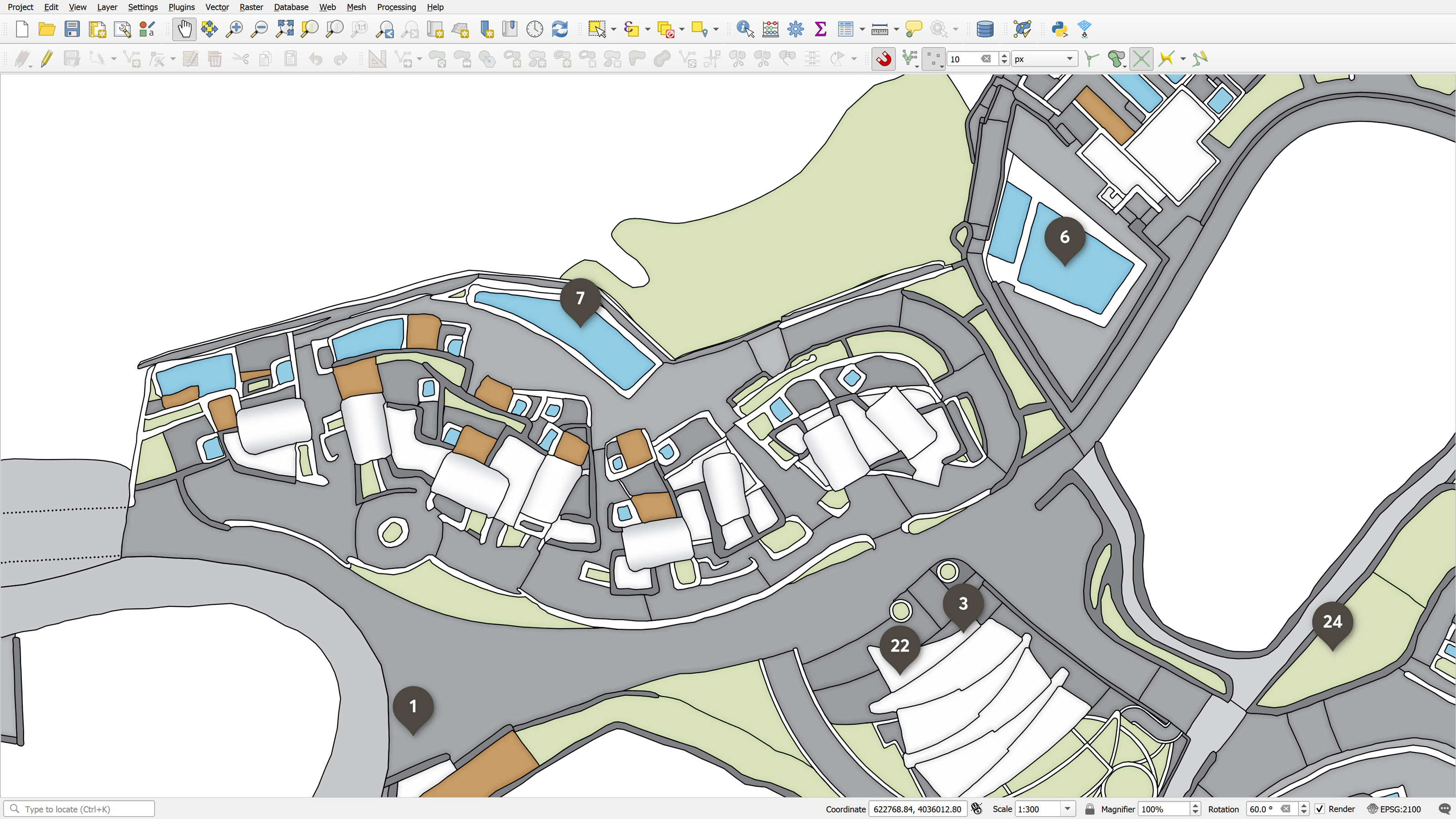
Points of interest being placed inside QGIS, each one tied to real coordinates and numbered to match the key that will eventually run down the printed map.
Everything then moved into a graphic design program for the final cartographic composition, where the last layer of decisions came together, placing the unit logos and the small regional elements, like the short list of nearby points of interest that runs along the edge of the map, giving a guest a sense of what lies just beyond the property line before they have even left the building.
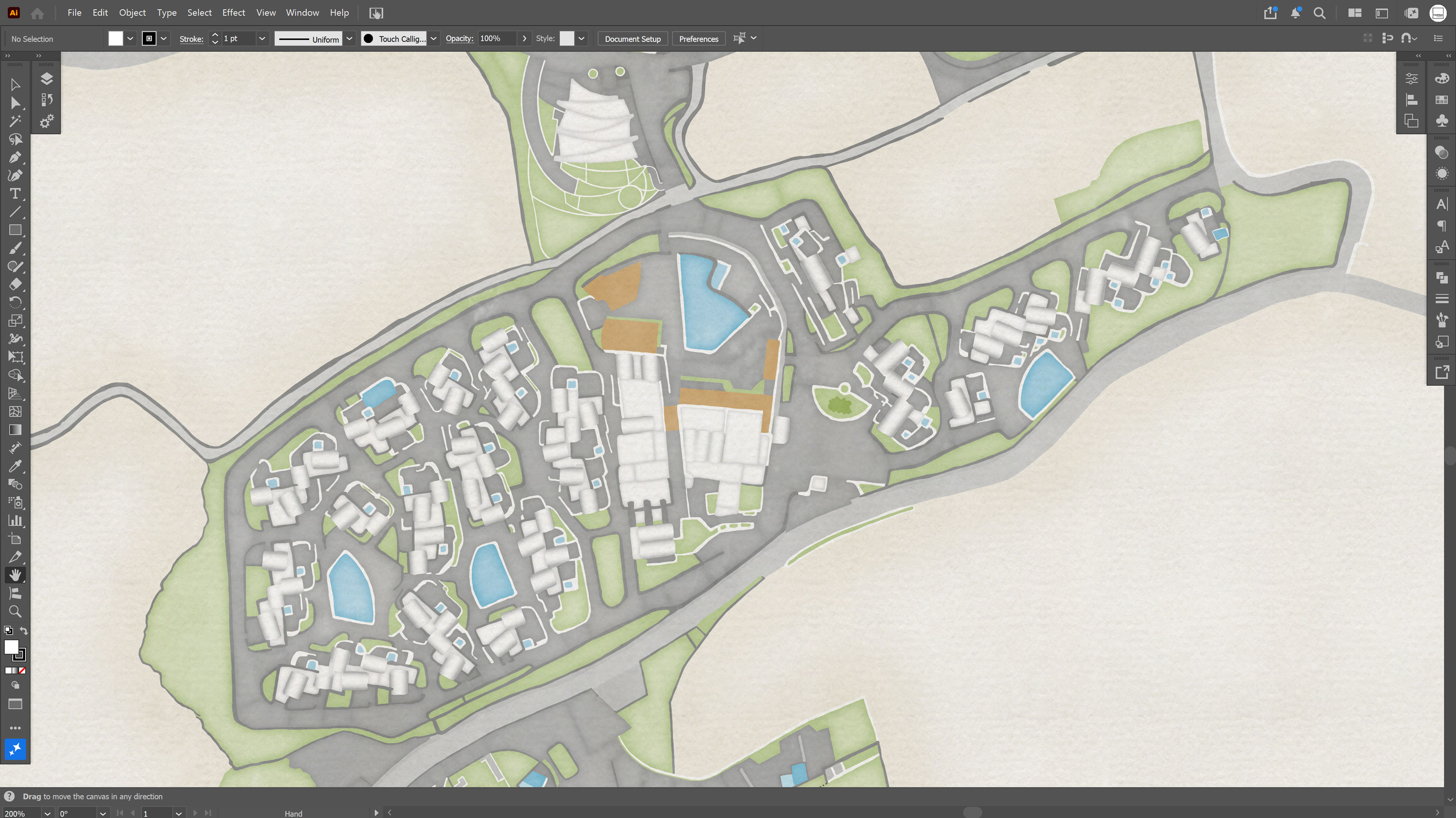
The final cartographic composition of Side A taking shape in Adobe Illustrator, with a watercolor paper texture that ties it back to its hand-drawn origins.
Making of Side B
Side B works at a completely different scale, and it demanded a different kind of thinking from the very start, less about one property's floor plan and more about representing an entire island honestly and usefully in the same visual language as Side A. It covers the full cartographic coverage of the Santorini islands, the coastline, the complete road network, and place names, alongside a proper bathymetric and hypsometric treatment, isobaths tracing the sea floor offshore and contour lines describing the terrain on land, so the caldera actually reads as the collapsed volcanic feature it is, rather than a flat outline on paper.
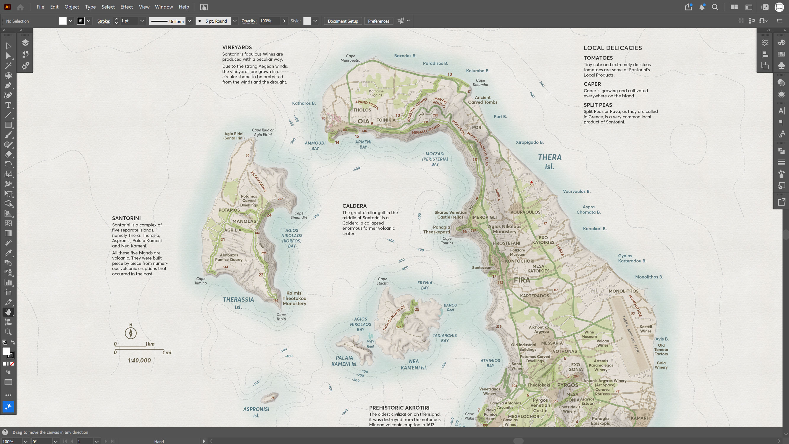
Side B under construction in Illustrator, the island's coastline, roads and contour lines now carrying the vineyard, caldera and local-delicacy call-outs that describe Santorini as a destination.
On top of that base sit the points of interest that matter to someone staying in Oia rather than a generic tourist map's worth of everything, settlement names, beaches worth the walk, hiking paths along the caldera rim, and an enlarged inset of Oia itself tucked into one corner, giving the village the kind of detail the island wide scale simply cannot afford elsewhere on the sheet.
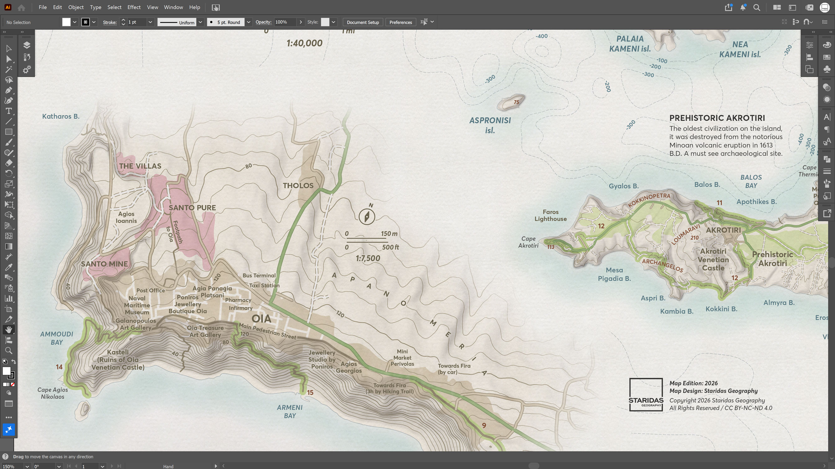
The enlarged inset of Oia itself, giving the village's pedestrian street and landmarks room to breathe at a scale the island-wide map cannot afford.
The short version of the process is that the geographic accuracy behind all of it came from serious GIS work, coastlines, roads and contours built from real survey data rather than traced by eye, while the final composition, its layout, its styling, its typography, was handled in a graphic design program. But the part I actually care about most here is that none of the symbology on this side was designed in isolation. Every symbol was built to match Side A exactly, same weight of line, same palette, same typographic voice, so a guest unfolding the whole map experiences one coherent cartographic system, not two different maps that happen to share a fold line.
Software
The project began in 2016, and that first edition was produced in ArcMap, back when the entire workflow, hand sketch included, was considerably rougher around the edges than it is today.
In 2018 ArcMap was retired in favor of ArcGIS Pro, and that migration became the occasion for the second full edition of the property survey. The hand drawn sketch was redrawn from scratch to match the resort's growth, and this is also the point where the design became properly digital for the first time, with the project's first real database sitting behind the artwork rather than the artwork standing entirely on its own.
From 2026 onward I made the decision to move the geographic side of the work over to QGIS entirely, and this year's edition was built from the ground up inside it, meaning the processing of points and everything else tied to the geography now runs through QGIS rather than Esri's ecosystem. Going forward, the project will keep being updated exclusively with QGIS.
The graphic design side of things, meanwhile, is and will remain done in Adobe Photoshop and Illustrator, the two programs that have carried the visual half of this project since the very first edition and show no sign of being replaced.
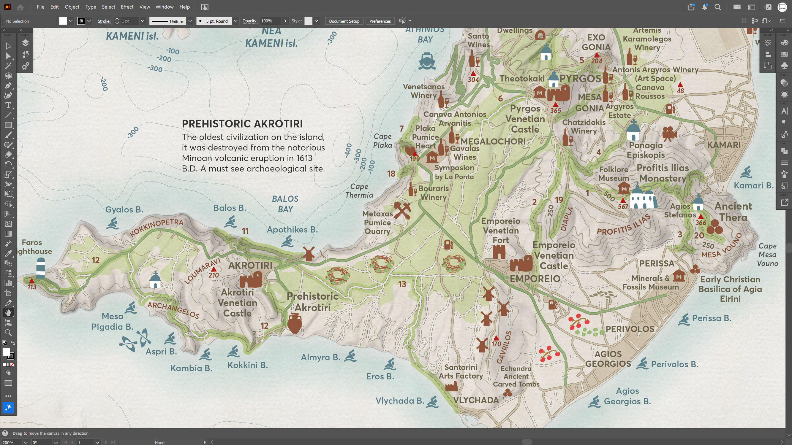
A finished section of Side B, wineries, monasteries and archaeological sites rendered in the same restrained palette and linework as Side A, so both halves read as one map.
The Online Map Design Process
Preparation
None of the paper map's data could simply be dropped onto a website and called finished, a printed sheet and a browser window are two completely different mediums with different rules, and treating them the same is usually where projects like this quietly fail. I took the digitized, fully colored cartography and rebuilt it from scratch as a dynamic, multi scale base map in QGIS, generating raster tiles from it so the browser only ever loads as much detail as a given zoom level actually needs, rather than forcing every visitor to download one enormous image regardless of whether they are looking at the whole resort or a single building.
The points of interest went through their own parallel preparation, exported out of QGIS into a format a WebGIS application could actually read and render efficiently, rather than a static list that would need to be rebuilt by hand for the web. Every one of those points also needed a photograph to actually appear inside its info window once a guest clicked on it, and that meant going through every single image, cropping, adjusting and preparing it in Adobe Photoshop so it looked consistent and presentable at the small size those popups actually display it at, rather than a raw photo dropped in as is.
Design & Development
With the data actually ready to be used, the interface itself still had to be designed and built, and that started with research of the client's own website, where I went through in detail to its layout, its typography, its spacing, its tone, before sketching a rough wireframe of how this particular interface should feel and behave alongside it.
From that wireframe came the actual engineering, writing the code that ties every piece together, the dynamic map itself, its base layer, its points, and the small info windows that open for each one carrying a picture, a name and a description rather than a bare pin on a featureless background. Once the interface genuinely worked end to end, I spent additional time aligning it visually with the client's own website, matching typography, spacing and color so the map reads as a native part of the site rather than a third party tool embedded awkwardly on the side of it.
The final step was testing for usability across enough browsers and devices to be confident the map behaves consistently whether someone opens it on a desktop screen while planning a trip from home, or on a phone standing in the resort's own driveway.
Software
QGIS handled the preparation of the base map and its points, Adobe Photoshop took care of image editing, and the interactive map itself was built with HTML, CSS, JavaScript and Leaflet.
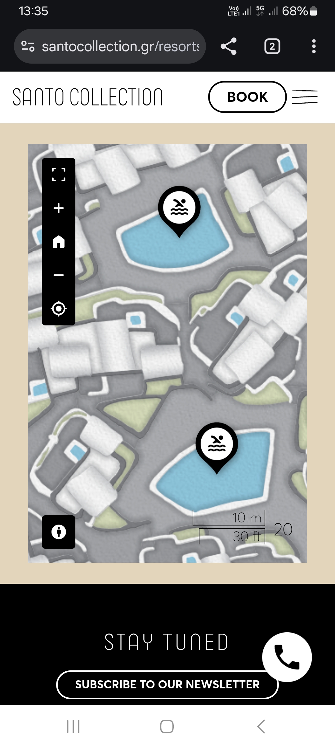
The same interactive map reduced to a guest's own phone screen, the form it actually takes once someone is standing on the resort grounds looking for their room.
Where to Find These Maps
The paper map never leaves the resort in any formal, retail sense, and it is not meant to. It is folded and waiting at the reception desk of Santo Pure, Santo Mine and The Villas alike, and every guest receives one as part of their arrival, somewhere between the key card and the first glass of something cold. It tends to have a slightly different life once it leaves that desk though, guests keep it in a beach bag for the week, mark it up in pen, fold it back the wrong way by accident, and more than a few take it home afterward as a small souvenir of the trip rather than a disposable handout, which is honestly the outcome I always hope for when I design something meant to be printed rather than just looked at once and thrown away.
The digital side reaches a completely different audience at a completely different moment. Long before anyone actually books a room, the interactive map sits on Santo Collection's own website, giving prospective guests a real sense of the property's scale and layout while they are still deciding whether to come at all. Once they do arrive, that same map, or one of the three dedicated versions built individually for Santo Pure, Santo Mine and The Villas, switches roles entirely, from a sales tool into a practical, on the ground companion guests actually pull up on their phone.
Value and Impact
For guests, the value shows up in small, ordinary moments rather than anything dramatic, not needing to interrupt a receptionist to ask where the pool is, not getting turned around walking back from dinner after dark, feeling like even a large, spread out resort is easy and pleasant to move through rather than confusing.
For Santo Collection, the value is different but connected to that same experience, a consistent, polished piece of wayfinding and branding that guests actually keep, photograph, and quietly associate with the quality of the stay long after they have checked out and gone home.
The clearest measure I have, though, is simply how long this has lasted. This year we marked ten years of continuous collaboration, and I wrote about it publicly on LinkedIn and on X, not really expecting much beyond a few likes. Instead, both posts got a genuinely warm, unprompted reply straight from the client's own official accounts.
On LinkedIn, Santo Collection wrote:
Thank you Spiros for being such an integral part of our journey over the years! Your creativity and dedication have beautifully captured the essence of our resorts, bringing our vision to life in the most thoughtful way. We truly value this collaboration and look forward to many more inspiring years together!
On X, Santo Collection wrote:
We are truly thankful for your creativity and dedication over the years, through which you have beautifully captured the essence of our resorts. We truly value this collaboration and look forward to many more inspiring years together!
Ten years, two warm public replies, and a client who keeps commissioning a new edition of the same map year after year, that is about the clearest measure of value I could ask for, and honestly a more convincing one than anything I could write about myself here.
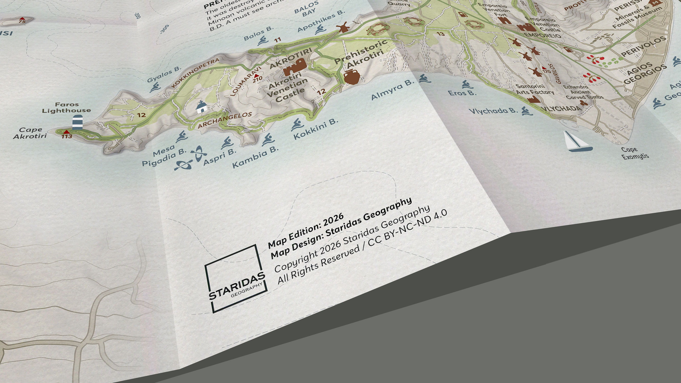
The paper map's closing panel, carrying the Staridas Geography credit and copyright line that has appeared, updated, on ten consecutive editions since 2016.
Epilogue
Working on the same project for ten years changes how you think about your own craft, more than any single edition of it ever could. In the early years I was mostly worried about getting the geography right, making sure a building sat exactly where it should, making sure a scale bar meant what it claimed. Somewhere along the way that concern quietly became secondary to a different one, whether a guest holding this map for the first time would actually feel welcomed by it, rather than simply informed by it.
I have also had to make peace with the fact that this project will never really be finished, and that used to bother me more than it does now. A resort that keeps growing means a map that keeps needing to be redrawn, and for a while I treated every new edition as proof that the last one had already gone stale. I see it differently these days, every new edition is proof the collaboration is still alive, that the client keeps trusting me with it rather than looking elsewhere or trying to handle it in house.
If I am honest, there are things I would still like to push further, better accessibility for guests with impaired vision, a version that works just as well for someone who has genuinely never read a map before, maybe eventually a properly interactive 3D model of the resort instead of a flat plan. None of that takes anything away from what already exists, but ten editions in, I still see plenty of room to grow, and I take that as a good sign rather than a shortcoming.
What I keep coming back to, though, is something simpler than any of that. This whole project began because a hotel wanted its guests to stop getting lost. Ten years later, that is still, at its heart, exactly what it does, and I am genuinely proud that something built with a pencil, tracing paper and a lot of patience has managed to matter to real people for this long.
Time to explore!