Project Overview
Spinalonga is a small island, but it carries an unusually heavy historical and emotional weight. Over the centuries it has been a Venetian fortress, an Ottoman settlement, and later a leper colony. Today, visitors walk its paths surrounded by ruins that belong to different eras, often layered directly on top of one another. The challenge is that very little of this complexity is immediately understandable on site. Walls, buildings, and open spaces blur together unless you already know what you are looking at.
This project began as a commissioned printed visitor map for the Municipality of Agios Nikolaos. The intention was not simply to create a navigational aid, but to design a map that would help visitors read the island. It needed to explain the place spatially and historically, while remaining intuitive enough to be used while walking.
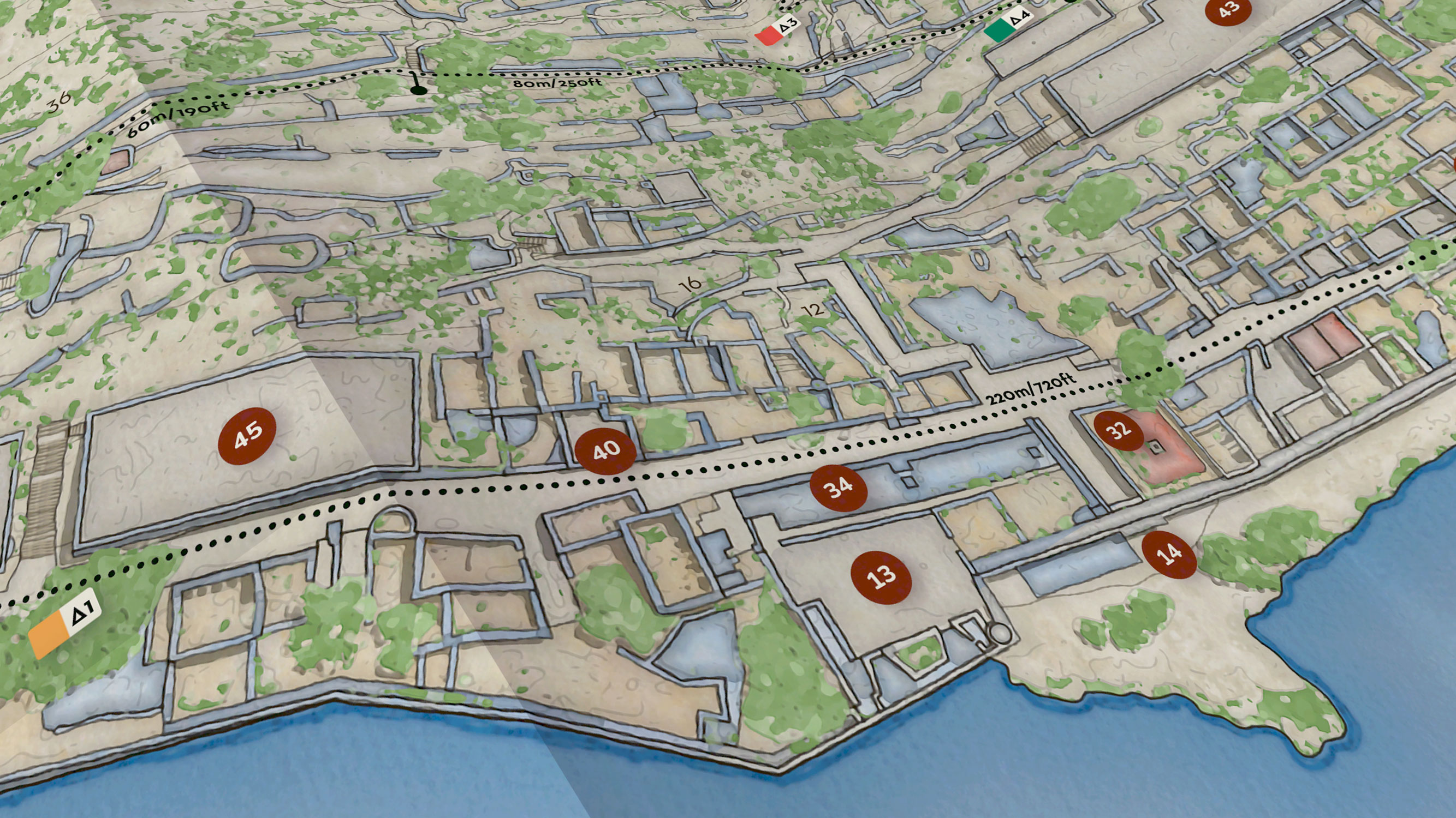
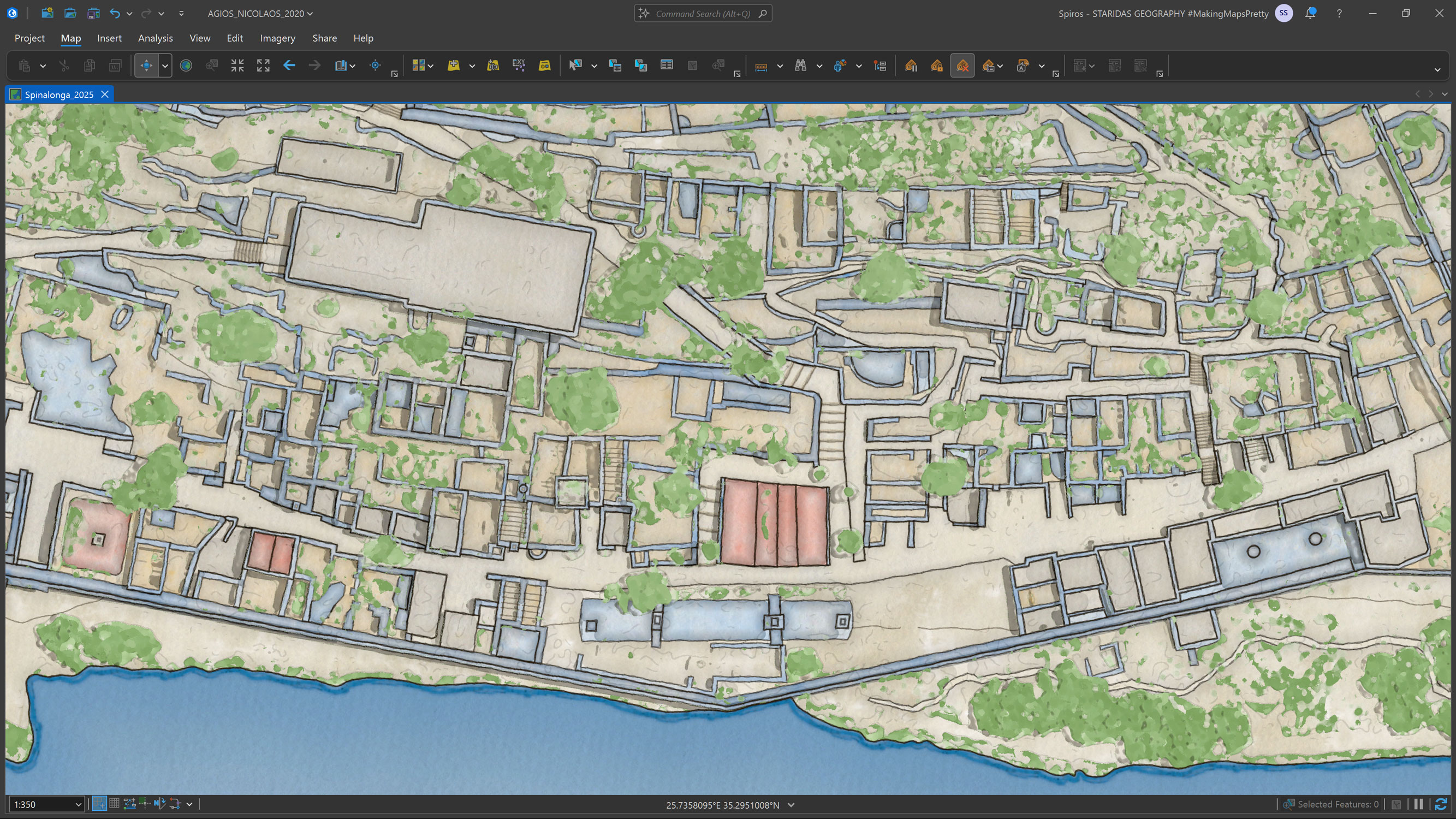
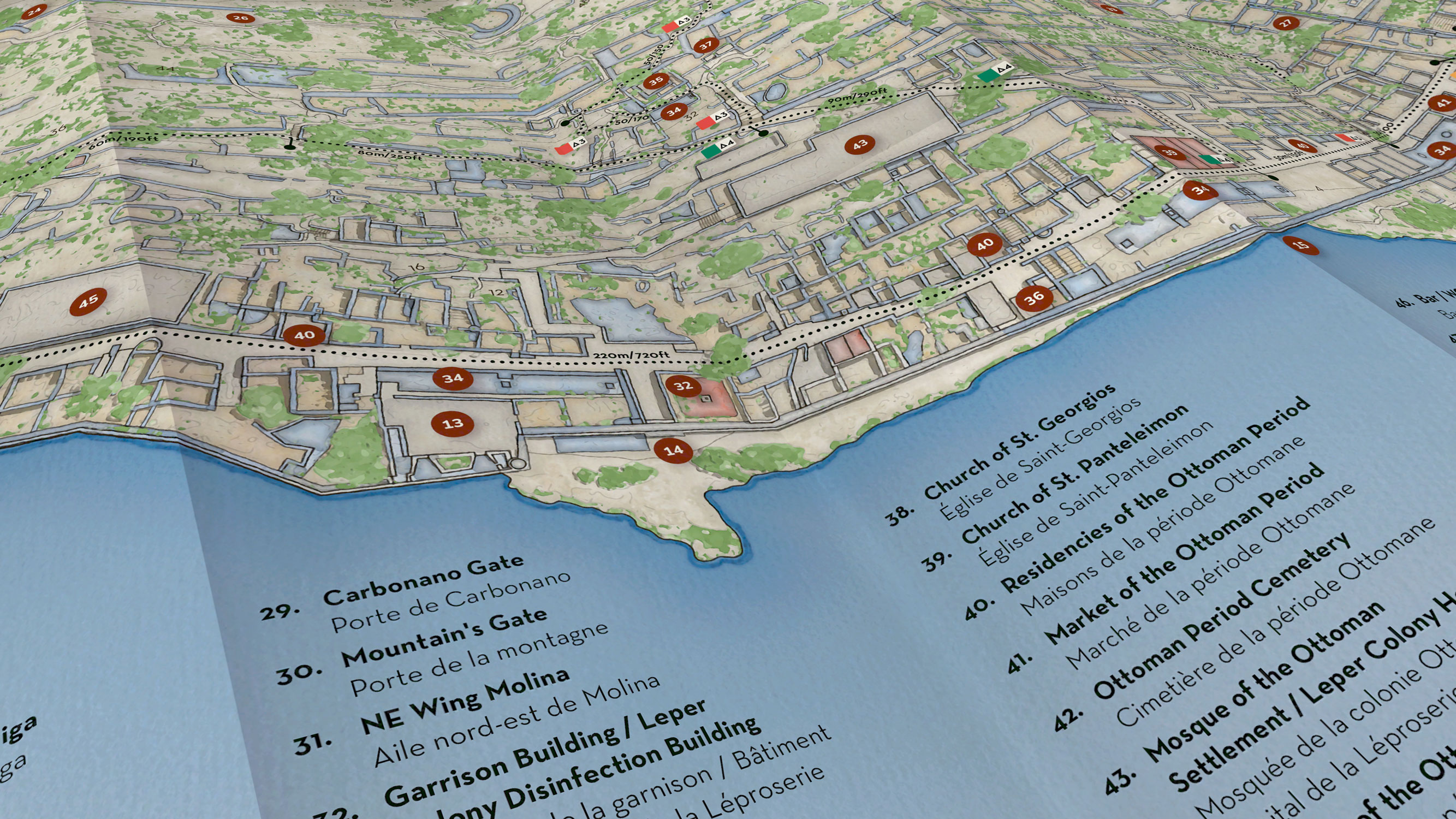
Close up of the southern part of the islet, showing dense building footprints, archaeological remains, points of interest, and hiking routes in one of the most complex areas of the map.
From the start, I approached this map as a storytelling exercise rather than a purely technical one. I wanted the final result to guide people gently through Spinalonga, revealing its structure and history without overwhelming them.
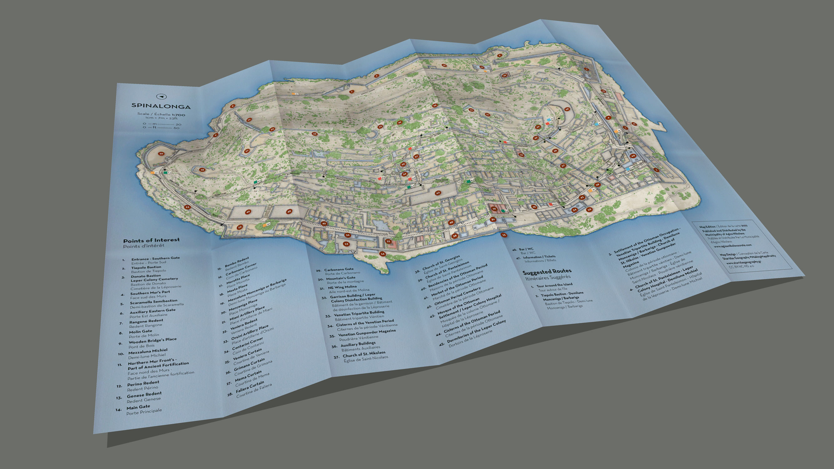
The map depicts the entire islet at a scale of 1:700, showing archaeological remains, building footprints, fortifications, terrain, vegetation, hiking routes, and forty seven officially recognized points of interest. It is a hand drawn styled map, but it is grounded in precise geographic data. The goal was to strike a balance between accuracy and atmosphere, clarity and emotion.
Another detailed view of the southern section of Spinalonga, illustrating how building remains, trails, and points of interest coexist within a highly compact spatial layout.
Context, Audience, and Purpose
The map was designed for a very broad audience. Spinalonga attracts tourists from all over the world, many of whom have no background in archaeology or local history. At the same time, the information presented on the map needed to align with official guides and academic studies of the island. This meant that the content had to be authoritative, but the presentation had to remain approachable.
The primary purpose of the map is both educational and navigational. It helps visitors understand where they are, what they are seeing, and how different parts of the island connect to one another. At the same time, it is also meant to function as a keepsake. As a printed object, it should feel worth holding on to, unfolding again later, and revisiting after the visit has ended.
The final medium is a printed paper map, designed to be folded and carried on site. This physical constraint influenced almost every design decision, from scale and layout to typography and information density.
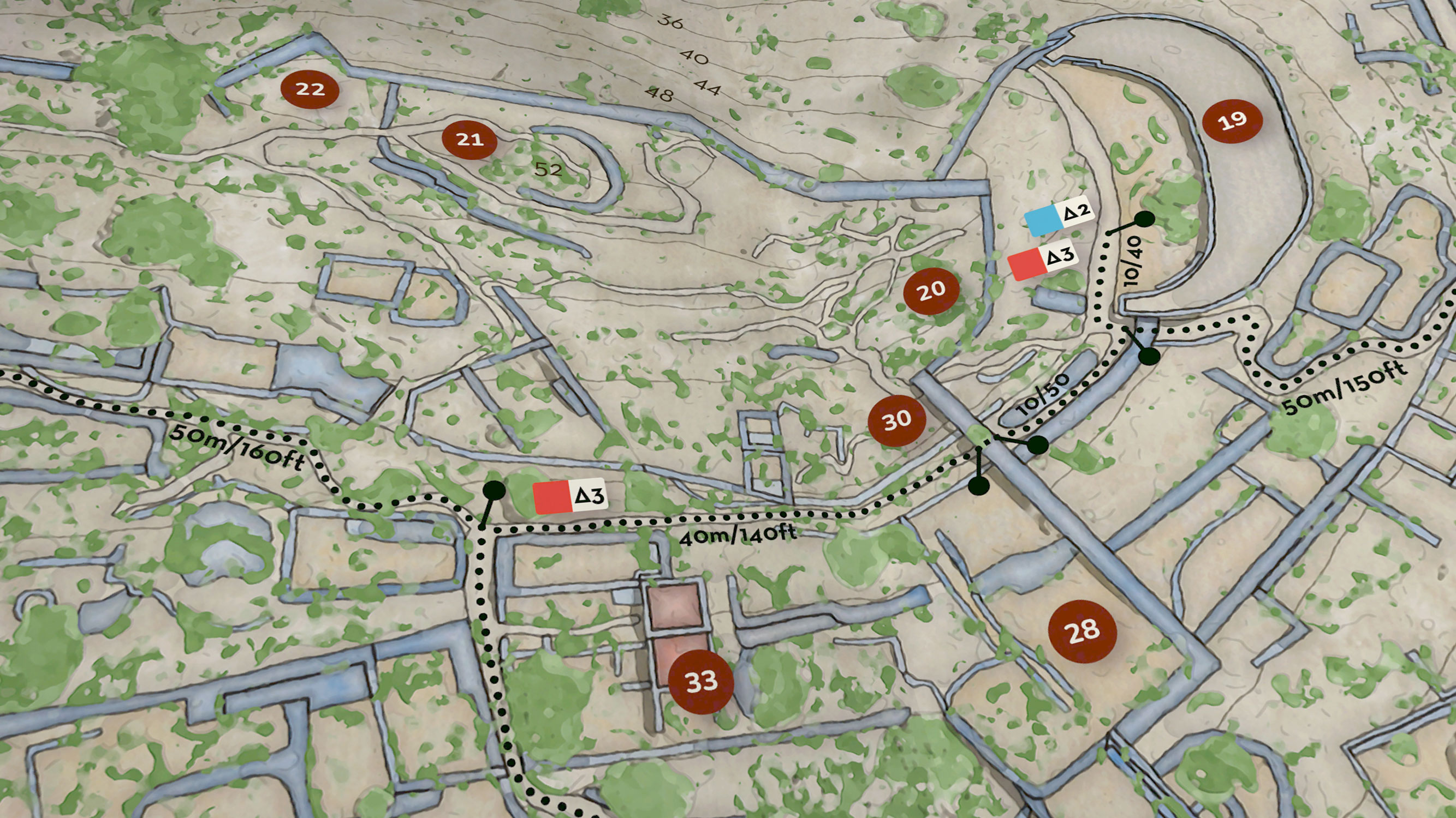
Close up of the eastern part of the island, highlighting building footprints, ruins, points of interest, and walking paths integrated into the overall cartographic hierarchy.
The Core Challenge
The fundamental challenge of this project was density. Spinalonga contains a remarkable amount of information in a very small area. Hundreds of building remains, multiple historical phases, steep terrain, narrow paths, and extensive fortifications all coexist on a limited footprint. Representing all of this without creating visual chaos required constant prioritization.
Another major challenge was scale. At one to seven hundred, every millimeter on paper corresponds to a meaningful distance on the ground. There is no room for unnecessary detail, but removing too much information would undermine the map’s educational value. Every element had to justify its presence.
Finally, there was the challenge of tone. A purely technical map would feel cold and disconnected from the lived experience of the island. A purely illustrative map would risk losing credibility. The design needed to sit carefully between those two extremes.
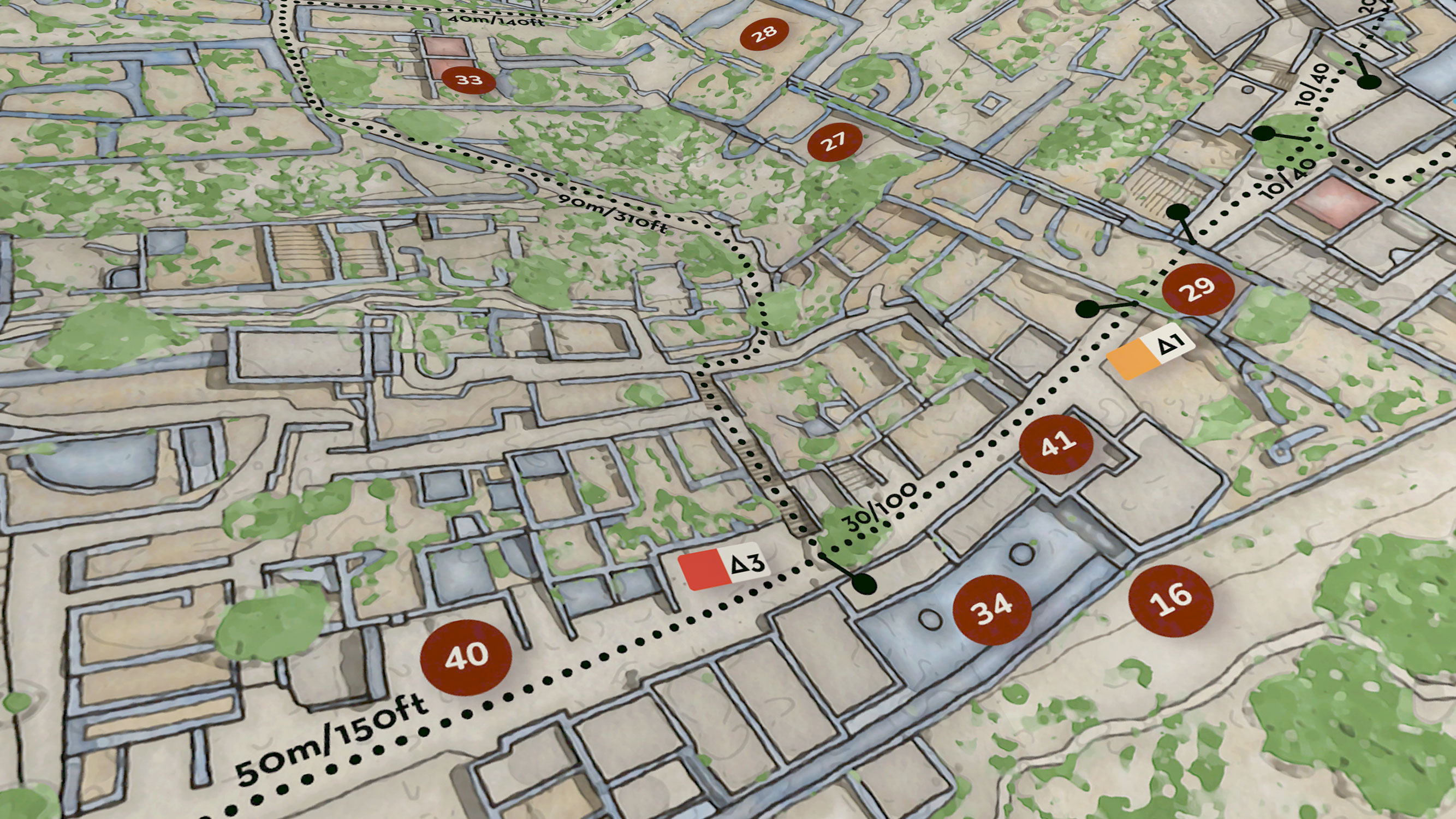
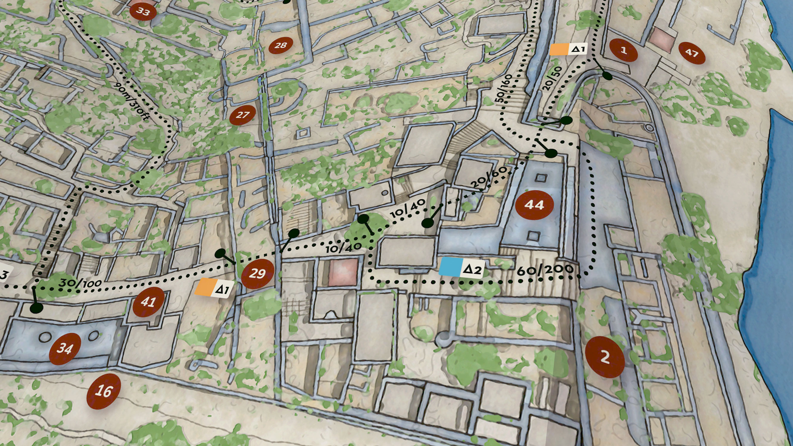
Close up of the central area of the islet, showing the balance between architectural density, open space, and visitor circulation.
Design Process
Building the Foundation in ArcGIS Pro
The design process began in ArcGIS Pro, where I constructed the base geography of the island. This included coastline, terrain, fortifications, building footprints, and circulation paths. At this stage, the focus was on structure and accuracy rather than aesthetics.
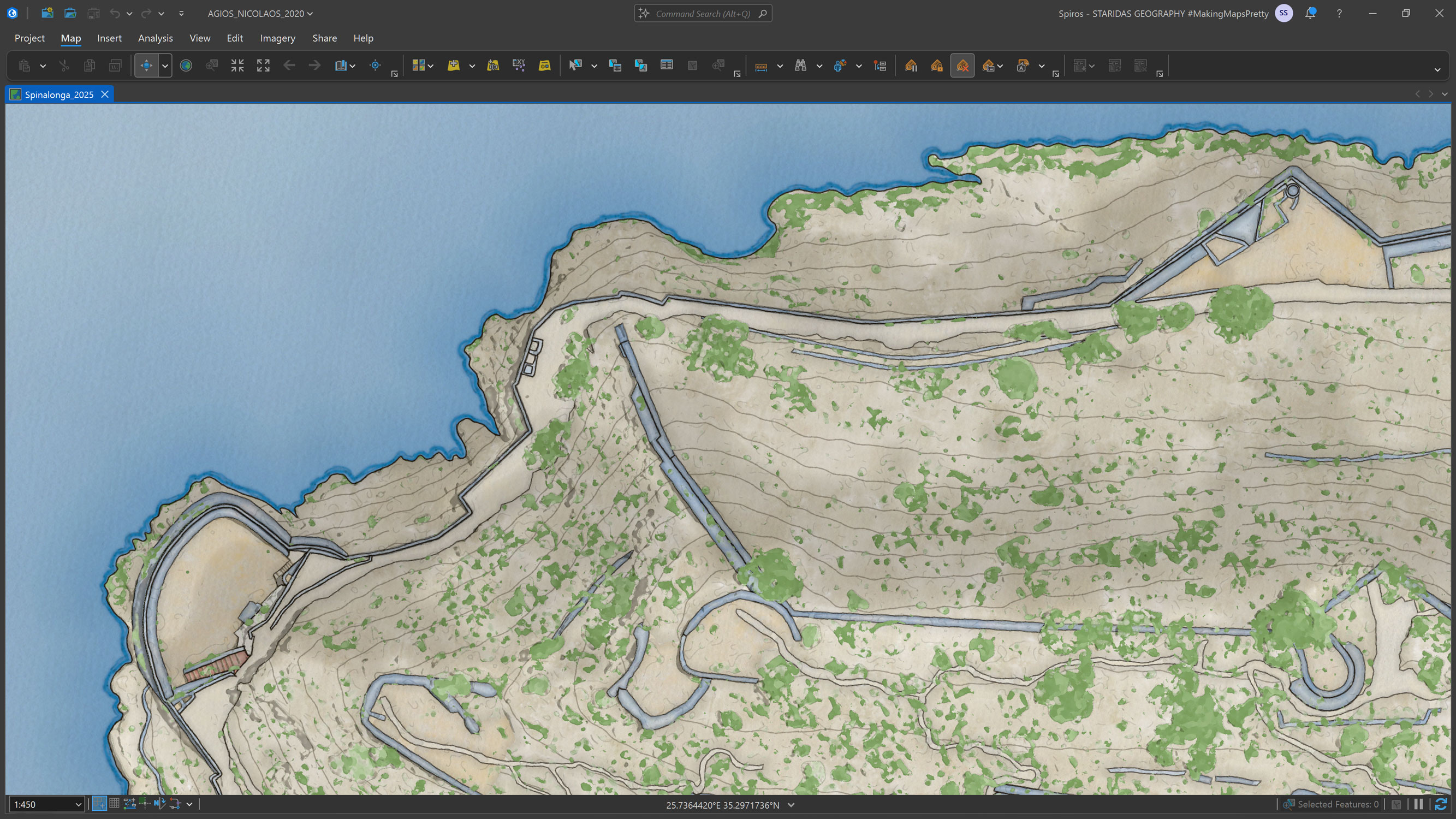
One of the first areas I concentrated on was the western part of the islet, where the main walking path follows closely along the Venetian fortifications. This area immediately highlighted the complexity of the site. The walls, the path, the slope, and the sea are all tightly compressed. Mapping this section forced me to think carefully about line weight, spacing, and simplification.
Detailed view of buildings, archaeological remains, and Venetian walls designed in ArcGIS Pro, rendered with a hand drawn watercolor style to balance precision and atmosphere.
Buildings and ruins were designed as readable footprints rather than realistic representations of decay. The intention was not to show how the island looks today in photographic terms, but to show how it is organized spatially.
Venetian walls were given a slightly stronger visual presence to reflect their importance as both historical and navigational features. At this stage, I constantly adjusted geometry and symbolization to ensure that features remained legible when viewed together.
Designing Terrain and Natural Character
Once the built environment was established, I turned my attention to the terrain and natural character of the island. Although Spinalonga does not have dramatic elevation changes, its slopes strongly affect how people move through it. Ignoring relief would flatten the experience of the place.
I chose to represent terrain using subtle contouring and soft tonal variation rather than strong hillshading. This allowed elevation to be perceived intuitively without dominating the map. Vegetation was rendered in a loose, organic style that suggests texture and variation rather than precise botanical detail.
This is where the hand drawn watercolor aesthetic became essential. The natural elements soften the rigidity of the architectural remains and help the island feel alive rather than diagrammatic. The goal was to let the terrain breathe visually, providing contrast to the dense built areas.
Close up of the island’s relief and natural character, designed in ArcGIS Pro and styled to emphasize terrain, vegetation, and subtle elevation changes.
Transitioning from ArcGIS Pro to Adobe Illustrator
With the basemap completed in ArcGIS Pro, I moved the project into Adobe Illustrator. This transition marked a shift from geographic construction to graphic composition.
In Illustrator, I added the layers that transform the map into a visitor guide. These included numbered points of interest, hiking routes, distance annotations, labels, and layout elements. Working in a vector design environment allowed much finer control over hierarchy, spacing, and visual balance.
At this stage, I constantly zoomed in and out, checking how the map functioned both as a whole and in close up views. The challenge was to add information without cluttering the island itself. This led to a strong reliance on margins and structured lists to carry explanatory content.
The basemap after completion in ArcGIS Pro, imported into Adobe Illustrator where additional layers such as points of interest, hiking trails, and annotations were added.
Points of Interest and Multilingual Design
The forty seven points of interest are the backbone of the map’s interpretive function. Each numbered marker corresponds to an entry in a bilingual list in English and French. This decision was essential for accessibility, given the international audience of the site.
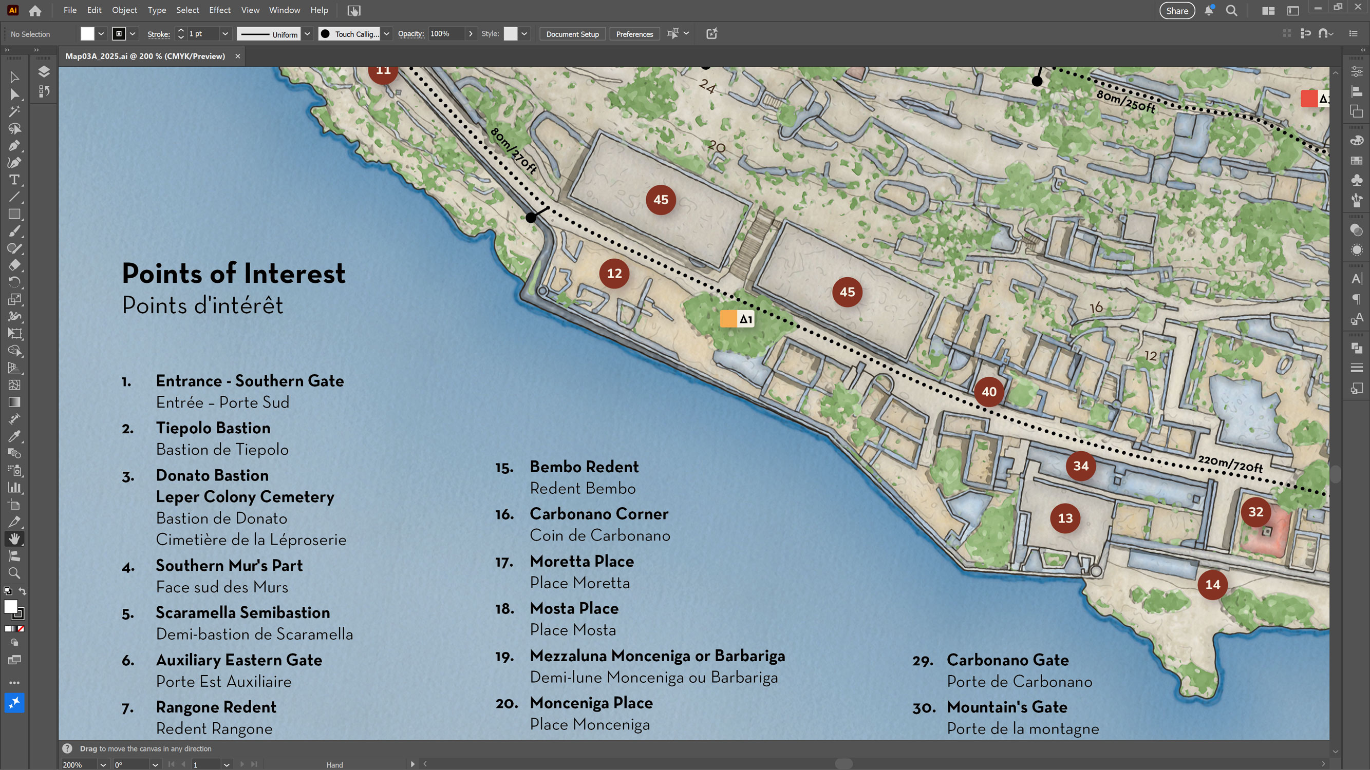
Close up showing the numbered points of interest on the map alongside their corresponding bilingual list in English and French.
Designing these markers required careful placement. Each number needed to be clearly associated with a specific location without obscuring important features beneath it. The markers had to be visible against varied backgrounds of terrain, buildings, and vegetation.
Equally important was the relationship between the map and the list. The numbering system needed to feel intuitive and trustworthy. Visitors should be able to move easily between what they see on the island and what they read on the map without hesitation or confusion.
Close up of the points of interest system, showing how numbered symbols on the map correspond directly to the bilingual explanatory list.
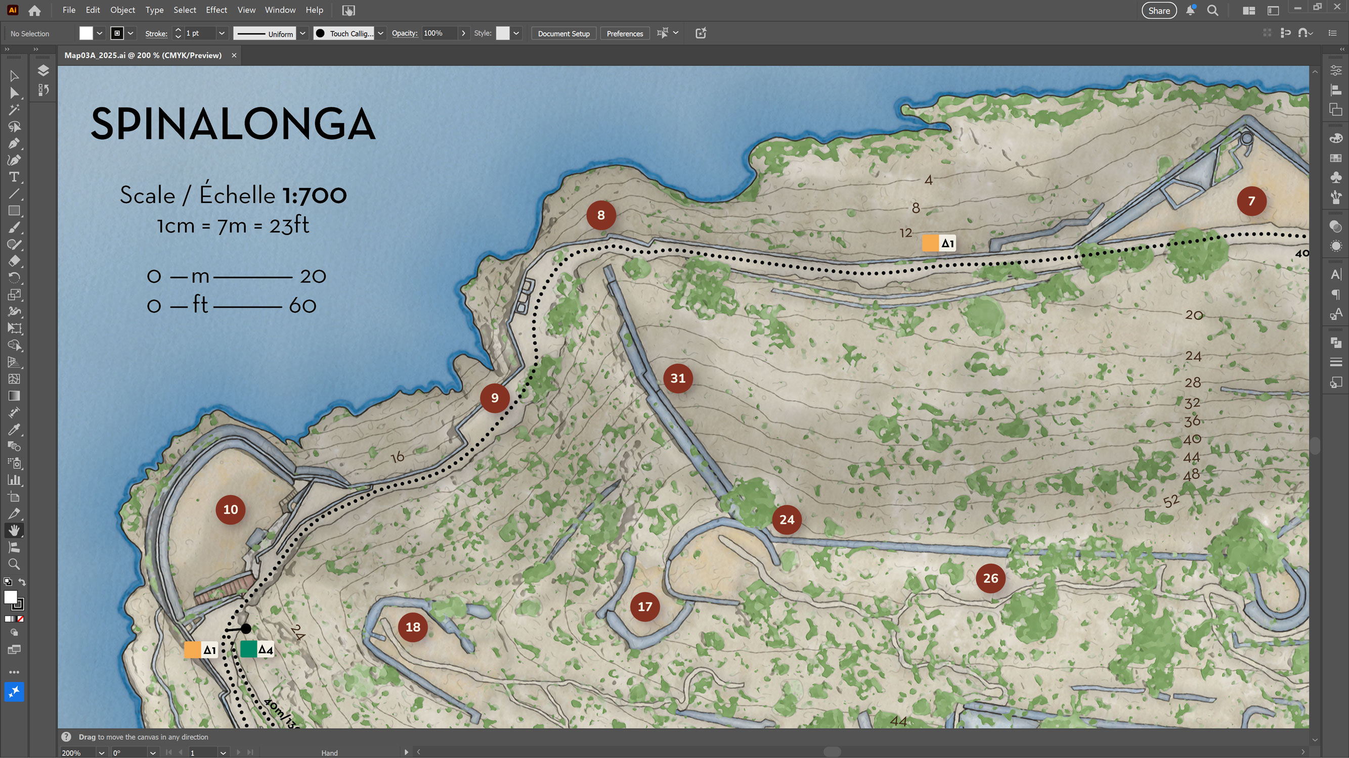
Mapping Movement Through Hiking Routes
Movement is central to how Spinalonga is experienced. People explore the island on foot, often without a fixed plan. The hiking routes were designed to support this exploration rather than constrain it.
Four suggested routes are shown on the map, each representing a different way of moving through the island. Distances are provided for individual segments in both meters and feet. This dual unit approach reflects the international nature of the audience and reinforces clarity.
The routes are drawn as dotted lines that guide the eye without overpowering the underlying geography. They suggest possibilities rather than prescriptions. Designing these paths required careful calibration to ensure that distances felt accurate when experienced on the ground.
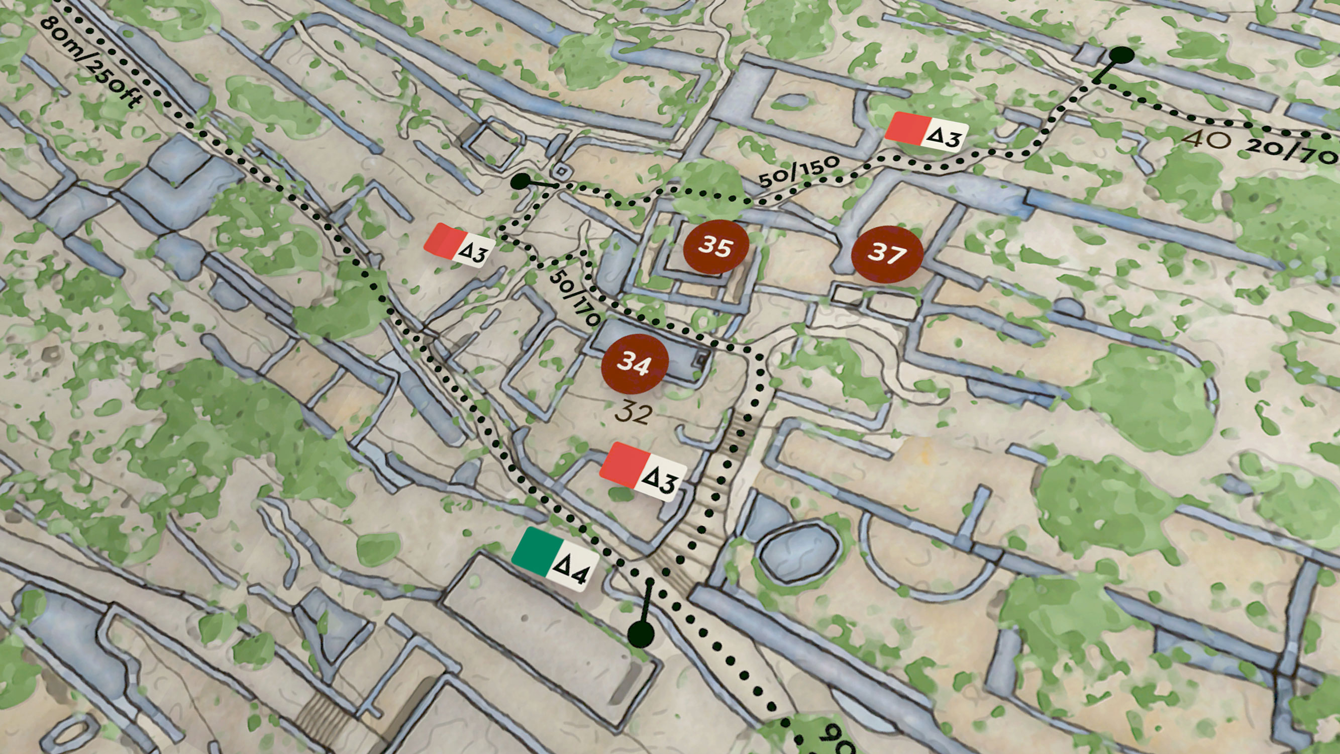
Close up of the southern edge of Spinalonga, showing how ruins, paths, and terrain meet along the coastline.
The Map as a Physical Object
One of the final stages of the project involved designing the folded form of the map. A printed map is not experienced all at once. It is unfolded, refolded, partially opened, and handled in less than ideal conditions.
Designing for this physical reality influenced layout decisions and content placement. Key information needed to remain accessible even when the map was not fully open. Folds had to align with logical breaks in content. The tactile nature of paper was treated as part of the design rather than an afterthought.
Folded paper mockup of the map, demonstrating its tactile qualities and how it is intended to be handled and used after printing.
Closing Notes
The Final Result
The completed map brings together terrain, ruins, routes, and interpretation into a single coherent composition. At one to seven hundred scale, the entire island is readable and structured. Visitors can understand where they are, where they can go, and what they are seeing.
The map does not attempt to explain everything at once. Instead, it invites exploration and discovery, both on site and after the visit has ended.
Authorship, Credits, and Responsibility
Maps carry authority, and with that authority comes responsibility. The information panel clearly states the edition of the map, the publishing authority, my role as map designer, and the licensing terms. This transparency is important. It acknowledges that the map is both an official document and a designed interpretation.
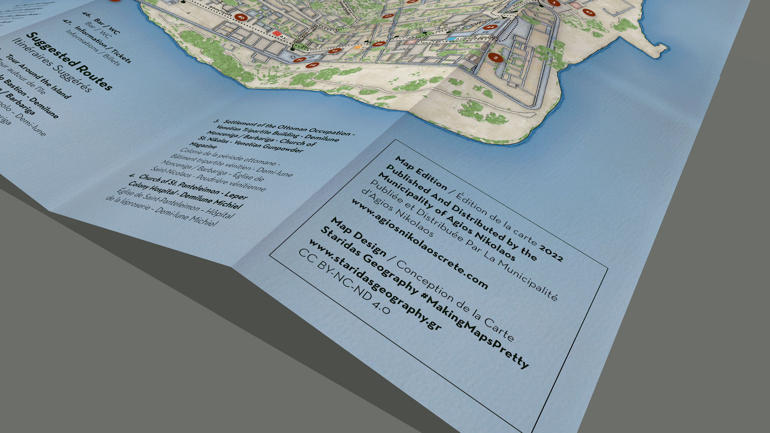
Detail of the map credits and information panel, including authorship, client, edition details, and licensing information.
Reflection
This project reinforced my belief that good cartography is not about showing as much information as possible. It is about making thoughtful decisions about what matters and how it should be seen.
Working on Spinalonga strengthened my ability to move between GIS precision and graphic design sensitivity. It deepened my understanding of scale, hierarchy, and storytelling in cartography. Most importantly, it reminded me that maps are experienced by people, not just viewed.
Designing this map was an exercise in respect. Respect for the place, for its history, and for the people who walk its paths today.